Boom Brief #3: How you met our challenge to brand a coastal music & arts festival
From hypnotic sound waves to neon-glitch energy, your Echo Festival identities prove just how boundless our community's creativity can be.
](https://media.creativeboom.com/0d1b8c52-f534-4801-997a-658afb6d08a7/conversions/43d040b5287ef5308d595d254f156de2ae519484-medium.webp)
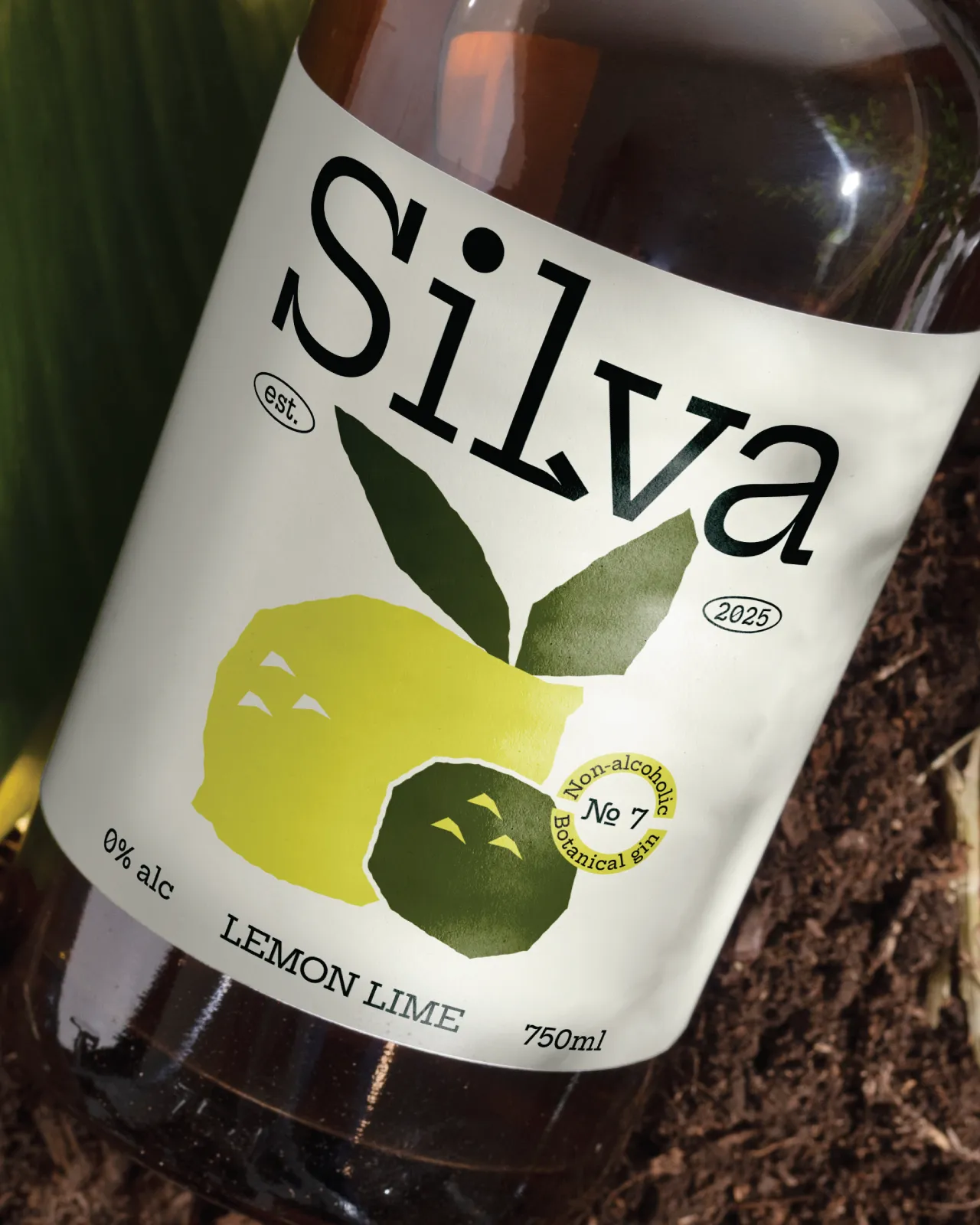
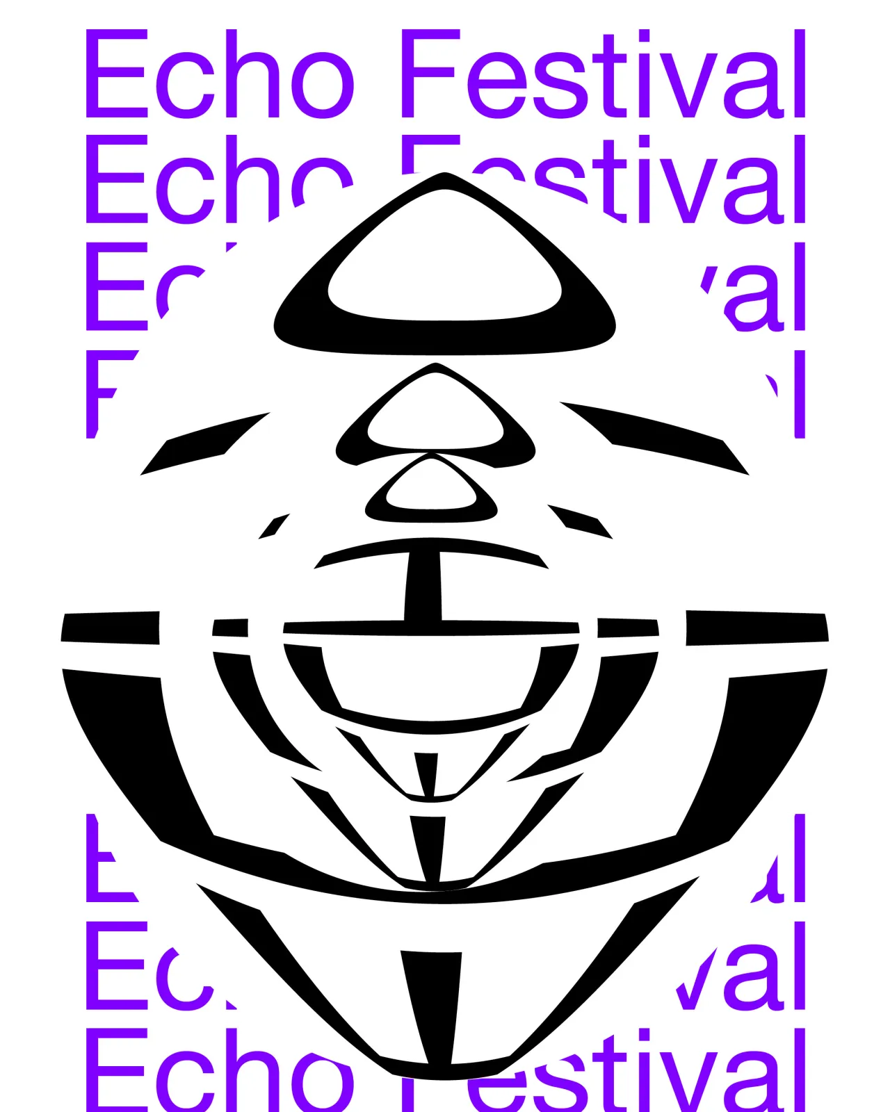
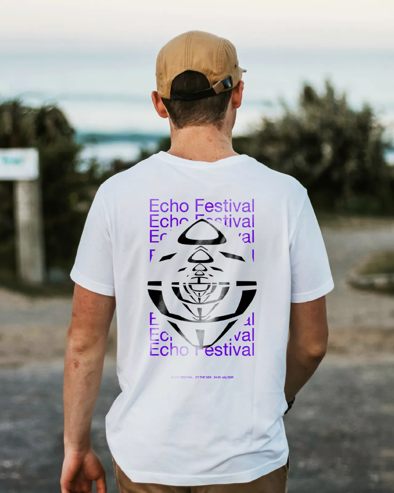
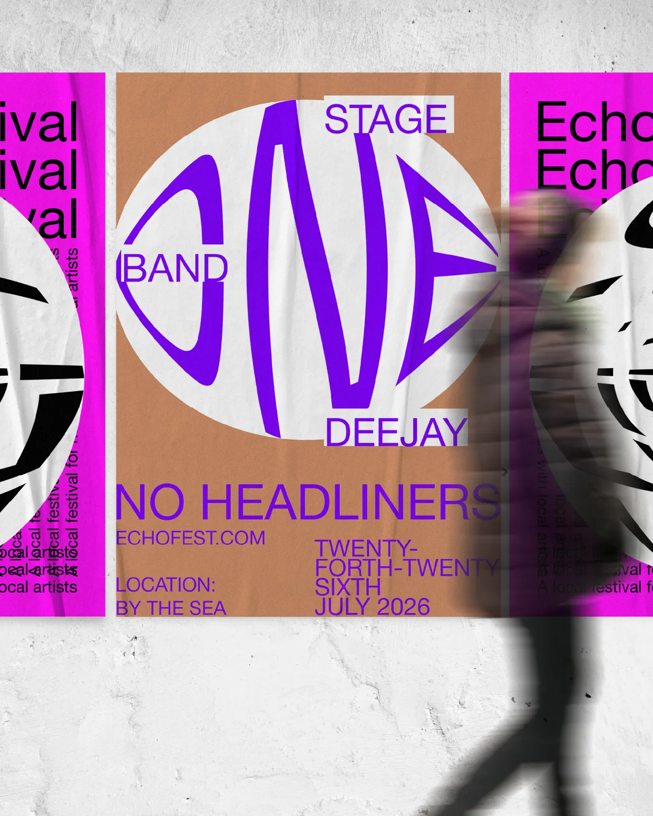
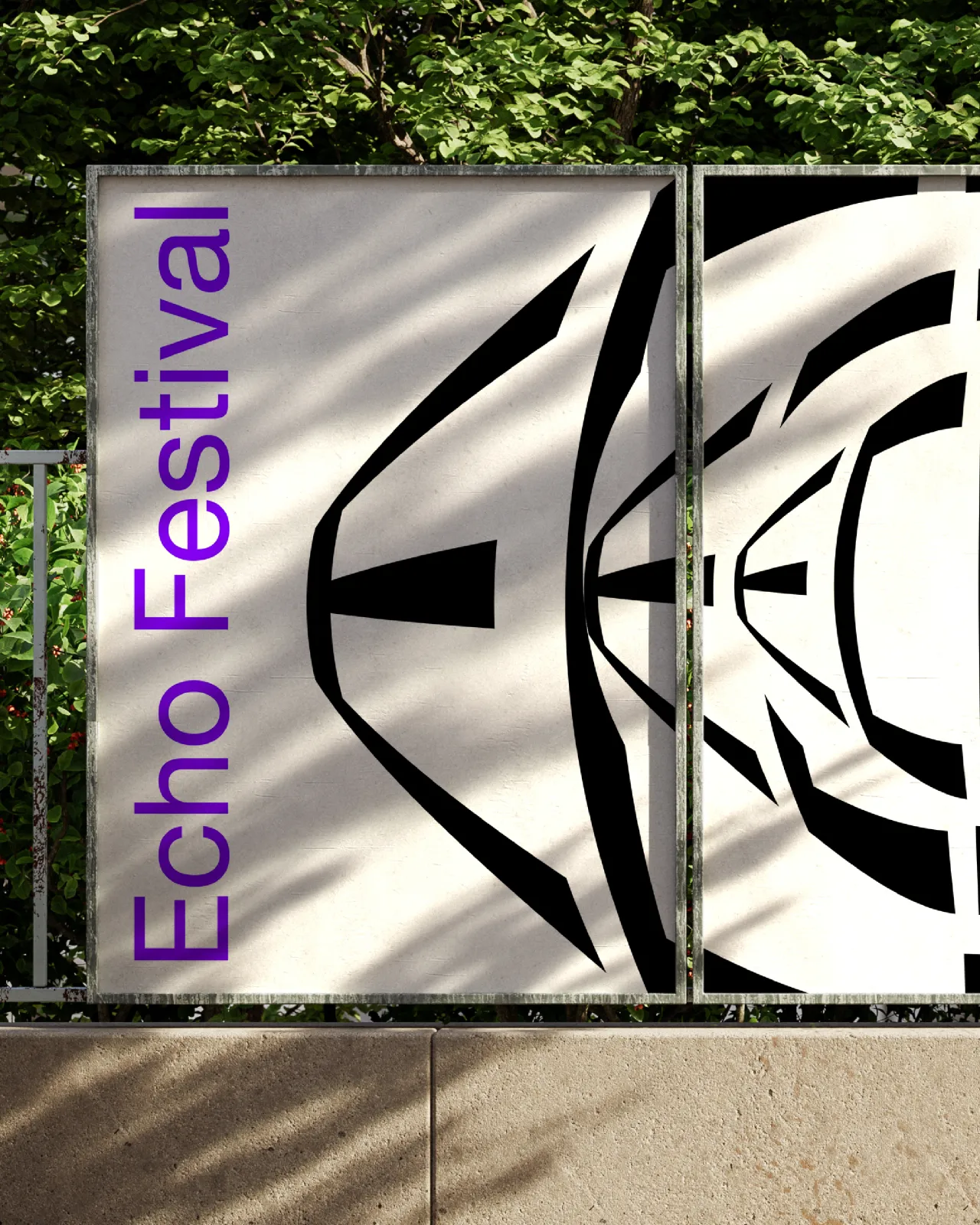
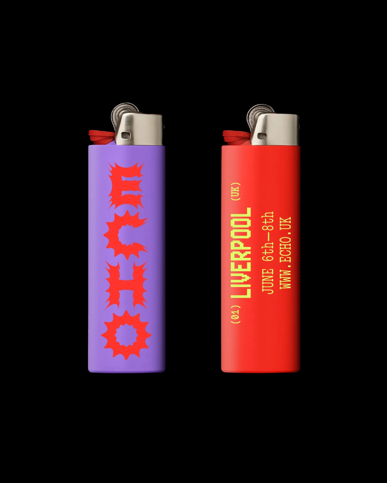
Work by designer Florian Frauendorfer
We're three months into our new Boom Briefs series: our monthly creative challenge that's part warm-up, part workout, and 100% an excuse to make something fun. So far, we've retreated to the hills to devise a creative retreat and fashioned branding for a northern design school. Now for part 3, we've packed our (fictional) bags and headed to the coast.
The challenge? To brand Echo Festival: a new, three-day celebration of sound, creativity and community by the sea. Think independent bands, DJs, street food, sunrise yoga and art installations scattered across the shoreline. A proper modern festival with big energy.
We asked you to capture the spirit of it all: fresh, accessible, playful, and bursting with life. Logo, poster, merch, stage design; it was totally up to you. The result? A tidal wave of creativity that blew us away.
Standout approaches
Nathan Bishop of HB gave us a dynamic wordmark that literally echoes. Layered type, bold shapes and a vibrant festival-ready colour palette all combine to create an identity that feels alive with sound. It's the kind of branding that works just as well across a poster as it does on a tote bag, bringing that sense of energy and togetherness right to the shoreline.
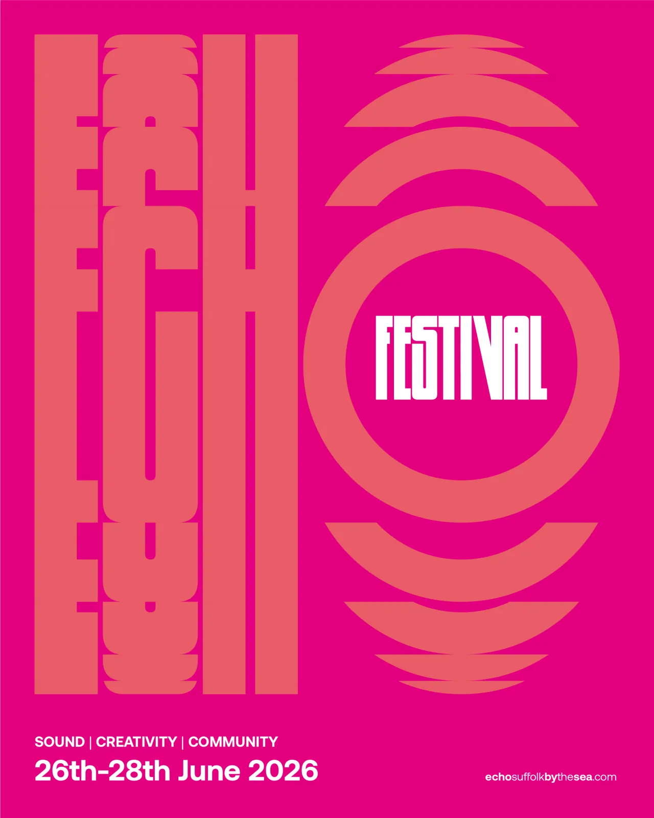
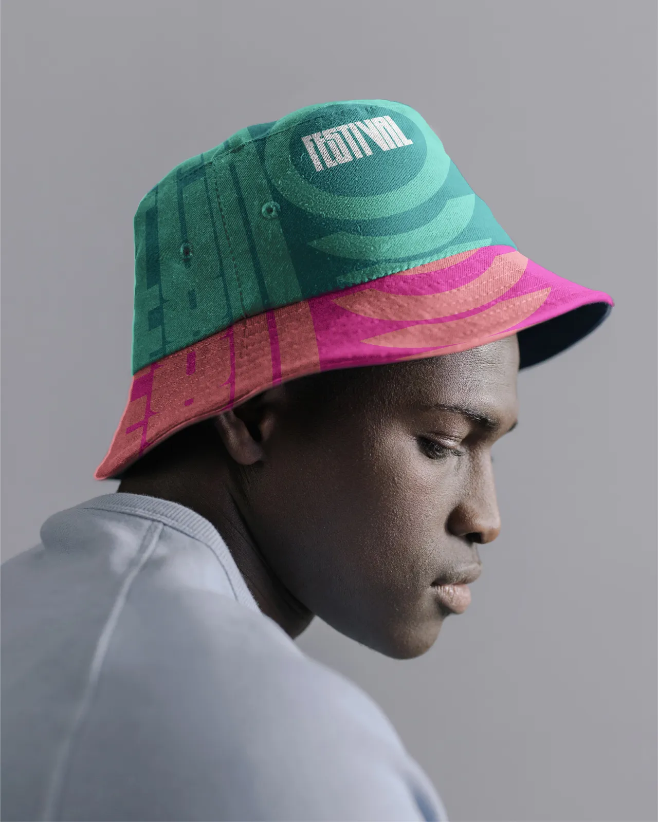
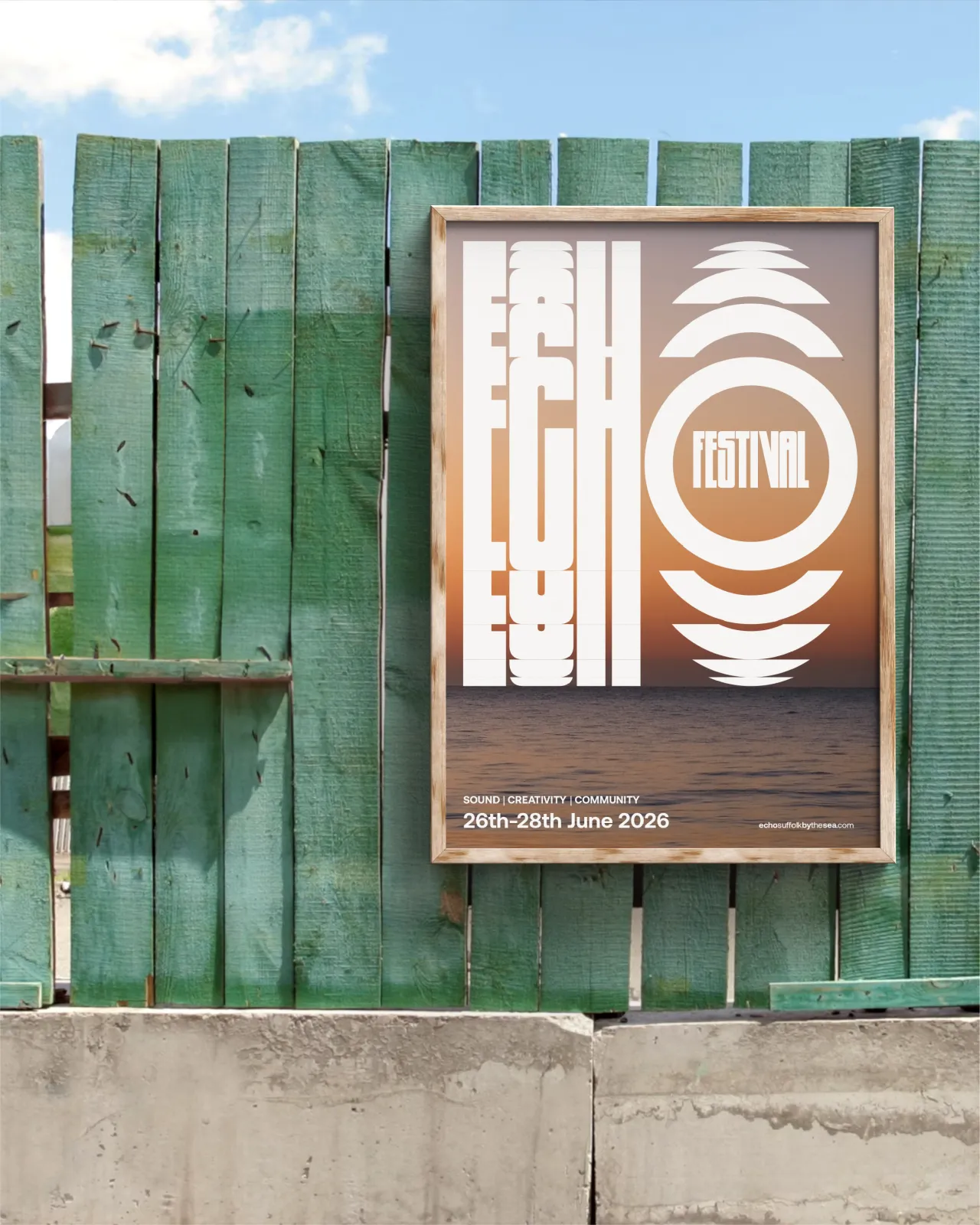
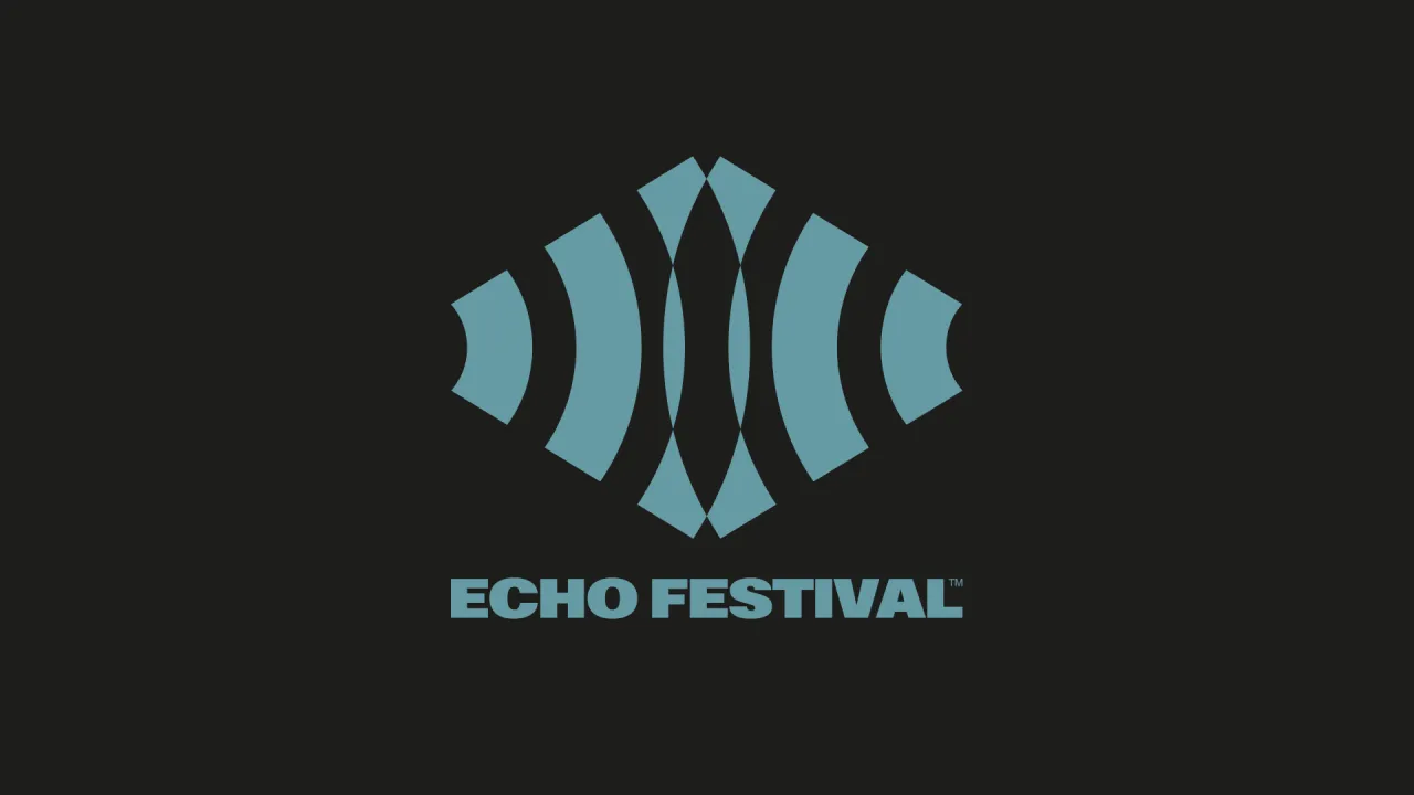
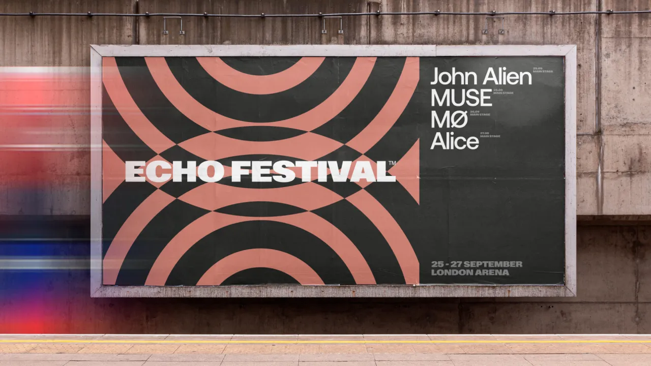
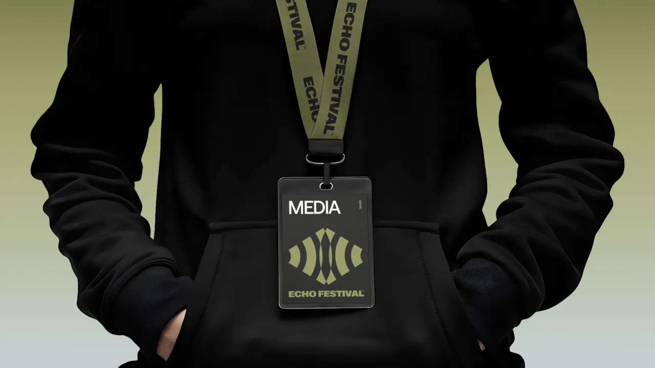
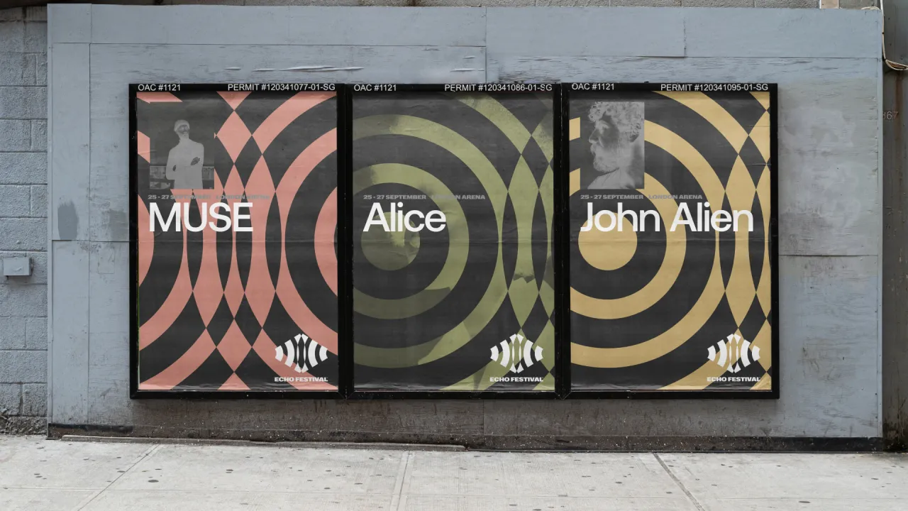
Elsewhere, designer Kris delivered an equally powerful take. At the heart of the system is a diamond-shaped sound wave motif, paired with hypnotic circular patterns that ripple out like music across water. With its stripped-back palette of black, teal and olive, the identity leans into an electronic aesthetic: sophisticated, modern and endlessly versatile.
Anthony Kearney of HB, meanwhile, went full underground with a bold, experimental approach. His glitchy typography and abstract mask icon scream non-conformist energy, while the neon pink and purple palette turns the volume up to 11. This is branding that doesn't play it safe. Instead, it throws itself straight into the mosh pit of creativity, perfectly capturing the raw artistic expression that a festival such as Echo would thrive on.
David Payne of Studio Payne in Shrewsbury spent an afternoon stretching his creative muscles with our monthly challenge. For his approach, the brand and web designer crafted a logomark that takes its cue from coast and sound waves, echoing the name. Tied in with a striking colour palette, the entire identity is elevated for maximum impact.
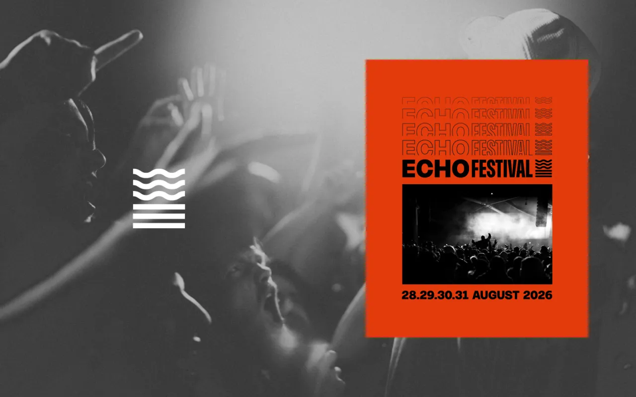
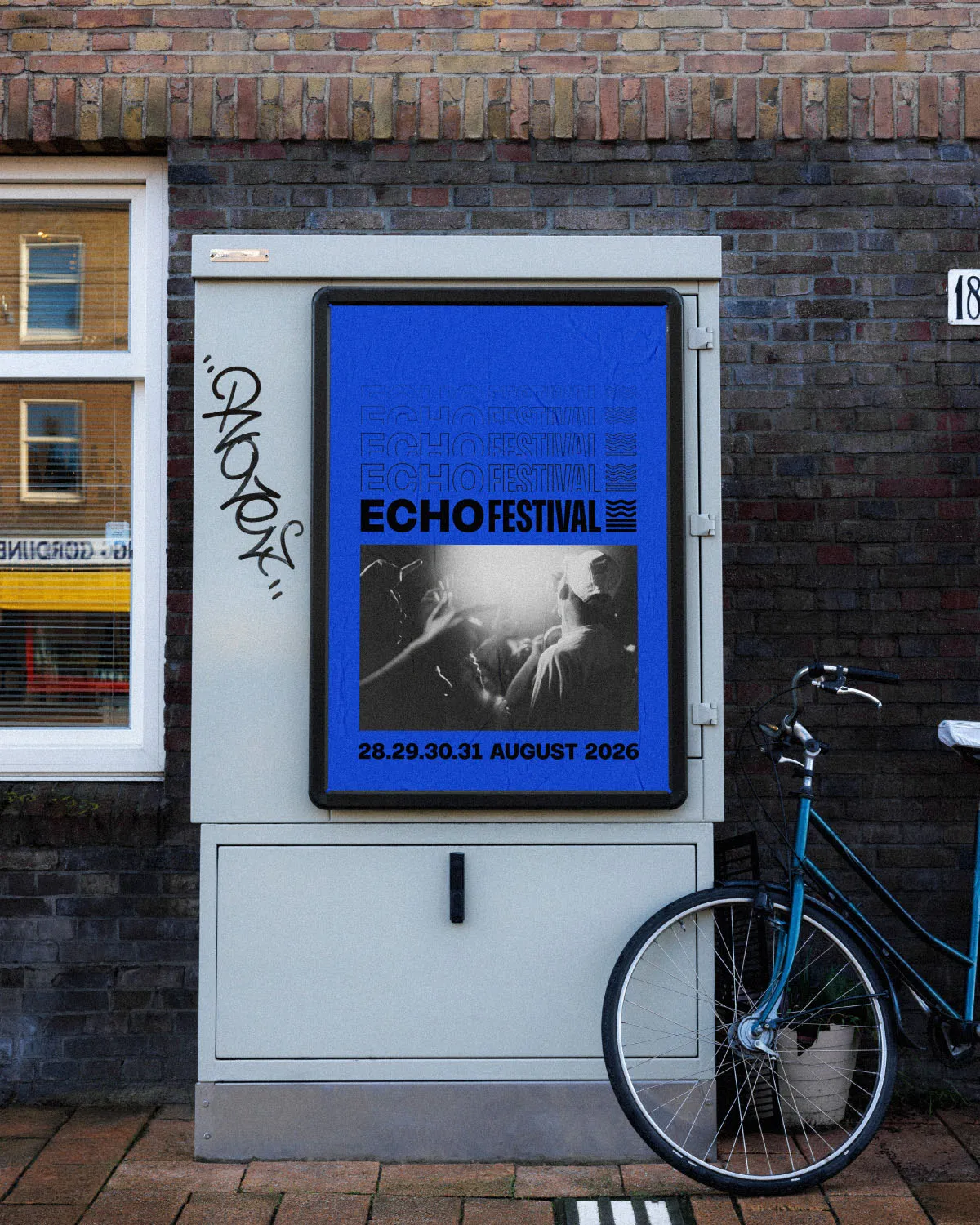
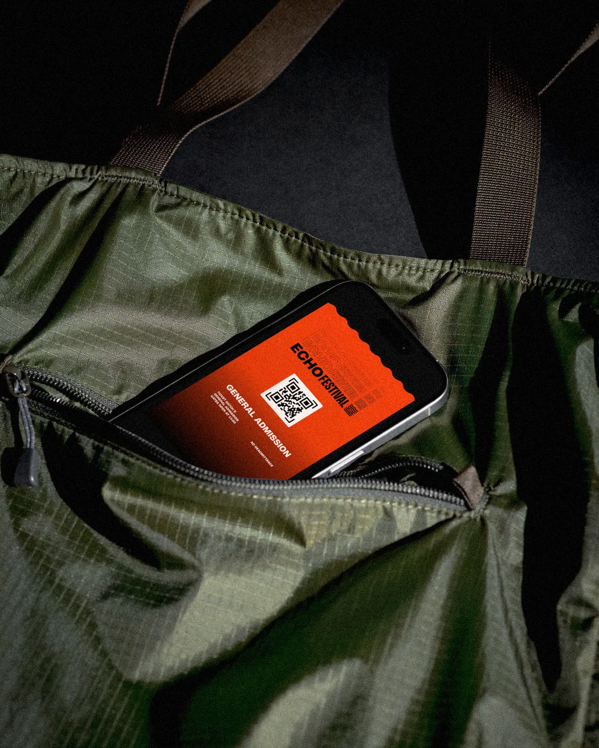
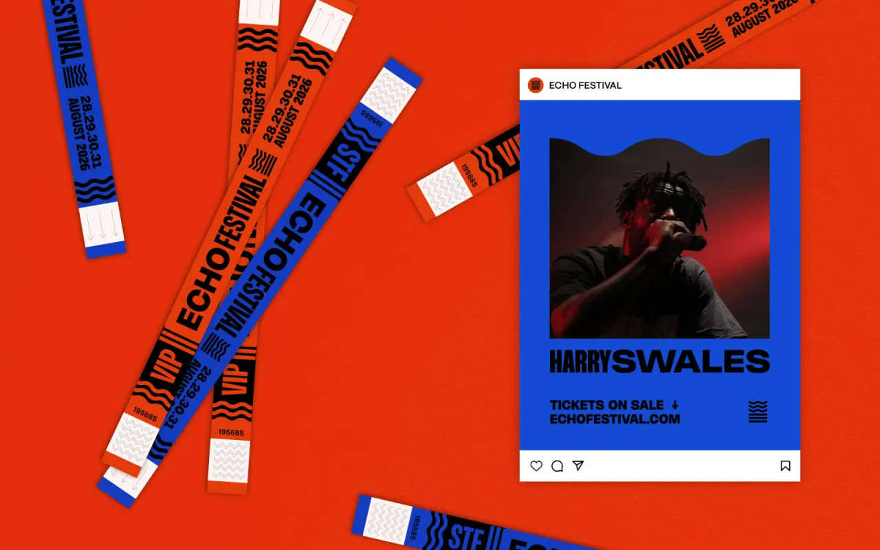
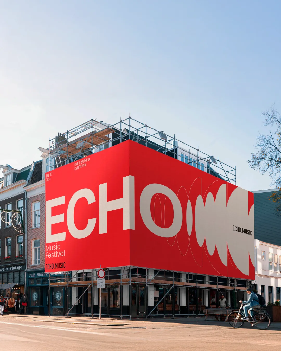
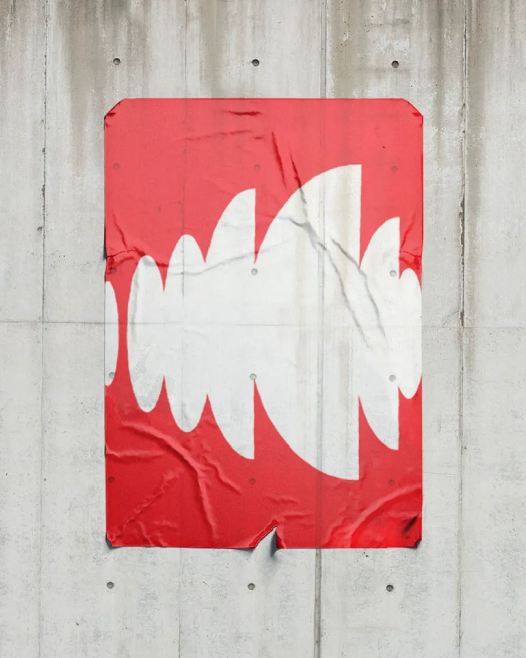
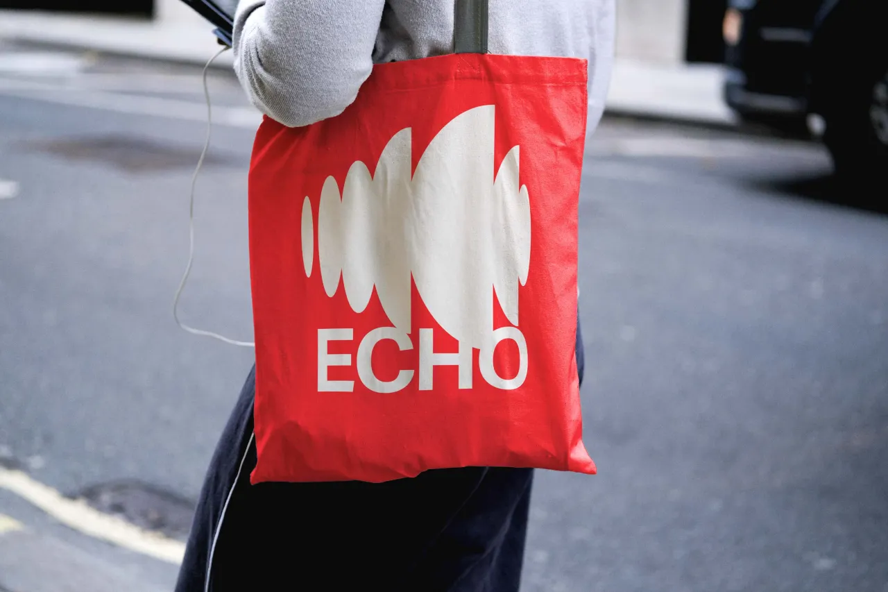
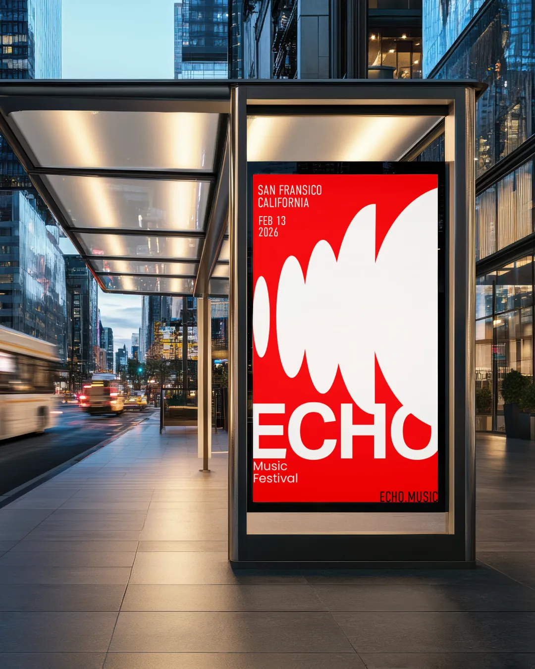
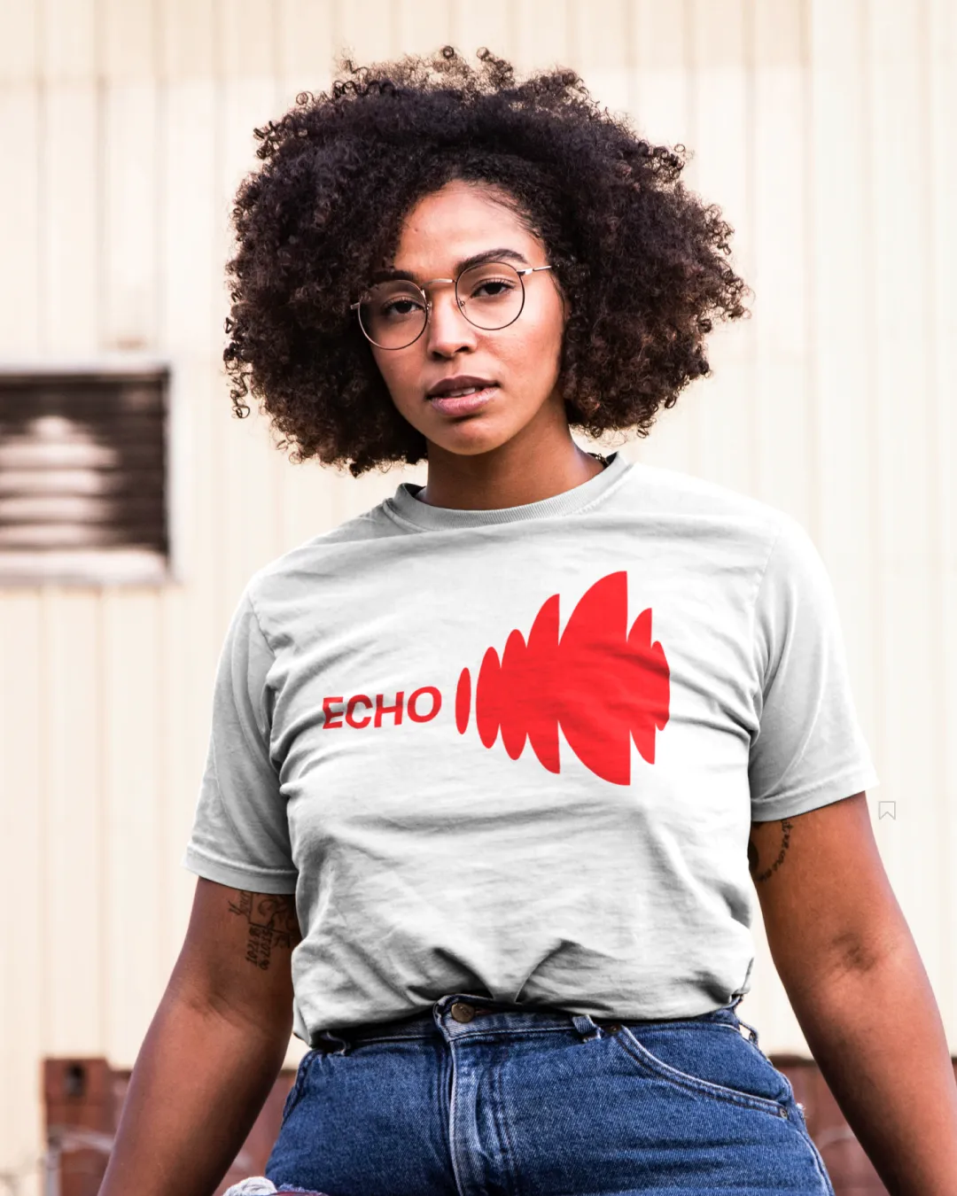
Matt Freed created a bold, graphic system focused on a central sound wave icon. The bright red and white palette is immediately striking, used across everything from street posters to T-shirts to VIP passes, giving the festival a unified and energetic visual presence.
The logomark's distinct, almost-blunt wave shapes offer a fresh take on the 'sound' concept, making it look impactful, modern, and perfectly suited for a large-scale music event by the sea. Check out this detailed case study to learn how he designed it.
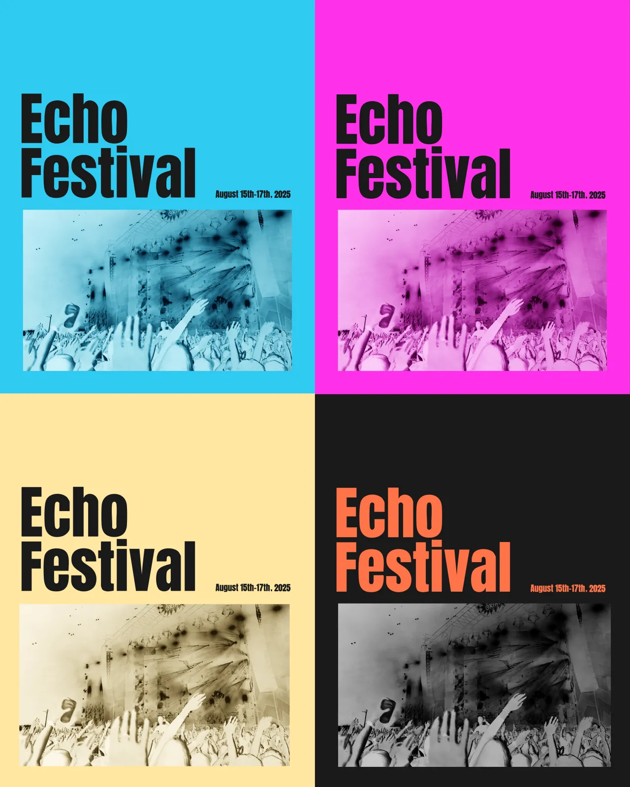
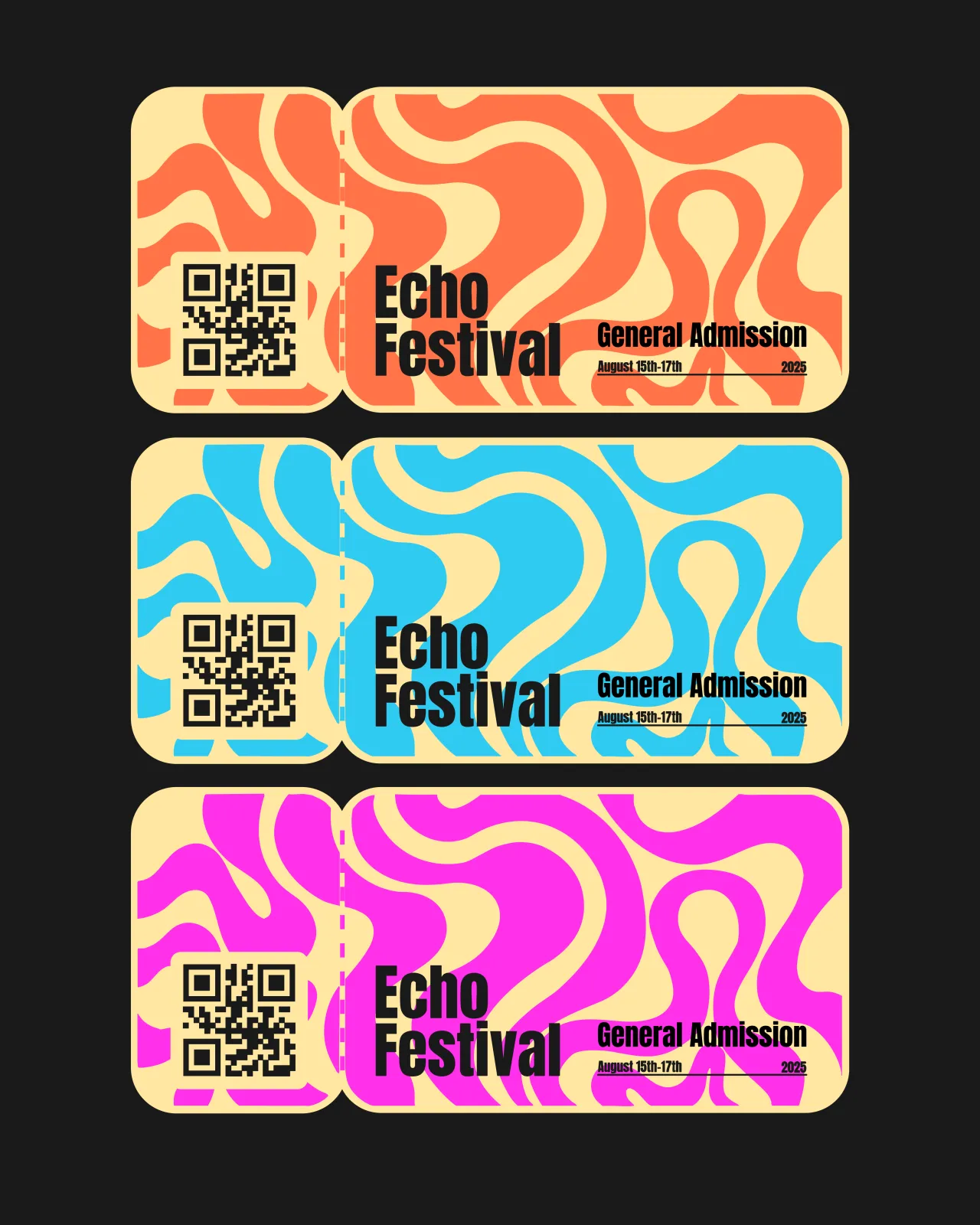
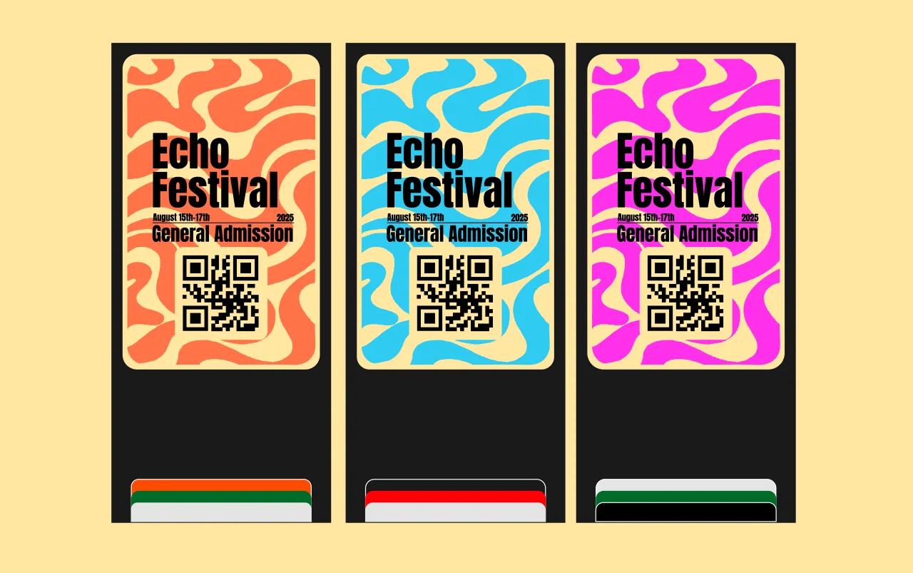
Student designer Jess Smith took a bright and playful approach that perfectly channels Echo Festival's seaside setting. Working to a tight one-week deadline, she kept things simple but full of energy. Her ticket design leans into illustration, inspired by the waves of the sea, while a bold, easy-to-read font keeps everything clear and confident.
Across posters and print, she used her own sunny colour palette and layered photography edited with blending modes to create a vivid, summery feel. The result is a cheerful identity that captures the joy and freedom of a festival by the coast.
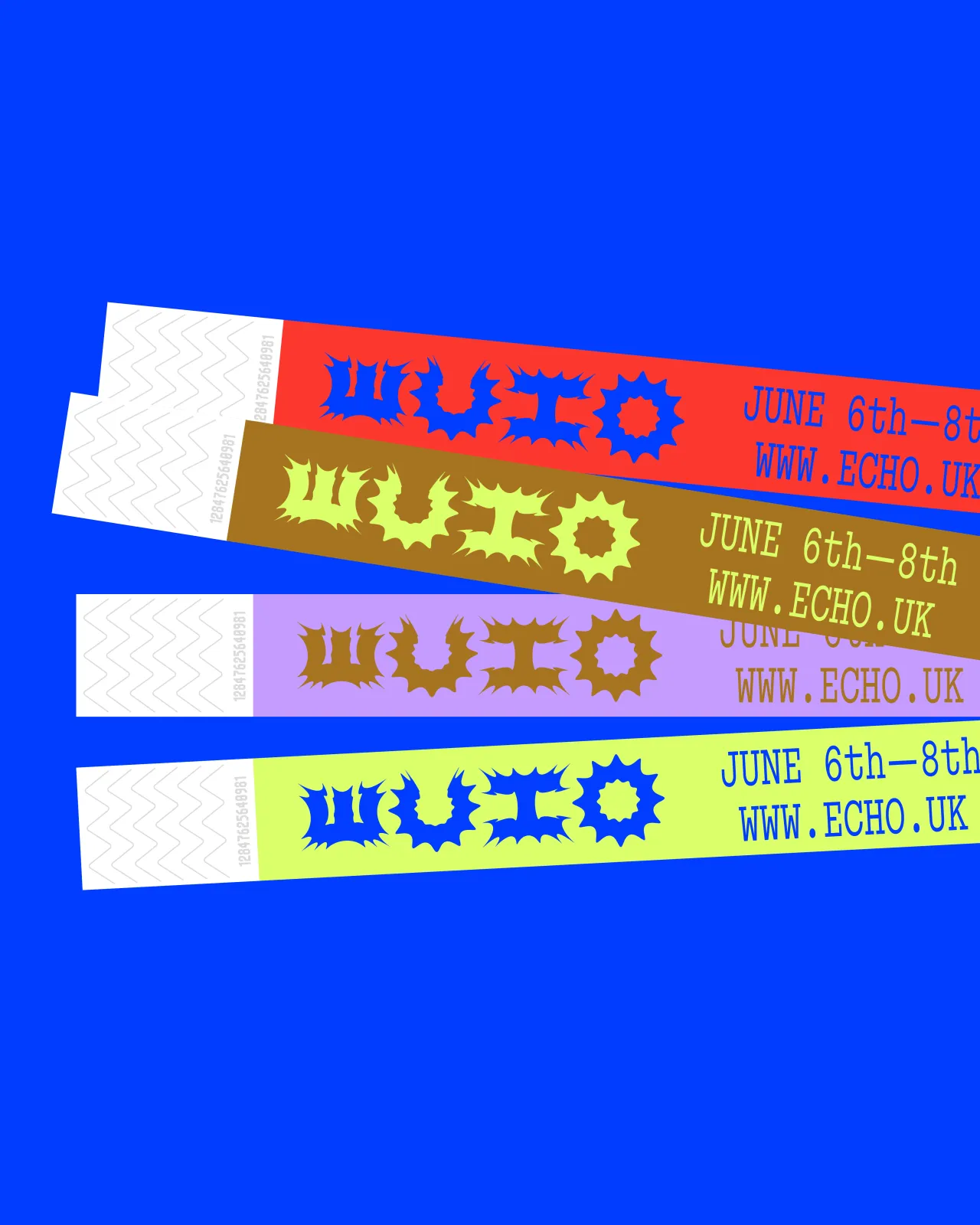
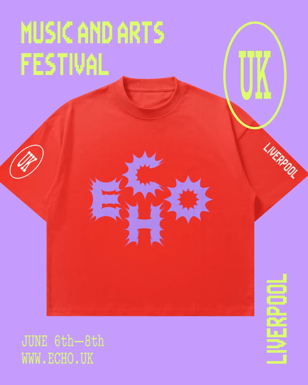
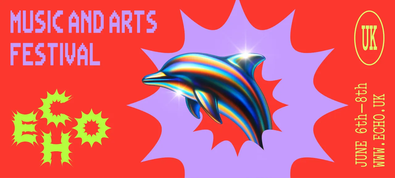
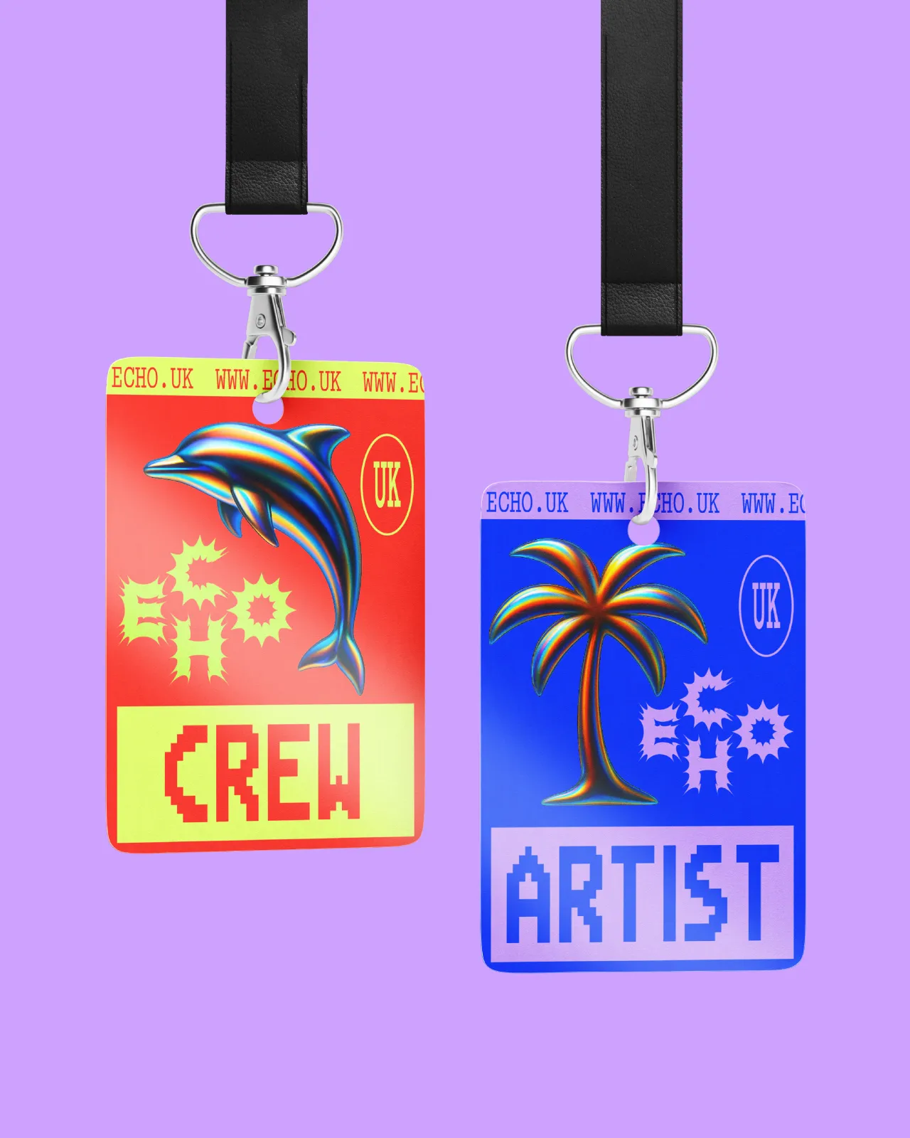
Last but not least, designer Florian Frauendorfer responded to our latest brief by creating an identity for Echo Festival where playful colours meet edgy details. "Chrome palms and dolphins channel the coastal vibe, while the bold, gritty logo typeface gives the festival its unique, standout character," he explains. We also love the typography used: ABC Simon Mono & Mega Man Battle Network. Lovely stuff.
How to get involved
What makes these fictional briefs so exciting is seeing how wildly different your responses are to the same challenge. From layered typography to hypnotic motifs and neon glitch aesthetics, our community took the Echo Festival and made it entirely their own.
Missed this round? Don't worry: Boom Brief #4 is already on its way! This time, we're challenging you to create the branding for The Abyss, a terrifying new rollercoaster. The ride is a high-thrill experience that plunges riders into darkness, featuring eerie soundscapes, sudden drops, and glowing, otherworldly visuals. Head over to our Instagram @creativeboom to read the latest full brief, tag your entries with the hashtag, and join in.
No pressure, no expectations. Just let your imagination rip, and enjoy the chance to create something that didn't exist before. We can't wait to see what you come up with!
Editor's Picks





Trending
Latest Jobs
Senior Front End Developer at Crown Creative
Full-time·Belfast·£50k–£60k
Art Director at SPOKE
Full-time·London·£55k-65k
Creative Director at Koto
Full-time·London·£95k-£130k
Senior Designer at Creative Spark
Full-time·Manchester·£35k-£50k
Senior Designer at Jubba
Full-time·London·£50k-£60k
Associate Web Designer at Planhat
Full-time·London·£30,000 – £35,000