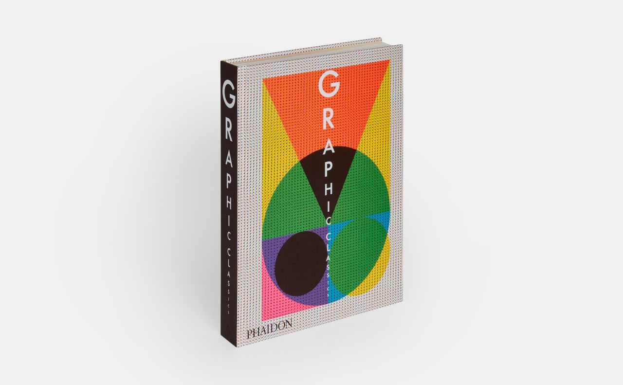
A gorgeous deep dive into the art of graphic design through the ages
Certain design books will always be considered essential. Graphic Classics more than earns its spot, featuring 500 iconic projects spanning the entire history of graphic design. This updated edition from Phaidon is a must-have for any discerning designer.

Graphic Classics reimagines the 2017 bestseller Graphic: 500 Designs That Matter with 50 new entries highlighting contemporary artists, activists, several industry icons, and previously overlooked pioneers. From the earliest days of mechanical reproduction to today's digital masterpieces, this book provides an extraordinary visual survey of design's evolution over 700 years.
Divided into two parts, the book presents large-scale images upfront, followed by in-depth descriptions of each piece at the back. We're talking 300-plus word text. A new colour-coded key makes navigation easier, classifying designs into categories like advertising, typefaces, books, magazines, and logos.
Curated by a panel of esteemed experts, the projects span 33 countries and feature over 400 designers. They showcase everything from the Nike logo, Shepard Fairey's Obama Hope poster, and the New York City subway map to the Gutenberg Bible and Joy Division album art. We get an understanding of the career highlights of anonymous creators to industry icons such as Aleksandr Rodchenko, Paul Rand, Alessandro Mendini, Emory Douglas, April Greiman, Stefan Sagmeister, Ahn Sang-soo, and Julia Born.

But here's where it gets a bit more modern: 50 new additions address design's historical biases by incorporating a broader range of voices. For example, forty per cent of these new entries come from female or mixed-gender teams, and a third represent designers of colour or those from diverse backgrounds. We're talking cover designs from The Black Panther and Gay Power and posters like Silence = Death and Black Lives Matter.
As Phaidon puts it, "Like many other creative fields, graphic design has historically been a male-dominated industry, with a distinctly European and North American emphasis. This updated edition seeks to address and confront this imbalance by incorporating a myriad of different voices, approaches, and disciplines, such as non-Western design history, the use of information design in recent political movements, and much more."
We love Reza Abedini's work. His 2003 poster, designed for a lecture at the Iranian Academic Center, beautifully showcases his skill in blending Persian culture with Western design principles. The text appearing inside his silhouette is a mixture of Farsi and English. It's a beautiful use of typography and is sure to inspire.
There's also the Accessible Icon Project. Initiated by Sara Hendren and Brian Glenney, it reimagines the traditional symbol for disability, which depicts a passive figure in a wheelchair. Their version makes it more dynamic and forward-leaning to push for a broader understanding and positive representation of disability. Thanks to their vision, the symbol was globally adopted. But as Phaidon rightly points out, it still doesn't fully represent the diversity of disabilities, so there's a big ongoing conversation to be had there.

Whether you're a designer, student, or enthusiast, Graphic Classics is a bold, informative, and visually stunning tribute to the art form. A must-have for design lovers, it offers a stunning, meticulously curated journey through the evolution of visual culture. Each page captures the essence of graphic design's transformative power, making it an indispensable resource for seasoned professionals and budding creatives. Grab your copy from Phaidon today.


 by Tüpokompanii](https://www.creativeboom.com/upload/articles/58/58684538770fb5b428dc1882f7a732f153500153_732.jpg)

 using <a href="https://www.ohnotype.co/fonts/obviously" target="_blank">Obviously</a> by Oh No Type Co., Art Director, Brand & Creative—Spotify](https://www.creativeboom.com/upload/articles/6e/6ed31eddc26fa563f213fc76d6993dab9231ffe4_732.jpg)


 for Creative Boom](https://www.creativeboom.com/upload/articles/7f/7f704d6175ce97899858e714661499b8302279f6_732.jpg)


