Counter-Print celebrates the world's best food and drink logos in fun new book
Counter-Print's Jon Dowling explains the thinking behind a brilliant new book on culinary logos and some of the themes that emerge from it.
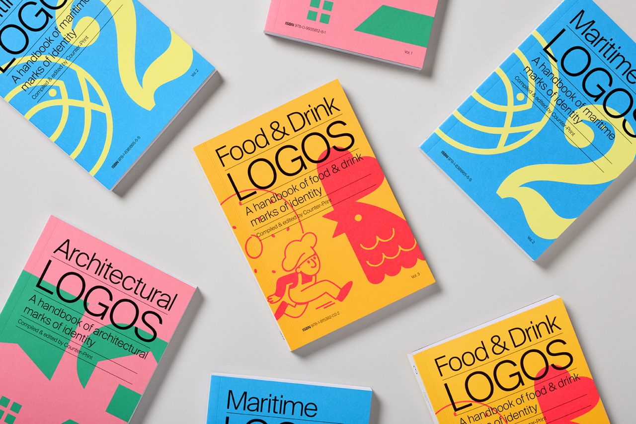
While many people think making a logo is "easy", working graphic designers know it's anything but. Crafting a visual identity can be one of the biggest challenges of your career, and you need as much inspiration as possible. Which makes a new book from Counter-Print a tempting buy for anyone working in logo design today.
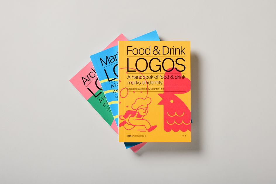
Food & Drink Logos is the third in a series from the publisher, following Architecture Logos and Maritime Logos. "The idea was to create a mini-series of books which could tackle niche themes," explains Jon Dowling, co-founder of Counter-Print. "I always love to collect vintage books on logos, and they are often sectioned by strange little themes like vehicles, hearts, instruments or flowers. We wanted to create a contemporary series of books that could provide an expanded exploration of a limited theme, such as these."
This new culinary-themed entry to the series is a visual feast, packed with logos, trademarks and symbols from around the world promoting everything from fruit and vegetables to doughnuts, burgers and hot dogs, as well as food-related items such as plates, glasses and cutlery.
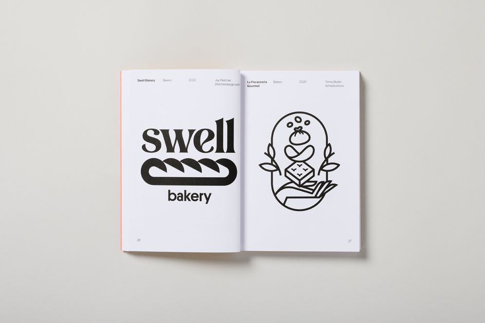
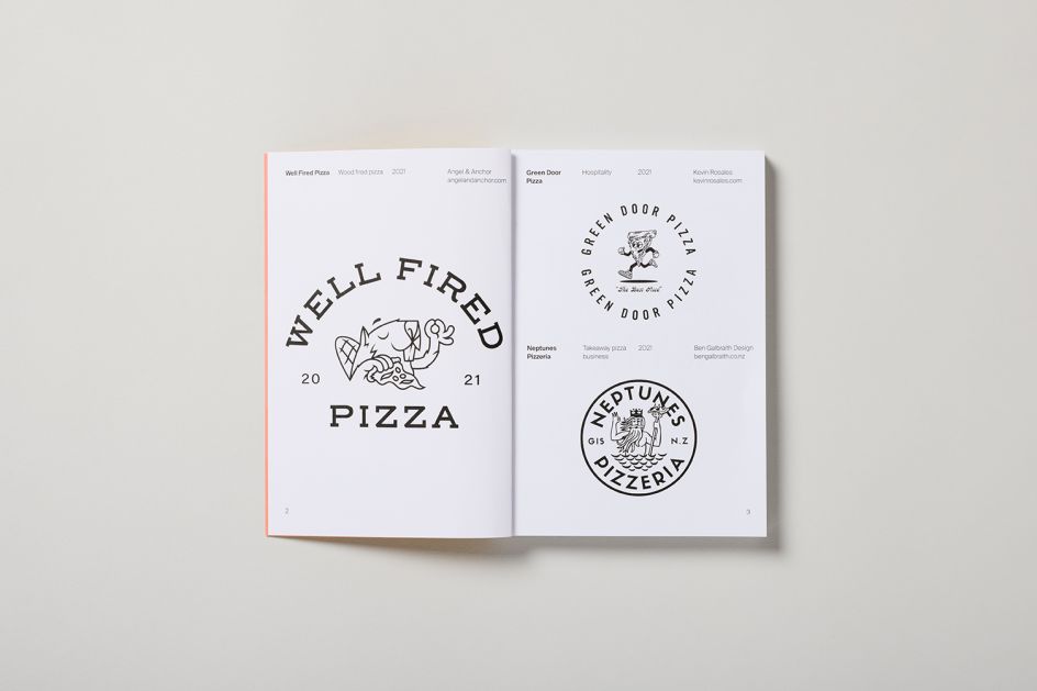
Spread across 108 pages, these visual assets have been crafted by some of the world's most talented designers and agencies, including Asís, Carpenter Collective, Rob Clarke, Commune, Doublenaut, Jay Fletcher, Futura, Steve Gavan, Heydays, IWANT and Jones Knowles Ritchie. And now the book is complete, Jon has identified a few themes running through it.
"One of the main ones, and one I wish to expand on in the future, is that of mascots," he says. "I think we associate mascots with restaurants and fast-food outlets for nostalgia. It's easy to call them to mind, from Ronald McDonald to Colonel Sanders. Designers working today still seem to love creating new mascots for the food and beverage industry. Steve Gavan is a master at it, so we included his logos for Taco Palace and Good Time Wines."
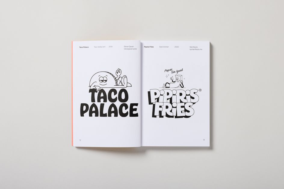
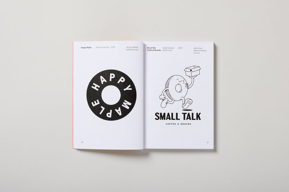
John also points to After Hours' logo for Small Talk Coffee and Snacks and Manifiesto's logo for Pipiris Fries as beloved examples. "I think mascots are so successful because they create a face for an organisation and can convey emotion," he adds. "This works particularly well for this sector, as so much of what we love about food is how it makes us feel."
Interlinking with the theme of mascots is a sense of nostalgia. "Although the vast majority of the logos seem very contemporary in their execution, many of the types of mark hark back to a bygone age," notes John. "Whether that's done through the use of heraldry and laurels, by including the date in which the company was established or in the choice of typography, there is often a retro vibe.
"I think this ties in with the theme of mascots, which also remind us of our childhood," he continues. "When we think about the enjoyment of eating, we often recollect childhood memories, whether it's the food our mothers and grandmothers made for us or the sweets and treats from the decade of our birth that perhaps no longer exist. Playing on our memories and emotional connections to nostalgic flavours and experiences can be very successful for brands."

So what other logo books can we expect from Counter-Print in the future? "We have so many ideas, but, as with any series, the next book will only become a reality if this one is successful," responds John. "I'd love to publish one on space – moons, rockets, stars, etc. I'd also love to create one on transport and cover cars, trains, wheels and so on.
"I just think they are really fun, small books you can keep on your shelf and use as reference when the time comes," he adds. "I wish I'd had this set of books when I was working in branding."
Food & Drink Logos is out now and available to buy for £10 through Counter-Print.


 by Tüpokompanii](https://www.creativeboom.com/upload/articles/58/58684538770fb5b428dc1882f7a732f153500153_732.jpg)


 using <a href="https://www.ohnotype.co/fonts/obviously" target="_blank">Obviously</a> by Oh No Type Co., Art Director, Brand & Creative—Spotify](https://www.creativeboom.com/upload/articles/6e/6ed31eddc26fa563f213fc76d6993dab9231ffe4_732.jpg)


