Frank William Miller Jr on the five books that have helped chart his creative path and passions
Frank William Miller Junior has enjoyed quite a varied career so far, navigating the worlds of culture, music and social good, and working with everyone from Tribe Called Quest and Nike to Rockstar Games. Here, we chat with Frank about the five books that have helped shape his creative path.

Miller has spent over 15 years in both the corporate and entertainment sectors, handling graphics at New York's leading radio station for hip hop and RnB before moving on to Rockstar. There, he worked on record-breaking games such as Red Dead Redemption and Max Payne 3. He later became marketing designer for Complex, a magazine founded by fashion designer Marc Milecofsky that focuses on style, sneakers, food, music, sports and pop culture.
Today, as the Design Director of New York creative consultancy Matter Unlimited, he has applied those experiences to support clients such as Merck For Mothers, Seth and Lauren Rogen's Hilarity for Charity, and data.org – organisations committed to building a better world.
Miller balances his time between creative collaborations with musicians such as A Tribe Called Quest and The Roots and films like Questlove's just-released Summer of Soul documentary, for which he served as a consulting art director. He also works with apparel brands such as Nike and educational equity and non-profits like University Beyond Bars, where he's taught a graphic design course at the largest state prison in Washington. Here, in his own words, Miller shares the five books that embody his life's journey so far, charting a path of his passions and personal growth.
1. Art of Atari by Tim Lapetino
My father was a gamer. When I was a toddler, my mother would have him take me along to the laundromat to do the family laundry and, most importantly, give her a little peace and quiet in their apartment in New Lots. He'd regularly spend an extra hour or two playing Pac-Man on the arcade console in the seating area.
By the time we moved to the Philippines in the early '80s, my father was renting a Famicom (later released as the Nintendo Entertainment System in the U.S.) from a local video rental once a week for us to play games together. Some of my earliest memories of being excited by colour and the reactive dynamism of interactive media (versus passive mediums like cartoons and movies, and books) were from these weekends of gaming.
One of my favourite childhood books was an audiobook based on the Atari Game Super Breakout that came with a little 7" vinyl record that you would play while you read along, turning the page whenever the record would chime. The cover art by Cliff Spohn made a simple PONG-style game of volleys look like the most colourful sci-fi deep space epic ever. I always found myself bored to tears while playing it more than a few rounds, but the artwork burrowed in my brain.
When I bought the first volume of Tim Lapetino's Art of Atari a few years ago, I found it to be the sweetest little time warp back to some formative years of loving and understanding colour, animation and implied movement in static images. Video game cover artists had to do quite a bit of heavy lifting to fill in the gaps left by the actual games' rudimentary graphics.
2. Race for Profit: How Banks and the Real Estate Industry Undermined Black Homeownership (Justice, Power, and Politics) by Keeanga-Yamahtta Taylor
I met Princeton Professor Keeanga-Yamahtta Taylor several years ago via my partner Megan Ming Francis on her Seattle book tour stop for 'From #BlackLivesMatter to Black Liberation'. Again, a few years later, at Princeton's Black Alumni Weekend. Regularly, reading her writing or hearing her speak on organising anti-black racism and how it infiltrates and instructs so many of America's institutions, Black Politics and social movements in the New Yorker, or on social media, or on academic panels, her Pulizter Finalist book Race For Profit: How Banks and the Real Estate Industry Undermined Black Homeownership was a must.
Descriptors as ubiquitous as "sketchy" or "ghetto" or "up and coming" or "ethnic" to describe neighbourhoods and enclaves chronically underserved and routinely disenfranchised by that nefarious "they" in power, the book is an examination of how that came to be through redlining, and as it pertains to Black Americans and persists to our present-day even after the abolition of redlining through a process she calls "predatory inclusion".
Some may be tempted to look at present American segregation as inevitable or simply that different kinds of Americans self-select into the neighbourhoods they desire in a vacuum without acknowledging the systems (and profits made) that keep it that way.
On top of being a gamer, and a fan of science fiction in general, my father was also a jazz head, so the music and the artwork has always felt ubiquitous.
3. SKIP by Molly Mendoza
Molly Mendoza is a Portland, Oregon-based illustrator I've been following on Instagram for a few years now. If the algorithm is kind, I'm guaranteed a wash of relief and joy whenever any of her posts appear. Her use of bright colour, and swooping kinetic shapes, and emotive facial expressions always put me at ease and make my smile a sort of self-pleased 'hmph', which, with the aggressive proliferation of rehashed meme accounts, targeted adverts, and poorly lit food pics (guilty as charged here) is a very welcome break.
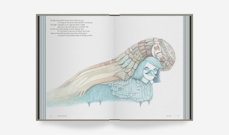
When she started teasing her graphic novel SKIP on her Instagram account, I knew I would be buying a copy. Beyond the expressive spreads, this book is a bounty of beautiful colour palettes. The way one might spin a globe atop their desk, place their finger on the spinning globe to stop it while blindfolded to pick a travel destination, they could flip to any page in the book in a similar fashion and find the most perfectly balanced and vibrant set of colours.
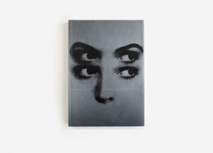
4. Jazz Covers by Joaquim Paulo
When I first made the transition from being simply interested in graphic design to being a practising graphic designer, I was creating album art and packaging for local music artists in Houston, Texas. Many Hip Hop, some Jazz, some Pop—in those formative years, figuring things out as I went along and pulling inspiration from my 'immediate' surroundings, I was taking a lot of design cues from peers on message boards that were into "emo" before it got commodified and sold back to us as Zach Braff's Garden State and that sort of pining for a vintage 1960s to the '70s, just post mid-century modern aesthetic that seemed to dominate many of the design 'blogs' (I'm not sure they were called blogs then) of the late '90s and early '00s.
On top of being a gamer, and a fan of science fiction in general, my father was also a jazz head, so the music and the artwork has always felt ubiquitous. He had a college radio show at Hunter College when he was young and, as you could imagine, had quite a lot of vinyl growing up. Whenever I'd get stuck on a project I was working on, I'd always try to create a mood board (sometimes literally, most times mentally) of other album covers or movie posters that made great use of shape, type and colour. Sometimes that was physically and manually combing through my father's record collection (and sometimes disappearing them into my own collection indefinitely) and examining liners and jackets I liked, or flipping through $1 bins at a local record shop or bookstore and finding some cool treatments there.
When I found out about Jazz Covers, it was as if all the hard work of discovery was put right at my fingertips in a way that didn't feel as fleeting as, say, an Alta Vista search. So many great, instructive examples of form and colour and negative space and fun typography.
5. Worlds of Amano by Yoshitaka Amano
Beyond childhood favourites like famed Uncanny X-Men illustrator Jim Lee, Yoshitaka Amano is perhaps my favourite artist. Initially, I found his work via the box art for the Final Fantasy video game series. Amano was the series' main character designer, illustrator and graphic designer while working for the series publisher Square Co, Ltd.
In the way that box artwork from the Atari and 8-Bit console generation of video games had to do serious heavy lifting visually to compensate for what the in-game graphics lacked, Amano's work immediately struck me as a style that possibly could never be replicated in game—35 years later, I haven't seen anything attempt or even come close. Cutting his teeth in animation with the original Speed Racer and Gatchaman animated series, and graphic novel series Vampire Hunter D, his style continued to evolve into—and this is a crude, ineffective description—a unique mix of manga-style characters that landed somewhere on the sliding scale of Gustav Klimt and French Nouveau, draped in ornate and patterned fabrics and that could only be born on the Silk Road from the Roman Empire to modern China. Deeply romantic, slender, and dark, and fantastic—phantasmagoric would probably be my best description of his style.
Worlds of Amano was the first book I bought that gave a good cross-section of all the different kinds of work and mediums he's worked in during his career as a sort of make good to myself for missing his debut New York show, Think Like Amano, in the late '90s. I keep it on my little Ikea shelf next to my desk to flip through whenever I feel that I'm approaching a design problem too literally, reminding myself to embrace the elusive, the fantastic, and sometimes the inexplicable.


 by Tüpokompanii](https://www.creativeboom.com/upload/articles/58/58684538770fb5b428dc1882f7a732f153500153_732.jpg)


 using <a href="https://www.ohnotype.co/fonts/obviously" target="_blank">Obviously</a> by Oh No Type Co., Art Director, Brand & Creative—Spotify](https://www.creativeboom.com/upload/articles/6e/6ed31eddc26fa563f213fc76d6993dab9231ffe4_732.jpg)


