Hatiye Garip on accessible illustration and how the creative industry can take action
Freelance designer and illustrator Hatiye Garip is part of an ever-growing community of creatives making art more inclusive and accessible for all. We caught up with her to learn more about her work and discover what action the industry needs to take going forwards.
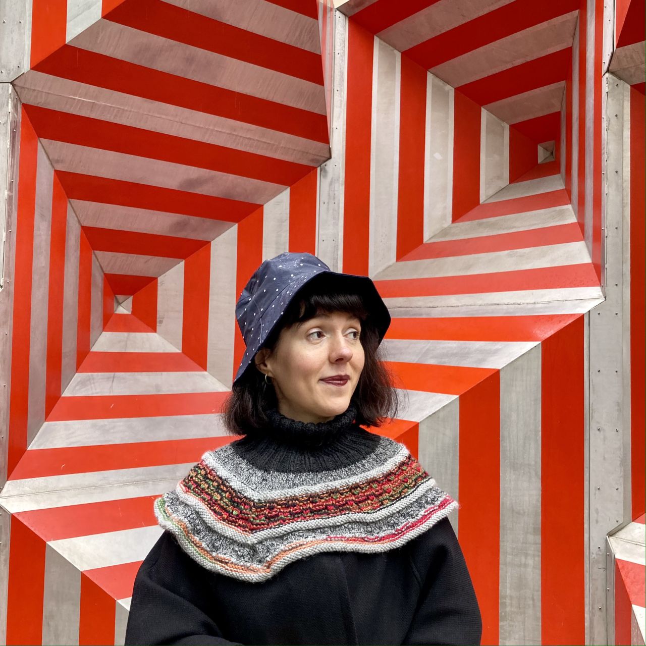
Hatiye (she/her/disabled), a medium light-skinned person with dark and short bob haircut, is in front of a red and gray background with geometric shapes reminiscent of op art. She wears a navy blue polka dot rain hat, looks to the left and smiles. She also wears a black poncho and hand-knit Icelandic collar.
The creative industry likes to think of itself as a progressive, open-minded space, but there is always more that can be done. When it comes to disabled people, art can often leave them behind by not catering to their needs. This doesn't need to be the case, though, and there are many ways in which individuals and studios can help to redress this imbalance.
One such creative who is making a positive difference is Turkey-based designer and illustrator Hatiye Garip. Her beautiful, colourful work strives to make the illustration more accessible to a wider audience. Through her studies, research projects and workshops, she is quickly becoming an incredible ambassador for the often-overlooked topic.
We sat down with Hatiye to learn more about accessible illustration, how this discipline manifests itself in her work, and how creatives across all mediums can strive towards removing barriers of entry to artistic enjoyment.
Not everyone will be familiar with the term accessible illustration. Could you introduce it to us?
Of course, with pleasure! However, I am still not sure if such a definition exists. At least in practice, it is currently rather limited and unknown. The rules of the game are still not fully clear. When we take 'accessible' as an adjective and bring it to the head of the creative industries, we can understand that it is talking about equitable opportunities that include as many people as possible. In other words, accessible illustration means illustration for everyone. I hope you will be pleased to see it!
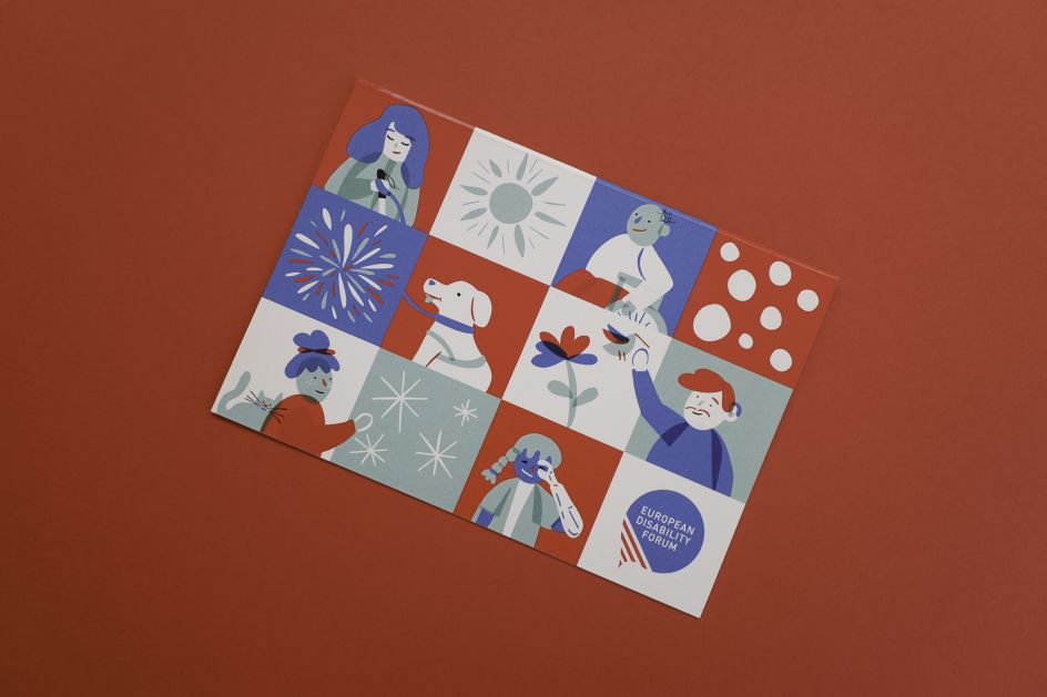
Accompanied by 12 illustrations integrated in a mosaic of squares. In blue, red, green and white colours. The illustrations represent 6 disable characters from left to right the following: a blind woman, a man in a wheelchair, a guide dog, a deaf man, a woman looking at stars accompanied by her cat and a girl with a prosthetic arm.
What made you decide to specialise in accessible illustration?
I can't say that I'm an expert on this subject yet. No, no, no, this is just the beginning. However, I can say that I am an illustrator who dares to take responsibility and initiate a change. At different times in my adventure with illustration, my path has somehow crossed with NGOs working on disability, accessibility, human rights or independent living.
I learned a lot from these encounters, specifically about including representations of disability in my illustrations. Other people often wrote the image descriptions under the illustrations I had created for them when the work was completed. That is until I was contacted by Alice Wong. Two years ago, disability rights activist Alice Wong contacted me through the Disabled Cartoonists Database while searching for an illustrator for her latest book, Year of the Tiger. Thus, for the first time, I wrote image descriptions for my illustrations as part of my job.
At that time, I was also illustrating the research journals of Open Style Lab, which made style accessible. Thinking about disabilities such as low vision and colour blindness, I created an illustration style for them and illustrated a series of journals. My bond with accessible illustration became even stronger after these two projects. It jumped to the next level with my accessible comic book.
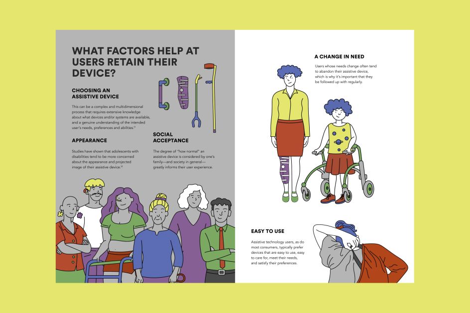
A spread from the Open Style Lab journals features assistive devices and disabled characters who use them.
How does accessibility express itself in your work?
Accessibility expresses itself in my work in various ways and depending on the project. These include the visualisation of the sign language dictionary, font selection for dyslexia, illustration and design for low vision, audio descriptions, transcripts, easy-to-read materials, and, finally, sometimes challenging tactile graphics.
I think there is much more to learn and try out regarding accessibility in illustration. For instance, I recently started field recordings to be a better listener and provide sounds that can accompany my illustrations and comics. This personal project, the Orange Beak, is an effective exercise for me. I wonder what it will turn into in the future.
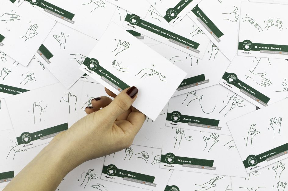
A photo of scattered cards in Turkish sign language, with a hand holding one of them. The cards show in a few steps how to sign coffee-related words.
You've recently run your first workshop about accessible illustration. Tell us more about that, and how did it go?
Earlier this year, I was accepted to the Creative Producers Program 2022-23 led by the British Council and Curated Place, thanks to my project idea about accessible illustrations. After the training, I conducted my first accessible illustration workshop as part of the inclusive arts festival Unlimited Forum organised by the British Council Turkey.
At the workshop called Accessible Lines, I asked the participants to bring three printed or digital illustrations they had drawn before. During the workshop, they tried to make one of their illustrations accessible by writing image descriptions. For this experiment, I supported the participants by presenting examples from my previous descriptions and related projects.
Seeing the differences in approaches and the curious questions that arose from describing oneself when meeting to describing an illustration was marvellous. Moreover, the workshop was like preparatory work for my project idea and a good opportunity to test the feasibility of this concept.
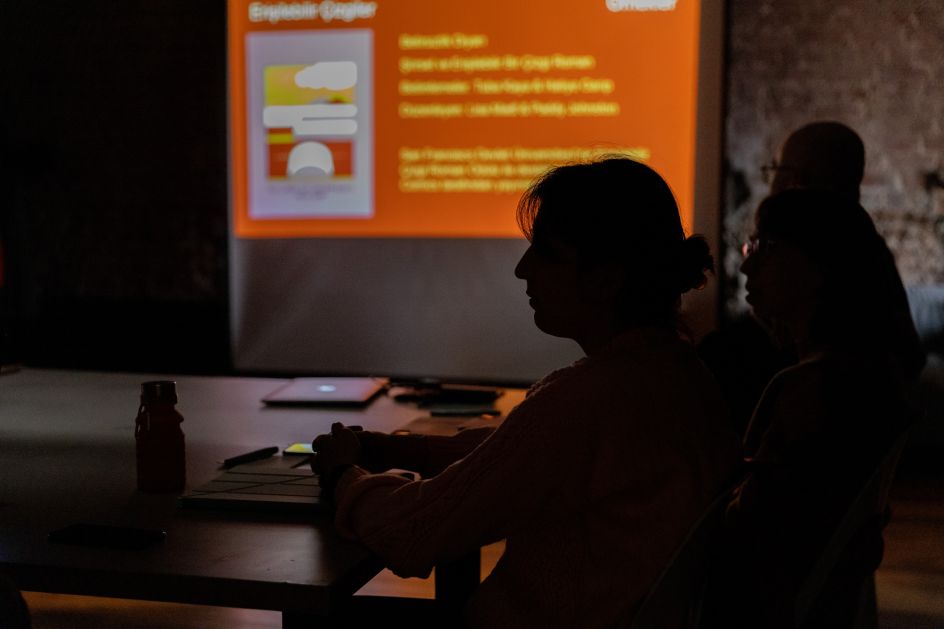
A photo from the Accessible Lines workshop organized in collaboration with British Council Turkey. There is a presentation projected on the wall in a dark environment, the participants sitting at the table are seen from the side.
What advice would you give to illustrators looking to join an accessible art community?
I usually do not like to give advice, especially in recent years. I prefer to take action. I want to unite illustrators through projects that spark accessibility, inclusion, and equity. Likewise, I would like to join other artists' communities who share the same values. My only advice is to contact me if they want to collaborate on accessible illustrations.
Can you tell us how your comic The Land of Uncertainty was made accessible to blind and low-vision readers?
The Land of Uncertainty is my first poetic and accessible comic book. The proposal for this comic got awarded in the Accessible Comics Design Competition, organised by San Francisco State University's Accessible Comics Collective. Being among the top five winning teams encouraged me to work on accessibility.
The comic has thick, dark drawing lines and high-contrast colours. More importantly, it is accompanied by dynamic audio descriptions and a tactile book. We are making the final preparations, and I hope to release it soon. I'd like to state that this is not possible to do alone; it is only possible with the support of a team. Many thanks to Paddy Johnston and Good Comics, Tuba Kaya, Esra Kaya, Lisa Madl, and Áine Kelly-Costello.
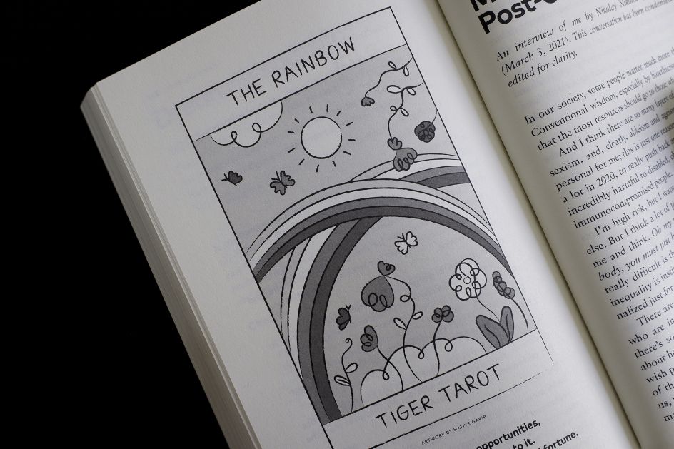
A photo from the ‘Year of the Tiger’ book, with a black and white illustration on the left page. In the illustration, the double rainbows are welcoming the flowers and the sun. Four butterflies are flying around, enjoying the good atmosphere and happiness that the rainbows brought.
How does your work tackle accessibility differently across print and digital mediums?
Suppose I evaluate it in terms of my illustrations. In that case, I can summarise it as alt-texts, audio and/or written descriptions, visuals that can be enlarged, zoomed in on and not pixelated, and graphics that will not cause seizures for digital readers.
As for print, I am experimenting with tactile prints, which are quite new to me. However, it is important not to forget the valid approaches for both mediums, such as using contrasting colours, not giving meaning to colours, easy-to-read materials, etc.
Finally, I would like to emphasise that wherever the illustrations are used, they also remove the language barrier with the visual communication they provide.
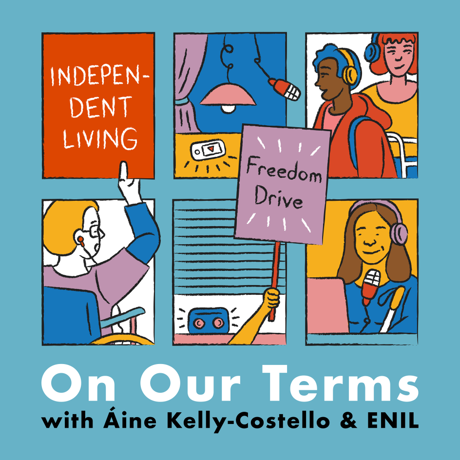
The podcast cover art is an illustration made up of window-frames and disabled people in action inside the frames. The effect is as a window into their lives. Below the frames, a white title reads “On Our Terms” and the smaller black text reads “with Áine Kelly-Costello & ENIL”.
What steps should the illustration industry take to improve its accessibility?
They can start by not ignoring inclusiveness and diversity and collaborating with disabled people. From there, it can diversify disability and develop it via intersectionality. Disabled people must be present among decision-makers, leaders, and other authorities for greater improvement. More voices, more needs assessment, more solutions.
This interview process also showed that alt-text could not be added to images on the Creative Boom website. We discovered one shortcoming while talking about accessible illustrations, and it's up to industry stakeholders to take action. It's up to us to demand it!


 by Tüpokompanii](https://www.creativeboom.com/upload/articles/58/58684538770fb5b428dc1882f7a732f153500153_732.jpg)


 using <a href="https://www.ohnotype.co/fonts/obviously" target="_blank">Obviously</a> by Oh No Type Co., Art Director, Brand & Creative—Spotify](https://www.creativeboom.com/upload/articles/6e/6ed31eddc26fa563f213fc76d6993dab9231ffe4_732.jpg)


