How to incorporate elements of nature in your designs
These days, if you want to engage people with your design work, incorporating nature elements is a good route to explore. As societies around the world emerge from lockdowns, we've all been craving the great outdoors like never before.
Add to that the new attention we're paying to issues such as the environment, sustainability and veganism, and it's no surprise that we're seeing the natural world influence packaging, marketing, advertising and branding to an unprecedented extent.
To help inspire you, we've pulled together five fantastic designs, all of which incorporate natural elements in different ways and do so brilliantly.
These designs are all winners of the Indigo Design Award 2021. Held annually, the Indigo Design Award is a global contest for projects in the fields of graphic design, digital, mobile, branding, and 'design for social change'. If you'd like to submit your own work, then quick! You have until 31 January 2022 to enter here.
1. Sensetics Website by Persuaid
Based in Munich, Germany, Persuaid is a strategic agency focused on branding and digital product design. They were approached by Sensetics, a sustainability-focused natural skincare company headquartered in Germany, whose products are not tested on animals and contain no mineral oils, parabens or colouring agents.
Sensetics wanted to develop a new web experience that would boost awareness of the overall brand and drive interest in its upcoming product range. In response, Persuaid developed a product landing page that streamlines the brand message remarkably effectively and directly.
Working closely with Sensetics, Persuaid developed a single-page website that loads quickly on both mobile and desktop devices, automatically aggregates Sensetics's Instagram posts to keep things current, and offers visitors the chance to sign up for a newsletter.
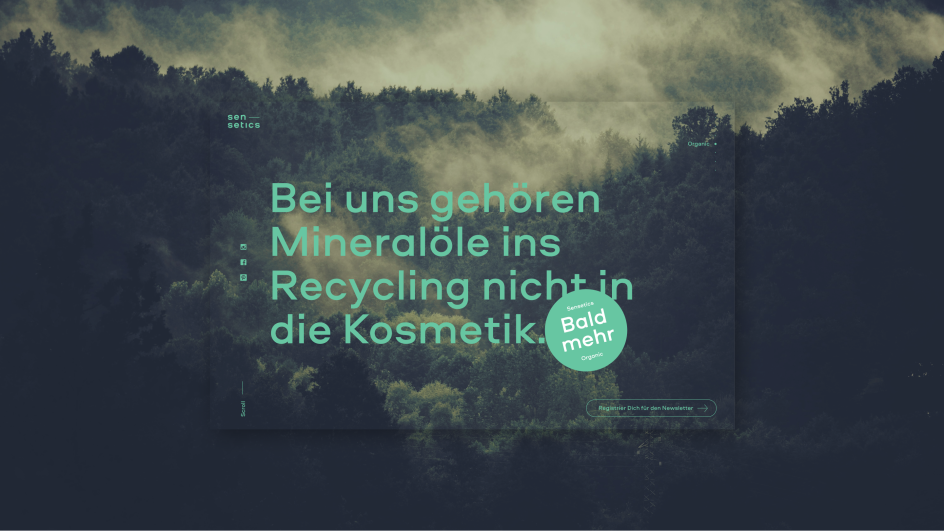
Persuaid has done a fabulous job conveying the core values of nature and sustainability into every fibre of this site. The big and bold typography, based around a lovely geometric sans, is impactful while remaining clean, relaxed and easy on the eye. The video backgrounds, which instantly transport the visitor into a world of natural wonder, are perfectly chosen. And the Sensetics' Brand Stripe', the core branding element that ties everything together, is beautifully incorporated into page transitions to make navigating the site a delightful experience overall.
Lessons learned
Bold type and epic video backgrounds can create an immersive experience that draws the viewer back into nature. But this can only work if all branding elements are on point and work together seamlessly.
2. Trip App by Z1
The efficacy of legal psychedelic therapies has been widely accepted by the medical establishment over recent years. Mental wellness company Field Trip is a leading practice in this field, on track to open 75 clinics in Canada and the United States by 2023.
Yet stereotypes and misinformation around this field remain. And so they came to Z1, an international digital product studio based in Seville, Spain and focused on partnering with North American startups with an idea. Trip was conceived as an app for people seeking altered states of consciousness for personal growth, who may not have access to one of Field Trip's clinic-based therapy programs.
Trip needed to be designed mindfully and was based on extensive research. Z1 worked closely on prototyping the concept with the Field Trip team experience, intending to make the app feel like a soothing journey, from the moment you open it, through your trip, and afterwards.
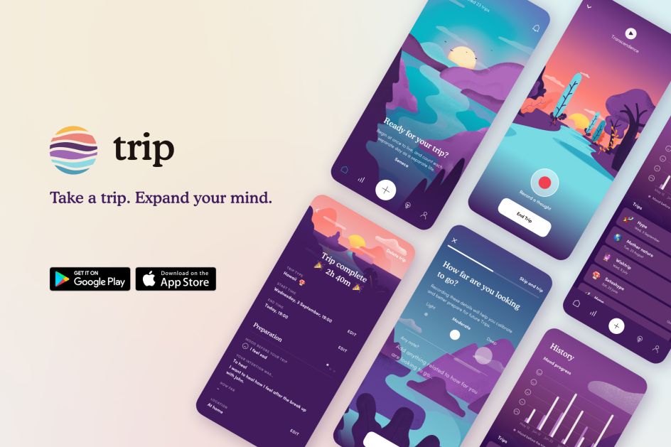
Z1's design and engineering teams worked side-by-side to bring to life bespoke illustrations in an easy-to-use app. The aim of the design was to create a sense of lightness, so they created a cool colour palette and incorporated temperatures, lights, and environments. The theme revolves around a landscape on which the users glide towards the horizon with a sense of continuous progression.
The result is a triumphant marriage of visuals and functionality, offering users the minimum of intrusion on the therapeutical experience but providing the maximum help on their journey.
This includes being able to set an intention before the journey, listen to AI-generated music, access a voice recorder while tripping, show analytics that displays progress over time, and read educational content based on scientific research and shamanic wisdom.
Lessons learned
Extraordinary services require an extraordinary level of attention to design detail. When done right, a digital experience can match and enhance even nature's most powerful elixirs.
3. Moose Piss: Double Dry Hopped IPA by Bruno Cintra
Hermoso Compadre is a Brazilian clothing brand, and in 2020, it decided to create its own beer label. In partnership with Nórdica brewery, they created a strong and intense 8.5% IPA with a unique communication. Art director Bruno Cintra took charge of developing the branding, which is based around eye-catching illustrations in the extreme.
Taking as their starting point the lush landscapes of a mountain range surrounded by vegetation, these vistas are brought to startling life by using a dramatic, electro-neon colour scheme. It's an instantly effective way to convey the intensity of the brew while also nodding towards the natural goodness of the ingredients used to make it.
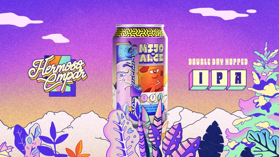
The accompanying animation continues this theme, with a funny plot involving what looks like a hunter (but might be something quite different) and a disturbing amount of anatomical detail in portraying the action that inspires the beer's name.
Lessons learned
Portraying nature doesn't have to be po-faced, serious or boring. Design can be fun and engaging while still harnessing our love for the great outdoors.
4. Chinese Zodiac by Mengyu Cao
Mengyu Cao is a Chinese artist and designer currently living in San Francisco. She's the founder of Yiqi Hanzi, aiming to share the beauty of Chinese characters and cultures with the world.
The thinking behind her award-winning project 'Chinese Zodiac' is that while Chinese characters are nominally pictorial, their visual meaning is not always obvious to a modern-day audience.
To help make things more obvious, she brilliantly combines traditional calligraphy with watercolours to visually depict the meaning of, in turn, the rat, ox, tiger, rabbit, dragon, snake, horse, goat, monkey, rooster, dog and pig.
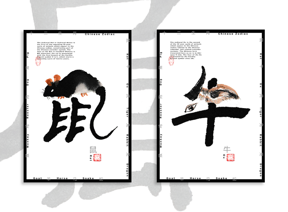
Mengyu is not the first artist to translate Chinese characters into something Westerners can visually recognise. But in this project, she's done it far more successfully than most. Rather than awkwardly twisting these shapes into something they're evidently not, her beautiful illustrations follow the flow of the lines perfectly, and the use of watercolours softens things to make the overall look utterly entrancing.
Lessons learned
Don't let your nature-inspired illustrations get stuck in a vector-based rut. Hand-painted styles can be much more evocative and instantly engaging, so try out different media, and you might just find fresh inspiration.
5. Branding for Botanical Lofts by Range Left
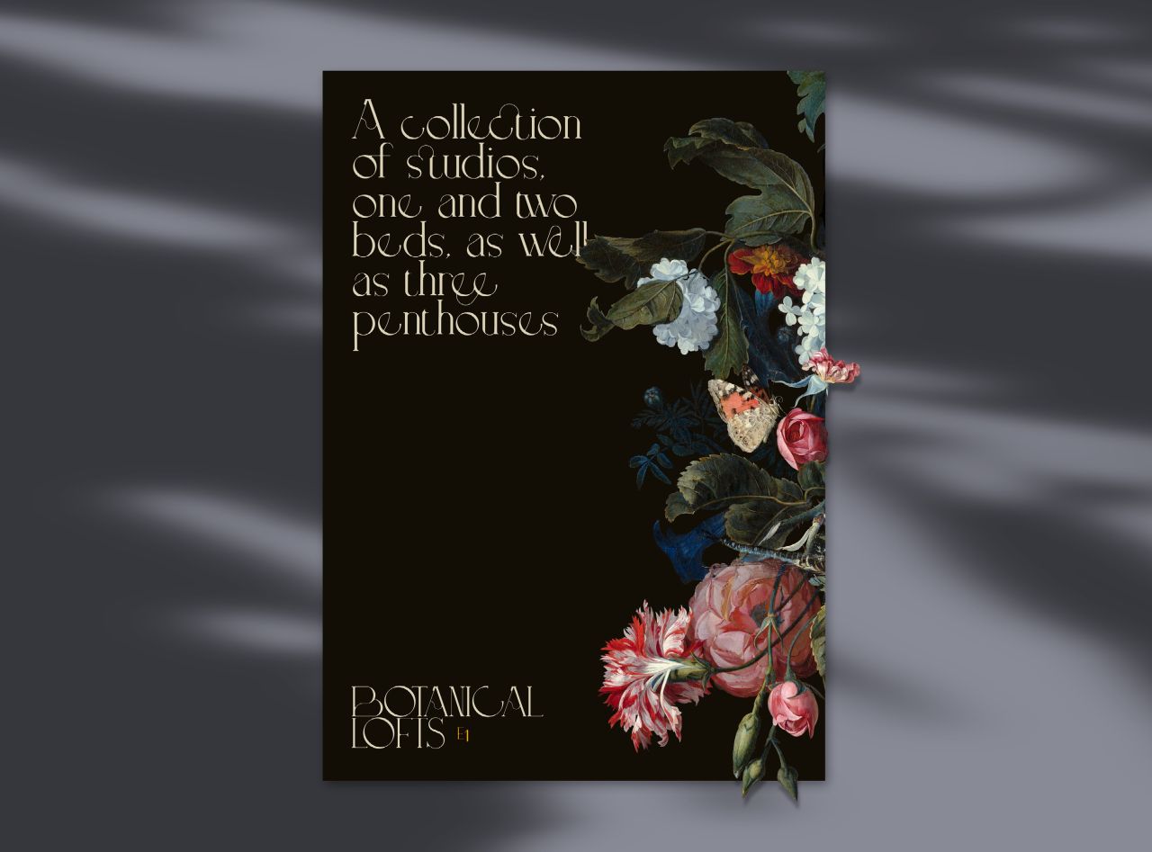
Botanical Lofts is a boutique development of one-, two- and three-bed apartments in the trendy E1 area of London. It's built on the site of historic Georgian botanical gardens, which originally housed plants most contemporary locals would have never seen before. These new homes were to be launched in 2021 and have a unique link with both its botanical heritage and the art and music culture of the neighbourhood.
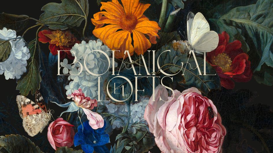
Range Left 's branding takes the botanical theme and absolutely runs with it. The visuals they have created for the website, brochures, social media assets and hoardings are all dominated by carefully chosen Dutch Master paintings. This bold approach fits perfectly with the upmarket nature of the development and its clientele.
The bespoke typography for the logo, in turn, is extravagant and elegant and blends perfectly with the artwork, evoking a timeless quality that draws together the past and the present effortlessly.
Lessons learned
Modern illustration and photography is not the only way to bring nature into our designs. Standing on the shoulders of giants, and incorporating the great art of the past, can often be a fruitful avenue to explore.
Enter the Indigo Awards 2022
Want to see more? You can find full details of all the Indigo Design Award 2021 winners here. If you fancy entering your own work for the competition, then you'll be pleased to know the Indigo Award 2022 is now open for submission. But hurry: you need to enter by 31 January 2022. You'll find all the details you need at indigoaward.com.


 by Tüpokompanii](https://www.creativeboom.com/upload/articles/58/58684538770fb5b428dc1882f7a732f153500153_732.jpg)


 using <a href="https://www.ohnotype.co/fonts/obviously" target="_blank">Obviously</a> by Oh No Type Co., Art Director, Brand & Creative—Spotify](https://www.creativeboom.com/upload/articles/6e/6ed31eddc26fa563f213fc76d6993dab9231ffe4_732.jpg)


