Neville Brody on authenticity, outrage, and his thoughts on AI
It's been 30 years since Neville Brody last published a monograph, and it's safe to say a hell of a lot's changed in that time – in his career, in the design industry, and in creativity more widely.
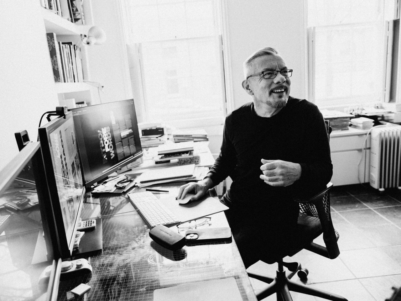
Following on from 1994's The Graphic Language of Neville Brody: v.2, The Graphic Language of Neville Brody 3 (NB3 for short) showcases work from the last three decades across editorial, brand identity, typography, systems, information, and interface design for clients including Channel 4, Supreme, Christian Dior, Coca Cola and more with his studio, Brody Associates.
The introduction, penned by graphic designer, writer, and publisher Adrian Shaughnessy, offers a breeze through Brody's backstory as the man behind the revolutionary, Constructivist-leaning designs for The Face magazine in the 1980s; his work in the Barney Bubbles-helmed Stiff Records design team, and his superb record sleeves for bands like Cabaret Voltaire, The Slits, and Psychic TV.
Indeed, Brody's is a firmly counter-cultural backstory. "The traditional design industry was anathema to me at the time – I evolved from a radical, counter-cultural place. I chose poverty and commitment for four years after leaving college, rather than compromise and get a safe job anywhere," he writes in the book's introduction.
And while his client list today is peppered with household name brands and luxury fashion labels, his stance on everything from education to AI is no less uncompromising.
Brody has been working at London's Royal College of Art since 2011. He was appointed Dean of the School of Communication and head of the Visual Communication Programme, becoming Professor of Communication in 2018. However, his own experiences of design education were less than positive, as Shaughnessy's introduction reveals.
Despite all the looking backwards; the book firmly places Brody and his legacy both in the present and the future; demonstrating his relentlessly iconoclastic, highly original approach to design and creativity.
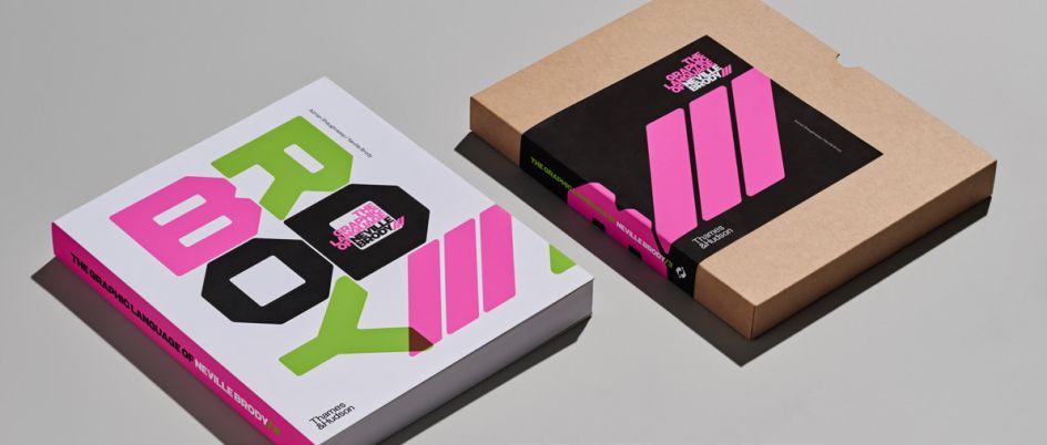
The Graphic Language of Neville Brody, cover

The Graphic Language of Neville Brody, cover
Why did you decide to publish the new book now?
To be honest, there's more work done in that 30 years than there was in the first two books put together. It's been a six-year process from the beginning, and graphic design has really changed and is changing – so it's quite interesting and important, I think, to capture those 30 years before it's going to change out of all recognition.
I wanted to capture the last three decades in the book and, in a way, use it as a kind of prism to reflect some of the things that would have been felt right across the design industry – for better or worse.
What's changed or is changing in graphic design?
Graphic design is shifting more towards the sort of engineering and system-building thing: it's more about a delivery system rather than an expressive system that adds drama to content. Most of what we're developing in our studio is really kind of detuned mechanisms to deliver content, whereas what we were doing before was more about how you can express content. The challenges have changed quite considerably.
Brands are now less focused on the visual story and more on brand activation, which is a 24/7 process. The metrics and values have shifted so radically.
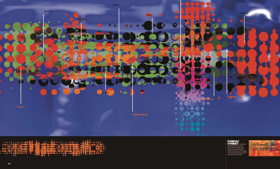
The Graphic Language of Neville Brody, spread showing Fuse Cyberfont poster from 1994
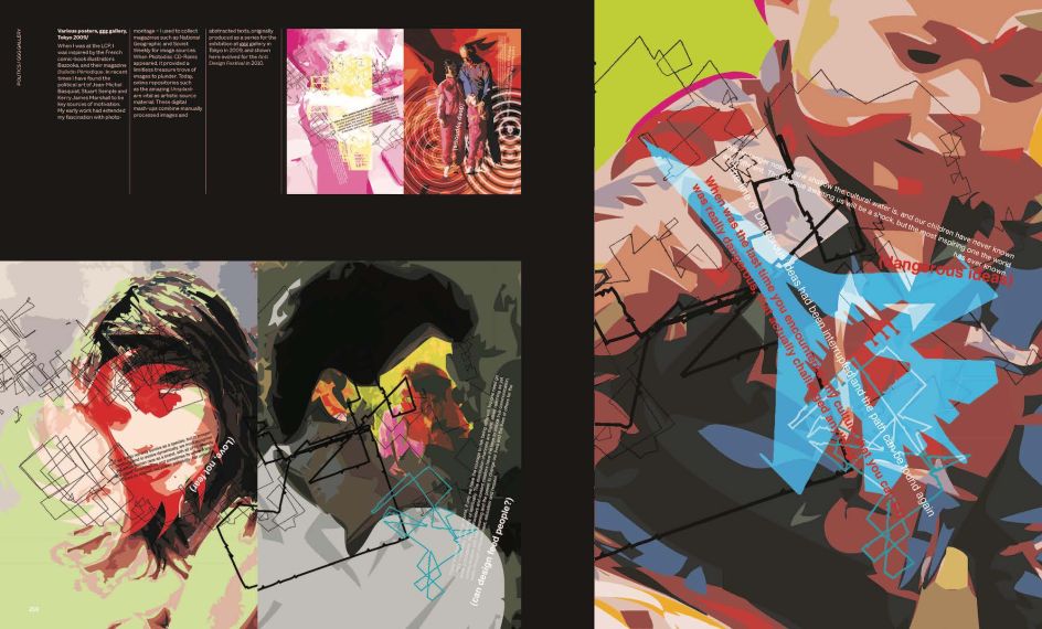
The Graphic Language of Neville Brody, spread
How do you mean brand activation? That makes me think of more PR stunt stuff.
Whether you're a street brand or an old mainstream brand, they're all trying to compete over the same space – it's all about 'Gen Z', the early 20s and five or ten years either side of that. Then, just like punk and hip-hop, advertising takes over all of those stereotypes, feeds them back, and eventually replaces the originals.
Tell me more about what you mean by that.
There's an investment app targeted towards young people that is currently advertising a lot, and they focus on things like a pair of sneakers – they're all trying to reference the same kind of streetwise generation. It's obviously run by a bunch of financiers and programmers – it's obviously not authentic, but it's shot in such a way that it looks authentic.
So then, what do you do if you are a genuine street brand? At the moment, we're seeing a lot of street brands aspiring to become luxury brands or luxury brands aspiring to become street brands. So you have this cross-fertilisation that we're seeing in many collaborations. Streetwear used to be more about personal expression. Not aspiring to sell out as luxury fashion.
I think all streetwear and sportswear brands start with a kernel of authenticity: Nike was authenticated by its running shoe; Adidas authenticated itself as being about football; Supreme, amongst others, is about skateboarding. That authentication means you can spread out because your brand has historical roots.
Supreme is such a broad brand now, but it still maintains its credibility and ensures it has all the right stuff in the right place to make it incredibly desirable. Streetwear right now is a very, very clever level of mechanisms.
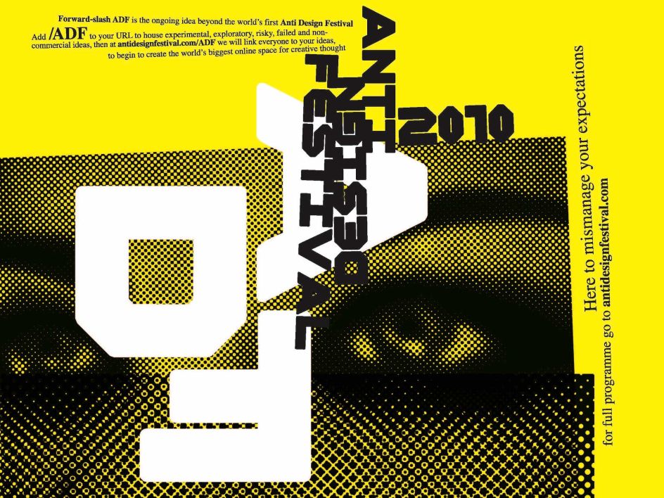
Neville Brody, Anti-Design Festival
What do you think are the most pressing design industry issues right now?
The destruction of our creative education system by this government? It's not only ignorant; it's cruel. Then enforcing rising fees means that most potential British artists and students can't afford to attend university. I just think it's criminal, and I feel so bad for a generation that simply cannot afford to go to university. I mean, even forgetting the fees, the cost of living, and then making, you know, raising the barrier to entry. It's really, I think, quite tragic.
Adrian Shaughnessy's introduction describes you as 'Britain's first bonafide graphic-design celebrity' (and your Blueprint April 1988 cover portrait shot by Nick Knight cover as 'More George Michael than Wally Olins'.) How do you feel about that? Do we still have 'graphic design celebrities'? Should we?
I mean, graphic design has changed. I'm unsure where the design heroes and heroines are, and it's been like that for quite a while. I expected to be made redundant somewhere in the middle of the '90s, and it sort of didn't happen. I mean, I'm not disappointed to say that, but for many decades there was such a rapid shift in generations that would soon become out of date and irrelevant, and this cycle of renewal was going on all the time. We don't seem to be having that now. It might be because design itself has found a place that lives more in books on graphic design.
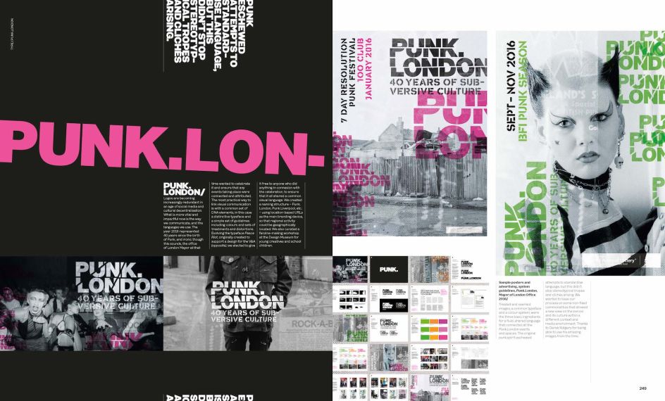
The Graphic Language of Neville Brody, spread showing designs for Punk London
How do you mean?
The sad thing is the loss of editorialisation: these days, you have a fixed format with content management systems: What is your main image? What is your big headline? What is the introduction? What is the rest of the text? Where are your linebreaks, your pull quotes, and the second image with a caption? It's quite a fixed formula.
When I was doing editorial design, it could be, 'Let's just leave this page blank with a small word in the middle'. And then the next round, 'Let's do a double-page image and have three pages of solid text with a big pull quote in it'. It comes back to the idea of expressing content rather than delivering content. And so I think when you get back to editorial spaces, magazines and books seem to be almost the most reasonable safe haven for editorialisation. Some websites push experimentation, but at the end of the day, most clients want a smooth user journey. When it comes to websites, graphic design is friction – you don't want too much structure in the way of delivering content and moving people to click through that journey.
We used to love the idea that graphic design is friction; because how you deliver a message is as important as the message you're delivering.
Do you think there are any magazines out there taking those sorts of risks?
There's certainly less appetite for outrage. Outrage has been moved to the realm of psychopathic leaders. You can feel outraged, but fewer people are making 'outrage' a statement.
Really? It feels like people are constantly calling each other out on Twitter and things like that.
There's a constant flow of trolls and counter-trolls, which is slightly different. It's a bit like things you'd say about your neighbour but putting it on posters instead. A kind of airing of viewpoints within that social media space. It feels too cheesy to say, but Trump, Boris Johnson, Musk and so on – that seems to be the most public airing of outrageous statements.
But when it comes to a magazine, people are unwilling to put across extreme viewpoints these days. Especially digitally, like on Twitter, you can express it in online features because it's quite easy to pull the feature or delete the tweet – but it stays out there forever, of course. With a printed magazine or newspaper, you can't do that – you can't run around them all and black out statements. They're a very different thing; there's a different temporal aspect.
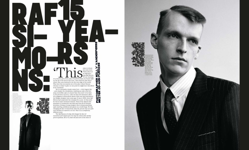
The Graphic Language of Neville Brody, spread showing Arena Homme + Raf Simons work
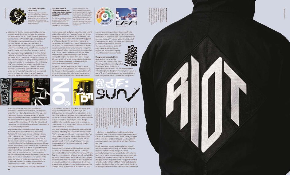
The Graphic Language of Neville Brody, spread showing work for Supreme
How do you think AI will affect the design industry in the future?
I honestly think it's a much bigger issue than people think. We're sort of strolling blindly into something that ultimately could replace most of what we're doing. As graphic designers, do you need big teams? Or do you need someone that can direct someone who can then programme the right cues and instructions to an AI engine? Then don't forget all of the output from AI engines is going into the mix of all AI engines, so it becomes an exponential growth.
What I realised is that what we can do is embrace abstract minimalism. AI is so sophisticated: it's all about virtuosity and showing how clever it is. It can do super sophisticated deep fake content but can't do the subtle touch, so I'm interested in embracing something very reductive, minimalist, and abstract. It also can't do lateral thinking very well – it will inevitably at some point.
Media content and production will radically change, too – and at the fastest rate and with the most extreme outcome of any kind of recent revolutions from industrial to technological information. The AI revolution is here already.
But it's an exciting time for design, and I'm excited about this book coming out, even if it asks more questions than answers. We're at the beginning of an adventure, and I'm excited by the possibilities.
The Graphic Language of Neville Brody 3 is published by Thames & Hudson on 25 May.


 by Tüpokompanii](https://www.creativeboom.com/upload/articles/58/58684538770fb5b428dc1882f7a732f153500153_732.jpg)

 using <a href="https://www.ohnotype.co/fonts/obviously" target="_blank">Obviously</a> by Oh No Type Co., Art Director, Brand & Creative—Spotify](https://www.creativeboom.com/upload/articles/6e/6ed31eddc26fa563f213fc76d6993dab9231ffe4_732.jpg)


