Our 10 all-time favourite portfolios to come out of the Wix Playground Academy
Want to improve your portfolio to help you win more work and advance your career? Then it helps to look at other creatives' portfolios to get fresh ideas and inspiration. To get you started, in this article, we bring you ten fantastic portfolios and explain what they've done differently and what you can learn from them.
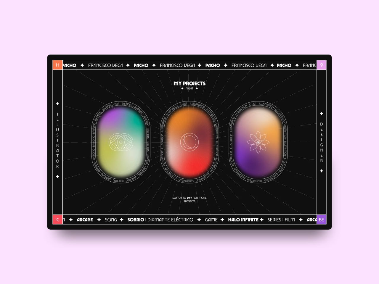
Francisco Vega, portfolio – one of the best portfolios to be created at Wix Playground
It's important to note that these portfolios didn't arrive fully formed out of anywhere. They've all been perfected following portfolio reviews at the Wix Playground Academy, a free, five-week online programme for new designers looking to build a stand-out personal brand.
Portfolio reviews are a great way to raise your portfolio to the next level by getting a professional to look over your existing portfolio and discuss ways it can be made better. Even if you think your portfolio is already great, it's often surprising how another perspective – especially one informed by years of industry experience – can bring ideas for improvement you wouldn't have thought of yourself.
If you're embarking on a portfolio review, the main thing you need to prepare is the portfolio itself and make it as flawless as you can: your reviewer doesn't want to waste time pointing out the obvious. You also need to think clearly about what you want a portfolio for: are you looking for a job, freelance opportunities, new collaborations or something different? Because if the reviewer doesn't know what your portfolio is trying to achieve, they won't know how well it's working.
Finally, you need to bring an open mind. While none of us likes to hear criticism, a portfolio review aims to help you attain your dream career, so don't look a gift horse in the mouth! With all that in mind, let's check out 10 of our favourite reviews to come out of the Wix Playground Academy and the lessons we can learn from them.
1. Francisco Vega
Francisco Vega is an illustrator and designer, and his portfolio truly is like nothing you've ever seen. Its psychedelic, tarot card-esque design has the true wow factor, and there are fabulous touches.
We love, for example, the instruction to "Switch to 'day' for more projects" – a fun feature that transforms the entire design into a light mode, with the option to switch back to dark. The gradient-coloured shapes entice us to click and discover recent projects, and the surrounding navigation guides you reassuringly throughout. Even the About page is interactive and interesting. In short, not one corner of this portfolio is boring, and the work on display only strengthens the overall look.
Francisco Vega
Lessons Learned
Your work may be good, but if your portfolio is boring, why should anyone linger on it? Take inspiration from Francisco, find ways to keep viewers entertained, and you'll drive a lot more engagement with your portfolio site.
2. Emely Wensky
Emely Wensky is a fashion designer, and her portfolio takes a very specific theme – the 1990s/2000s websites of dress agencies and fashion houses – and runs with it. Cues to action appear in the form of the clothing labels, and huge, vintage background images remind us of the times when men wore flares and high heeled boots, and cocktail lounges were the in-thing.
Scroll and more surprises pop up until we get more of a modern feel, with a list of projects that showcase Emely's talent even more. Finally, the invitation letter at the bottom is a lovely touch and 'Let's work together' is the enticing call to action that can't be ignored.
Emely Wensky
Lessons Learned
Emely's portfolio is a whole heap of fun and makes it abundantly clear she loves fashion and wants to work in this sector. If you have a similar goal or passion, it's a great example to follow.
3. Caitlin Penaluna
Caitlin Penaluna is a multi-disciplinary creative who loves to experiment with new mediums. And that's immediately evident on her portfolio site, which boasts a clean, white backdrop with beautiful varying typography throughout, along with hints of gradient green to add interest.
As you scroll on the homepage, little Polaroid-style pictures pop up, revealing recent projects to click on and find out more. The project pages provide all the salient details, along with gorgeous imagery to demonstrate Caitlin's breadth of talent. We especially love the playful logo of her name, which flicks through various type, to suggest that branding oneself is no easy feat when your head is full of amazing ideas.
Caitlin Penaluna
Lessons Learned
There's an incredible energy to Caitlin's portfolio, but it's always controlled, never chaotic. If you can strike the same balance on your portfolio site, you're sure to draw people in.
4. Mertcan Şeker
Mertcan Şeker is a visual designer who specialises in 3D still images and animation. Working in a sector where everyone's time-pressured, you want to make your portfolio easy to navigate, offering just the right amount of information while also getting across your personality and passions. That's no easy feat, but Mertcan does an amazing job, and it's one that every creative should try to emulate.
His homepage uses a calm, muted blue as its background, conveying a grown-up approach, while a playful colour palette is used to define each project. The work is the star of the show here, showing us front and centre the talent on display. And we love that the About page spells out exactly what Mertcan is looking for from employers. It might seem obvious, but if you don't ask, how will you get?
Mertcan Şeker
Lessons Learned
There's no point in creating an amazing looking portfolio site if it doesn't deliver the fundamentals. Like on Mertcan's site, your portfolio needs to be easy to navigate, the work needs to be central, and what you're looking for from the industry must be clear.
5. Ori Tirosh
Ori Tirosh is an illustrator and designer specialising in gaming and character design, but you don't have to hunt for that information: the very design and look of his portfolio makes that clear from the get-go. Packed with personality, Ori's website instantly grabs you, enticing you to scroll and find out more.
Rather than looking at a standard portfolio, you feel more like you're reading an interactive graphic novel, perfect for showcasing Ori's talents. The copy is bold and confident, from the opening salvo – "If you wish to see cute designs and pretty pictures, you came to the wrong place". And we love how he highlights how "AMBITIOUS" he is.
The animated character looks cheeky and fun, making us instantly understand that Ori's style is far from cute. There's a big cue to scroll and a clear route to accessing his work pages. Projects are shown in all their glory with large videos and pictures.
Ori Tirosh
Lessons Learned
Both the design and text of Ori's portfolio tell us who he is, what he does, and what his biggest passions are. Does your portfolio present who you are to the world this clearly and confidently? If not, there's work to be done.
6. Catarina Rego Martins
Catarina Rego Martins is a graphic designer working across print and digital and specialising in fashion and culture. Her portfolio site is clean, minimalist and makes great use of white space.
She's also found an incredibly creative way of displaying her work: turning her graphic design projects into actual handbags, as modelled by herself in a stylish photoshoot that dominates the homepage. It's a brilliantly clever and original way of showing her passion for fashion.
Catarina Rego Martins
Lessons Learned
If you want to work in a particular sector of the creative industries, there are no prizes for being subtle about it. Make it crystal-clear what your ambitions are on your portfolio website, and you'll find it much easier to achieve them. And if you can do it imaginatively and originally, even better.
7. Hermes Mazali
Hermes Mazali is a logo and brand designer, and his portfolio is achingly cool. Everything screams style and elegance from its minimalist monochrome backdrop to the artful portrait photo on his About page.
With animated features throughout, the portfolio feels interactive, engaging, and slick. Glyphs abound, and there's plenty of gorgeous variable typography. In the projects section, every piece of work is laid out in a way that draws the eye, excites and delights.
And all this doesn't just delight the eyes but clarifies what Hermes is offering as a creative pro. You'd don't need to read any copy to know that he's passionate about big and bold typography, as well as simple, discreet design features that offer further flourish.
Hermes Mazali
Lessons Learned
Hermes' portfolio shows a confident graphic designer who knows what he likes and knows where he's heading. And that's something we can all learn from. If there's a particular approach, technique or style you're keen to make the focus in your career, then put it up front in your portfolio, and the world will beat a path to your door.
8. Andrada Has
Andrada Has is a graphic designer with a distinctive point of view, as her portfolio makes abundantly clear. With an overriding palette of burnt orange – a colour we keep seeing in 2022 – set against an elegant monochrome backdrop, it opens with an interactive element that begs to be played with.
This device plays with the two sides of her creative personality (Dreamer/Doer) as a way of dividing up her work and her bio. It's a unique approach that we've never seen on a portfolio before and adds to the sense of someone who can think outside the box.
The site's top and bottom navigation doesn't move as you scroll through various sections and projects, making it easy to navigate and fun to explore. And there are plenty of 'calls to action' along the way to encourage the visitors to engage with the site, such as the 'Pick and choose' graphic on the projects page.
Andrada Has
Lessons Learned
Andrada's portfolio site doesn't strictly follow the conventions of a standard portfolio site but instead gets playful with them. Because showing that you're a creative thinker is always more effective than telling.
9. Eileen Ahn
Eileen Ahn is a mixed-media artist and researcher, and her portfolio is one of the most intriguing we've ever seen. It greets you with a wacky name, ziplocked clear bag and a brain (yes, a brain) inside, along with hot sauce, oranges, and more.
This playful offering becomes even more bonkers and brilliant as you move your cursor over the homepage, revealing a palette of bold colours and interesting detail about the creative. Its game-like quality awakes your inner child and makes you want to click on different elements just for fun. And the cheeky visuals – a portrait with stuck-out tongue, acid-90s colours and confident text throughout – all add up to someone you want to get to know and discover more about.
Eileen Ahn
Lessons Learned
Eileen's portfolio looks crazy but is still carefully constructed. Her design demonstrates that a fun approach can deliver serious results as long as it's intelligently thought-through and well-executed.
10. Michael Pasion
Michael Pasion is a graphic designer whose influences are immediately apparent on visiting his portfolio website. Brash, bold, and evoking an instant '90s feel, this yellow, white and black website is dominated by grungy elements, what he calls "controlled-chaos" and the "bold-hushed".
With a surname that's one letter away from 'passion', Michael makes the obvious link and dubs titles his site' Passion Was Here'. And it's more than a throwaway line: he makes it the central theme, and brings his passions for horror, graffiti, zine and Japanese culture to the fore, showing what drives him as a creative.
Hover your mouse over the different elements, and the site becomes delightfully interactive, exciting and full of creativity. The projects are displayed beautifully, and we love the fixed left-hand information section that stays with you as you scroll through project images. There's no lack of personality here. We can't get enough of the welcoming eyes, and a downloadable PDF resume is always useful, too.
Michael Pasion
Lessons Learned
If you're driven by specific creative passions, don't hide them; celebrate them! By bringing them to the fore on your portfolio website, people will get an instant sense of where you're coming from and what you have to offer as a creative.
Take a portfolio retreat with Wix Playground Academy!
Looking to kick-start or push forward your career in design? The Wix Playground Academy is a five-week intensive online program for new designers looking for the perfect reason to focus on developing their creative identity and building a stand out personal brand. It takes place three times a year, and it's absolutely free! Applications for the next sessions are open now, and you can find out more information here.

Wix Playground


