Shanti Sparrow on finding her true calling, taking time off and her love of animals
Shanti Sparrow is an inspirational Australian illustrator, designer and lecturer living and working in New York City. Known for her vibrant and bold approach to design, she creates brands filled with individuality and personality. Her expressive typography and confident colour palettes create memorable and iconic identities.
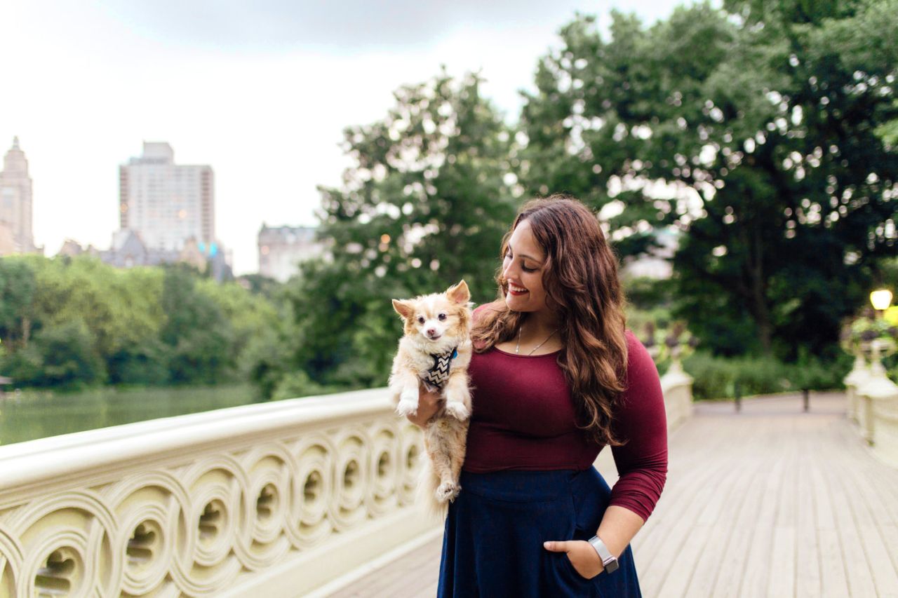
As an illustrator, she has a unique style that involves scanned textures, vector patterns and digital collage. Her subjects mainly involve animals and nature. Shanti has also published a range of children's books featuring her beautiful illustrations, some of which were recently transformed into life-sized statues for an exhibition in Shanghai.
And if all of the above doesn't keep her busy, Shanti loves to get involved with non-profits that create awareness and raise funds for important humanitarian, environmental and research-based causes. We caught up with Shanti to ask her about her career so far, her style and why colour matters.
Tell us about your journey. How did you get here?
I believe my love affair with design started with the title/cover pages of my primary school notebooks. I would spend hours creating elaborate titles using glitter pens and neons. I colour coded my notes with highlighters and enjoyed creating consistency with the same specific blue ink pen that was a shade lighter and more beautiful than the others. When I discovered there was a career where I could make cover pages and layouts all day I knew I had found my calling.
I studied a Bachelor of Design (Visual Communication) because it offered me a broad range of design disciplines to study. These included photography, animation, interactive design, digital design, advertising and illustration. Unfortunately, I graduated in the middle of the global financial crisis which was a tough time for design in general and an even tougher time for a graduate. After months of self-doubt and two-minute noodles, I finally landed my first design job within a small independent printery. It was humble beginnings where I embraced the wonderful world of print from the ground up and fell in love with stocks, finishes and ink.
Later, I joined the Sydney-based boutique studio Bug Communication that focused on appeal design for the not-for-profit industry. Here, I specialised in conceptual design. Designing for appeals is both rewarding and challenging. Every appeal needed a new perspective in approaching the same ask. We had to creatively look at the same problem over an over again and find a new way of solving it.
In 2014 I branched out as a commercial illustrator and delved into publishing. For several months I dedicated myself to experimentation in order to create my now signature textured, patterned and colourful style of illustration. This led to opportunities including children’s books, colouring books, calendars, greetings cards, puzzles, games and a range of other merchandise.
By this point, I was exhausted due to working long hours as a designer and an illustrator. I decided to take a year off to travel and recharge my batteries. It was a huge risk at the time, but it ended up being one of my most creative periods of my life. I spent six months in New York just enjoying the city and then travelled through Europe. I removed schedules from my life and let myself create whenever I wanted instead of whenever the client requested. When I got back to Australia, things felt different and my old routine just didn’t seem to fit anymore. This is when I discovered the possibility of combining freelance design with teaching design.
Today I am a lecturer at Shillington and run my own studio focusing on branding. I started teaching in Australia and through a few turns of fate I ended up right back in New York, but this time as a teacher. My students constantly inspire me and I get daily reminders about the infinite possibilities of creativity. I love the balance I get between the immersive environment of the school and the freedom of freelance design.
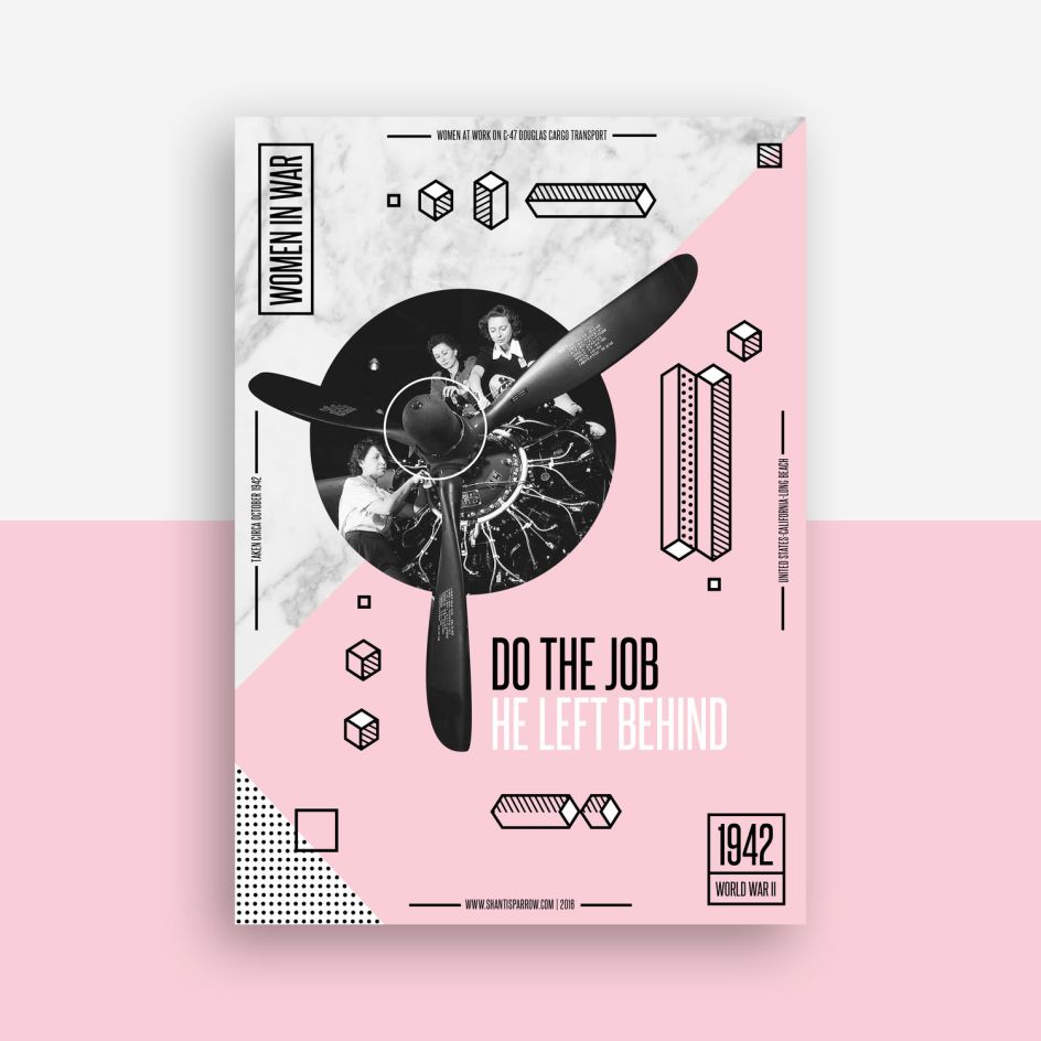
The Women in War poster series by Shanti Sparrow
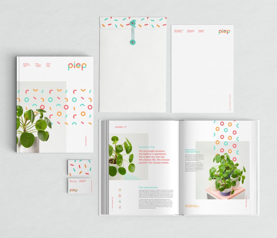
Piep brand identity by Shanti Sparrow
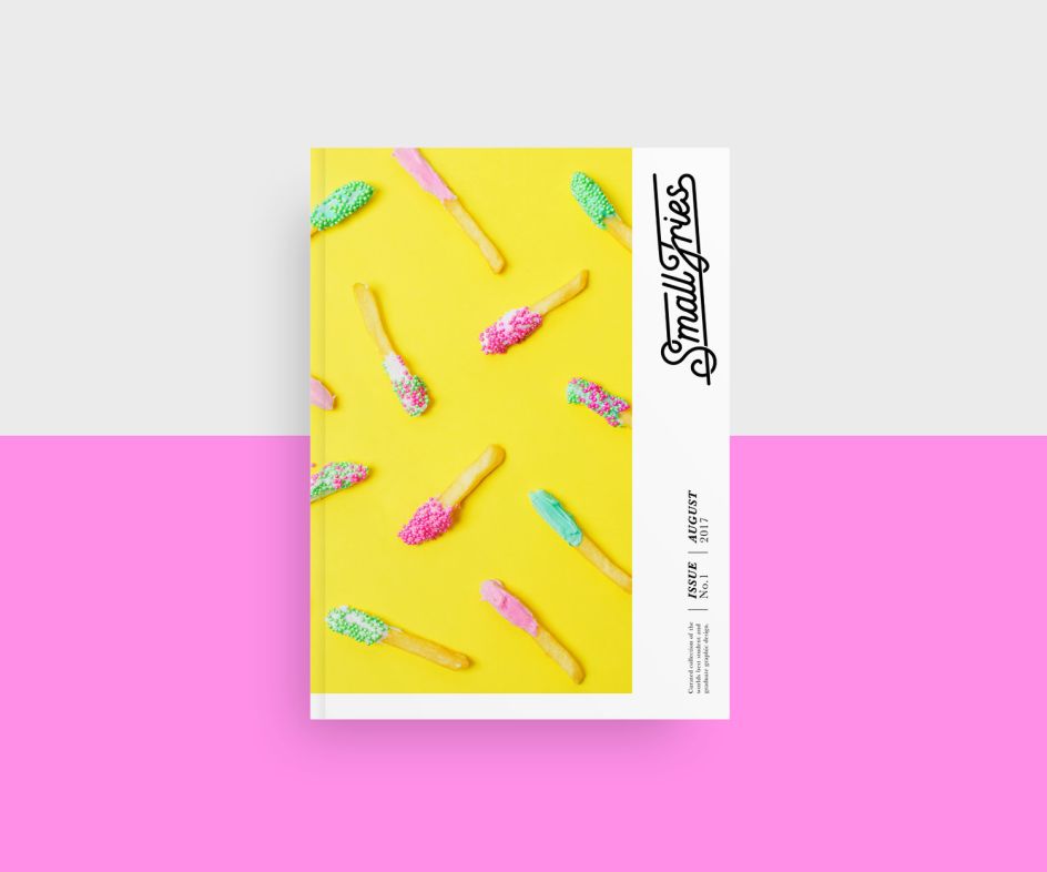
Small Fries editorial design and branding by Shanti Sparrow
Can you describe your style?
My style primarily reflects the needs of the client and project I am working with at the moment. Saying this, I do tend to favour strong typography and bright bold palettes. I am influenced by the International Style and my grids, structure and typography use Swiss principles as a foundation. Experimental grid systems, illustrative branding and patterns have become styles that I am now recognised for within my designs.
You have a particular love of animals and nature. Where does that come from?
My love for animals started in childhood. When I was eight years old a neighbour said I could have one of her kittens from her latest litter. Not willing to take the risk that my parents would say no I snuck the kitten into my room and devised a plan to keep a secret cat. Half an hour later my mum figured out what was going on when I asked the not-too-subtle question: 'Can I have a saucer of milk?'.
Luckily my mum saw how much I loved him and allowed me to keep him. As I grew up I looked after fallen chicks, helped out at the greyhound's rescue centre and fostered dogs. My original career goal as a child was to be a farmer who had lots of animals or a veterinarian. These paths never happened but I have been able to use my skills in design to benefit many animal charities and raise funds to help save and protect animals.
Tell us more about your dog Archie!
Archie is the love of my life! He has travelled with me through seven houses, three states and two countries. He magically makes any new apartment feel like home. Archie is a rescue dog who was urgently surrendered after his owner died. I was fostering at the time and within a day or two of nursing him through his grief, I knew I could never let him go. He is now almost 13 years old and his favourite things include watching people walk past my studio, belly scratches and napping.
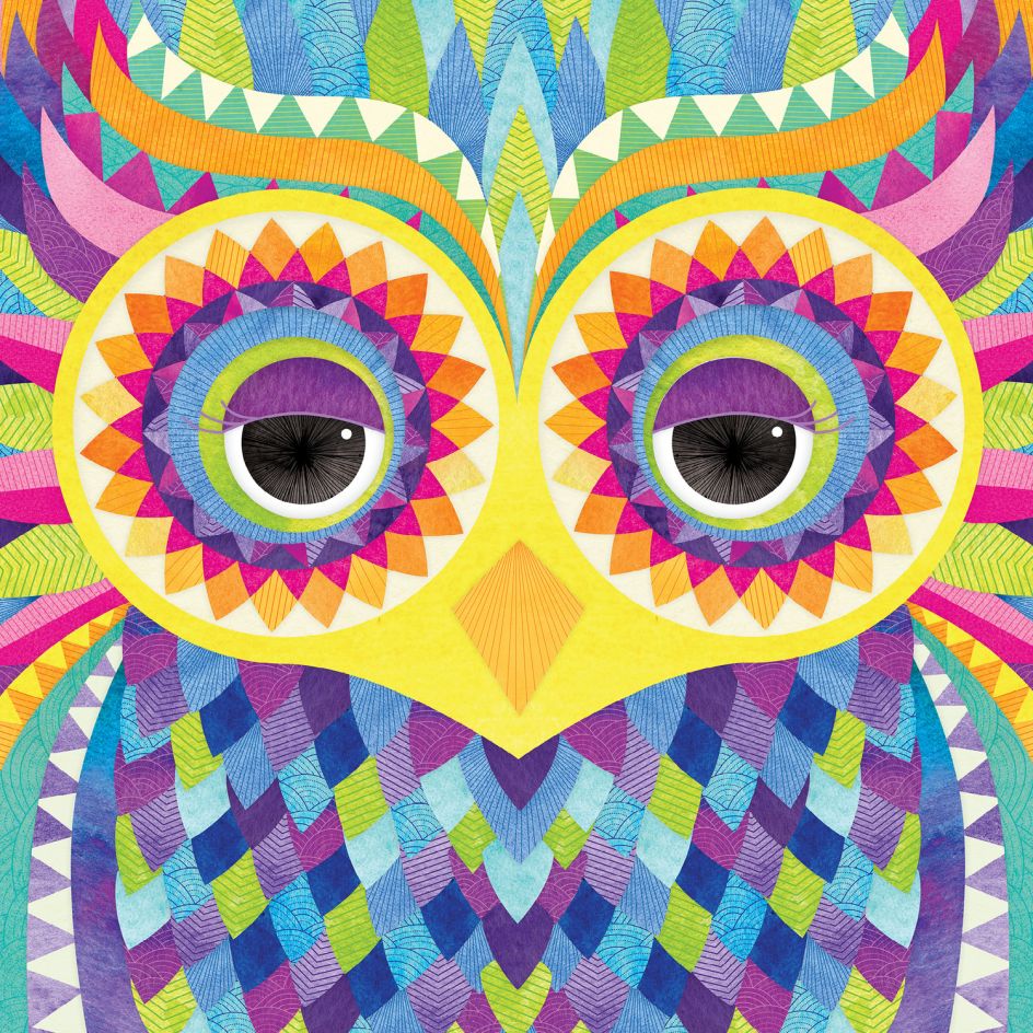
Illustration by Shanti Sparrow
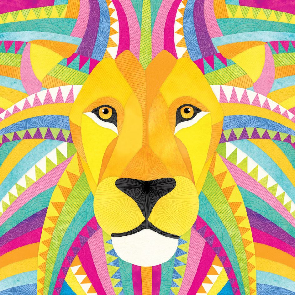
Illustration by Shanti Sparrow
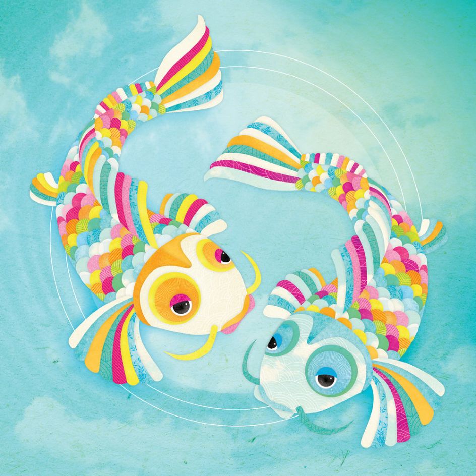
Illustration by Shanti Sparrow
How do you find working for yourself? The good, the bad and the ugly?
One of the best things about freelancing is the freedom to chose the kind of projects I wish to work on. I have been fortunate enough to have the opportunity to focus on more unusual and interesting projects. The ugly side of freelancing is the blurred lines between work and free time. I often find my work creeping into my 'off' time. I have to be very conscious of my work-life balance not getting too off kilt.
Is there anything that has surprised you about the industry?
When I was entering the design industry I had assumed it would be a very competitive environment. But in my experience, it's full of beautiful and generous people. There is so much work out there and room for everyone and every style. Designers are natural collaborators and, on the whole, very welcoming people. As an educator, I love seeing industry heavyweights donate their time to connect and inspire the next generation.
What would you like to see change?
More female creative directors and leaders would probably be my number one thing I’d like to see change. I know there are some incredibly talented women in the industry but unfortunately, I do not see even representation in the higher levels.
What motivates you to get out of bed each morning?
As a lecturer, my students are my motivation. I teach adults who have taken the brave decision to quit their jobs and put their life on hold in order to chase their dream of being a designer. I watch them go from a curious observer to a passionate creative in such a short amount of time. They open themselves up to being vulnerable in the creative process and put their trust in our guidance.
When I see their passion I'm reminded how lucky I am to work in this industry. It’s a lot of hard work, tears, coffee and late nights but the days when I receive an email letting me know they have their first client or job make it worthwhile. And it brings me so much happiness.
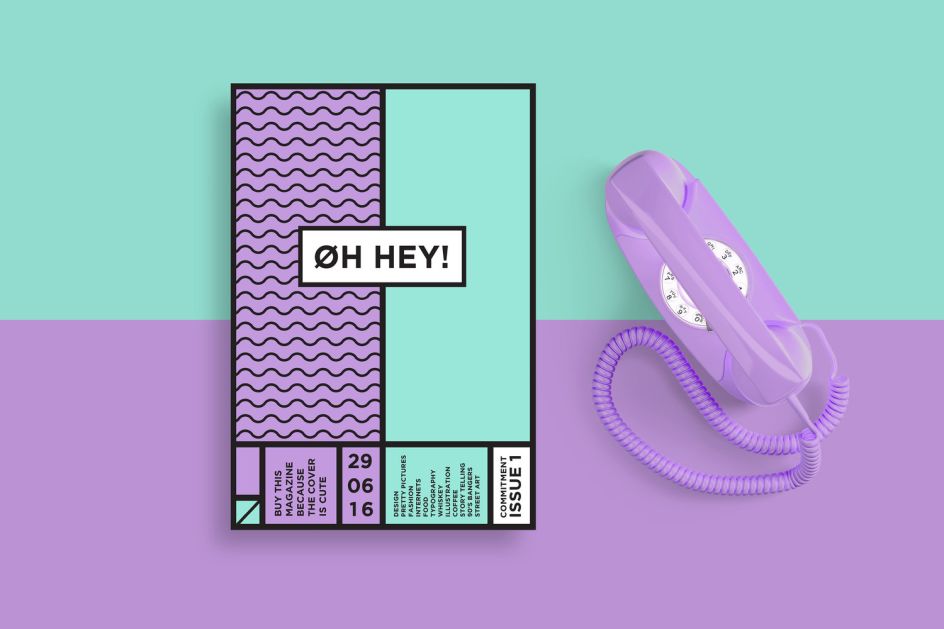
Design for Oh Hey! magazine
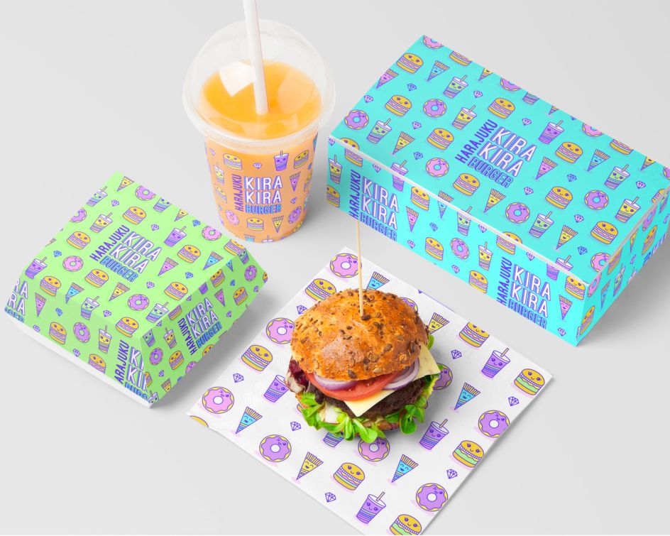
Branding for Harajuku Kira Kira Burger
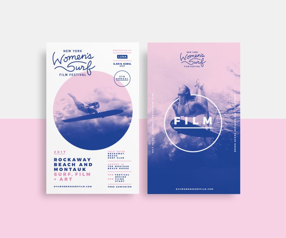
Work for the New York Women's Surf Film Festival |
You're a very charitable person. What have you recently become involved with?
I love collaborating with the Sydney Children’s Hospital Foundation in Australia. The Art Program helps make the hospital a vibrant, reassuring and colourful place of healing and culture, where children feel safe and happy. It's run by an amazingly passionate team who have gone out of their way to create opportunities for me to collaborate with them. I’ve participated in multiple group shows, art workshops and recently a solo show where a percentage of the profits went straight back into the hospital.
It's really rewarding to know that my illustrations can help make the physical environment of the hospital a little brighter, but more so to give joy to those who may be having a tough time.
What does your toolkit look like?
My toolkit is centred around the Adobe Creative Suite. I spend a lot of time in Illustrator crafting illustrations and patterns. I am really loving Sketch for web and app UX/UI. I’m very thankful we don’t have to struggle in Photoshop creating digital layouts anymore. I also like to get off the computer as much as possible, so I play with handmade graphic elements including ink, watercolour and scanned warped textures.
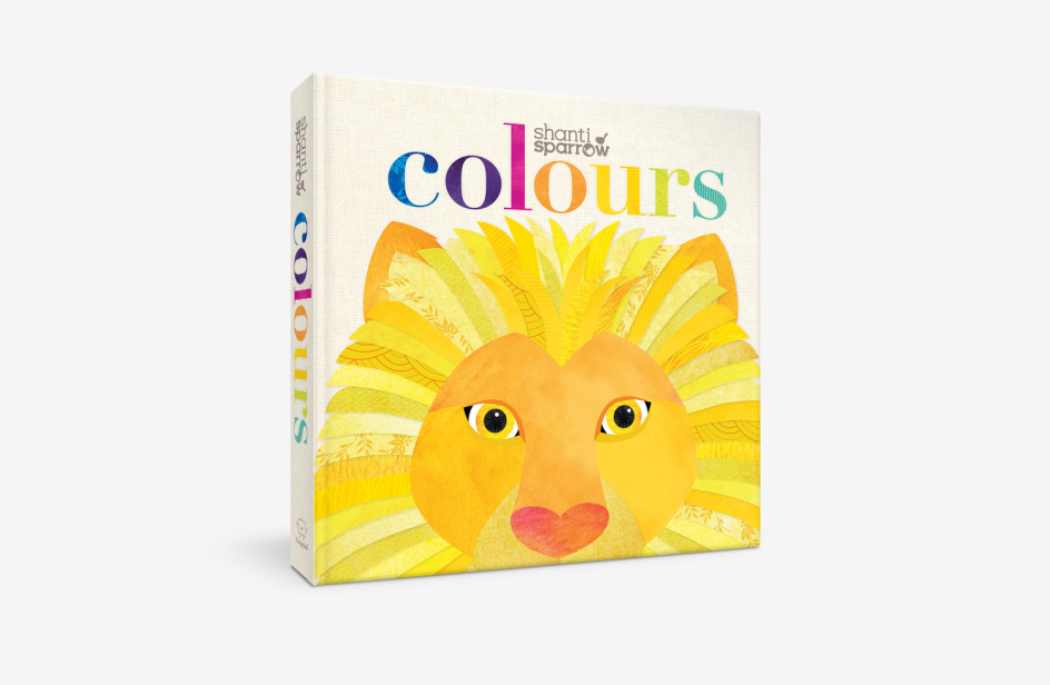
Colours by Shanti Sparrow
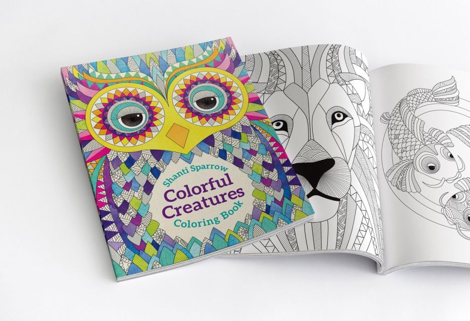
Colourful Creatures by Shanti Sparrow
Marketing-wise, what has really worked well for you?
Interestingly, I did not market myself for most of my career as it had not occurred to me that promoting myself was something that was necessary. Instead, I worked hard in the studio and relied on good work and positive client relationships to build a bigger client base. This is definitely the cornerstone of success for every designer.
It was not until I was teaching that I realised that releasing work and communicating publicly is incredibly important as it provides inspiration and opens a dialogue between the industry and new designers. I initially released my work on my website and noticed that they started popping up on networks like Pinterest. These gained a lot of traction and soon my potential client base became international.
Behance has been another amazing marketing tool. I have only been on the platform for two years but in that time I have gained so many amazing new clients and it has connected me to the global design community. I also love connecting with design blogs (like Creative Boom) because they offer me so much inspiration and insights and I get the opportunity to share my own experience with others.
What are you currently working on?
I always have a passion project in the works and am currently launching the first dedicated student and graduate design magazine called 'Small Fries'. The publication aims to provide an international platform to celebrate and showcase the outstanding talent and innovative work created by student and graduate designers.
Small Fries will accept submission in the categories of branding, packaging, web design, app design, social awareness campaigns, illustration, typography and advertising. It will work similarly to an illustration directory. It will feature student profiles, their work and have direct contact information.
The magazine will be distributed to top studios in Australia, the UK and US. This is to ensure the work gets under the noses of the right people. The students get published and promoted, studios get fresh inspiration and connection to new talent and the world gets a beautifully curated magazine full of gorgeous design.
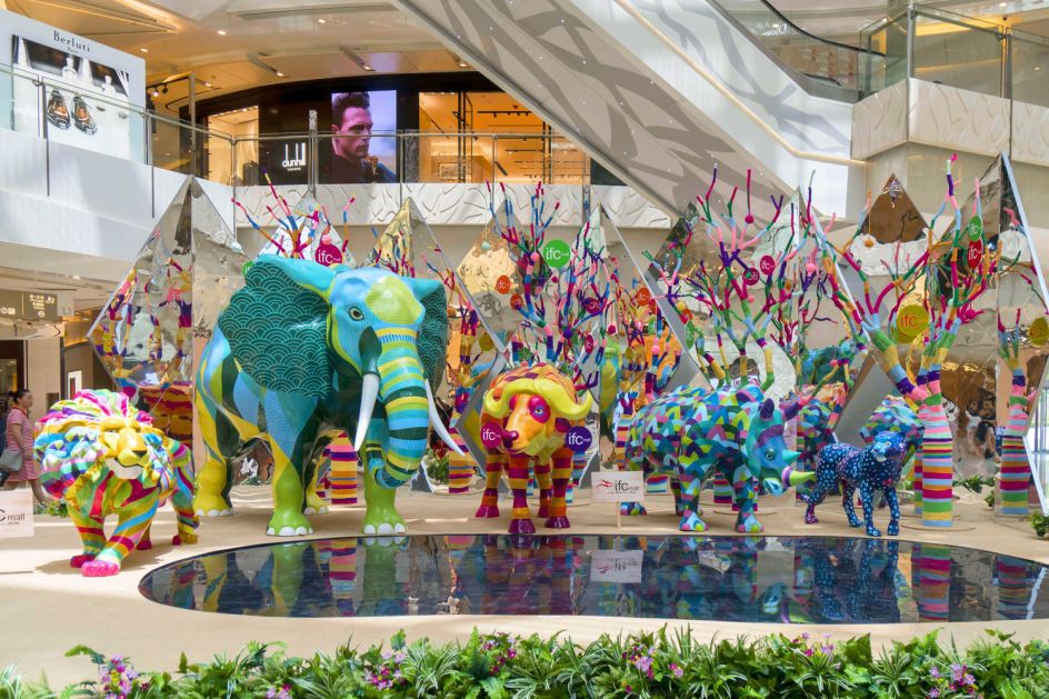
IFC Mall Shanghai "Summer Supreme Animal Kingdom"
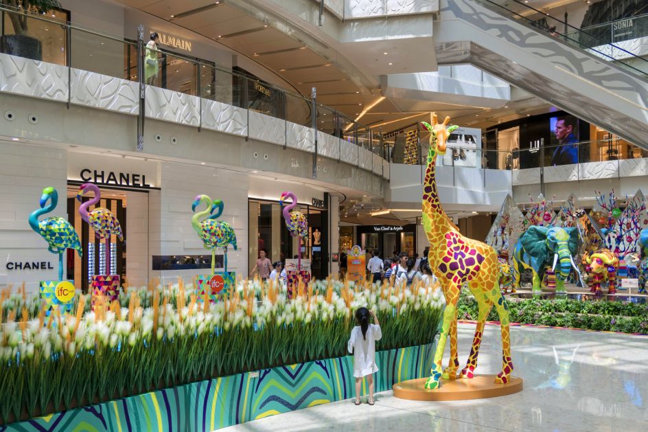
IFC Mall Shanghai "Summer Supreme Animal Kingdom"
Sounds great! Any favourite projects you can share with us?
One of my recent favourites was centred around my illustrations. This summer the Shanghai IFC Mall and I collaborated to create a Summer Supreme Animal Kingdom installation. IFC wished to celebrate a world full of colour and happiness and I was honoured to help them with this request.
This joyously colourful sculptural attraction includes 16 life-sized pattern rich animals which were all hand-painted with elaborate details. It has been a dream to see my illustrations come to life but even more rewarding to see people enjoying and interacting with them.
Tell us something about yourself that might surprise us
I technically have the noble title of 'Lady'. For fun, my mum gave me the title from the Principality of Sealand for my birthday.
Finally, what tips can you share with those just starting out?
Welcome to the start of a really interesting and challenging industry! It can be difficult to get your foot in the door, but once you are in, there are endless possibilities and opportunities. Make sure you become comfortable with feeling uncomfortable.
At first, it is hard to put your ideas and heart into a project and open it up for judgement. But you soon learn that the feedback you receive helps you become a better designer. Be brave and if your studio gives you an opportunity to pitch an idea, go for it! Enjoy it, there are not that many industries that let you create every day!


 by Tüpokompanii](https://www.creativeboom.com/upload/articles/58/58684538770fb5b428dc1882f7a732f153500153_732.jpg)


 using <a href="https://www.ohnotype.co/fonts/obviously" target="_blank">Obviously</a> by Oh No Type Co., Art Director, Brand & Creative—Spotify](https://www.creativeboom.com/upload/articles/6e/6ed31eddc26fa563f213fc76d6993dab9231ffe4_732.jpg)


