Three things we need to know about creativity and the future
Sex robots, self-driving cars, and an artificial-intelligence opera – exciting monuments to a brave new world, or foolish, fear-inspiring dystopian talismans?
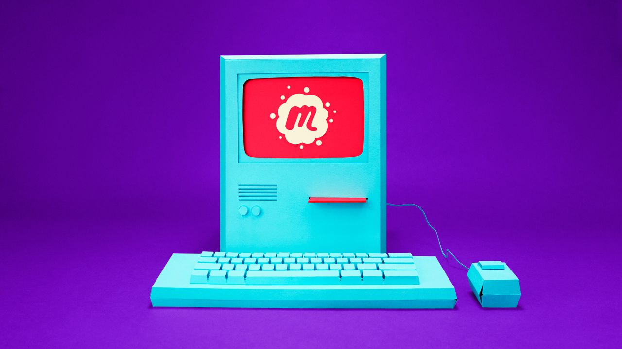
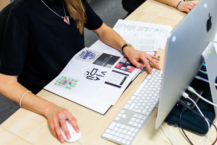
Meetup branding, by Sagmeister & Walsh
These things aren’t just wild ideas for the future anymore but are very real, and very now, as the superb little and& festival in Leuven, Belgium proved.
The four-day event comprised talks, demos, exhibitions, music and performance from a vast cavalcade of creatives from designers to artists, engineers, scientists, researchers, monks, philanthropists, chest, magician, and product developers, to name a few.
This was the inaugural and&, an initiative set up by the health, tech and creativity partnership LeuvenMindgate. According to the festival partners, its aims are "all about tearing down the borders between technology and daily life, between technological innovation and artistic creativity."
Alongside seeing some brilliantly innovative fine art (shout out to SquidSoup in particular for Submergence, a walkthrough light installation that modifies according to the viewers’ movements), and some truly banging techno, the summit discussions dove deep into some prescient and vital issues around the intersections of tech, art, and life. Here’s just a little of what we gleaned.
1. The robots can’t take all our jobs
So that’s something of a relief. In his talk about the city landscapes of the future, Dutch artist and innovator Daan Roosegaarde presented a series of optimistic and resourceful approaches to urban living: a sort of smog hoover, for instance, which sucks that bad stuff out of the air, with the carbon later harvested, compressed, and made into diamonds. Alongside this rags to riches product design story, he also showed some heartening data from the World Economic Forum, which predicted the most sought-after traits for workers in 2020: complex problem solving; critical thinking, and creativity.
What do they have in common? They’re all things that robots are very bad at. Nice try, R2D2, critically think your way out of that one.
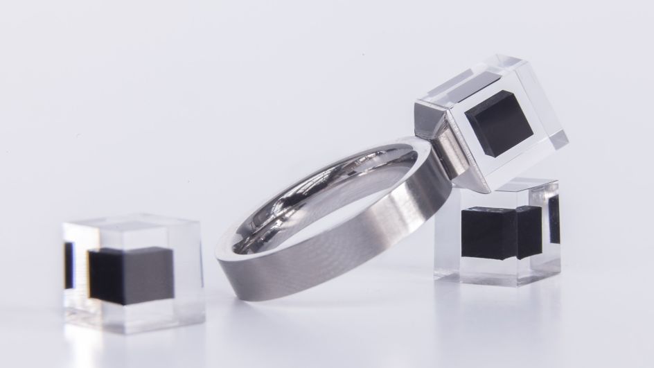
Daan Roosegarde, Smoke Free Ring
2. Art institutions will be even more participatory (though do so with caution)
One of the most successful major public art projects in recent(ish) memory as Olafur Eliasson’s The Weather Project, when in 2003 the Tate Modern’s vast Turbine Hall was bathed in sunlight and a sublime fine mist that felt entirely otherworldly.
As Chris Dercon, a former Tate Modern director, says, at first, the staff were shocked and irritated the visitors instantly began using the installation space as a "picnic space, kindergarten, space for people to show their own artwork", and so on. Very soon though, they realised that was exactly the point. "They recognised that the problem with the Weather Project was a solution – for people to flock there and form a togetherness," he says. The Turbine hall began to act as a place to "build communities," and the artwork was as much manifested by those that used the installation as the artist that conceived it.
Since then, while the idea itself is nothing new (see the Happenings of the 1960s), participation in the arts has boomed. But that doesn’t always mean it should be an institution’s end-goal, Deacon warns: "participation is something we have to carefully think about what it can do," he says. "It can also be an ‘artificial hell' – a fake democracy, an imitation of democracy."
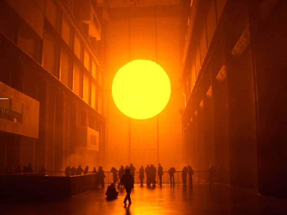
Olafur Eliassion, The Weather Project. Photo: Olafur Eliasson / Tate, London
3. Beauty will still matter
Stefan Sagmeister’s blistering talk immediately bulldozed the cliche that “beauty is in the eye of the beholder”, pointing out that the phrase only came to prominence thanks to a line stating as such in Margaret Wolfe Hungerford’s 1878 novel Molly Bawn.
Instead, Sagmeister explained, we actually have fairly universal ideas of what is, and what isn’t beautiful. He proves this by showing the audience a slide with five different colours, another with five different shapes, and asks us to vote for our favourite.
Turns out pretty much everywhere he speaks, the results are almost identical (circles and blue or purple won out, for the record.) From the results of this crude, but revelatory experiment, it turns out that a brown rectangle is the least favoured: you know, the basis of most modern building designs. Sagmeister suggests that much of this "ugliness" in architecture was thanks to the work of Viennese Modernist Adolf Loos being “wilfully misunderstood” by the next generation of architects, who he says "covered the world with the psychotic sameness we still suffer from to this day."
Beauty isn’t necessarily a design buzzword like, say, "disruption", but as Sagmeister points out, beauty makes us all happy. And surely, that means good design? A case in point is the difference between Penn and Grand Central stations in New York (even the most cursory glance at them will reveal the gulf between their relative gorgeousness). A survey of positive and negative tweets from users in each station revealed just exactly how much beautiful surroundings influence our mood: Sagmeister reveals that tweeters at Grand Central were overwhelmingly positive; those at Penn, overwhelmingly terrible: "Penn station is the buttonhole of the universe", wrote one adroit tweeter.
Sagmeister sums up a few reasons why beauty matters now, and will in future:
Beauty = part of being human
We agree on what is beautiful (somewhat) University College London Professor of Psychology and Medical Education Chris McManus developed a test around Mondrian images, showing non-experts two images of Mondrian-like images, one by the artist, one a fake. Pretty much everyone can spot the real one: "one just feels like the right composition, one does not," says Sagmeister. Mandarin tillers’, endlessly moved lines around in his works until they felt exactly correct.
When we lose our mind, we can still recognise beauty In one study, Alzheimer patients were asked to put a series of famous paintings in order of how beautiful they are. The same test two weeks later, with no memory of the previous test, and the results were exactly the same. "Even when most of our senses are gone, our sense of beauty remains," says Sagmeister. "It is truly part of who we are, part of being human."
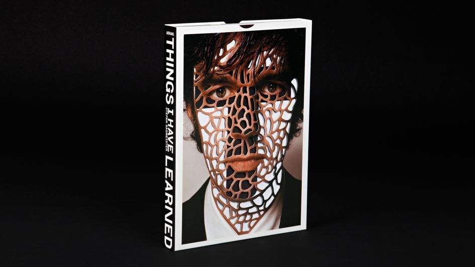
Things I Have Learned, Stefan Sagmeister


 by Tüpokompanii](https://www.creativeboom.com/upload/articles/58/58684538770fb5b428dc1882f7a732f153500153_732.jpg)


 using <a href="https://www.ohnotype.co/fonts/obviously" target="_blank">Obviously</a> by Oh No Type Co., Art Director, Brand & Creative—Spotify](https://www.creativeboom.com/upload/articles/6e/6ed31eddc26fa563f213fc76d6993dab9231ffe4_732.jpg)


