The 10 most popular stories on graphic design in 2022
Packed with inspiration and insights, these are the graphic design articles the Creative Boom audience has been most excited about over the last 12 months.
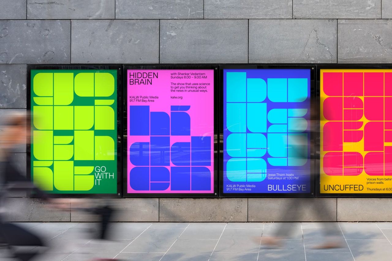
COLLINS rebrands San Francisco radio station, KALW
Whatever else has been happening in 2022, graphic designers have been in demand, more so, in fact, than ever before. Today, eye-catching, functional and thoughtful design is needed to attract public attention, guide people through processes, and increasingly interface with new media and technologies.
At Creative Boom, we've spent the last 12 months helping graphic design professionals keep up with the latest tools, trends, tech and more, as providing bucketloads of inspiration. From print to digital, motion design to AR and beyond, we've brought you the latest information and insights from the industry.
We've chatted with agency heads and well-known designers, learning how they found career success and sharing their advice on anyone following in their footsteps. We've brought you case studies of the best studio work, including not just finished pieces but behind-the-scenes glimpses into the conceptual thinking behind them and the process of creating and producing them.
We vow to keep providing you with fresh insights into 2023 and beyond. Meanwhile, though, in case you missed them, here are the 10 most popular stories on graphic design across the past year. From brilliant branding to terrific typography and resource collections to reading suggestions, you're sure to find plenty of useful tips and advice to boost your own graphic design practice below.
1. 10 high-quality design assets for serious graphic designers
When you're on a tight deadline and need to work fast, pre-built design assets are an invaluable way to speed up your workflow. But you need to be selective, which is why our article on high-quality design assets proved so popular this year. We highlighted the benefits of using someone like Supply Family, a curated marketplace for creatives that only features the best assets for your projects. From finely crafted mockups for tech, print, billboards, packaging, signage, posters, clothing, vehicles, and more.
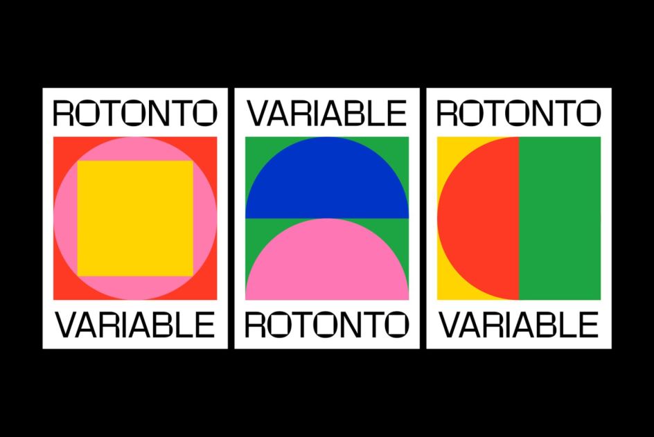
Rotonto, created by Supernulla
2. Pentagram's heartwarming identity for a charity that helps pets and their people
In April, Marina Willer and her team at Pentagram launched a super cute new identity for leading pet charity Woodgreen that was designed to reflect the charity's special mission: "to help pets and their people". At its centre lies a heartwarming mark that uses positive and negative forms to visually represent how pets and humans depend on one another. We share some of the main brand elements and explain the thinking behind them.

Pentagram's heartwarming identity for Woodgreen
3. The Faces Behind Typefaces: new web project is a deep dive into type design pioneers
Earlier this year, design tool Readymag collaborated with the Type Directors Club to create The Faces Behind Typefaces. This new web project brings together insightful conversations with some of the biggest names in type design history. If you want to learn what makes a type designer tick and get into the heads of the likes of Paula Scher, Paul Rand and Gerard Unger, this excellent resource allows you to read in-depth conversations with type design pioneers and many more.
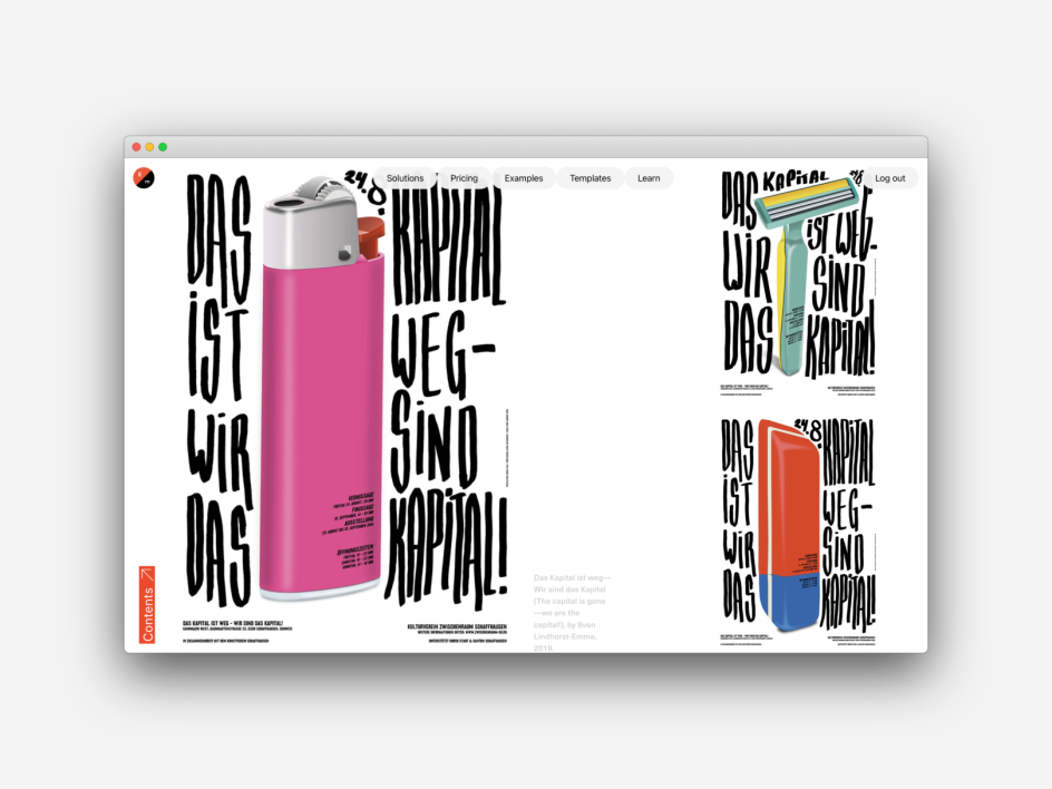
The Faces Behind Typefaces: new web project is a deep dive into type design pioneers
4. Transatlantika creates a new logo for the 'Fridays For Future' climate strike movement
Of all the recent design projects we've featured on Creative Boom this last 12 months, it was Transatlantika's fresh new designs for Greta Thunberg's global climate initiative that really grabbed your attention. You loved the simplicity behind the US and German design studio's proposal to redesign Fridays for Future's visuals. Although unsolicited, Transatlantika donated its designs and provided the assets for free so that both the organisation and individual protesters could use the logo as they saw fit. Nicely done.
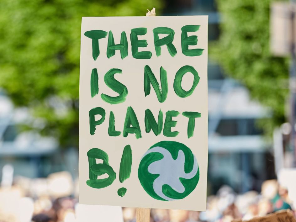
Transatlantika creates a new logo for the 'Fridays For Future'
5. Ogilvy's brand overhaul for the New York Philharmonic pays homage to its new chapter
New York is known for continually reinventing itself. And so, while the New York Philharmonic, founded in 1842, is one of America's oldest musical institutions, it couldn't rest on its laurels. In March, it launched a full rebrand of its visual identity in partnership with the global agency Ogilvy, and we delved into the process of its creation.
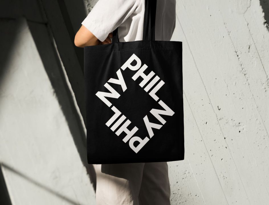
Ogilvy's brand overhaul for the New York Philharmonic
6. Michelle Mattar of Practice on brand building in the post-lockdown era and donating Fridays to meaningful work
Think of a successful branding agency, and you might imagine a firm that lands as many big clients as possible, extracts the maximum commission, and then tries to juggle endless projects at once and at a madcap pace. But Practice, an independent consultancy based in New York, couldn't be more different than that, as this interview revealed.
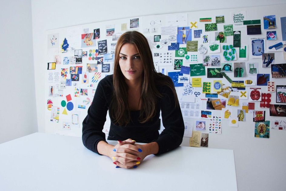
Michelle Mattar of Practice on brand building in the post-lockdown era
7. COLLINS rebrands San Francisco radio station for the next 80 years
With its 80th birthday approaching, San Francisco radio station KALW approached COLLINS – the brand experience design company based in New York and San Francisco – to create a new identity that would serve its broadcasting for the next 80 years. COLLINS decided to use a stencil for the logo mark and a brand system full of bold colours and simple styles inspired by jazz and classical concert posters from the 1950s and '60s. There's even a dash of Disney, resulting in an overhaul that will help "reimagine and redefine local radio".
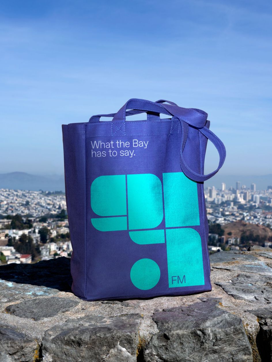
COLLINS rebrands San Francisco radio station, KALW
8. 50 questions to ask clients when designing a logo
Designing a logo isn't a case of just dashing off a quick sketch and hoping the client likes it. A professional logo designer will first get to know the company, its strategies, ambitions and goals. So just asking for a brief isn't enough. You need to employ all your skills and experience to uncover what lies beneath the company or brand. To help you out, we've put together a handy list of questions to answer your client.

Questions to ask when designing a logo. Image licensed via Adobe Stock
9. Bulletproof founder Gush Mundae on the five books that have inspired his creative journey
Throughout 2022, we ran a popular series focusing on the five books that inspire different creatives worldwide. Out of all of them, Bulletproof founder Gush Mundae's top picks got you most animated. These books reveal a little of what Gush has been through to build a business from nothing. From street art to inspiring outliers, it's clear that Gush's life and career so far have been far from ordinary, and neither is his reading selection.
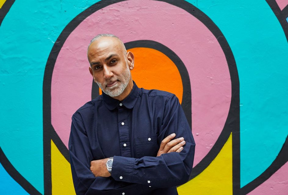
Gush Mundae of Bulletproof picks his top five books
10. NF-Type and branding biodiversity lead the charge in Monotype's 2022 trend report
2021 saw plenty of amazing typographic work emerge from creative agencies worldwide. To help us learn from their success and see what would continue to be influential, Monotype unveiled the Type Trends 2022 report in March this year. It's not so much an ad for the studio as a resource to help designers get to the root of creative storytelling.
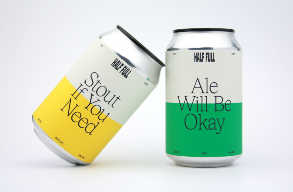
Trend: Svelte Serifs. Half Full. Agency/designer: Inside Fred


 by Tüpokompanii](https://www.creativeboom.com/upload/articles/58/58684538770fb5b428dc1882f7a732f153500153_732.jpg)

 using <a href="https://www.ohnotype.co/fonts/obviously" target="_blank">Obviously</a> by Oh No Type Co., Art Director, Brand & Creative—Spotify](https://www.creativeboom.com/upload/articles/6e/6ed31eddc26fa563f213fc76d6993dab9231ffe4_732.jpg)



](https://www.creativeboom.com/upload/articles/7c/7c67c49a08509fe07cc876daeb872d58a7026a0e_732.jpg)
