16 handmade album covers created by graphic design students
As creatives, we love a good "handmade" brief. It's something we often task our students at Shillington with. To design an album, book cover or movie poster of their choice, but with a major twist. They have to think outside the box, away from a computer screen.

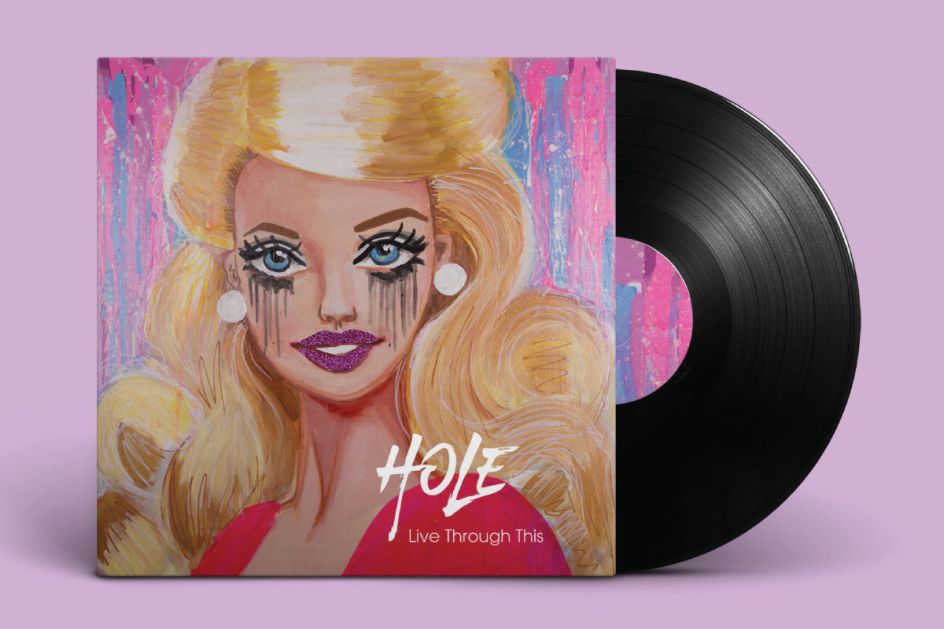
Live Through This – Hole by Phaedra Peer. All images courtesy of Shillington and its students.
Having to work with their hands can yield incredible outcomes. They're forced to explore what they know about the design principles, colour theory, lateral thinking and typography – away from the influence of digital.
Students usually learn a new skill or tackle a new technique – then bring it on-screen to finesse and finalise. It’s obviously a challenge to reimagine their sleeves, picking from hundreds of thousands of existing musical masterpieces, but we’re always amazed by the results.
We’ve selected 16 super cool designs created by Shillington students, inspired by the singles and albums of hip-hop artists, vintage rockers and contemporary pop musicians.
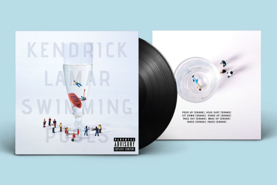
1. Swimming Pools – Kendrick Lamar by Alexander Wu Kim
Swimming Pools is a record by one of hip hop’s finest, Kendrick Lamar, and is the hit song from his album ‘Good Kid, m.A.A.d city’. The single is introspective of both Lamar’s and his family’s toxic relationship with alcohol. Hence, the inspiration behind Alexander Wu Kim's record sleeve.
"The song was, in part, inspired by his grandfather’s drinking habits and resulting death as well as the pressure he felt from his peers to 'get a swimming pool full of liquor' and then 'dive in it'," explains Alexander.
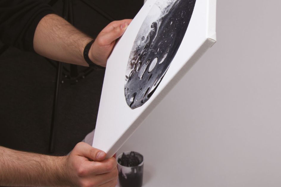
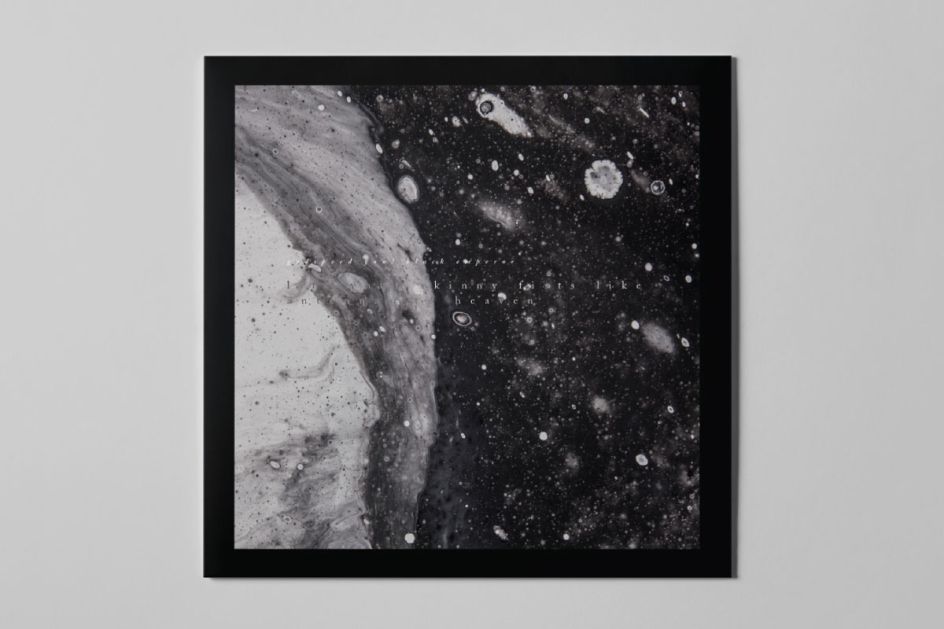
2. Luciferian Towers – Godspeed You! Black Emperor by Ali Keshtmand
For her interpretation of the latest album by Canadian rock band Godspeed You! Black Emperor, Ali Keshtmand considered a theme that was "organic, infinite and apocalyptic". Her resulting cover – made from a mixture of grey, white and black paint, poured onto canvas – is indeed dark and sinister, perfectly reflecting the band's experimental music.
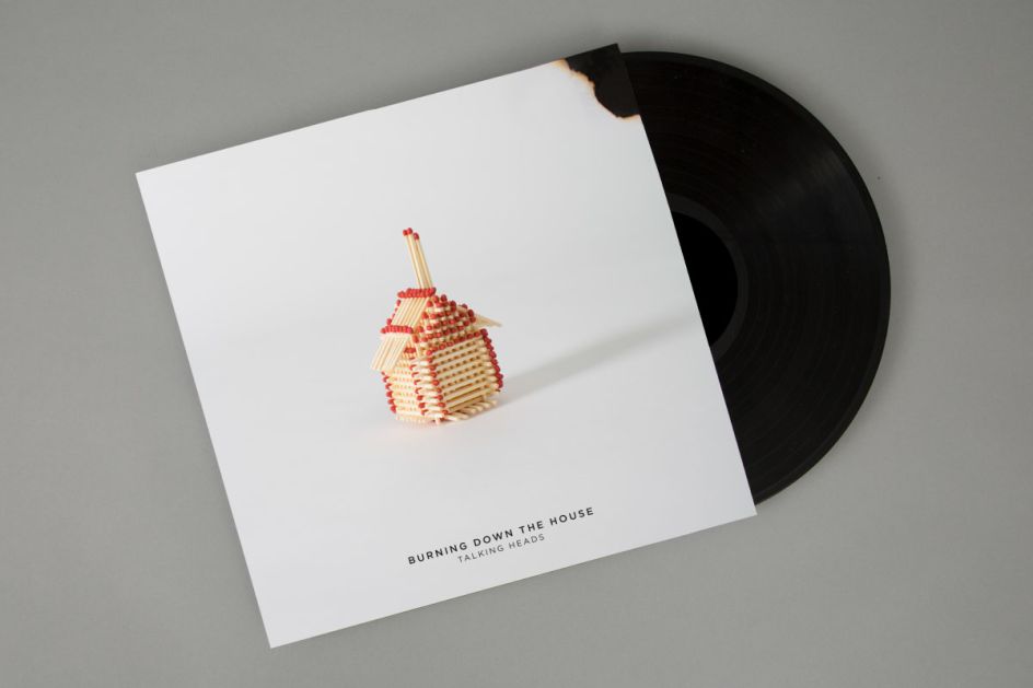
3. Burning Down The House – Talking Heads by Alicia Yeats
What do you use if you want to depict a burning house? Our design student, Alicia Yeats, cleverly chose matchsticks and crafted a miniature house made from hundreds of them. She even added burnt corners to the record sleeve, perfectly following the theme.

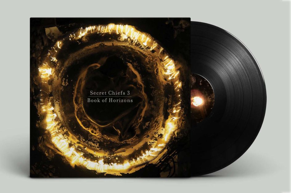
4. Book of Horizons – Secret Chiefs 3 by Chris Turalski
Chris Turalski created a "ruthless design for a groundbreaking album that tears apart the notions of music, spirituality, reality, and self." His handmade and burning artwork achieves the ideal setting for Book of Horizons, the fourth studio album by Secret Chiefs 3.
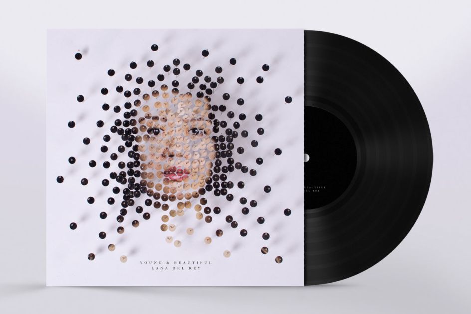
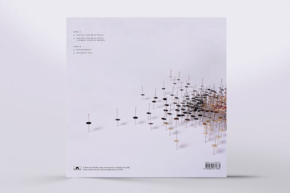
5. Young & Beautiful – Lana Del Rey by Gabriella Tato
In Young and Beautiful, Lana Del Rey asks the age-old question, "Will you still love me / when I’m no longer young and beautiful?" Inspired by this theme and the fragmented portraits of artist Michael Mapes, Gabriella Tato crafts an unusual, fragmented portrait of a young woman whose expression is meant to capture the innocence of young love even as the physical body "fades" away.
6. Rooms of the House – La Dispute by Hamish Hunter
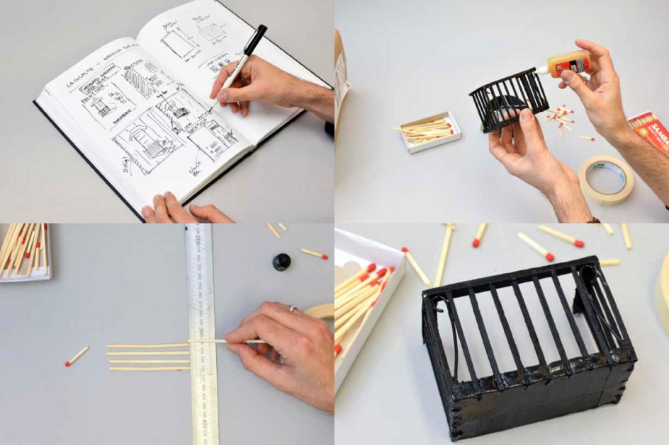
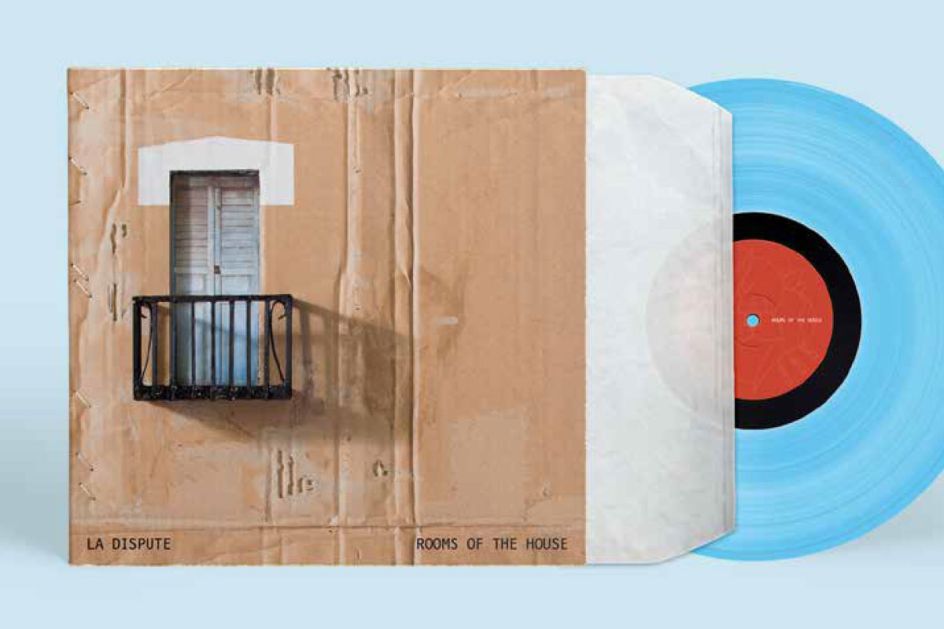
This incredible handmade cover for La Dispute's Rooms of the House was created by Hamish Hunter, one of our Shillington students at Brisbane.
The concept album is built around lyricist Jordan Dreyer's fabricated stories of a couple's break-up spanning decades in a genuinely realistic timeline. "The idea behind the cardboard building came directly from lyrics used throughout the album of moving boxes from a family home and stories of the couple's children playing house in their basement," explains Hamish.
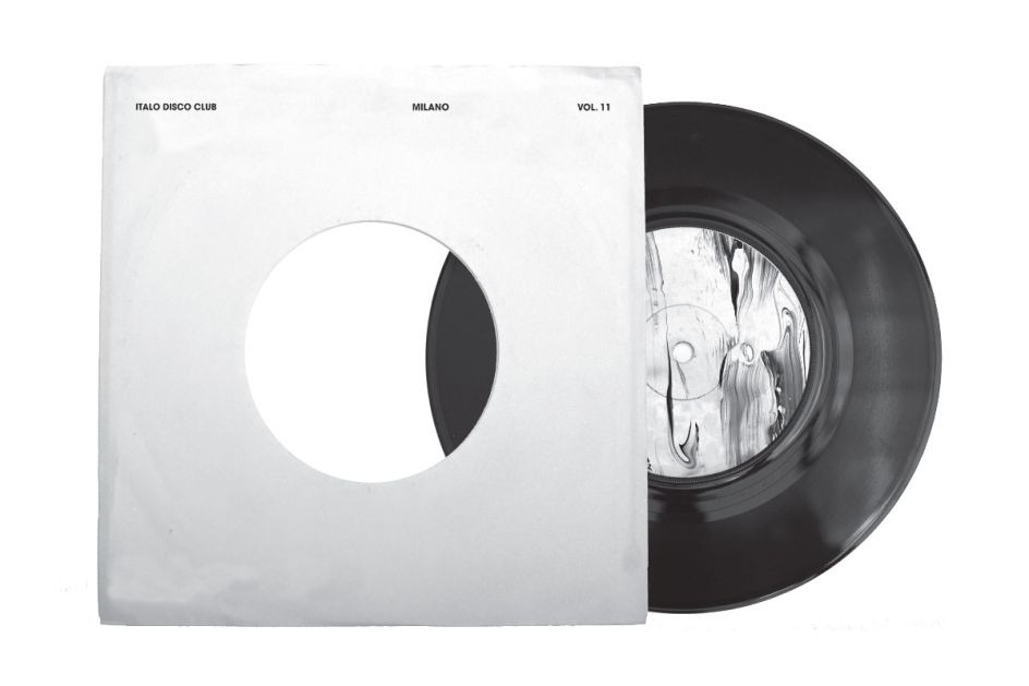
7. Italo Disco Club – Milano by Katie Love
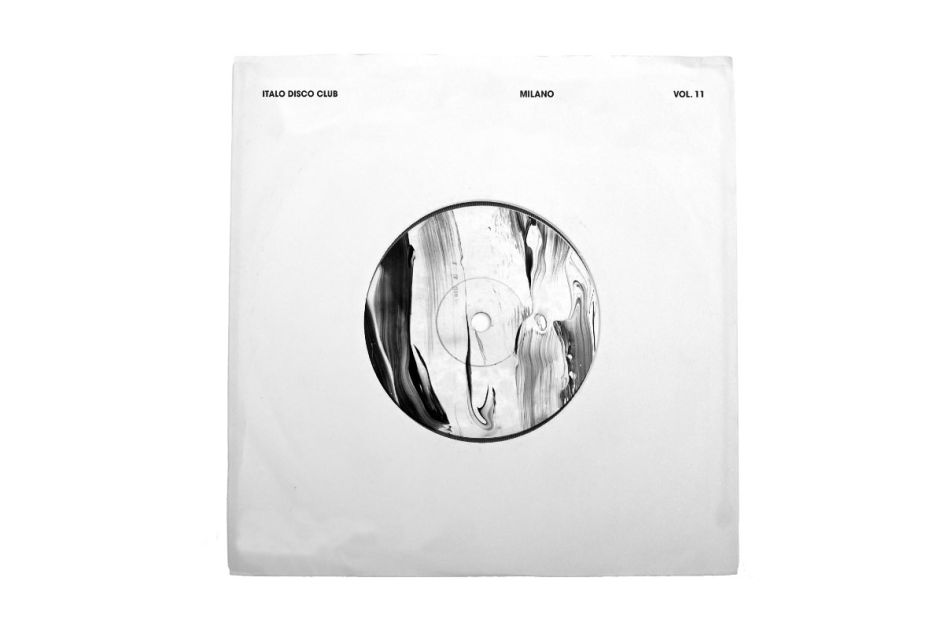
Imagining the hedonistic sounds of Boiler Room's Italo Disco Club in Milano, Katie Love paints a simple, monochrome cover that dreams up images of dance, sweat and good times. Elegant and honest, it's a confident design that speaks for itself.
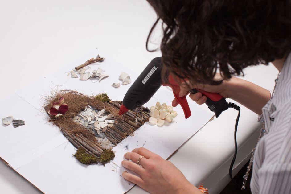
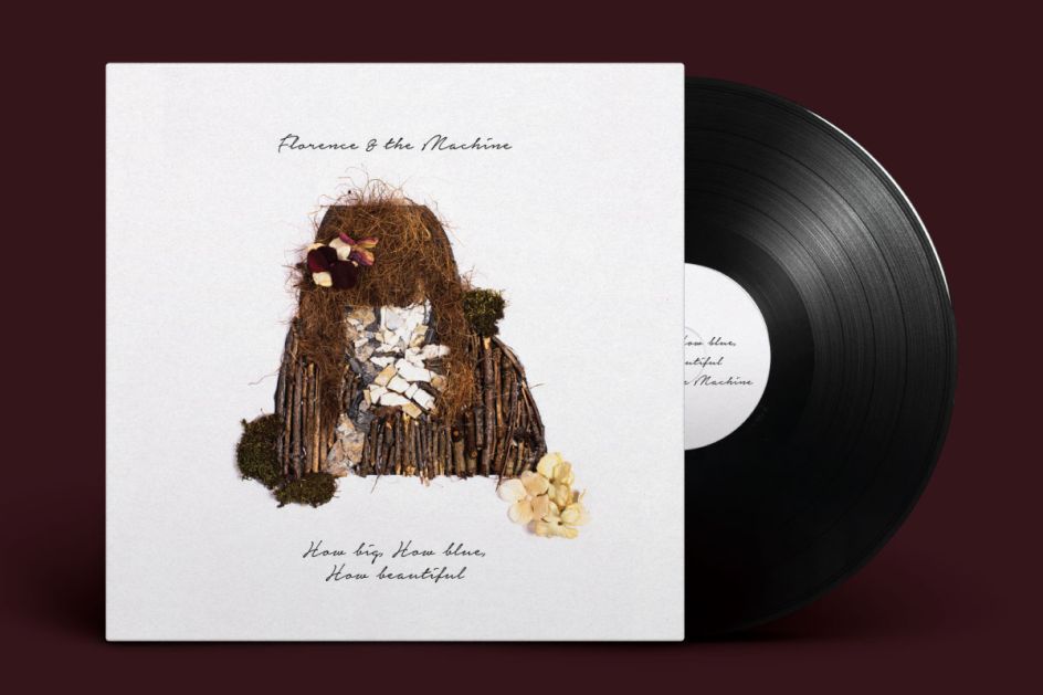
8. How Big, How Blue, How Beautiful – Florence and the Machine by Lauren Peterson
For her incredible design, Lauren Peterson blew us away with a hand-crafted portrait of frontwoman Florence Welch of Florence and the Machine. Made from bigs of twig, flower petals and other natural materials, the depiction of light and shadow across the musician's face is out-of-this-world.
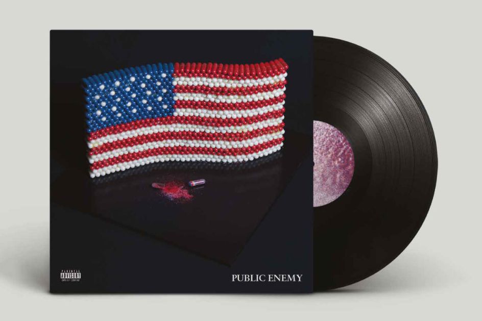
9. It Takes a Nation of Millions to Hold Us Back – Public Enemy by Matt Holmes
Matt Holmes decided to set himself a monumental task for his handmade project, choosing Public Enemy's album, It Takes a Nation of Millions to Hold Us Back.
The design encompasses the theme of the album and in particular the track Night of the Living Baseheads, which highlights the lack of government action against the rising drug problem in America. Matt used hundreds of tiny beads to build up the American flag before photographing his work for the cover.
10. Sunday Candy – Chance the Rapper by Monica Farag
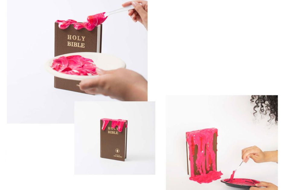
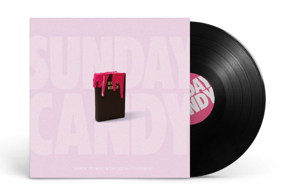
To create a cover for Chance the Rapper's single, Sunday Candy, Monica Farag took an old copy of The Bible and poured bright pink, gloopy paint onto it. She then photographed the text and placed the image onto an appealing candy-coloured sleeve.
11. Bloom – Rüfüs by Nat Jacotine
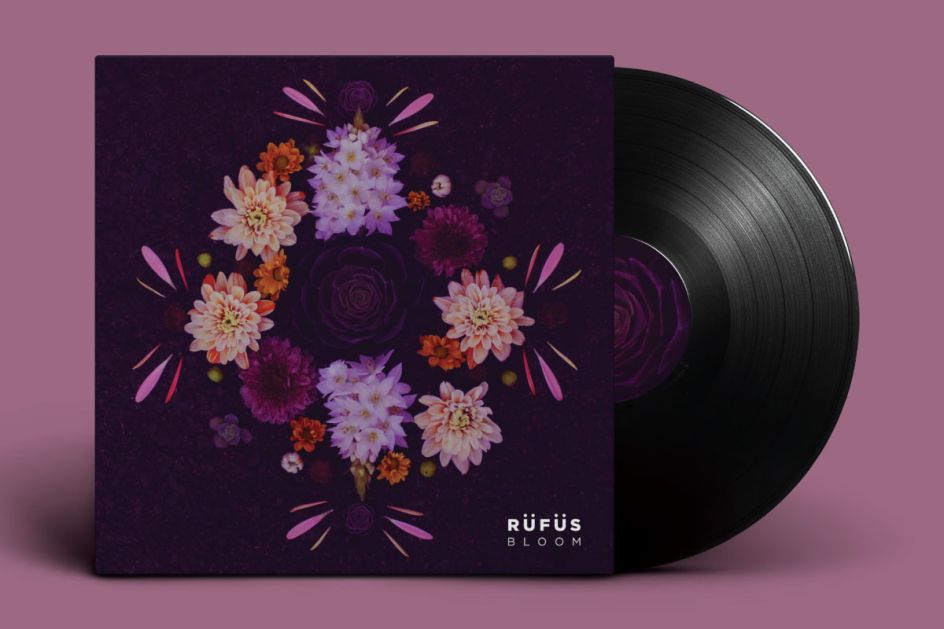
Bloom is the second studio album of the alternative dance group, Rüfüs and the inspiration for Nat Jacotine's project at our Shillington campus in Melbourne. Taking a mixture of beautiful flowers and petals, Nat arranged them to be photographed and placed on a dramatic black sleeve.
12. Drones – Muse by Nick Petzing
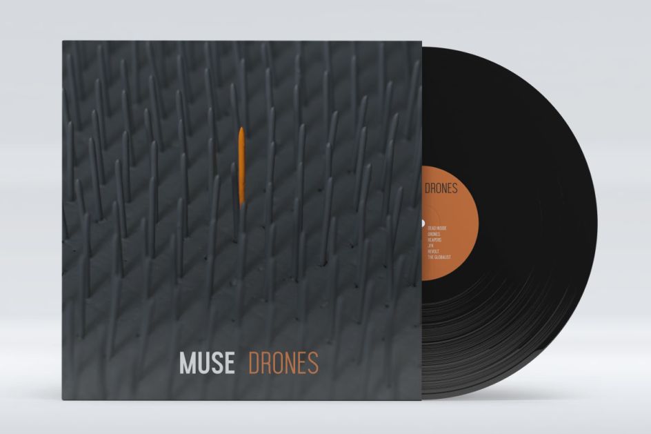
Nick Petzing was a firefighter with zero design experience before he enrolled at Shillington. Which is why we especially love his design for Muse's latest album, Drones – futuristic, dark and very much in line with the rock band's dark theme. We love the black depressing theme with a dash of bright orange, pointing to a robotic future where machines have taken over the world. To see more of Nick's work, watch his showreel.
13. Live Through This – Hole by Phaedra Peer
Phaedra Peer crafted an album cover for Hole's album, Live Through This. "I painted this image of a Barbie as it represents the fragility beneath the immaculate facade that is presented to the world which is my interpretation of many themes within this album," she explains.
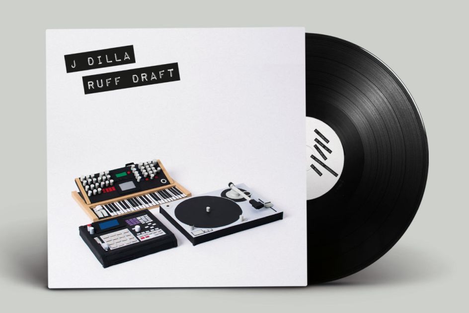
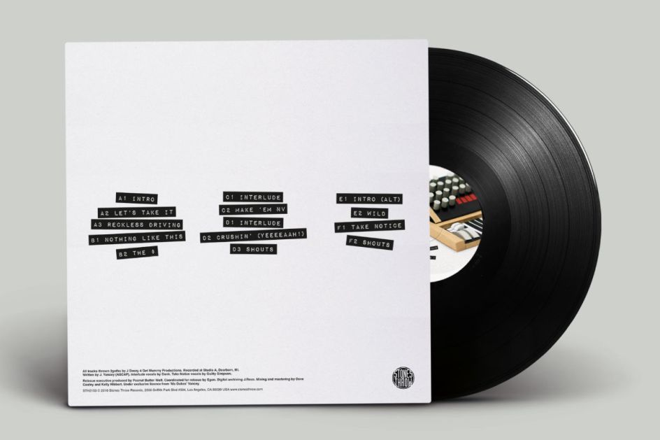
14. Ruff Draft – J Dilla by Robert Mead
Recorded as a reaction to the over-polished sound of mainstream hip-hop, Ruff Draft is one of the rawest albums in J Dilla’s expansive catalogue. The entire release was recorded and produced using only a turntable, synthesiser and MPC.
For our Sydney student Robert Mead's handmade project, he focused on "conveying the lo-fi sound of the record by reducing these three complex machines to simple forms made out of coloured paper".
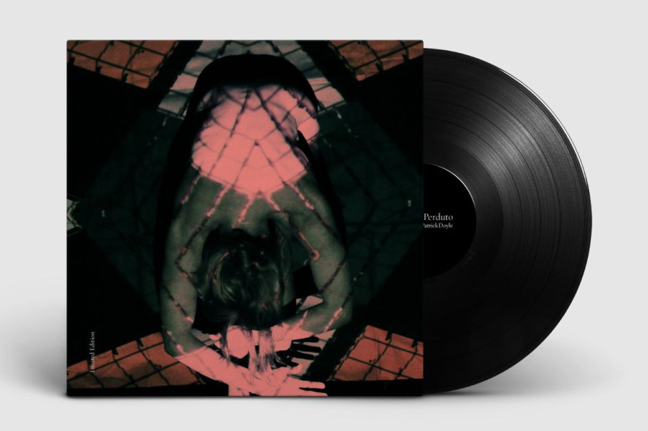
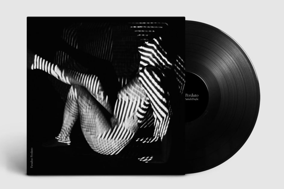
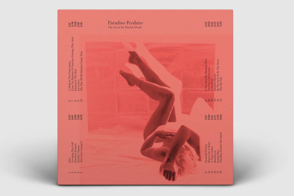
15. Great Expectations (The Score) – Patrick Doyle by Stefania Timanti
Stefania Timanti took inspiration from "true love tangled in a web of manipulation, hatred and rejection", as outlined in the coming of age novel, Great Expectations by Charles Dickens, which was modernised into a screenplay in 1988.
For its limited edition score by Patrick Doyle, Stefania projected twisted patterns onto nude female forms to represent this web of passion, desire and infatuation.
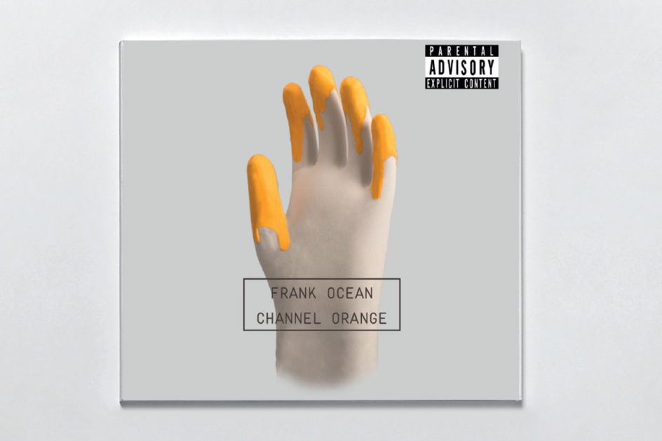
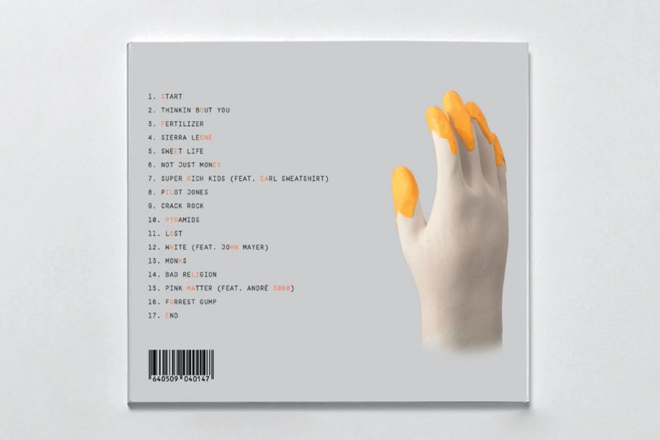
16. Channel Orange – Frank Ocean by Vitor Nano
Vitor Nano decided to redesign the CD cover of Frank Ocean’s album Channel Orange. "Frank Ocean said that the name of the album comes from the colour he 'felt' when he first fell in love, so the solution was to bring the feeling of synesthesia (mixed senses) to a hand touching the colour orange," explains Vitor.


 by Tüpokompanii](https://www.creativeboom.com/upload/articles/58/58684538770fb5b428dc1882f7a732f153500153_732.jpg)

 using <a href="https://www.ohnotype.co/fonts/obviously" target="_blank">Obviously</a> by Oh No Type Co., Art Director, Brand & Creative—Spotify](https://www.creativeboom.com/upload/articles/6e/6ed31eddc26fa563f213fc76d6993dab9231ffe4_732.jpg)


