18 inspiring handmade book covers created by graphic design students
How do you cope with the pressure of designing something that will not only stand out from thousands of other books but entice the reader to look inside? To perfectly convey or hint at its contents?

© Sam Alexander. All images courtesy of Shillington and its students.
Our students at Shillington are regularly tasked with design briefs to produce their own editorial covers of popular titles. Here, we share some recent superb examples of book designs that we wish existed so we could add them to our own shelves.
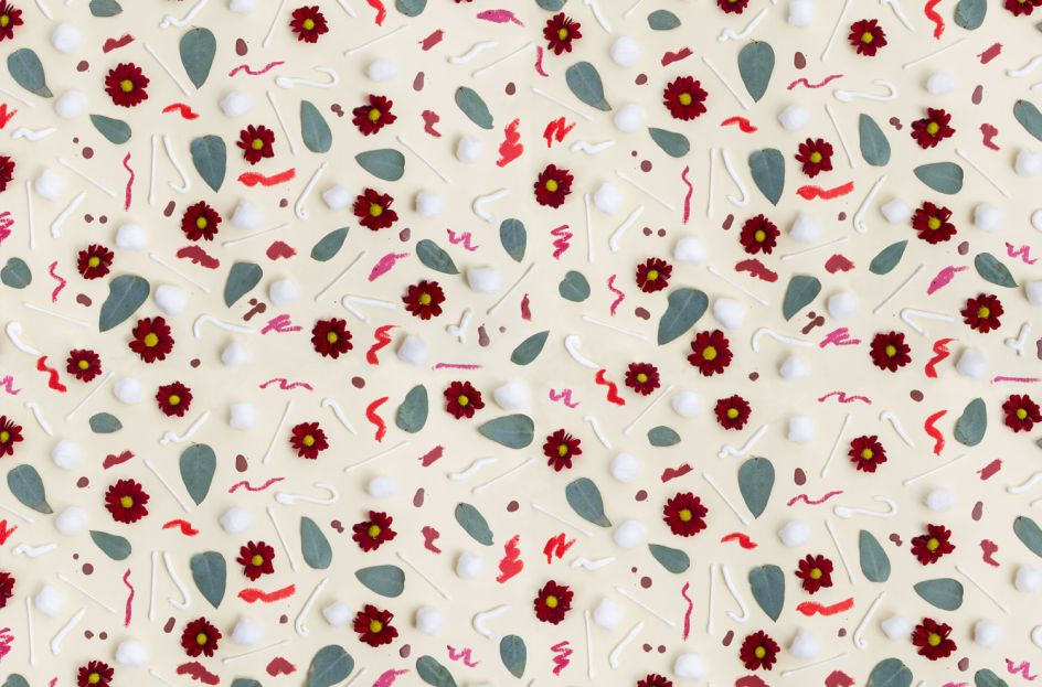
1. French Complexion, Christine Clais – Aimee Harel, Melbourne
For an alternative version of French Complexion by Christine Clais, Aimee Harel photographed lots of cotton buds, cotton wool, flower petals and creams to create a pretty, repetitive background. We love the little squiggles of lipstick too.

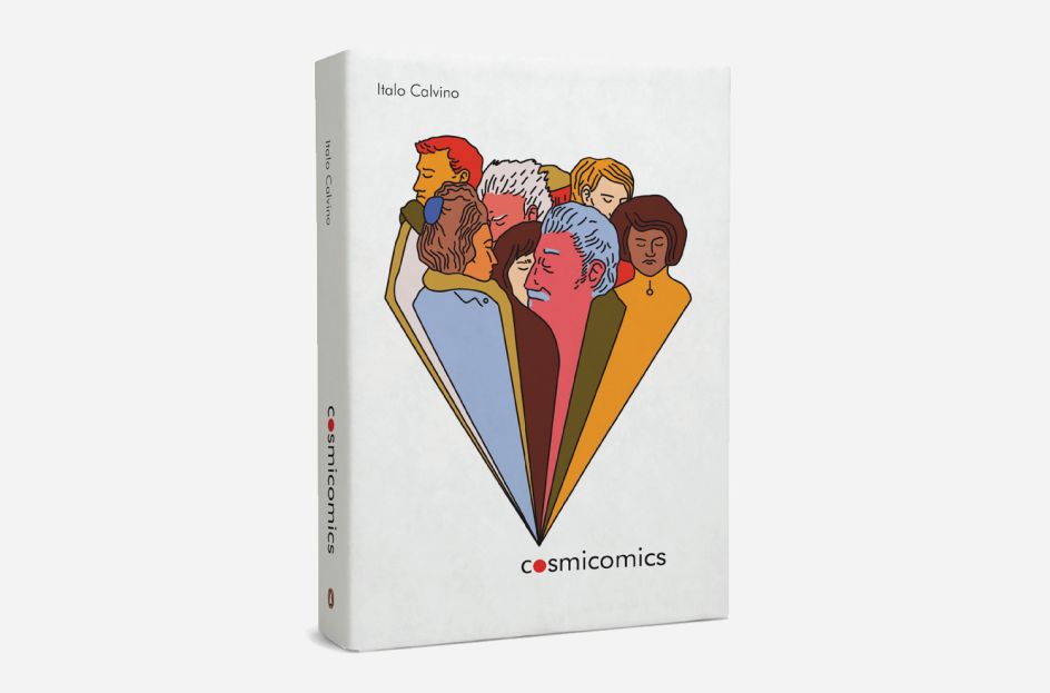
2. Cosmicomics, Italo Calvino – Caroline McClain, New York
"I designed a book jacket for one of my favourite short story collections, Cosmicomics by Italo Calvino," says Caroline McClain. "The book is a collection of imagined creation stories; for the cover design, I focused in particular on a story called All at One Point, describing crowded living conditions before the Big Bang."
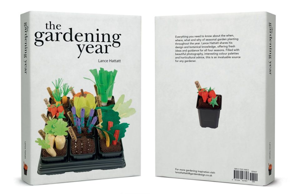
3. The Gardening Year, Lance Hattatt – Caroline Robinson, London
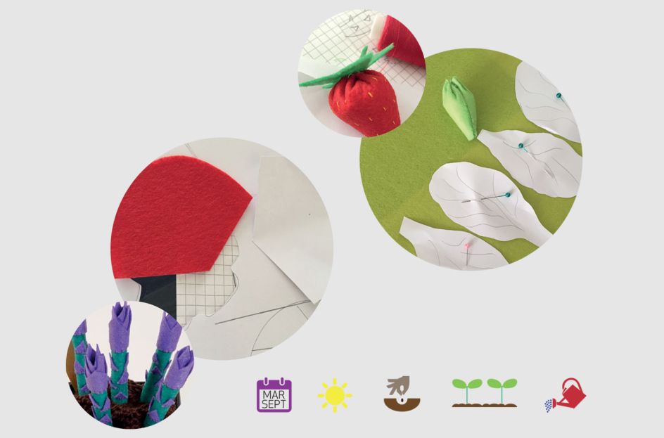
For her student brief, Caroline Robinson was asked to design a cover that represents the book, The Gardening Year, and produce a piece of handmade art that can be used as the central creative feature. Caroline rolled her sleeves up and produced beautifully intricate felt food before photographing her crafted creations.
4. Burial Rites, Hannah Kent – Daniel Kan, London
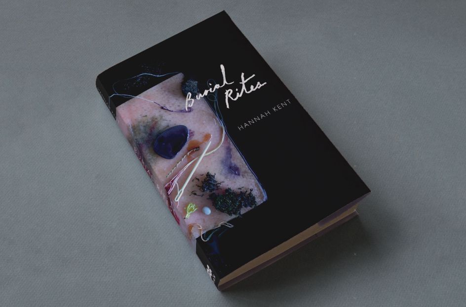
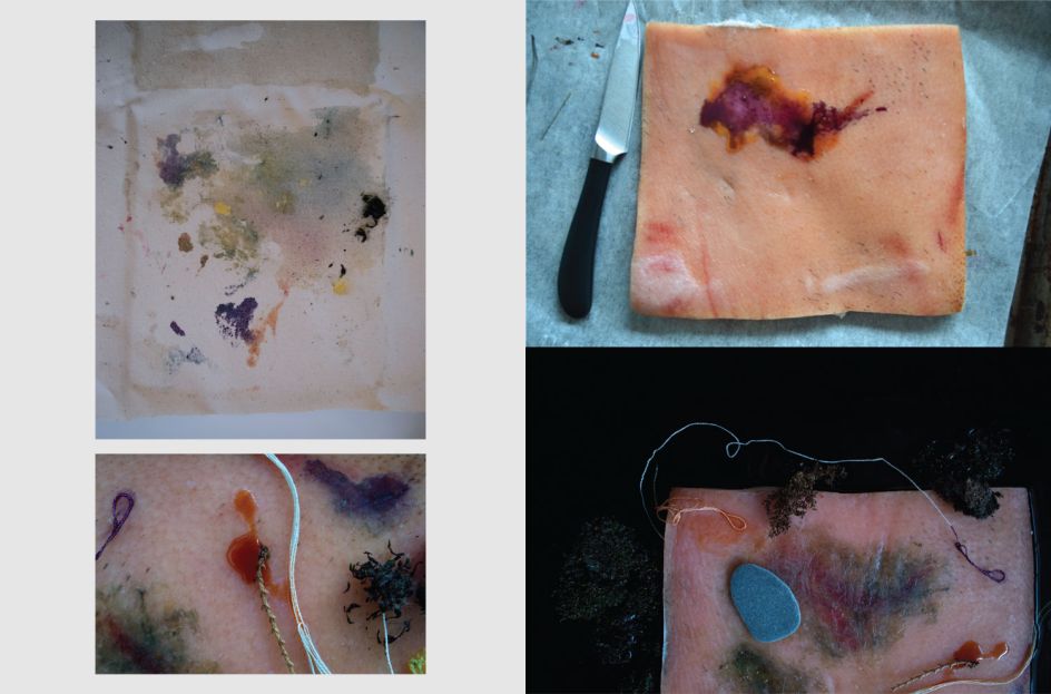
Daniel Kan went down a fairly dark route with his interpretation of Hannah Kent's Burial Rites. Not surprising when the lead character is accused of double murder and witchcraft. To craft his flesh-type cover, Daniel used various dyes, canvas and egg yolk along with an embroidery needle, human hair, moss, pebbles, pigskin and pine needles.
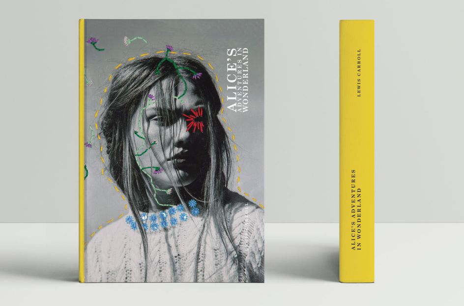
5. Alice's Adventures in Wonderland, Lewis Carroll– Ella Murray, London
London designer Ella Murray chose Lewis Carroll's classic, Alice's Adventures in Wonderland, for her book cover but she added a contemporary twist. Using a photograph of a more modern Alice and then applying a needle and thread to add colour and drama, Ella's final design is distinctive and unique.
6. The Art of the Deal, Donald Trump – Greg Morrison, New York
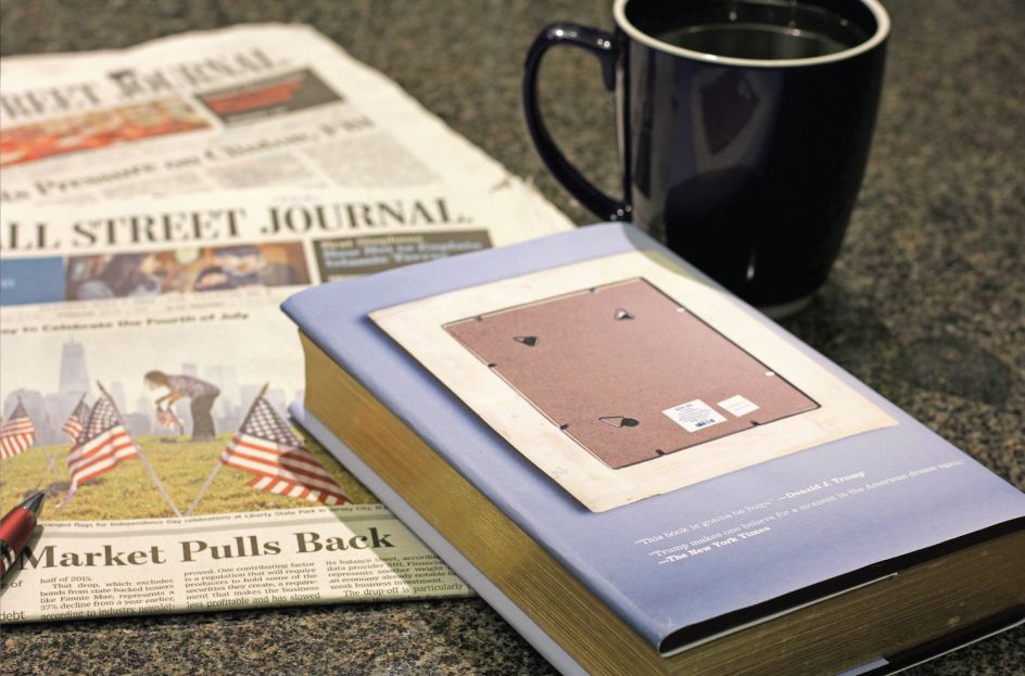
Taking a political angle, Greg Morrison was inspired to create a fresh cover for Donald Trump's The Art of the Deal. "A best-selling business book becomes a junk food portrait, with a side of social commentary," explains Greg, one of our Shillington graduates from New York.
With liquorice lips for Donald's famous pout, chicken nuggets for his ears and french fries for his blonde hair, this is a cover almost good enough to eat.


7. The Jungle Book, Rudyard Kipling – John Cox, New York
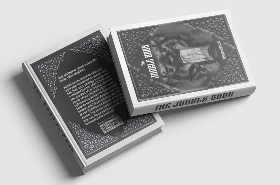
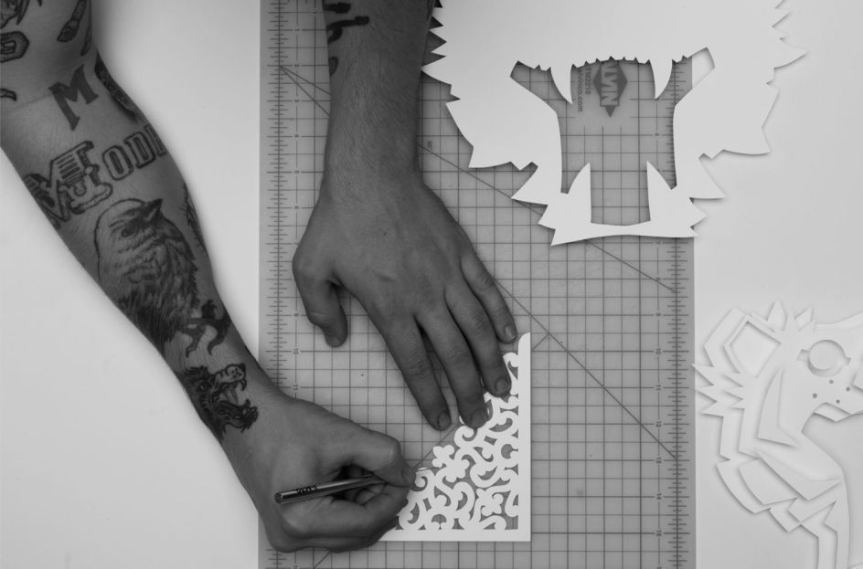
John Cox took on the epic challenge of reimagining Rudyard Kipling's The Jungle Book and we think you'll agree, it's rather wonderful. Cutting out six different layers of thick white paper, John played with light and shadow to create depth, texture and various shades of grey.
"Mowgli faces many challenges in the jungle during the story, obviously climaxing with his battle with Sheer Khan," says John. "I wanted to highlight this with my cover while also showcasing Mowgli's bravery. I illustrated a picture of Mowgli looking deep into the belly of the jungle in the gaping mouth of his adversary."
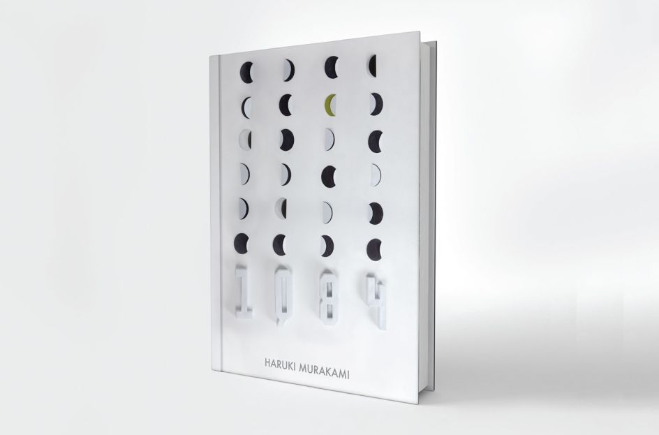
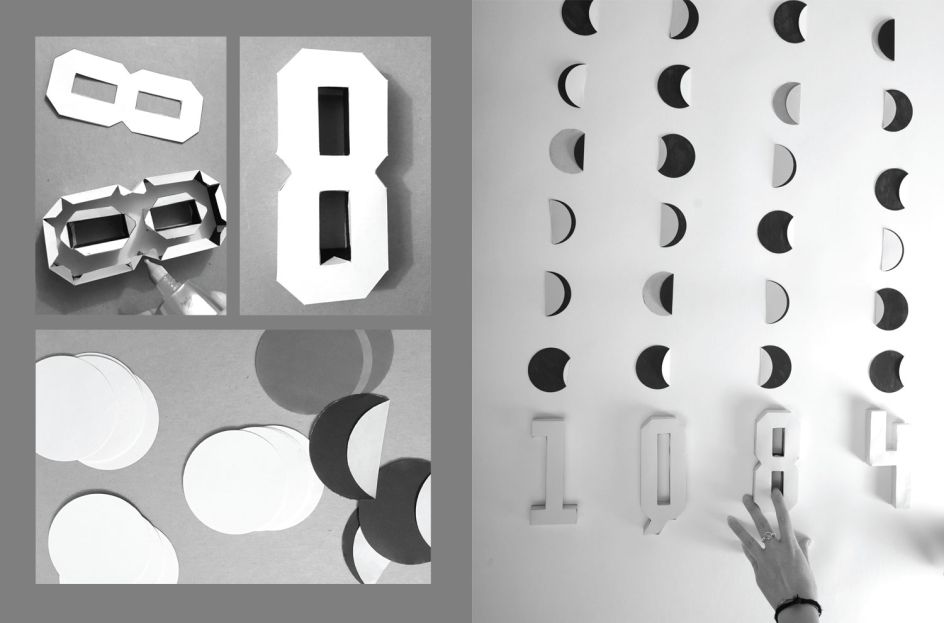
8. 1Q84, Haruki Murakami – Kirsten McColl, New York
Kirsten McColl, who has quite the impressive portfolio, decided to come up with her own book cover design for Haruki Murakami’s novel 1Q84, featuring handmade typography and other appealing elements. A beautiful piece of work.
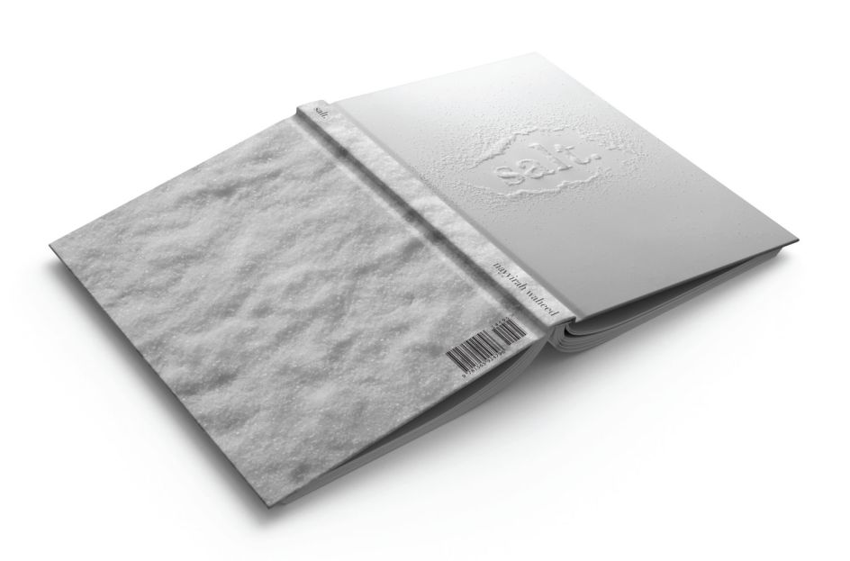
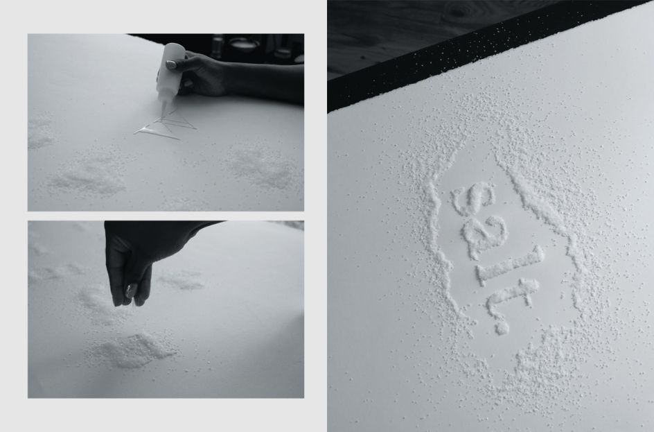
9. Salt, Nayyirah Waheed – Kyra Price, New York
New York's Kyra Price crafted a handmade typeface and book cover for her version of Nayyirah Waheed’s Salt, featuring short, yet powerful and textured poems. From minimal salt typography on white to letters cut and aligned by hand, this is a design definitely worth admiring.
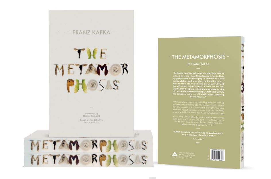
10. The Metamorphosis, Franz Kafka – Marina De Salis, Manchester
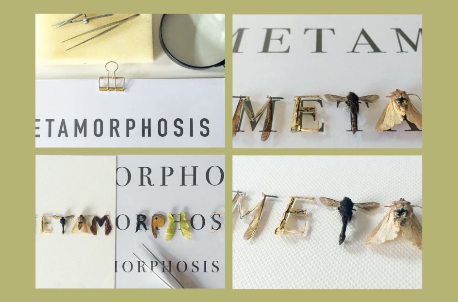
The Metamorphosis is a novella written by Franz Kafka which was first published in 1915. It's a title that inspired Marina De Salis to come up with a new book design – one that would bring the classic text into the 21st Century.
With typography digitally crafted out of various insects, curved and manoeuvred into different letters, it's a beautifully executed idea.
11. Alice's Adventures in Wonderland, Lewis Carroll – Nicole Koncz, Sydney
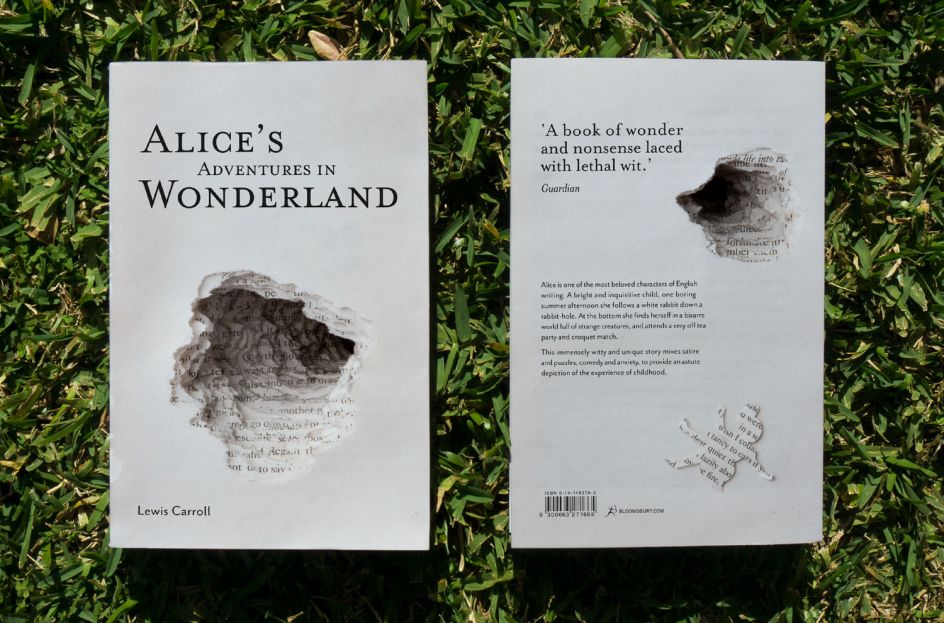
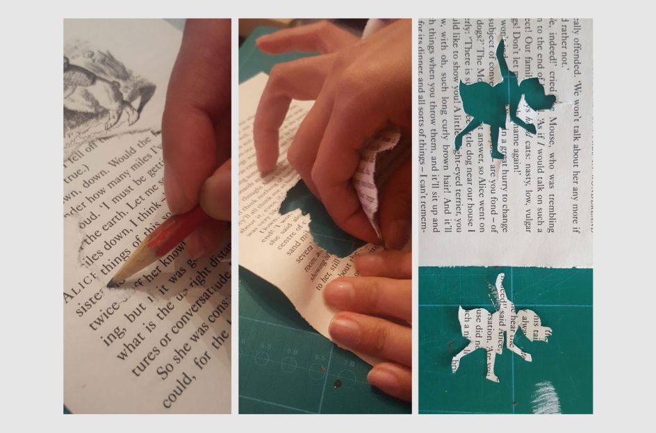
Here's another contender for Alice's Adventures in Wonderland – because who doesn't love Lewis Carroll's literary classic? Nicole Koncz from Sydney decided to delve into the overarching theme of the story: "I subverted the idea of a traditional book cover by using the physical inside pages of the book on the outside.
"I took the book apart, tore holes in each page and layered them to create the illusion of the rabbit hole. Just as Alice falls into Wonderland, the reader is consumed by the book, and falls in after her."
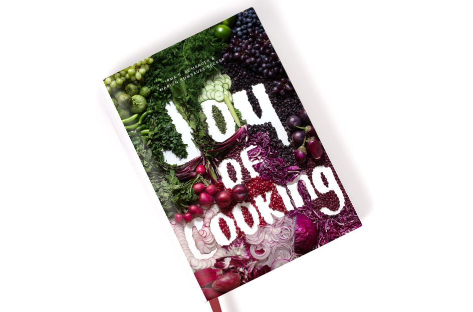
12. Joy of Cooking, Irma Starkhoff Rombauer – Nina Caldas, New York
We love this fresh and vibrant approach to one of America’s bestselling cookbooks of all time, Joy of Cooking. In fact, there's clearly real joy in Nina Caldas's cover design. Stuffed to the brim with chopped herbs, fruits and vegetables, Nina has carved out white space to spell out the title of this authoritative American classic.
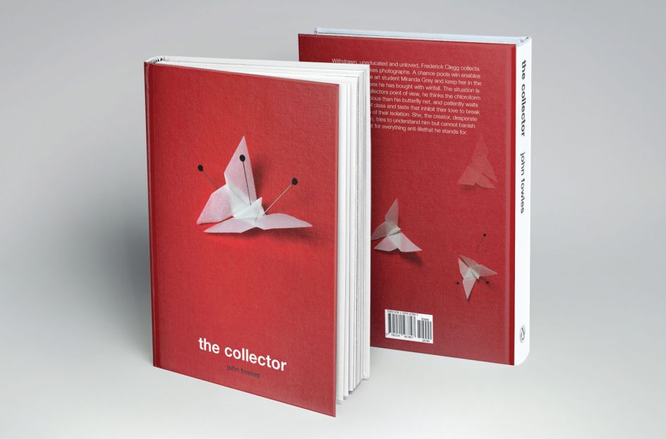
13. The Collector, John Fowles – Olga Romanova, New York
Olga Romanova looked to The Collector for her fictional cover design – the 1963 debut novel by author John Fowles. Her handmade origami butterflies pinned to a board represent the curious and mysterious plot of the novel.
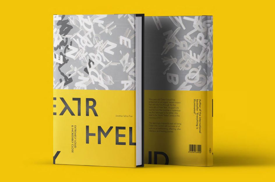
14. Extremely Loud and Incredibly Close, Jonathan Safran Foer – Ray Wong, London
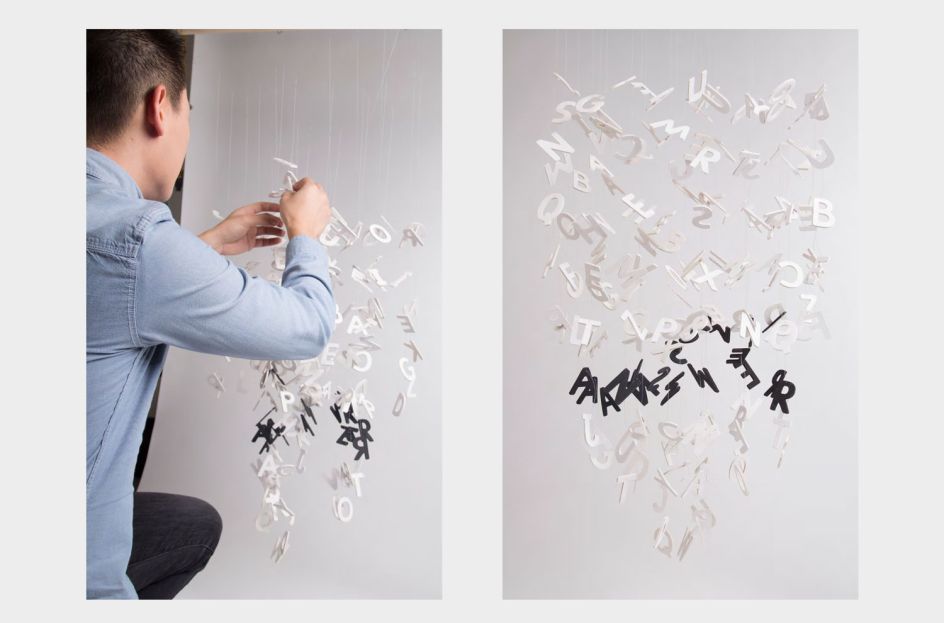
Ray Wong was moved by Extremely Loud and Incredibly Close by Jonathan Safran Foer, a bestselling novel about tragic loss and the aftermath of 911. Ray created an installation for the cover of the book to portray the emotional journey of the characters in the story.
15. White Teeth, Zadie Smith – Renée Lemieux, Manchester
Renée Lemieux looked to Zadie Smith's White Teeth to sink her own teeth into crafting an alternative book cover design. Using a bright and bold palette, Renée created multicoloured typography by cutting, layering and glueing each letter to hint at a rainbow against a blue and cloudy sky.

16. Sidewalk Flowers, Jonarno Lawson – Sam Alexander, Sydney
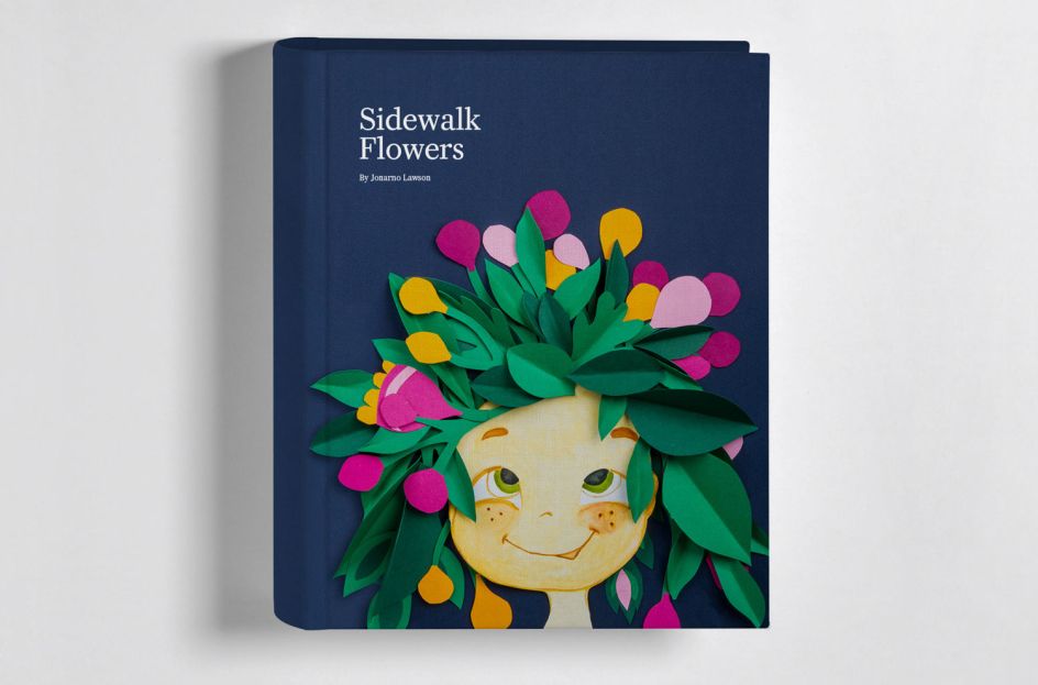
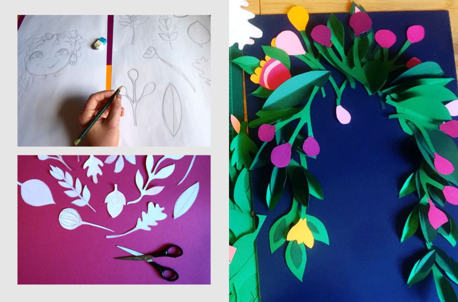
For her book cover, Sydney's Sam Alexander was inspired by Sidewalk Flowers, a wordless picture book by Jonarno Lawson that features a little girl who collects wildflowers while her distracted father pays her little attention. Using multiple layers of card, cut into flowers, petals and leaves, Sam's design is rich, colourful and inviting.
17. The Amazing Adventures of Kavalier & Clay, Michael Chabon – Sam Jacobs, New York
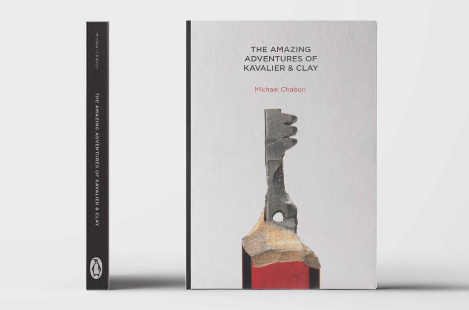
Sam Jacobs – a Shillington graduate who has landed his dream job at Time Inc. – designed a handmade book cover for The Amazing Adventures of Kavalier & Clay, taking inspiration from the superhero elements of the story. His design for Michael Chabon's book includes a key, intricately carved out of the tip of a pencil. Incredible.
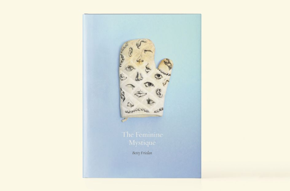
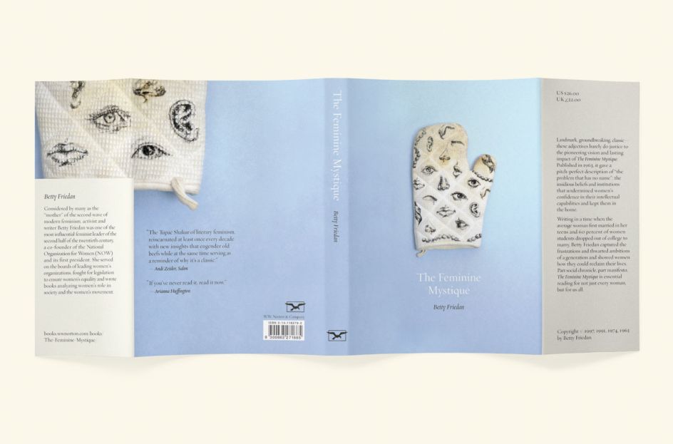
18. The Feminine Mystique, Betty Friedan – Sophie Forman, New York
Betty Friedan's The Feminine Mystique formed the basis of Sophie Forman's book cover design. She wanted to create a jacket for the 1963 seminal feminist classic using handmade objects, like a burnt oven mitt covered in beautiful illustrations hinting at the book's contents.


 by Tüpokompanii](https://www.creativeboom.com/upload/articles/58/58684538770fb5b428dc1882f7a732f153500153_732.jpg)


 using <a href="https://www.ohnotype.co/fonts/obviously" target="_blank">Obviously</a> by Oh No Type Co., Art Director, Brand & Creative—Spotify](https://www.creativeboom.com/upload/articles/6e/6ed31eddc26fa563f213fc76d6993dab9231ffe4_732.jpg)


