A close shave: Portland England seeks inspiration from the Shipping Forecast for its brand identity
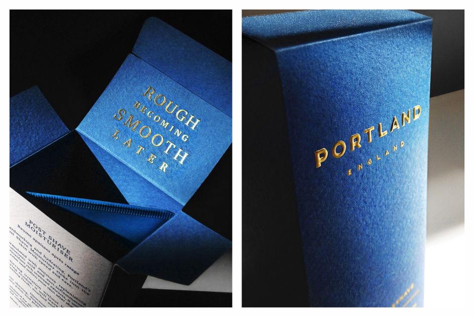
With the help of designer James Burton, skin care company Portland England has launched a new brand identity inspired by the British tradition of the Shipping Forecast.
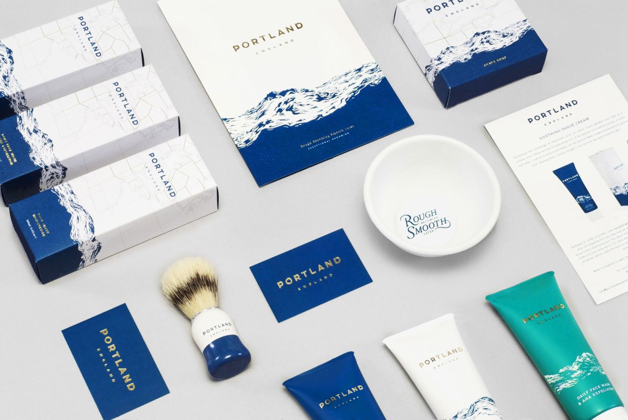
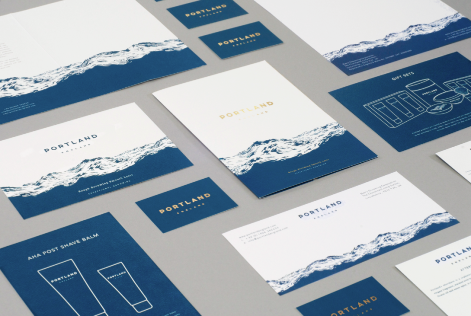
As the core brand is based on providing exceptional skin care, focused on hydration and preparing men for the day ahead, "whether battling force eight gales or boardroom storms", a water themed design for its packaging, stationary and website made complete sense.
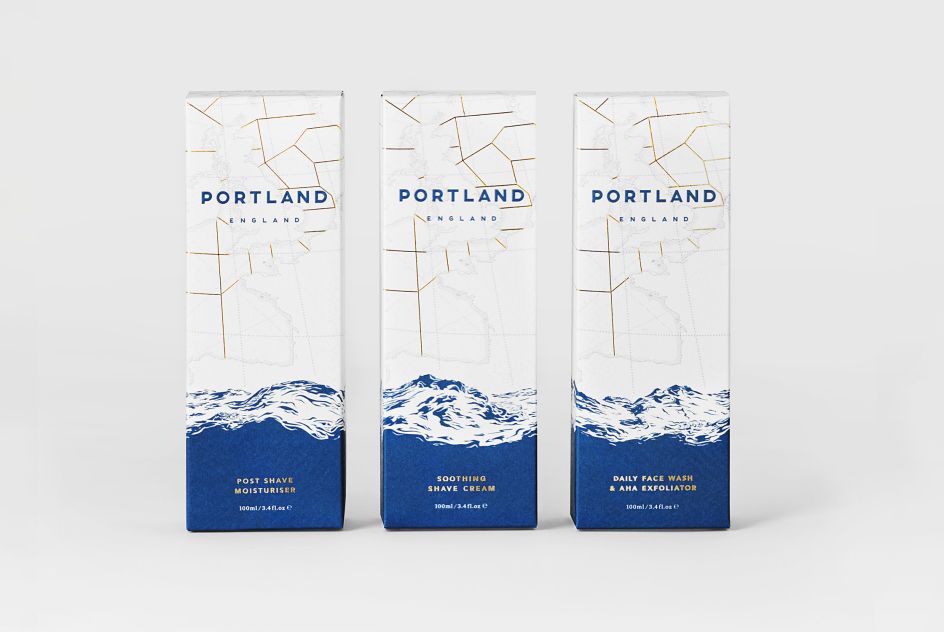
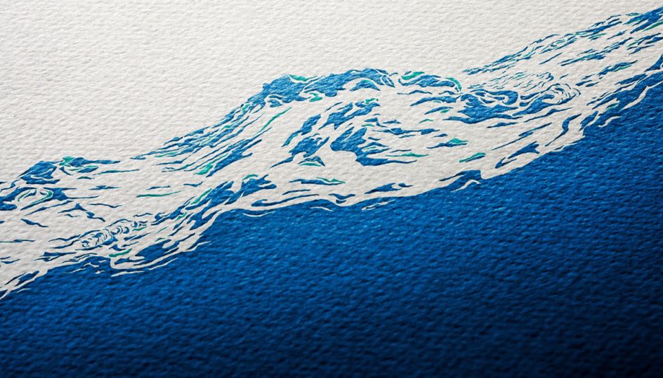
Burton explains: "The continuous modular sequence of the wave was used to bring the products together, emphasising the hydrational performance of the products and the rugged nature of the open seas."
The collection is made up of 14 products, with a total of 25 elements. Details associated with the Shipping Forecast can be seen throughout, such as in the gold foil – used to represent boundaries on a map.
The concept behind the branding was well-received by the design community, and Burton was recently awarded top prize at The International Visual Identity Awards.
London-based designer, James, focuses on many levels of visual communication, specialising in brand identity and development. Past clients include Men's Society and Aki Hair. Discover more over on Behance, or visit jamesburtondesign.com.


 by Tüpokompanii](https://www.creativeboom.com/upload/articles/58/58684538770fb5b428dc1882f7a732f153500153_732.jpg)


 using <a href="https://www.ohnotype.co/fonts/obviously" target="_blank">Obviously</a> by Oh No Type Co., Art Director, Brand & Creative—Spotify](https://www.creativeboom.com/upload/articles/6e/6ed31eddc26fa563f213fc76d6993dab9231ffe4_732.jpg)


