A new brand identity by Philipp Zurmöhle for Von & Zu Buch
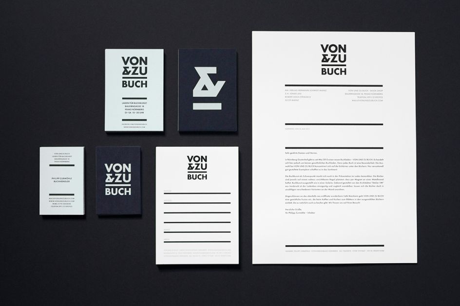
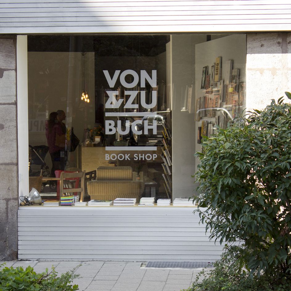
German illustrator and graphic designer Philipp Zurmöhle has created this new brand identity for Von & Zu Buch, a small book shop in Nürnberg, Germany.
All images courtesy of Philipp Zurmöhle
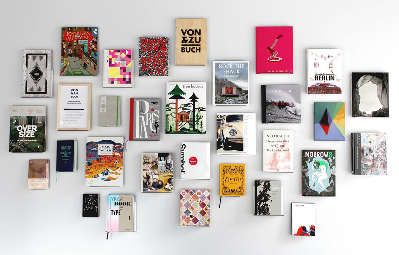
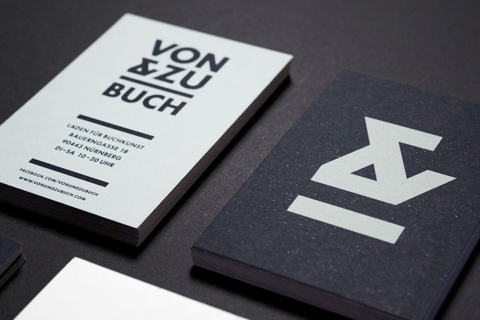
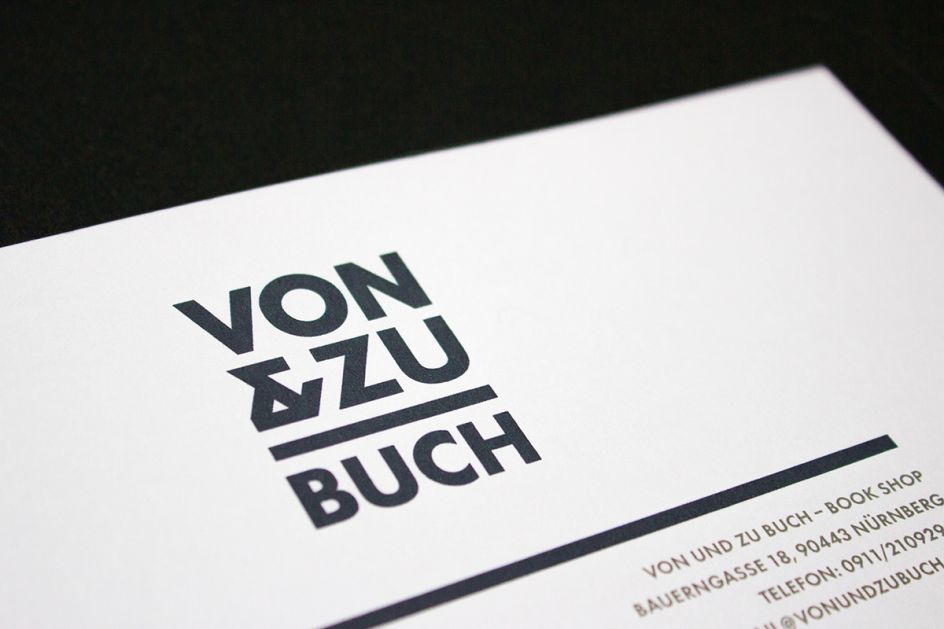
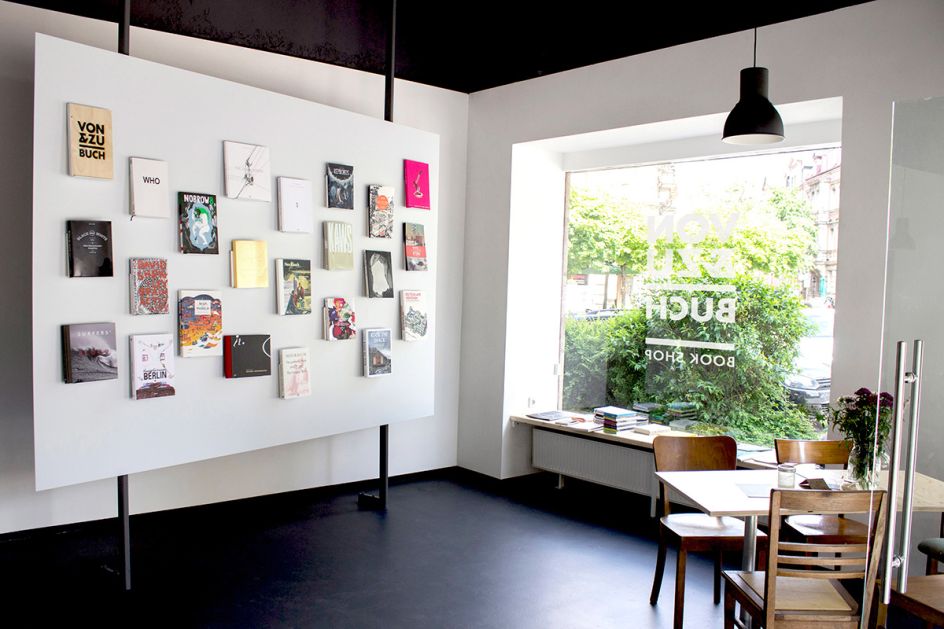
Featuring a horizontal line in the logo and a layout which resembles the little bookshelves on the shop's wall displays, the featured ampersand contains the forms of the letters V and Z from the company's name.
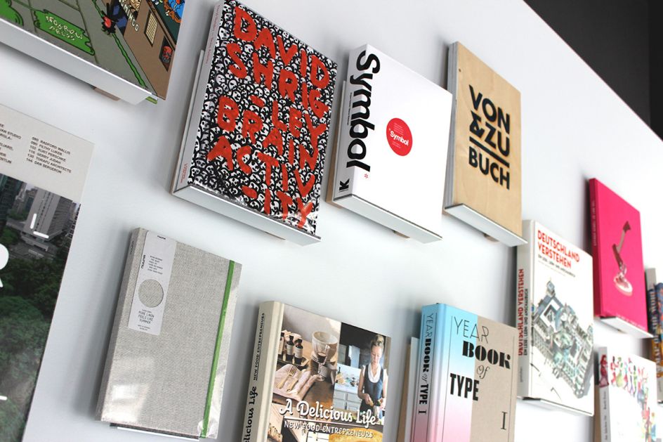
Describing his inspiration, Philipp said: "The retail wall is designed by Atelier VM architects from Innsbruck. Each book is placed on a little shelf that is mounted on the metal wall with magnets. That way the display can be changed now and then and the number of books shown can vary. The white wall reminds me of a gallery wall showing artworks. In this case, books are shown – as precious and beautiful as artworks."


 by Tüpokompanii](https://www.creativeboom.com/upload/articles/58/58684538770fb5b428dc1882f7a732f153500153_732.jpg)


 using <a href="https://www.ohnotype.co/fonts/obviously" target="_blank">Obviously</a> by Oh No Type Co., Art Director, Brand & Creative—Spotify](https://www.creativeboom.com/upload/articles/6e/6ed31eddc26fa563f213fc76d6993dab9231ffe4_732.jpg)


