An 'imperfect' new identity for a mental health platform that celebrates our differences
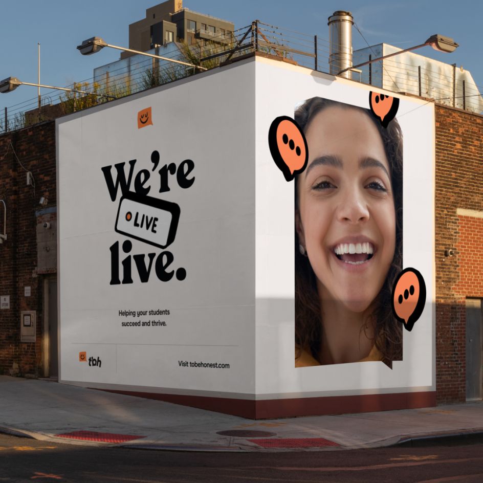
Austin-based design studio Voila has crafted a calming yet "imperfect' identity for ToBeHonest, a mental health support platform designed specially for Generation Z. The refresh hopes to encourage a shift in attitudes towards mental health in the United States and help break down any stigma surrounding it.
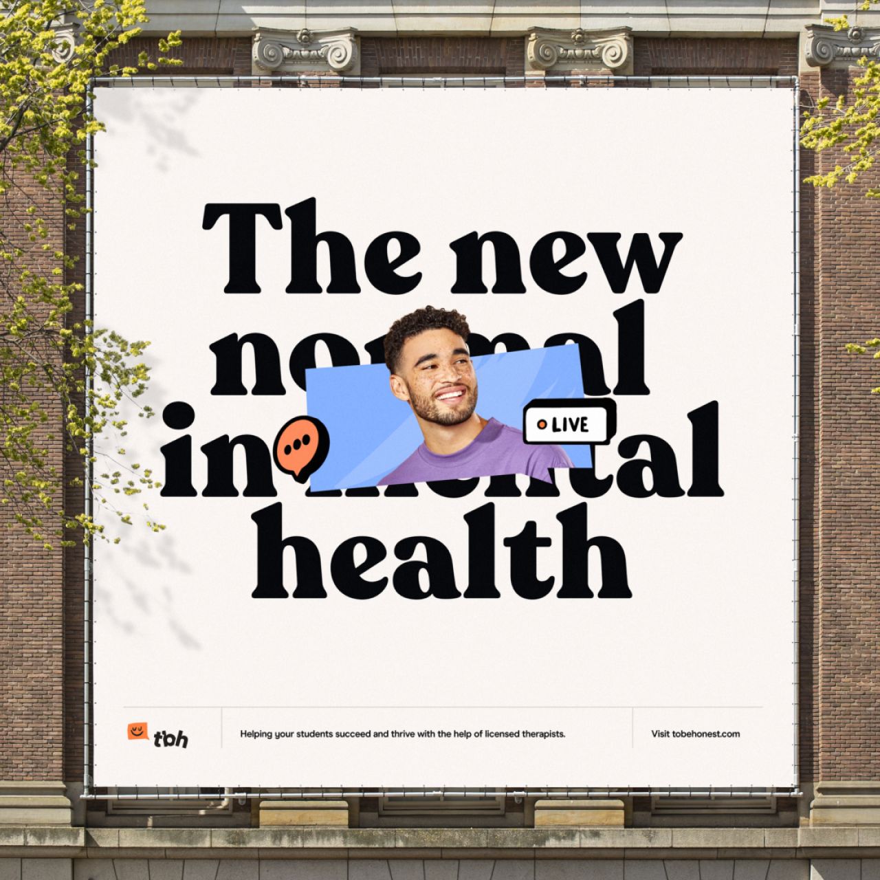
Led by Julien Renvoye and Diego Leal, Voila calls itself a "creative growth studio" and currently has a team of five, working with brands such as EverAfter, Resolute and Office Space. On approaching Viola for support, ToBeHonest wanted a rebrand and redesign of its entire digital experience. The Texas studio dived straight into the brand strategy and discovered the importance of creating a comfortable and safe environment for its client's target audience: students.
"We recognised that seeking help for mental health issues can be stigmatised, especially at a young age," says Julien. "Therefore, we decided to refocus the brand to better align with the world of youngsters, allowing them to feel a sense of ease while navigating our platform. In order to make students feel more comfortable, our platform needed to speak the same language as they do."

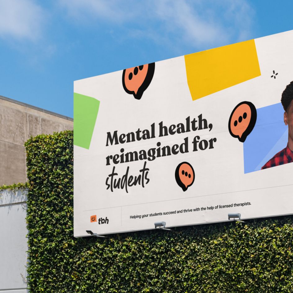
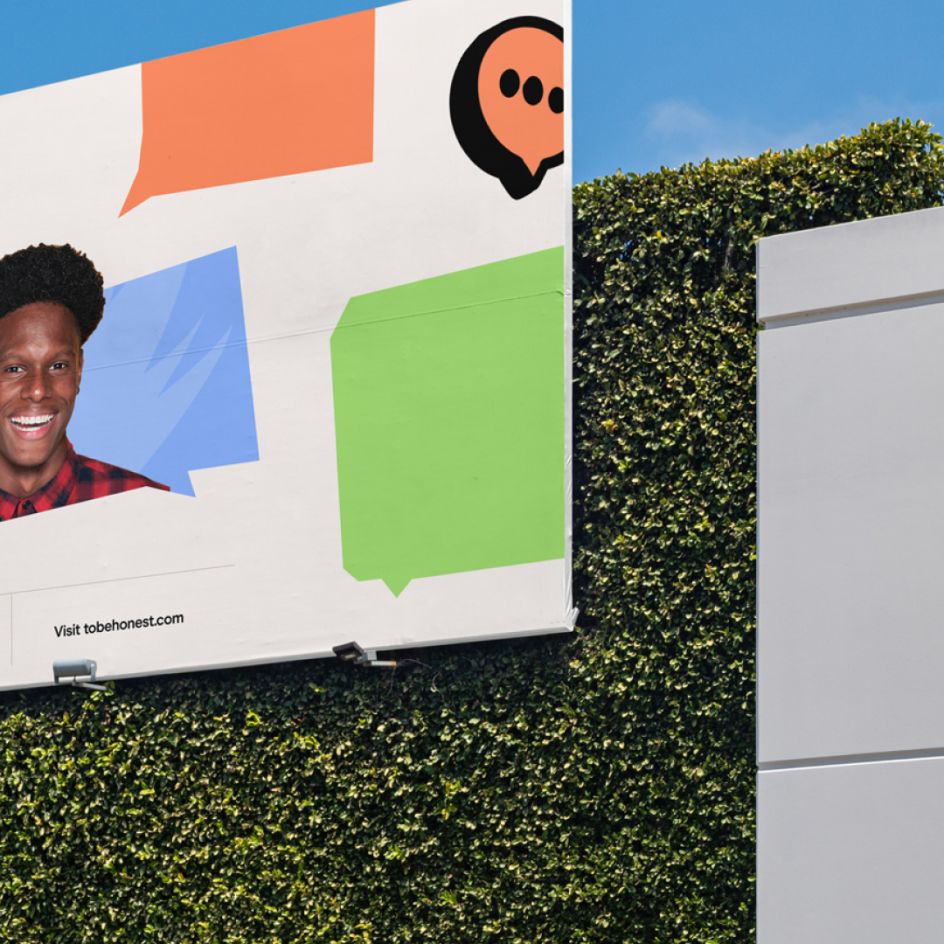
The solution, Viola found, was to create a brand that is "imperfect", just like all of us. "Imperfection can be fun and cool," says Julien. The so-called imperfect work is based around a colourful and optimistic palette that aims to capture the energy and personality of ToBeHonest, "bringing comfort and joy" to those who access its platform.
Type-wise, Viola took on board its client's belief that "being different is okay and can lead to positive personal growth". As such, the studio chose two different fonts: Recoleta (created by LatinoType) and Guthen Bloots (created by Azetype Studio). "By combining these two fonts, we aim to create a friendly and energetic vibe that encourages our audience to embrace their unique qualities and communicates the spirit of the platform," Julien says.
Voila was responsible for the brand strategy, brand direction, website design, and motion graphics. PamStudio handled the front-end implementation of the refreshed website. The refresh is set to be rolled out across all touchpoints later this month.


 by Tüpokompanii](https://www.creativeboom.com/upload/articles/58/58684538770fb5b428dc1882f7a732f153500153_732.jpg)


 using <a href="https://www.ohnotype.co/fonts/obviously" target="_blank">Obviously</a> by Oh No Type Co., Art Director, Brand & Creative—Spotify](https://www.creativeboom.com/upload/articles/6e/6ed31eddc26fa563f213fc76d6993dab9231ffe4_732.jpg)


