An optimistic new identity for Pelago to make 'substance use support' approachable and accessible
A LINE has created a new identity for Pelago, a leading digital clinic for substance use management. Designed to help break down barriers and remove any stigma, the work is bright, optimistic and cheerful, marking a new chapter for the brand formerly known as Quit Genius.
Substance use has reached a crisis point in the workplace. Forty-six per cent of American workers have experienced personal or family problems involving substance or alcohol use, yet, despite nearly two in three workers believing their employers should offer support, only 17% report having this benefit.
Enter Pelago, a resource created to help those who need it most through a unique combination of physician-led care, technology, and medication-assisted treatment. It partners with employers to provide discreet, personalised substance use care, supporting members wanting to cut back, stop, or otherwise manage their tobacco, alcohol, and opioid use.

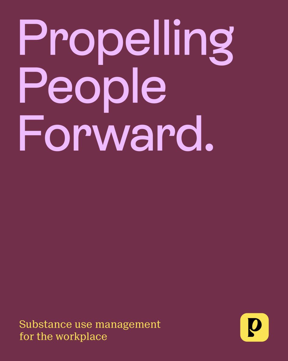
However, research shows that substance use carries an enormous stigma and that people who suffer from substance use disorders feel isolated and alone. Pelago felt a new brand was needed to remove this negativity and change perceptions. It approached San Francisco-based studio A LINE to help refresh its brand.
If you don't like what's being said, change the conversation
When we think of this particular sector, unhelpful terms like 'addict' and 'rehab' might spring to mind. It's why A LINE wanted to create a new category that could change the entire conversation around substance use. From a brand idea, 'You're not an island', the studio built a platform grounded in "empathy, connection, and metaphor that removes the stigma and better supports a world where everyone has access to substance use care that works".
The new name Pelago was introduced as part of this process, replacing the former Quit Genius. Rooted in the word 'archipelago' – a string or chain of islands scattered among the sea – Pelago alludes to islands that have moved away from the continent to which they were attached but remain close enough to be connected and supportive.
An optimistic new identity
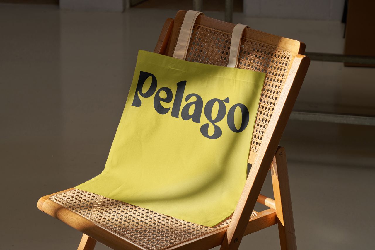
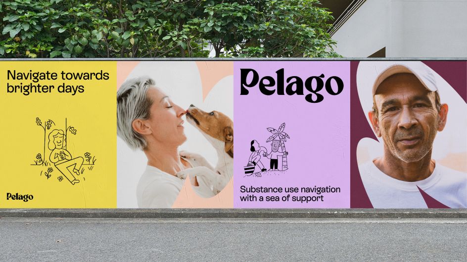
Next, the A LINE and Pelago teams worked to create a new visual identity designed to feel fresh, modern, and optimistic. The face of the brand, the new logo, is built around a series of connected ovals that represent the islands in an archipelago, and its colour palette pairs the bright hero colour 'Pelago yell-o' with approachable earth tones that "speak to a grounding in understanding and knowledge".
Looking at chosen typefaces, A LINE wanted them to feel "as memorable and unique as Pelago's members" while keeping readability and accessibility in mind. Iconography is designed to create clarity while being friendly and "approach-ably imperfect". Bespoke illustrations aim to be quirky and relatable, and photography is warm, optimistic, and honest. Motion is also used across the new brand's many applications to build engagement and bring the new brand's personality to life.
"Substance use is widely misunderstood, but there is research to support that employers have an advantage in successfully initiating treatment rather than friends or family," said Yusuf Sherwani from Pelago. "The time is now for employers to realise that they have a unique opportunity to offer their employees the right benefits and break the long-held stigmas around substance use that have kept many from getting the help they need."


 by Tüpokompanii](https://www.creativeboom.com/upload/articles/58/58684538770fb5b428dc1882f7a732f153500153_732.jpg)


 using <a href="https://www.ohnotype.co/fonts/obviously" target="_blank">Obviously</a> by Oh No Type Co., Art Director, Brand & Creative—Spotify](https://www.creativeboom.com/upload/articles/6e/6ed31eddc26fa563f213fc76d6993dab9231ffe4_732.jpg)


