Andrea Johansson's illustrations have an unexpected balance of humour, colour and idiosyncrasy
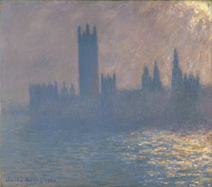
The principles of design are clear in Andrea Johansson's illustrations; formal composition, negative space and hierarchy play a prominent role in her work. She finds a lot of her inspiration in both the mundane and in art historical references, such as Milton Avery’s or Marsden Hartley's paintings, Jean Arp’s shapes and Sophie Taeuber Arp’s puppets.

Her titling/naming is important in her work and her illustrations aim to communicate the viewer’s interpretation rather than a literal narrative. These particular works are part of a self-initiated project with a goal to express a humorous and natural style.
Andrea is an illustrator and designer from southern Sweden who is living and working in New York. She graduated from Parsons School of Design in 2014 with an Associate’s Degree in Graphic Design. Prior to that she completed courses at Berghs School of Communication in Stockholm and Scuola Leonardo Da Vinci in Rome.
Andrea started out as a graphic designer with a focus on branding hospitality projects. She soon realised her heart was in illustration, and has since focused her attention on that. She approaches her work with a visual direction that contains an unexpected balance of humour, composition, colour, form, and idiosyncrasy. You can discover more at andreajohansson.com.








 by Tüpokompanii](https://www.creativeboom.com/upload/articles/58/58684538770fb5b428dc1882f7a732f153500153_732.jpg)

 using <a href="https://www.ohnotype.co/fonts/obviously" target="_blank">Obviously</a> by Oh No Type Co., Art Director, Brand & Creative—Spotify](https://www.creativeboom.com/upload/articles/6e/6ed31eddc26fa563f213fc76d6993dab9231ffe4_732.jpg)


