'The human body is magical': Andy Huang's colourful illustrations depict people in a whole new light
New York-based illustrator Andy Huang channels his knowledge of communication design into his illustrations of people to create colourful, expressive depictions that exude style and personality. We caught up with him to hear how they are made.
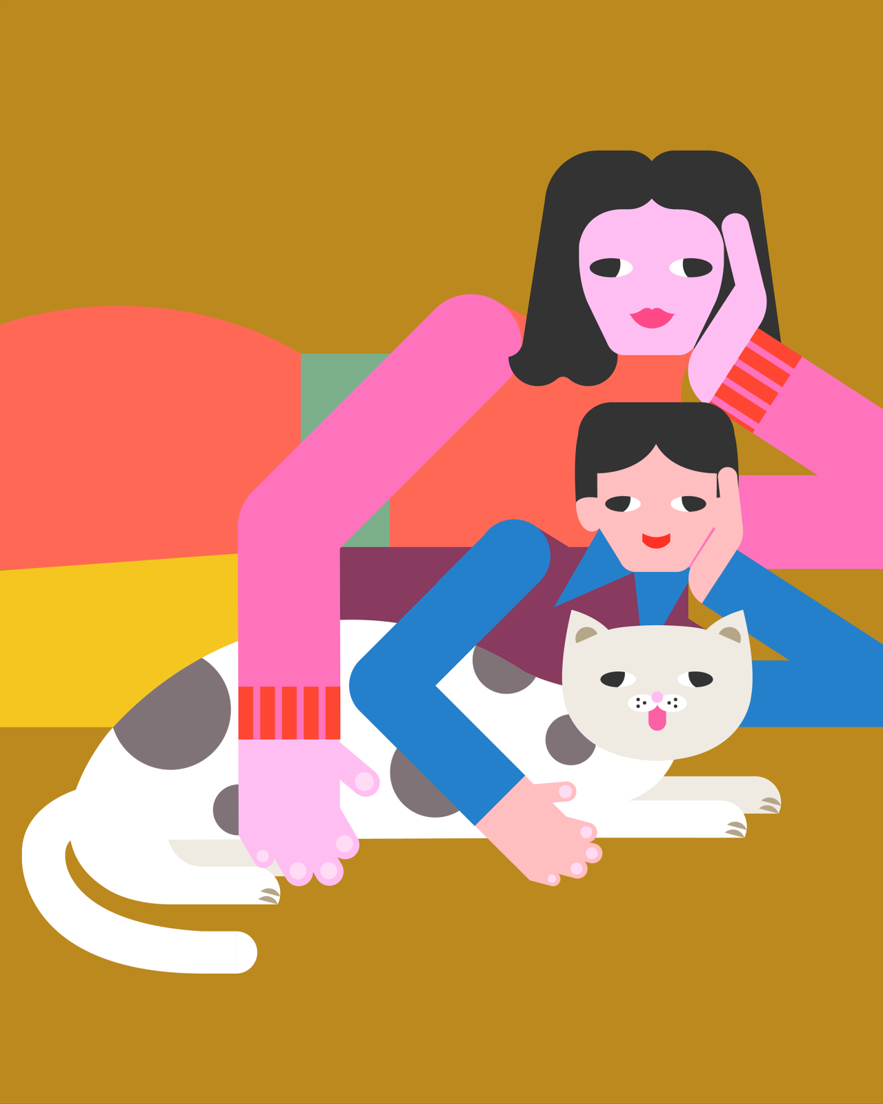
Originally from Taiwan, Andy Huang is an American illustrator and graduate of the Pratt Institute. With a background in communication design, Andy went on to work for NYC agencies before pivoting in 2022 to focus on his freelance illustration career. And thank goodness he did, as he's gifted us with vibrant, graphic illustrations that focus on the human body.
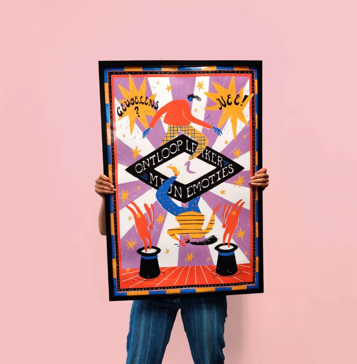
"My illustrations have always been about people," Andy tells Creative Boom. "From focusing on portraits in the early stages to recently enlarging the field of view to reveal the entire human body. I have been constantly exploring different ways to depict and interpret people."
According to Andy, "the human body is magical" because it is the carrier of life, the extension of a person's will and a tool of communication. In his illustrations, Andy is fascinated with how people express their unique style and personality through their bodies and limbs.
"When you swing, rotate, twist, bend, stretch, exert, and relax, your body and limbs reveal your most honest feelings, release true emotions and express unique personalities," he explains. "When you and others interact through physical contact, your partner will feel the message you deliver directly. Wonderful communication is completed between people, or even between people and animals without any words."
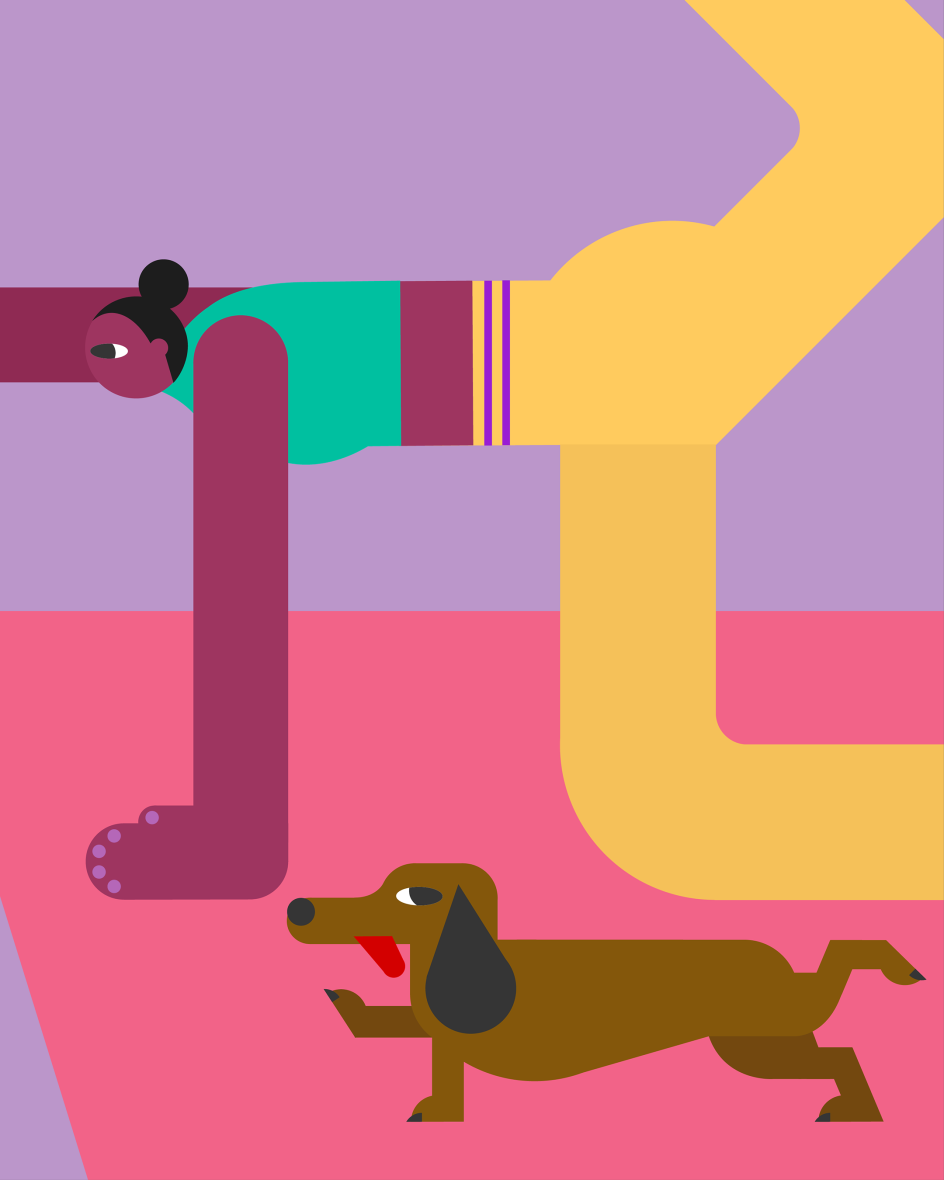

This approach can be seen right the way through Andy's illustrations, as he uses a very concise approach to depicting body language. One that aims to resonate with the "original and intuitive nature" of the human body. "I'm glad that people have become an interesting and effective element in my work to spread good vibes, convey messages and tell stories," he adds.
In order to know his subject, Andy has to study people. Luckily, this was something he did while studying communication design, and it's a practise he's not left behind. "I have always maintained the habit of sketching, and the human body is one of the subjects I sketch," he adds. "It teaches me to observe the structure and details of the human body."
Studying at Pratt Institute gave Andy an appreciation for graphic design principles that have transferred over into his illustrations. These include a love of flat graphics, geometric shapes, and precise outlines, all of which keep his work cohesive and scaleable.
"They also made my illustrations more concise and expressive, as well as making them applicable to different media such as animations, sculpture and merchandise," he adds. "This is how I interpret and imagine contemporary illustration in response to today's world.
"I definitely think that illustration is an important form of visual communication. It holds a prominent position in today's design, with its expressive images, vivid sense of life, aesthetic taste, and storytelling capabilities. Illustration is a highly effective communication tool across print and digital media."


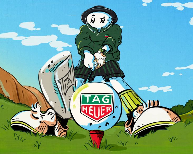
As for why he eliminates complex lights, shadows and textures from his illustrations, Andy says that by simplifying the real world, he can restore people to their original state. "It brings me a harmonious and purer feeling, which I like," he reveals. "It helps me to focus on the core presence and concept, de-cluttering unnecessary details or distractions and fostering clarity. It is not just a style; for me, it's more like how to look at and process the world."
Colour itself is an intuitive and emotional thing for Andy. "It can drastically change the mood and vibe so effortlessly," he says. "Bold colours have an abundant energy, which can instantly grab your viewer's attention, create a huge impact, and deliver excitement. The closest thing to colour would be music. Both are the most simple and powerful things that can make our lives wonderful or miserable.
"I use flat graphics and bold colours to depict people because it resonates so well with the original and intuitive nature of our bodies. They create concise forms which everyone can relate to, and amplify their vibrancy to create an atmosphere."
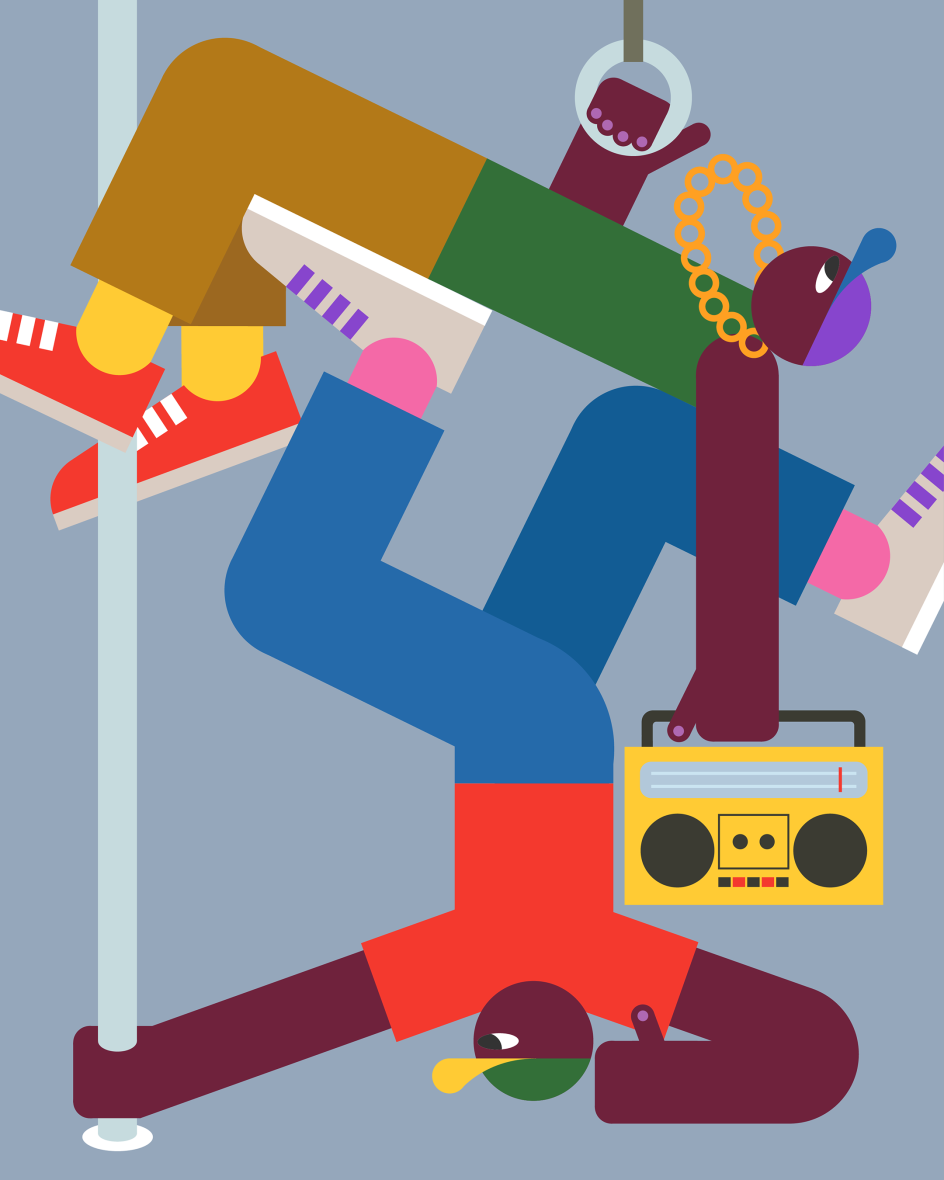
All of these elements come together to create a style which Andy describes as "digital meets mid-century modern." Explaining further, he says this approach blends the minimal aesthetics of the digital age with the simplicity and timelessness of mid-century design. "The result is a colourful, playful, witty and expressive style, and I certainly want people to perceive all these feelings when they look at my work."
Fortunately for Andy, this seems to be coming across as he often notices a knowing smile on his viewers' faces. "I know they're delighted by my sense of humour and storytelling," he concludes. "It motivates me to create illustrations that spread uplifting energy and good vibes to people. I'm always trying to make great illustrations that can tell stories brilliantly and delight people creatively."


 by Tüpokompanii](https://www.creativeboom.com/upload/articles/58/58684538770fb5b428dc1882f7a732f153500153_732.jpg)

 using <a href="https://www.ohnotype.co/fonts/obviously" target="_blank">Obviously</a> by Oh No Type Co., Art Director, Brand & Creative—Spotify](https://www.creativeboom.com/upload/articles/6e/6ed31eddc26fa563f213fc76d6993dab9231ffe4_732.jpg)


