Andy Shillington on 20 years of running a global graphic design school
Back in the good old days of 1997, Andy Shillington was running Shillington Graphics – a design studio based in Sydney. As a business owner, he faced the usual challenges and finding the right staff was one of them.
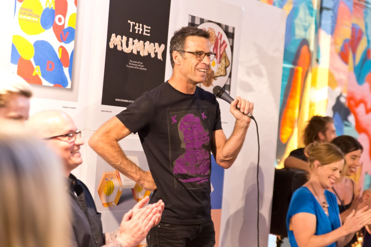
He was always on the lookout for new recruits, and although fresh graduates had wonderful attitudes and were eager to learn – they didn't seem to have the skills required for the industry. It was then that Andy decided to create a course that was relevant to the working world and would prepare graduates to land a job. That was two decades ago. Today, Andy is the CEO of Shillington, a respected international educational facility with six campuses around the world.
Marking its 20th anniversary, Shillington has recently undergone its own redesign with a new website freshly launched this week. We chatted to Andy about the new look as well as how he feels after two decades of design.
Tell us more about those early days of Shillington.
Back in 1997, I was running a busy design studio and kept coming up short on the hunt for junior designers. There was plenty of passion, but less than impressive proficiency. Most graduates just weren't prepared technically and couldn't meet tight deadlines. So I decided to do something about it.
Shillington pioneered a new approach to design education. Our innovative teaching method meant that students could fast-track their careers from nowhere to somewhere in only three months full-time or nine months part-time. We've spent two decades perfecting our curriculum, and are proud to have thousands of successful graduates currently working in the industry.
Has your mission changed since 1997? What do you stand for today?
No. Shillington's mission hasn't changed since day one. We still provide an inspirational environment for students to learn practical skills, create awesome portfolios and graduate industry-ready. Things move fast at Shillington, and we plan on keeping it that way.
Shillington is 20 years old in 2017. What's changed the most in the last two decades in terms of design?
So much has changed. It's been our challenge to keep up! To state the obvious: technology has changed everything. Deadlines are tighter. Collaboration is easier. And design is more dynamic than ever.
Our UK Director Sarah McHugh wrote a great round-up of how the design industry has changed in Decades of Digital in our latest issue of the Shillington Post.
What have been your proudest moments?
We've had so many incredible moments over the past 20 years at Shillington, but I can narrow it down to a few. First, I'm always inspired by the teamwork of our international team. It's powerful to see creative people collaborate across time zones to make Shillington the best it can be.
Second, it's amazing to watch the evolution of our students' portfolios. Their work is freaking awesome, and reviewing portfolios just never gets old.
And third, I love running into graduates out in the world. When they give me a big hug and explain how Shillington changed their life, it reminds me why we do what we do.
How have you stayed relevant to the industry?
Easy answer: by only hiring top designers. At Shillington, all our teachers are personable, practising designers eager to mentor and share their knowledge with the next generation. We keep things flexible and always ask for their input. Our teachers' expertise guides our curriculum, and their experience allows us to cultivate an authentic "studio" classroom. They're the heart and soul of Shillington.
Plus, our maverick methods let us skip rigid institutional expectations and redundant academic criteria. Instead, we focus on what's real and relevant—letting our students move fast and discover what being a working designer is actually all about.
Can you give us some examples of the type of jobs people secure after graduation?
All sorts! Our graduates land jobs as junior designers at top agencies, work in-house at big companies and start their own businesses. They work in publishing, like Sophie Lord at Hello May, at boutique design studios, like Andy Vargas at Bitacora, in digital design, like Hamish Snow at Josephmark and in-house at big brands like Greg Bemis at Nike.
Visit graduate testimonials on our new website to browse through dozens of Shillington graduate stories.
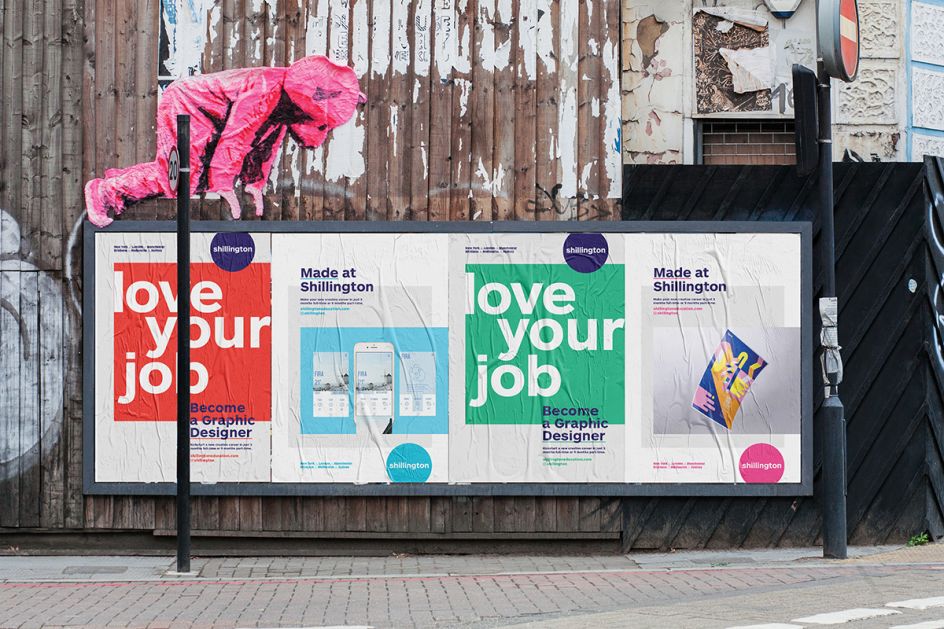
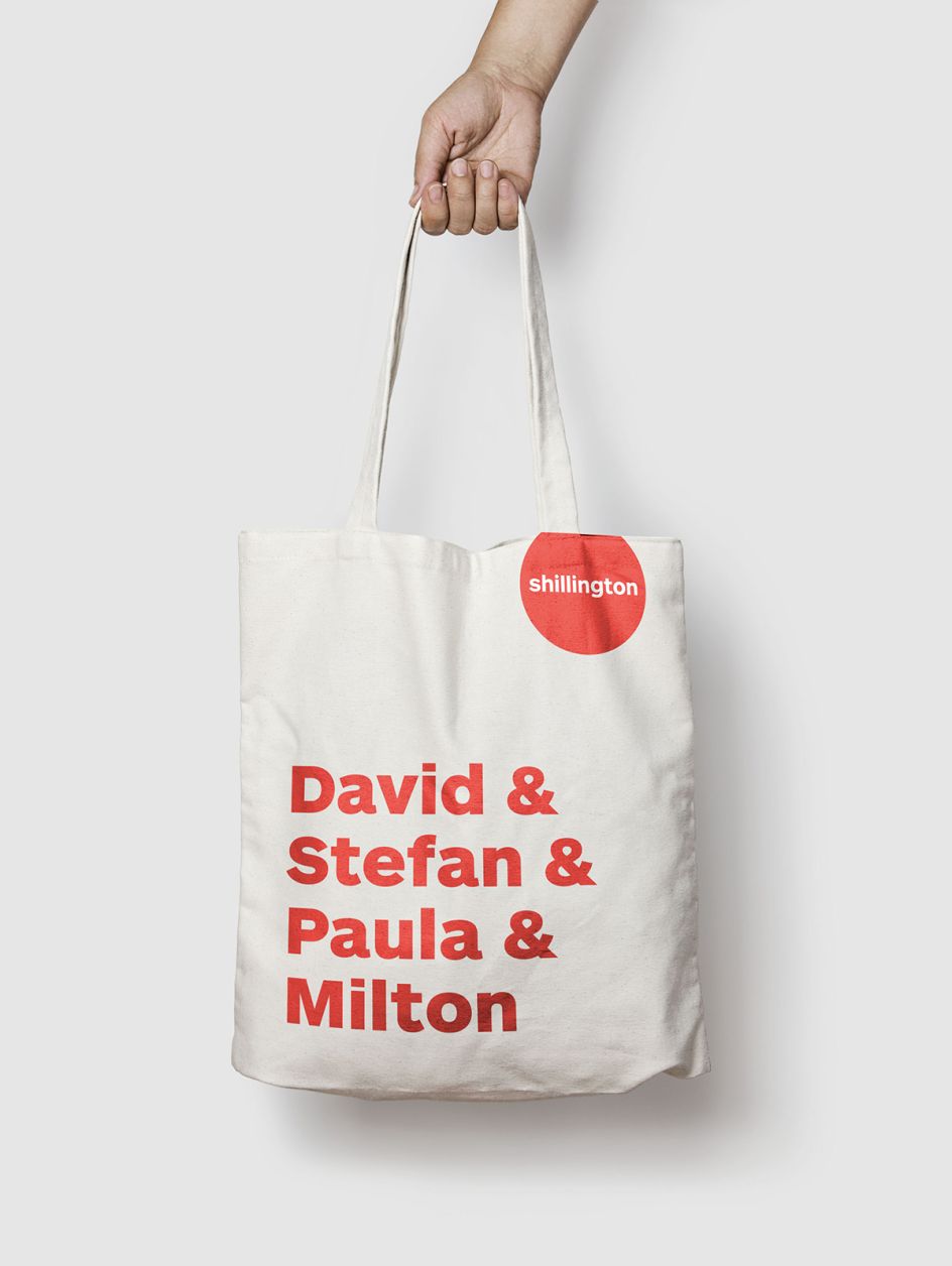
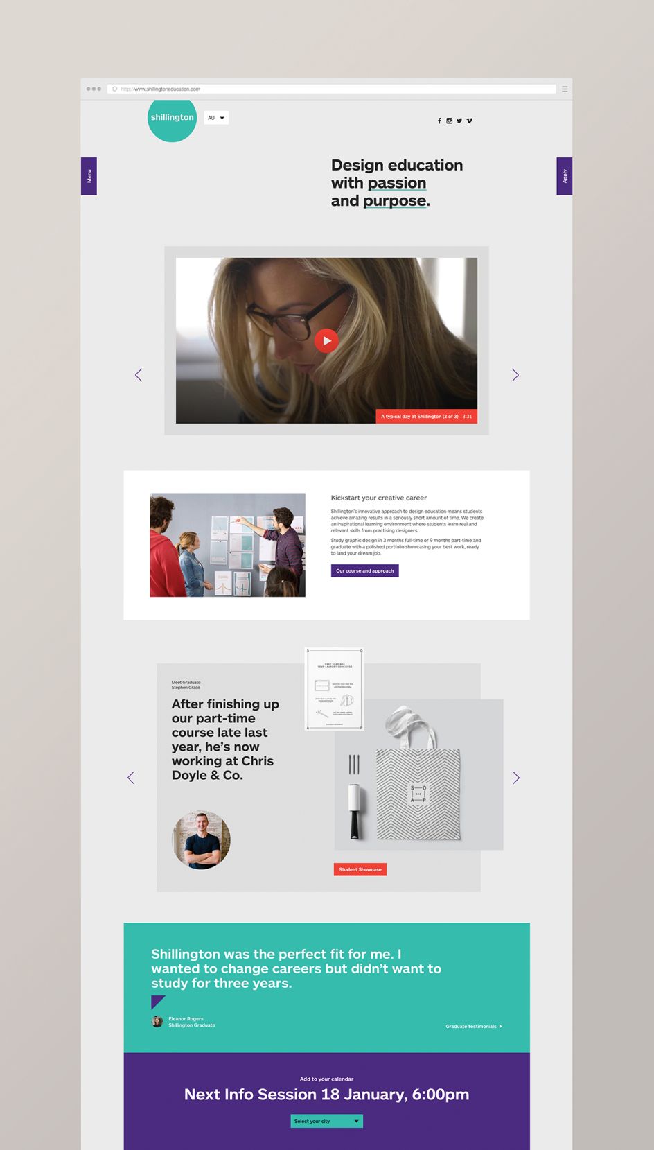
You've recently gone through a rebrand and have launched a new website. Why the change?
To put it simply, we needed to simplify and unify our global brand. Our existing look wasn't broken but didn't have the flexibility to let our content shine. We needed to develop a framework that stripped back to the design fundamentals—allowing us to showcase our amazing student stories and creative output. That's what makes us stand out from the competition. That's our difference. That's our brand.
The website was another big challenge. We needed to connect our global presence and make everything a bit simpler, sharper and more engaging.
Can you tell us more about the process behind the redesign?
The rebrand was tackled by an all-star team of Shillington staff and teachers, and the process was incredibly collaborative. More than 15 people researched, experimented and worked through challenges to bring the brand to life. You can read all about it in Global Director Anthony Wood's article 10 Lessons from Rebranding a Design School in our latest issue of Shillington Post.
What can we expect from the new website?
Our new website was designed and developed by the awesome guys at Standing by Company. It was a tough brief, and they absolutely nailed it. Take a look!
It features a simple online enrolment system, a Shillington student work showcase, an engaging FAQ section and our new #Shillumni network, working to connect our graduates from all around the world.
If you could go back 20 years, what piece of advice would you give yourself?
Just try it. If it doesn't work, you'll learn something and it'll be better the next time. Always keep trying.
What is your definition of 'good design'?
When I don't have to ask what it means. I've reviewed literally thousands of student portfolios over the years, and it always comes down to that.
What makes a great designer?
A great designer listens to the client. A great designer does their research. And a great designer is brave enough to show the client an alternative... as long as it still meets the brief.
Just try it. If it doesn't work, you'll learn something and it'll be better the next time. Always keep trying.
In your view, who is the best designer of the 21st century and why?
My favourite designer is Herb Lubalin. His playful typography with Mother & Child, Families, and more is so clever and helped me fall in love with design.
If you're into design history, we actually do a monthly series on Shillington Design Blog. Throwback Thursdays lets our teachers share quick and fun design history lessons about their favourite design legends. We've already featured the best of the best: Lance Wyman, Alan Fletcher, Paula Scher and many more.
Any further plans for Shillington in 2017?
We're just trying to keep up with everything! With our fast-paced industry, our hard-working students and all the aspiring designers who want to study with us.
Finally, if people are keen to find out more about Shillington, what can they do?
Check out our brand new website and connect with us online! We're always sharing design resources and inspiration on Facebook, Instagram and Twitter.
Or, join us in person! We frequently hold Info Sessions in New York, London, Manchester, Sydney, Melbourne and Brisbane. Meet teachers, chat to graduates and view student work. It's the perfect way to see what we're all about and get your questions answered.
To find out more about Shillington, visit www.shillingtoneducation.com. Or follow the latest inspiring student work on Instagram.


 by Tüpokompanii](https://www.creativeboom.com/upload/articles/58/58684538770fb5b428dc1882f7a732f153500153_732.jpg)


 using <a href="https://www.ohnotype.co/fonts/obviously" target="_blank">Obviously</a> by Oh No Type Co., Art Director, Brand & Creative—Spotify](https://www.creativeboom.com/upload/articles/6e/6ed31eddc26fa563f213fc76d6993dab9231ffe4_732.jpg)


](https://www.creativeboom.com/upload/articles/a5/a59a332e69f215531a527887ea303752eefb4c60_732.jpg)
