Anna Parini on her cover for The New Yorker, the rise of female illustrators and diversity
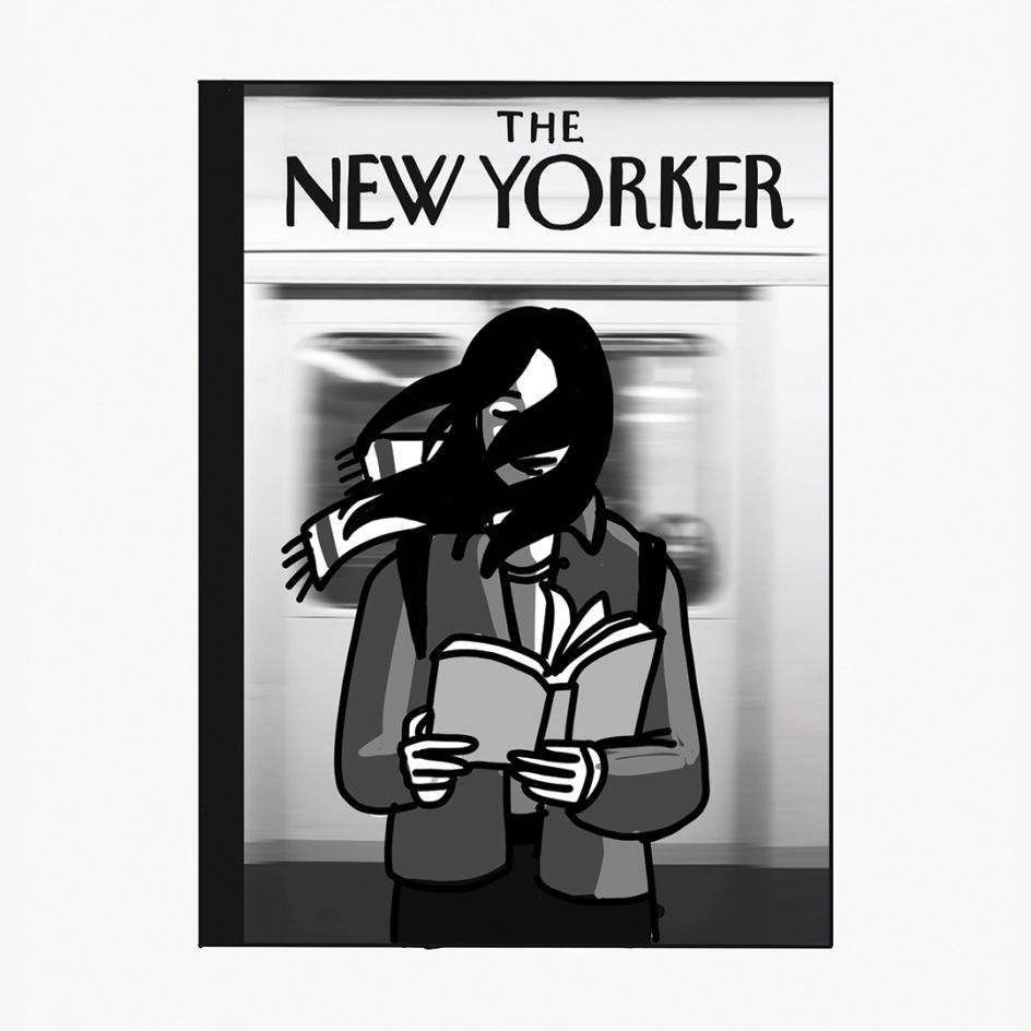
On a cold winter's morning, The New Yorker's latest issue landed on our doormats featuring a cover that immediately resonated with millions everywhere.
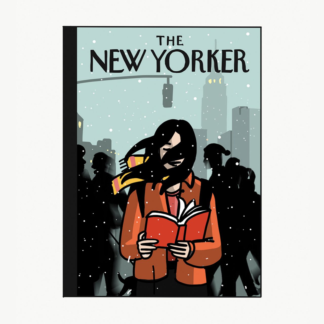
Designed by Anna Parini, the wintry illustration of a smiling woman in the middle of rush hour, reading a book while snow was falling around her, was a cheerful pick-me-up in the usual post-Christmas lull.
It was the Barcelona-based Italian illustrator's first ever cover for the Big Apple's favourite weekly magazine. Her clients include The New York Times, El País, Rolling Stone, The Guardian, Penguin Random House, Save The Children among others. We chatted to Anna about The New Yorker, her life as a freelance illustrator and what she's currently up to.
Can you talk us through the cover. What was the thinking behind it?
Initially, it was created to appear on The New Yorker's Fall Books Issue published in October. It showed the same girl, in the same subway, reading a book in front of a departing train.
Every week, the art editors receive many submissions from different artists around the globe and for that issue, they finally decided to go with a beautiful image titled 'Reading Group', created by legend Jean-Jacques Sempé (who has contributed more covers than any other contemporary artist – well over a hundred).
Later in December, Françoise Mouly, the art editor, got in touch again asking me if I could work on a new version of that first sketch that was still hanging on her wall – suggesting a scene showing the same woman engrossed in her book in the midst of all the end-of-year bustle one sees in New York.
I sent them a couple of ideas and one of them finally caught their eye.
Did you feel pressure for such a big opportunity?
Of course I did! But I always do my best to keep both feet on the ground. Until the last moment, I wasn’t sure if the cover would have run or not and for this reason, I decided to keep it for myself. Nobody knew about it until the day it got published.
Would you be able to describe your style?
Pop and conceptual, maybe? Pop-ceptual? As a student, I was fascinated by Brad Holland’s work and all the conceptual socio-political, black and white illustrations like the ones published on The New York Times Op-Ed section.
I was drawn by the smart use of metaphor. The intelligent, challenging imagery and the authorial power an illustration could have. Those pieces were effortlessly able to interpret an entire article and also create some kind of emotional reaction to the reader.
My illustrations are somehow an attempt to combine that kind of thinking with a pop – colourful and with a more modern aesthetic.
Talk us through your process of turning a brief into a finished piece
When it comes to editorial assignments you only have a few days, sometimes one or two, to deliver a finished piece. It can be a little stressful sometimes — it’s not always easy to work under pressure but I somehow find that very useful.
I start by writing down a few keywords, brainstorming and drawing very small thumbnails. When I’m facing a particularly challenging subject it helps a lot to work with word associations, for example.
I generally present two to three sketches to the art director and, once the idea gets approved, we move it to final.
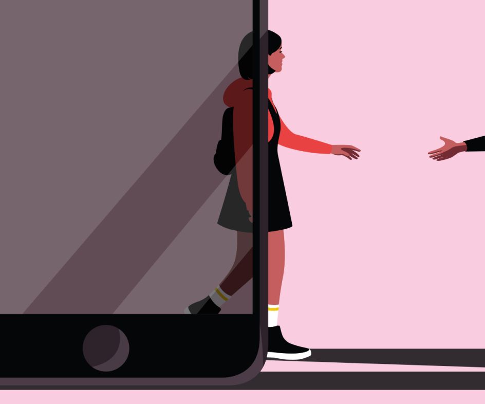
Any other projects you want to tell us about? What made them so special?
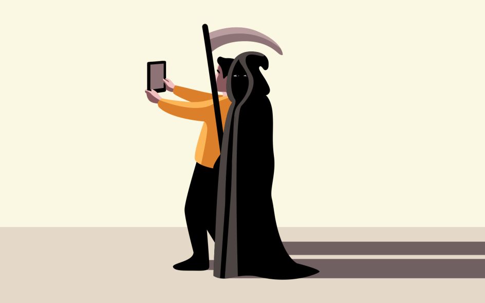
I've enjoyed working with animations lately. I’ve collaborated with motion-designer Jose Lorenzo on various assignments – The New Yorker cover is one of them. The possibility of creating moving images makes my brain work differently; sometimes it’s easier to express a concept through a scene rather than a still image, it offers you a wider spectrum of possibilities.
What's worked for you in terms of getting your name out there?
In my first years, I did a lot of self-promotion, mostly by email. I accepted most of the assignments that came along, too. I had a crazy work schedule and didn’t pay too much attention to deadlines or fees.
Those years were amazing training for me but the quality of my life and especially the quality of my work suffered because of it.
On the other hand, I’ve been able to reach a large number of clients, and that has been extremely helpful in the years since.
I’m not sure I would recommend this approach to an emerging artist. On the contrary, I would maybe suggest to him or her to be a little more patient – but at the end of the day, it’s what you learn that matters, not how you got to learn it.
In an interview with Brad Holland, he’s been asked the same question and his answer was, "Well, I knew I was going to have to start at the bottom, so I wanted to get to the bottom as fast as possible."
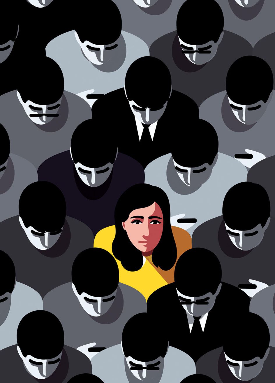
Did you always know you wanted to be an illustrator?
As a child, I was a little clumsy and I guess the only skill I could use to achieve some social approval was through drawing. I enjoyed it and soon noticed I was better at it than the other kids in my class — childhood traumas can be extremely useful sometimes.
I noticed through the years that the interest was growing and that it somehow remained my main tool of expression. After high school, I decided to sign up to art school and a few years of bartending after, I found a way to make a living out of it.
What advice would you share with others wanting to follow a similar path?
Many hours of practice and, based on my experience, no fear of making mistakes – it’s the best way of learning. Bad work will last forever on the Internet but it can also be productive — let that shameful feeling haunt you as a reminder to do a better job next time.
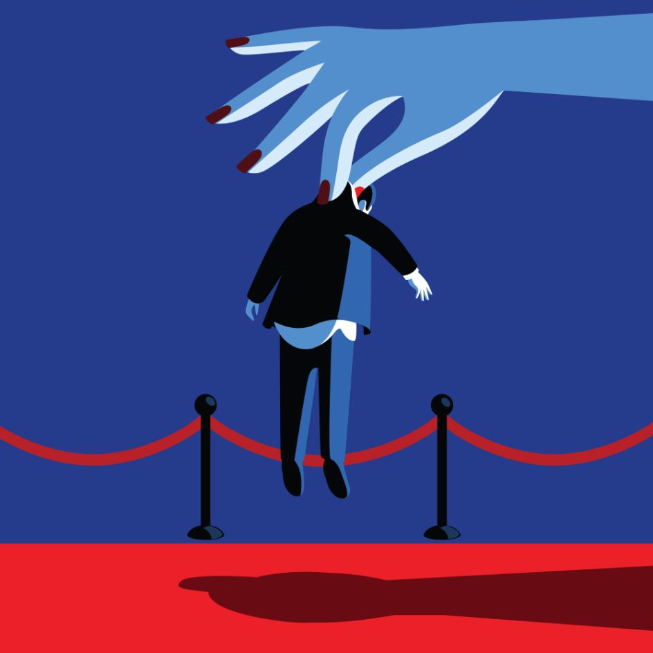
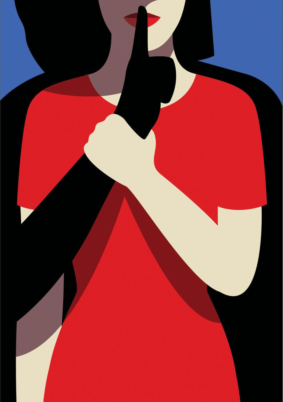
We love your Tech Industry’s Gender-Discrimination Problem illustration for The New Yorker. Does being a woman ever hold you back?
I don’t think so, quite the contrary, I believe that it helped me face some challenging topics in a more sensitive way.
Last year, for example, when the #metoo movement exploded, newspapers suddenly realised that there was a need for more female voices able to tell and interpret those stories.
Editorial and conceptual illustration – it’s a field that initially, like many others, had a strong male predominance but each year we slowly grow in numbers and, hopefully very soon, an illustration like this one will be only telling us an old story.
What would you like to see change in the industry?
Since we mentioned it, more women of course.
Moving on, does where you're based matter anymore?
Not in my case — the only thing I need is a desk, a power plug and a decent WiFi connection. Internet and the digital era made a big change in the industry, opening up more opportunities and allowing emerging artists to be more visible worldwide, work faster and travel lighter.
Sometimes I take advantage of the privilege this profession gives me and move the office abroad to catch some fresh air – I just got back from Mexico, where I spent over a month working and eating tacos at every corner.
Finally, what's next for you?
Hopefully more travels, and more tacos.


 by Tüpokompanii](https://www.creativeboom.com/upload/articles/58/58684538770fb5b428dc1882f7a732f153500153_732.jpg)


 using <a href="https://www.ohnotype.co/fonts/obviously" target="_blank">Obviously</a> by Oh No Type Co., Art Director, Brand & Creative—Spotify](https://www.creativeboom.com/upload/articles/6e/6ed31eddc26fa563f213fc76d6993dab9231ffe4_732.jpg)


