Pentagram's Harry Pearce and team launch an upbeat identity for John Lewis' affordable range
If you've been on the John Lewis website lately (and it's certainly good enough for us), then you may have noticed its new ANYDAY basic range. How could you not with its bold and orange identity? Created by Pentagram's Harry Pearce and team, they wanted it to reflect the products' "affordability, optimism, and energy".
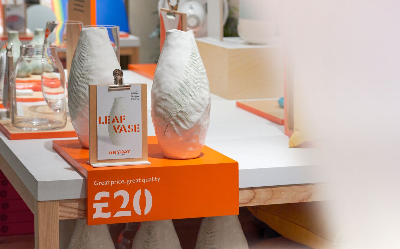
Inspired by the "handmade look and feel of packing cases and street market displays", the own-brand collection is aimed at customers who "want to make a rental feel more like home, get a nursery ready for a new arrival or furnish a first home", as Pentagram explains, and launches with 2,400 products, mainly for the home and nursery, including childrenswear and small electrical items.

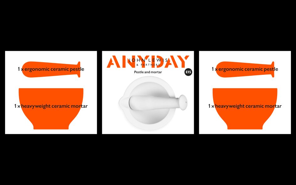
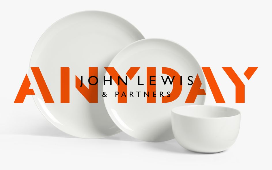
The work builds on the identity Pentagram created for The John Lewis Partnership in 2018 and features an ANYDAY stencil logo – a re-drawn version of the existing bespoke typeface Gill Sans Nova for JL. Decidedly upbeat and authentic, the logo can be used in two ways, as a standard lock-up or as an overlay.
With the former, it sits nicely over imagery and would even work well on applications such as die-cutting and embossing. While the latter echos a stencil vernacular and has the John Lewis & Partners logotype printed directly on top of the ANYDAY stencil logo. "This allows for large scale, expressive use of the combined mark across many different applications, from packaging to signage and display," explains Pentagram.
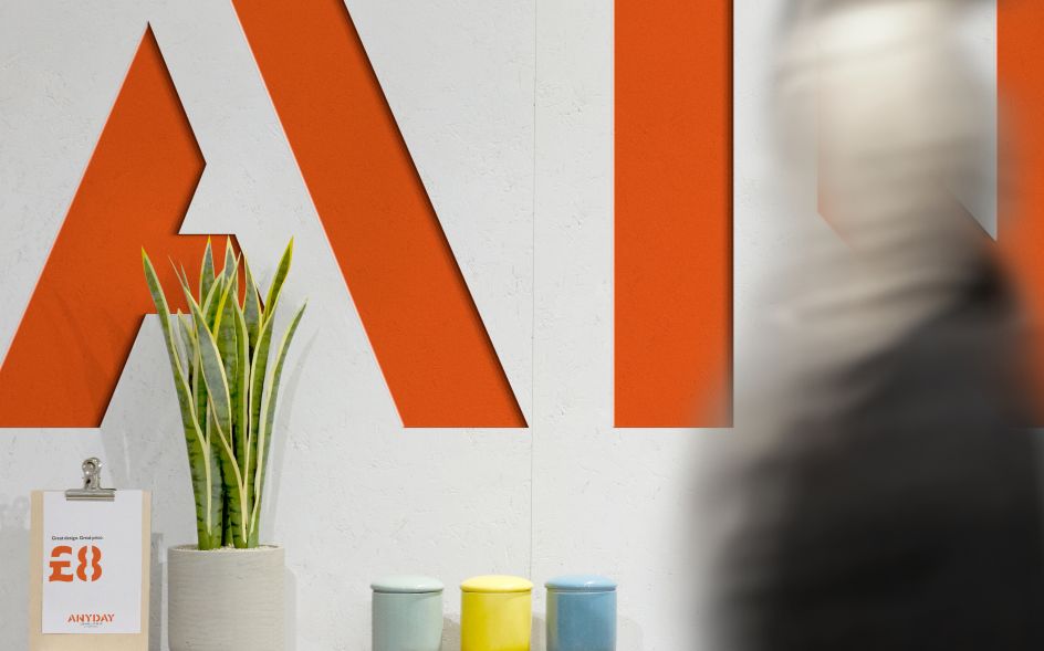
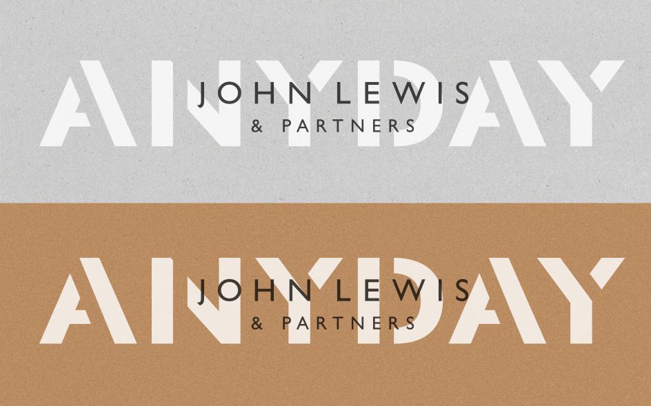
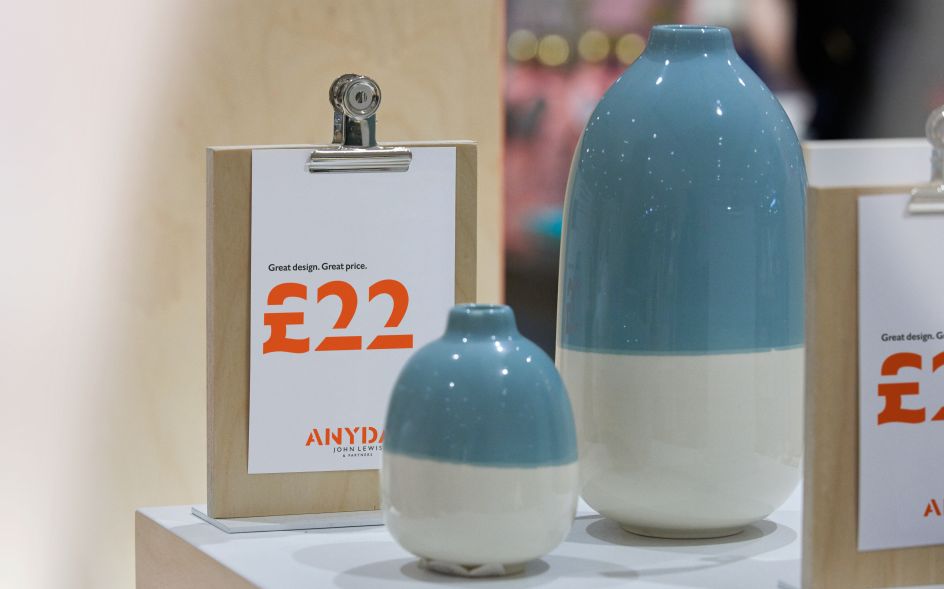
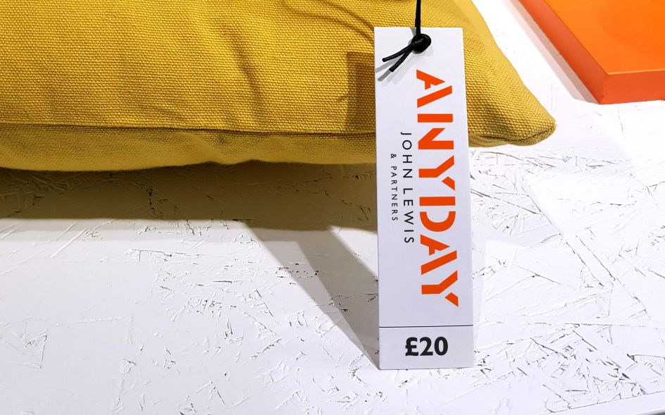
Gill Sans Nova for John Lewis is used across the ANYDAY identity in two key weights, Semibold and Medium. The design team also created a full stencil headline alphabet and numerals for the pricing system from Gill Sans to work alongside the primary typeface.
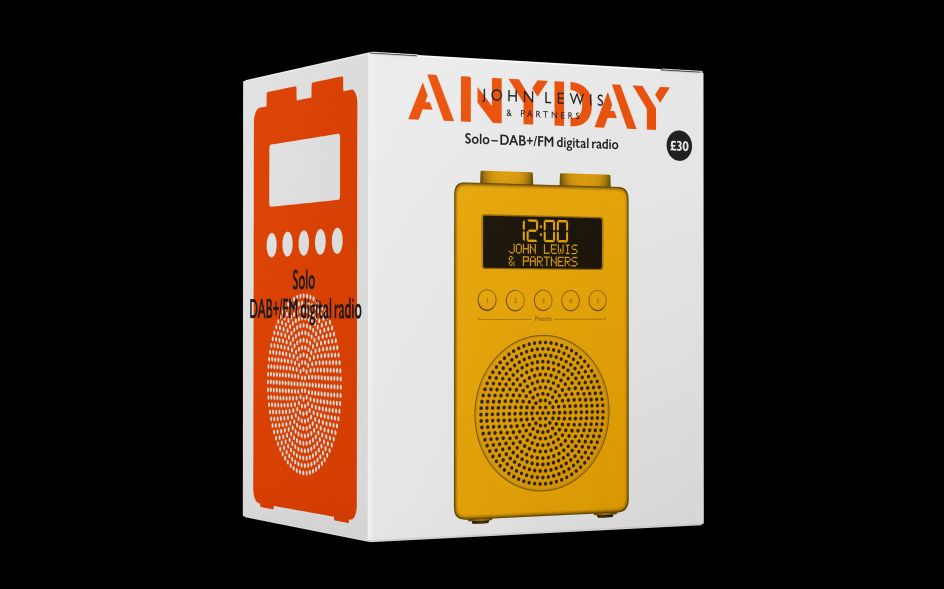
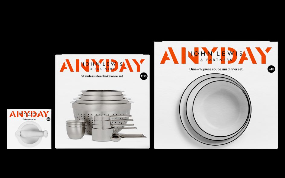
There's a confident colour palette, too. Bright orange sits warmly alongside black and white. Together, they make bold graphics and bring all the packaging together. On larger items, products are displayed as illustrated silhouettes. While product descriptions are placed over the images, suggestive of the screen printing aesthetic of the logotype. Reinforcing this whole "practicality and simplicity", the product photography is straightforward and not over-styled, with cut-out images on white backgrounds.
Speaking of scale, it plays an important part in the design system, with the approach to the packaging translating "directly into point-of-sale and dramatic use of all the elements, echoing the look of packing crates in marketplaces," says Pentagram. The packaging itself, meanwhile, has been carefully designed to use as little material as possible and incorporates stickers and paper sleeves, as well as open sections to reveal the product inside.


 by Tüpokompanii](https://www.creativeboom.com/upload/articles/58/58684538770fb5b428dc1882f7a732f153500153_732.jpg)


 using <a href="https://www.ohnotype.co/fonts/obviously" target="_blank">Obviously</a> by Oh No Type Co., Art Director, Brand & Creative—Spotify](https://www.creativeboom.com/upload/articles/6e/6ed31eddc26fa563f213fc76d6993dab9231ffe4_732.jpg)


