Baxter and Bailey help Goldsmiths University of London to attract the brightest and best
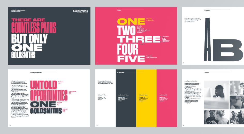
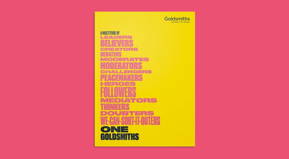
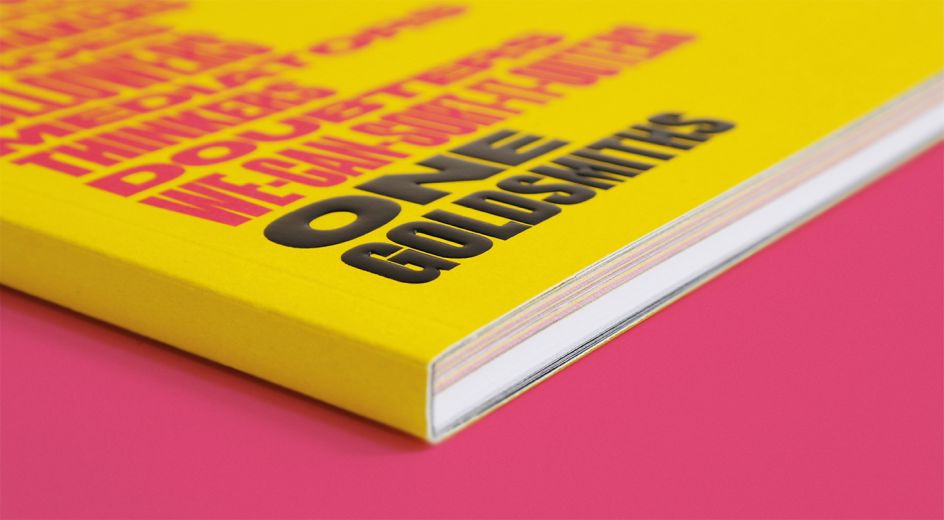
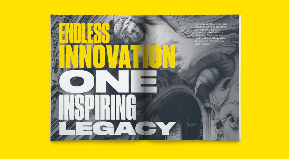
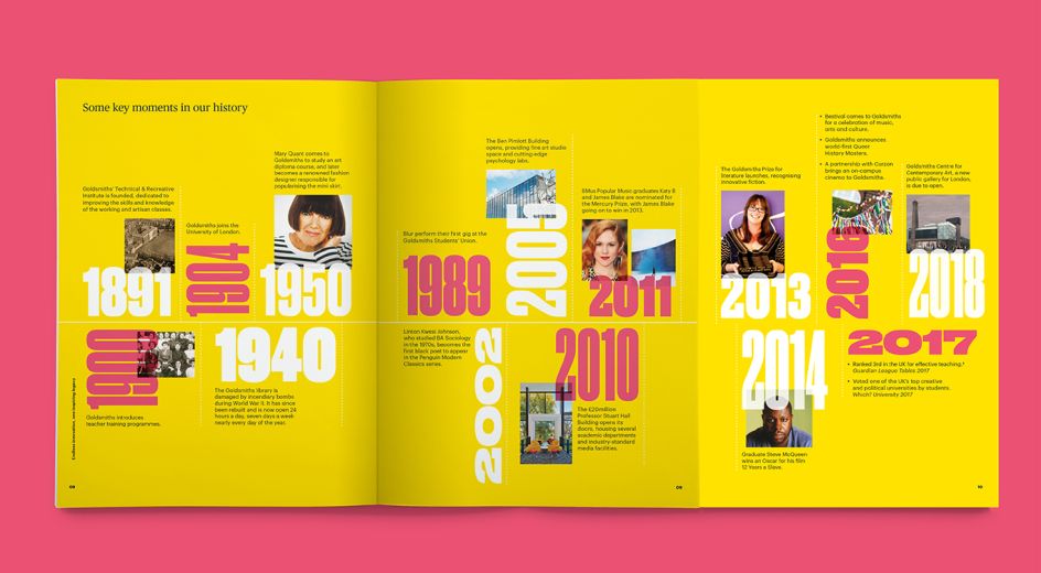
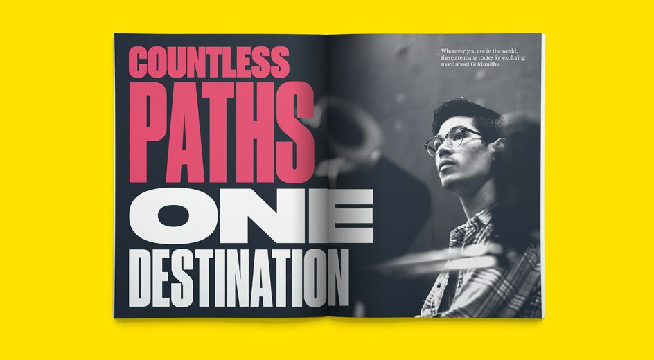
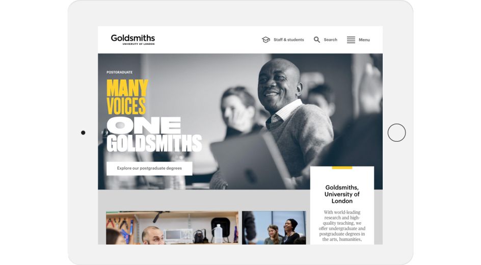
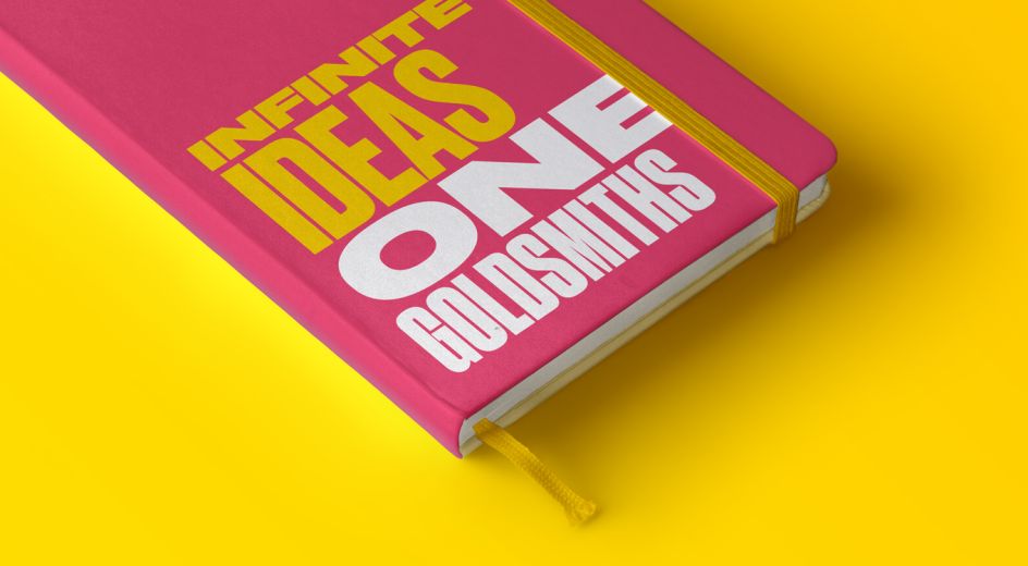
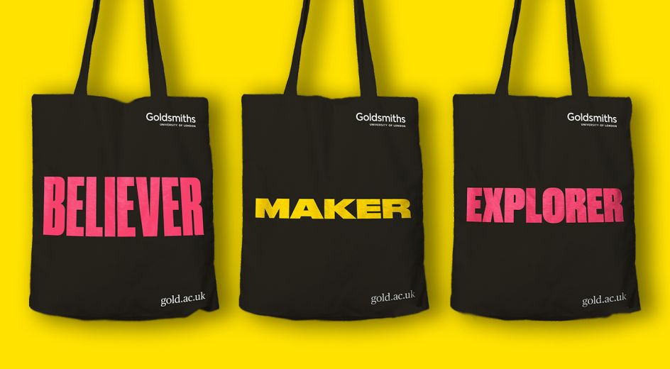
This rather nice typographically-led recruitment campaign for Goldsmiths University of London is by Brighton agency, Baxter and Bailey to help the world-renowned institution to attract the brightest and best students over the next three years.
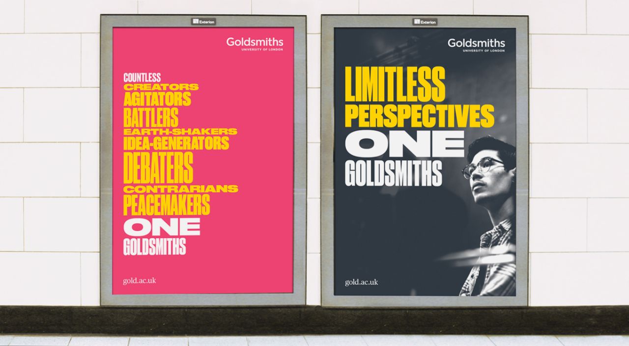
Working with regular writing partner Kate Van der Borgh, the agency's starting point was to craft a compelling and flexible approach to copy: "Our one Goldsmiths concept placed eclecticism, individuality and diversity at the heart of the solution," explains Creative Director, Matt Baxter. "With a similarly eclectic approach to typography, we brought this melting pot of disciplines, specialisms and subjects to life."
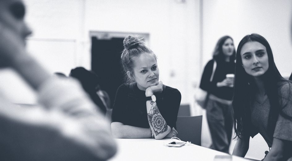
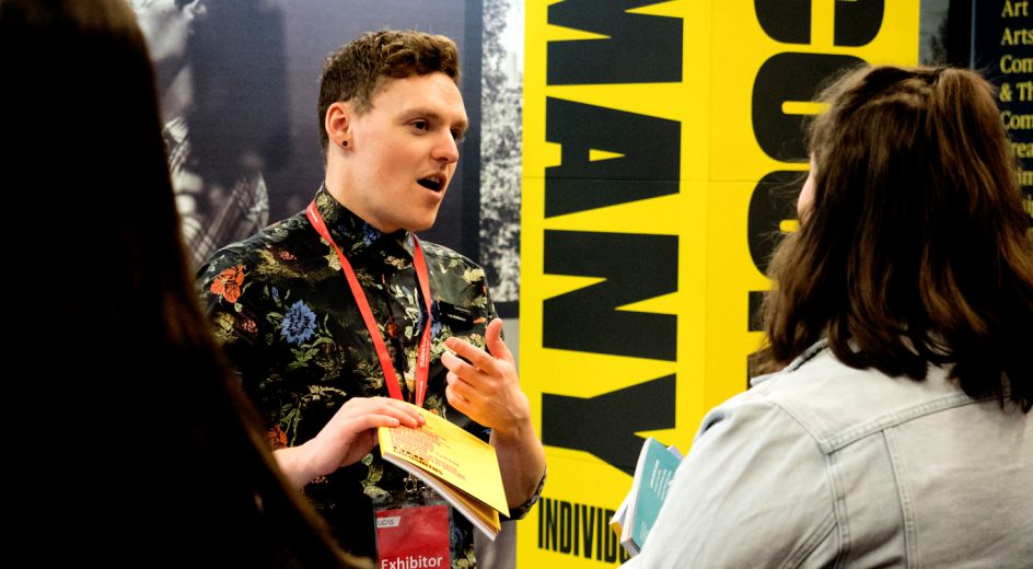
Photographer John Wildgoose joined the agency's project team to deliver a suite of brilliant black and white reportage photographs, all shot on and around the Goldsmiths campus. Baxter and Bailey also brought animators Buff Motion and exhibition build specialists Standard 8 on board to deliver their own areas of expertise. "An appropriately collaborative solution for a boldly collaborative institution," adds Matt.
And how did Goldsmiths feel? Jennifer New, Student Marketing Manager at Goldsmiths, said: "It’s been a real pleasure working with the team at Baxter and Bailey. We came to them with an ambitious brief that they’ve distilled into a striking, powerful campaign that authentically gets to the heart of what makes Goldsmiths such an exciting and inclusive place to study."





 by Tüpokompanii](https://www.creativeboom.com/upload/articles/58/58684538770fb5b428dc1882f7a732f153500153_732.jpg)


 using <a href="https://www.ohnotype.co/fonts/obviously" target="_blank">Obviously</a> by Oh No Type Co., Art Director, Brand & Creative—Spotify](https://www.creativeboom.com/upload/articles/6e/6ed31eddc26fa563f213fc76d6993dab9231ffe4_732.jpg)


