B&B studio brings credibility to alcohol-free with branding for Infinite Session
Despite the growing trend amongst young people for going teetotal, alcohol-free beer brands still tend to be defined by what’s ‘missing’, in a way that’s reminiscent of diet food brands of the 1980s and '90s.
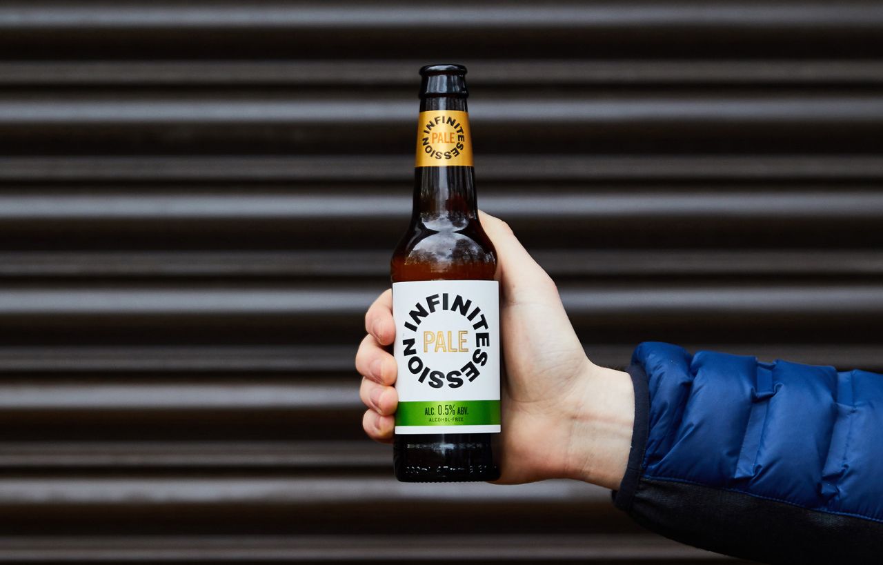
Non-alcoholic versions of mainstream beers often use blue and silver design codes and pun-based names to alert consumers to their lack of alcohol, whilst dedicated alcohol-free brands turn to wellbeing benefits and language that can come across as a little smug and sanctimonious.
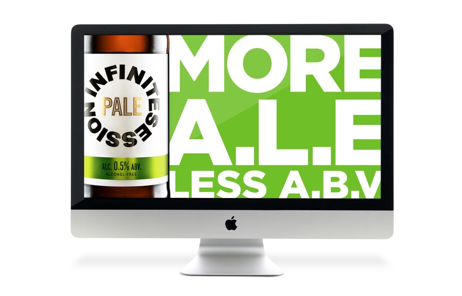
Keen to avoid such stereotypes, alcohol-free beer brand Infinite Session enlisted the help of B&B studio to come up with a bold and confident brand with the look and feel of a mainstream, craft beer.
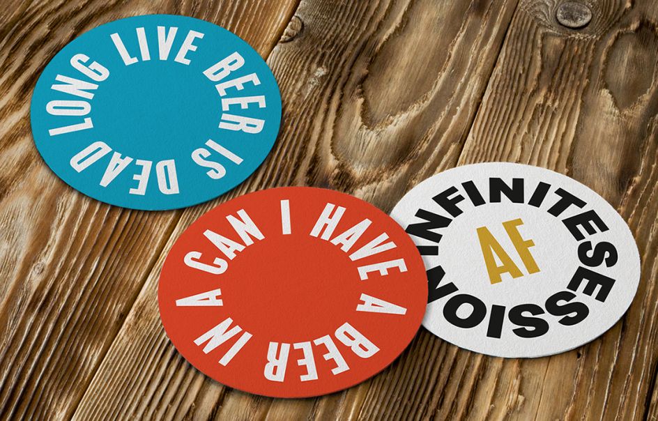
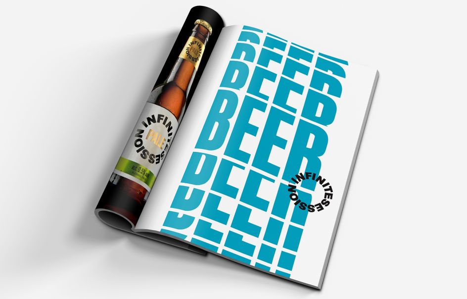
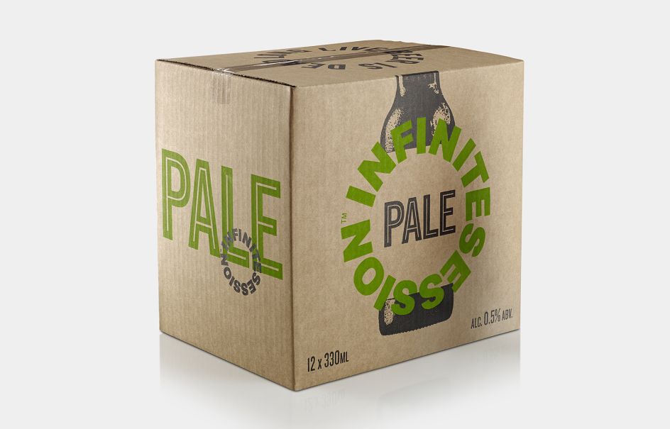
B&B studio created the name, positioning, identity and packaging for the brand, focused on what it delivers –refreshment and enjoyment – rather than what it lacks. By deliberately creating a design that communicates ‘beer’ rather than ‘alcohol-free beer’, B&B is reflecting a strong cultural shift towards the normalisation of alcohol alternatives. This positioning is reflected in the name Infinite Session, created by B&B to evoke a drinking experience that doesn’t have to end.
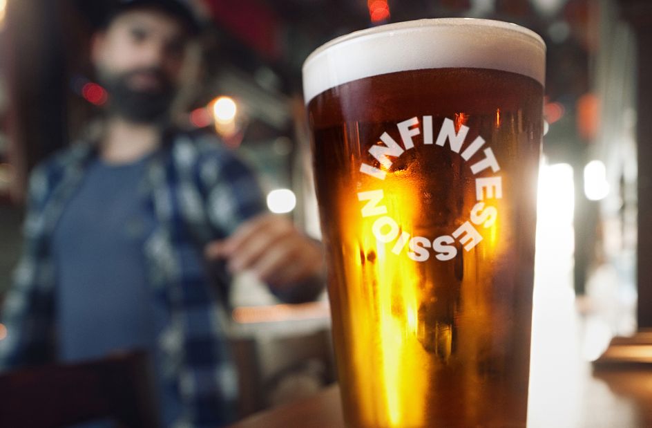
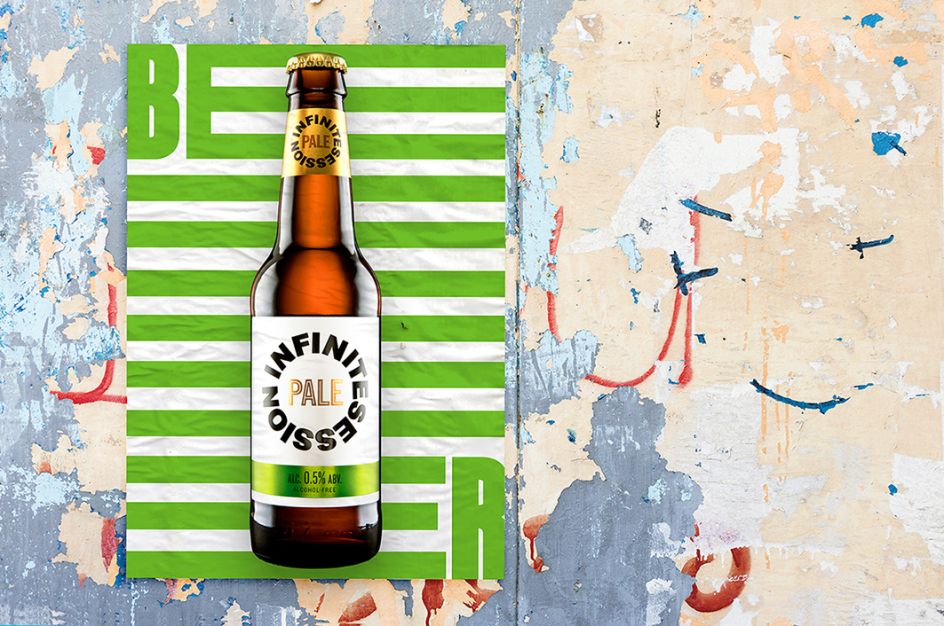
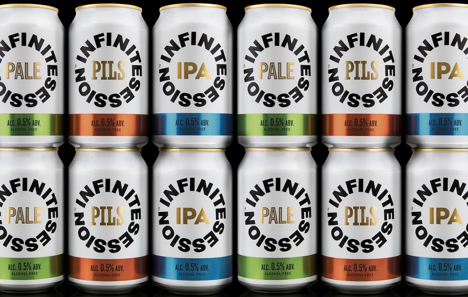
The team avoided the obvious use of the infinity symbol solution, instead of creating a bold and modern circular logo that place the brand name in a wheel. The logo is placed on a fresh, white background for readability, while the beer type is placed in the centre using characterful type.
"B&B studio challenged our thinking from the start," says Chris Hannaway of Infinite Session. "We’re launching with a really bold and confident brand, that is secure in itself and makes no apologies. It’s both exactly what we wanted, and entirely different to what we expected."


 by Tüpokompanii](https://www.creativeboom.com/upload/articles/58/58684538770fb5b428dc1882f7a732f153500153_732.jpg)

 using <a href="https://www.ohnotype.co/fonts/obviously" target="_blank">Obviously</a> by Oh No Type Co., Art Director, Brand & Creative—Spotify](https://www.creativeboom.com/upload/articles/6e/6ed31eddc26fa563f213fc76d6993dab9231ffe4_732.jpg)


