Beautiful identity for Japanese tea brand Yojoki Tea
When Buenos Aires-based agency Twentyfive was commissioned to develop the identity system for a Japanese brand of tea, the creative process began with ancient Asian tea culture.
Ariel Di Lisio, director at Twentyfive explains: "We found the oldest Japanese specialty tea book, Kissa Yōjōki (喫茶 養生 記) – "be healthy through tea", written in 1211.
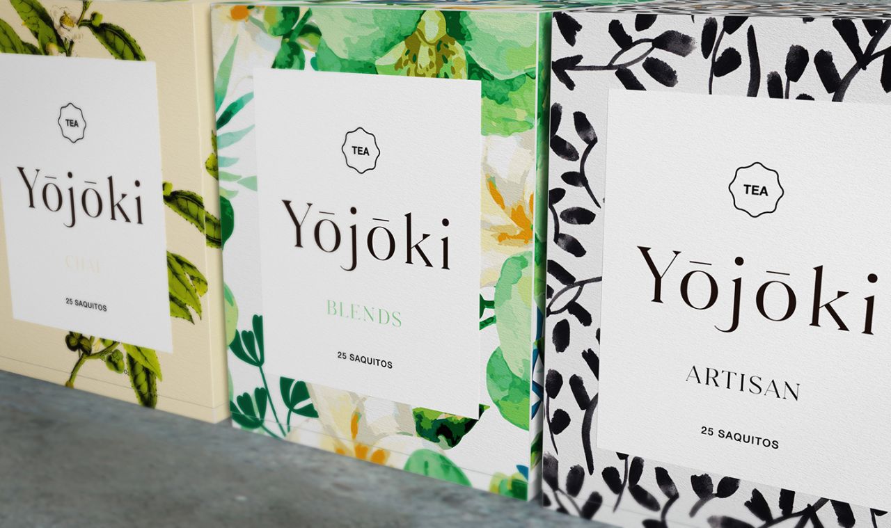
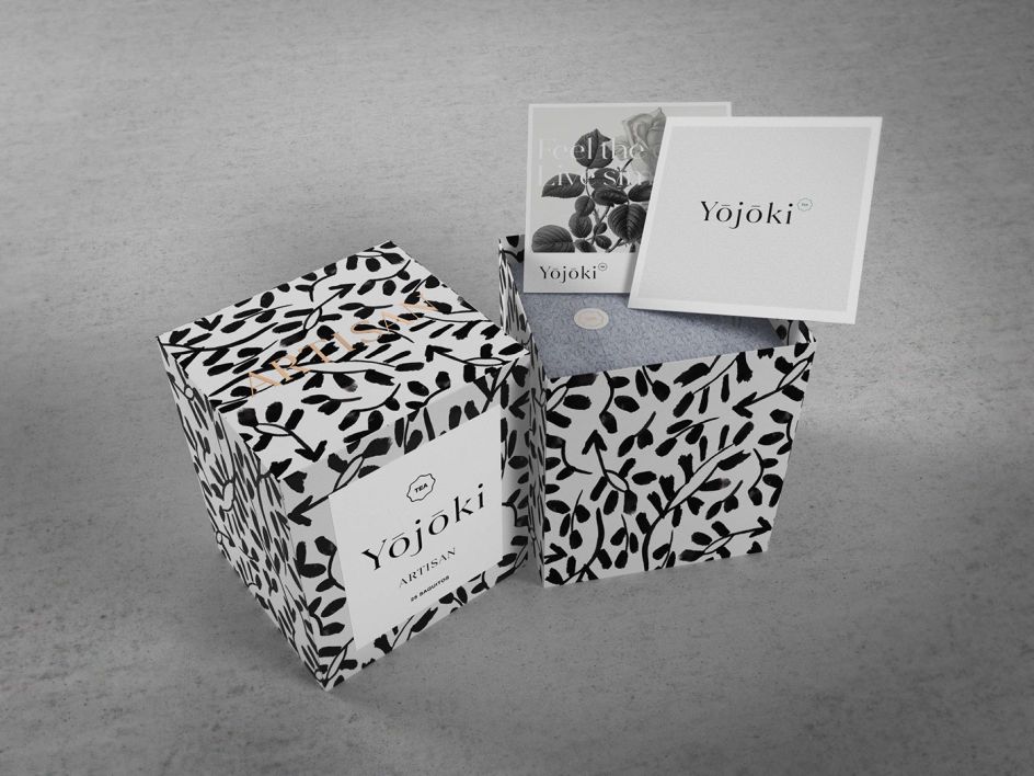
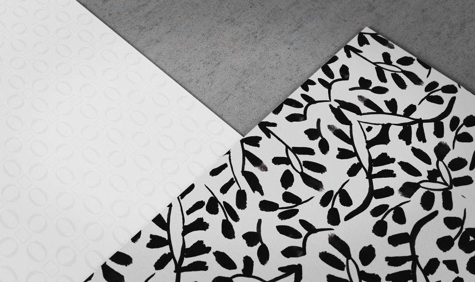
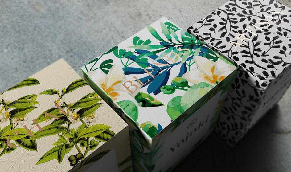
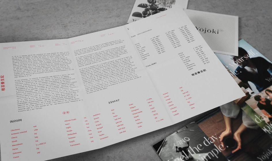
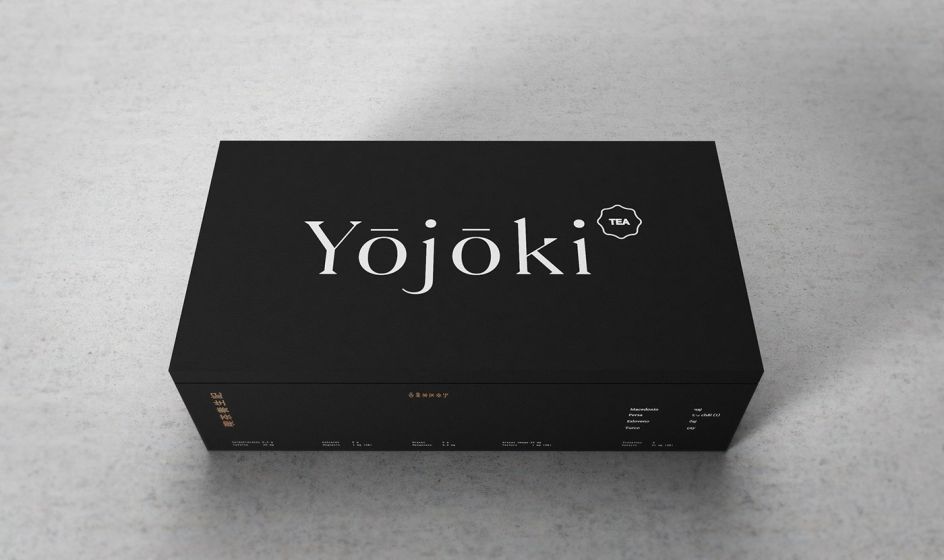
"The ideas inspired by the book's contents became the guiding concept behind the identity system; first of all we came up with the name Yojoki. The brand always appears surrounded by white, within a context filled with handmade textures, shapes, floral elements and kanji script – one of the first writing systems. The concept of luxury is inherent to the product, we integrate it through a Didona typeface developed for the brand, which comes alive through subtle printed finishes and high-quality materials.
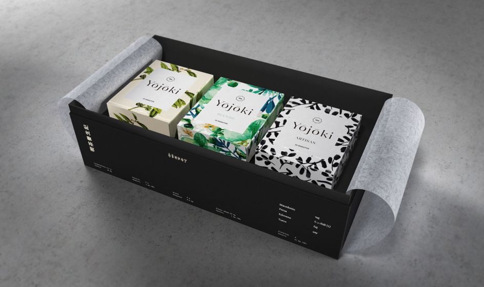
"All the elements of the brand are interconnected through the packaging and its different presentations, as well as complementary elements such as wrapping paper, stickers, postcards and fact sheets which communicate the different types of tea blends."
Discover more at betwentyfive.com.
Via Behance | All images copyright of Twentyfive


 by Tüpokompanii](https://www.creativeboom.com/upload/articles/58/58684538770fb5b428dc1882f7a732f153500153_732.jpg)

 using <a href="https://www.ohnotype.co/fonts/obviously" target="_blank">Obviously</a> by Oh No Type Co., Art Director, Brand & Creative—Spotify](https://www.creativeboom.com/upload/articles/6e/6ed31eddc26fa563f213fc76d6993dab9231ffe4_732.jpg)


