Bold, showstopping identity for Norwegian eyewear brand Kaibosh
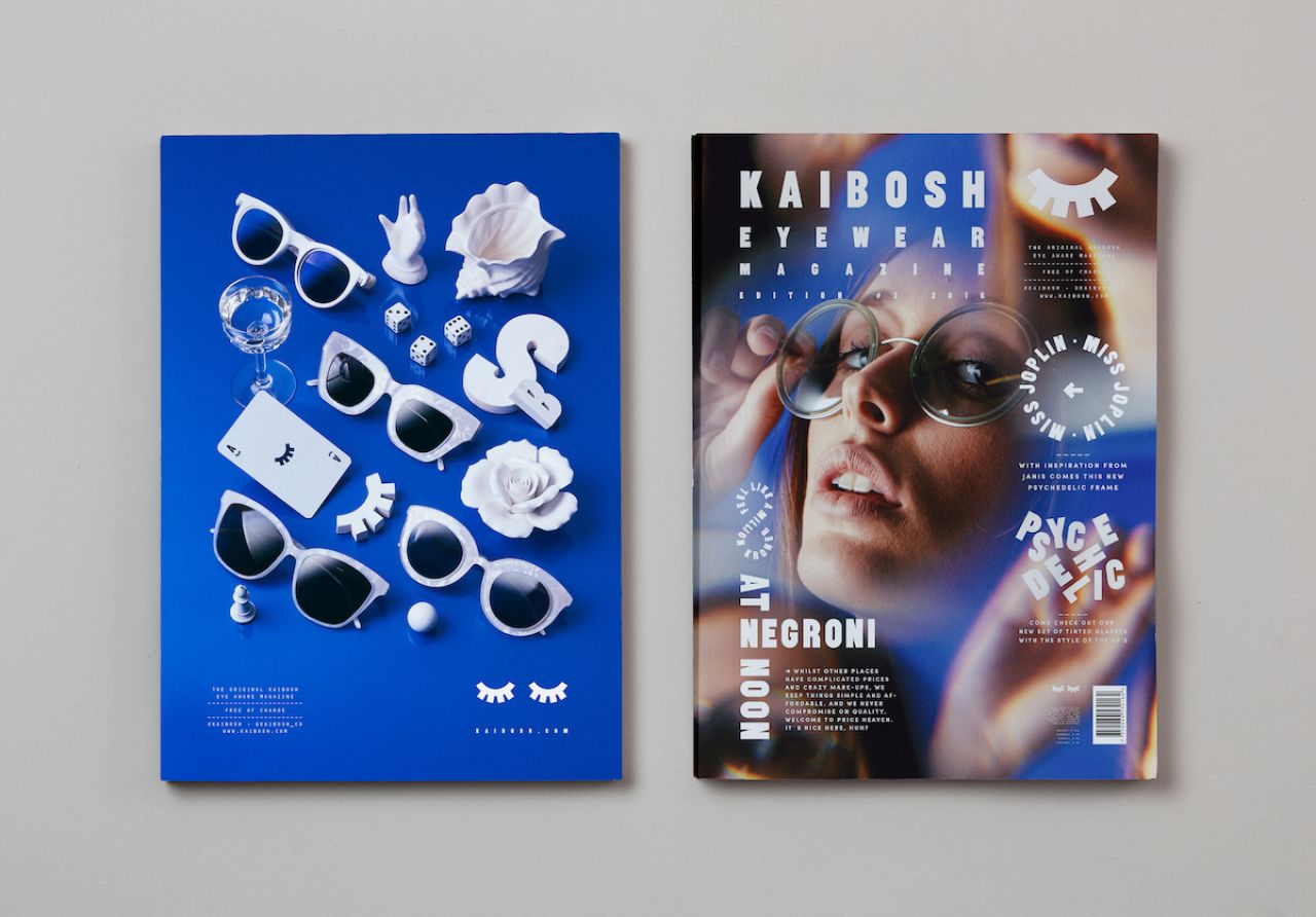
The eye-catching identity for this trailblazing eyewear brand, Kaibosh, was created by Snask – an internationally-renowned creative agency that makes 'kick ass branding, design and film'.
Fredrik Öst, Founder & Creative Director, explains: "We got contacted by the Norwegian eyewear company Kaibosh. They felt that they had become too boring as opposed to what they should be, a trendy and bold eyewear brand.
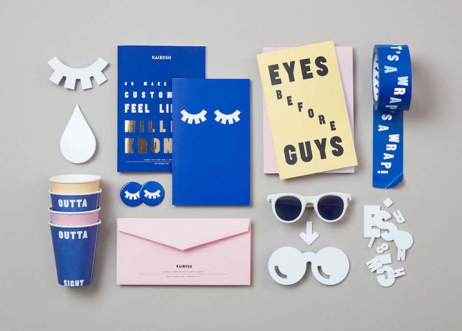
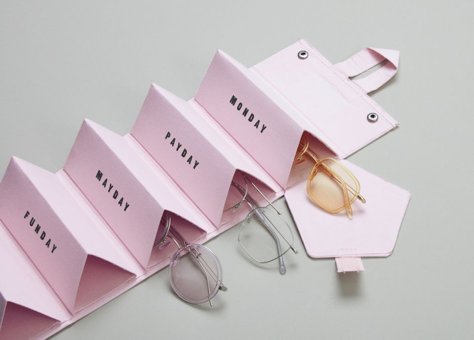
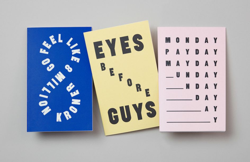
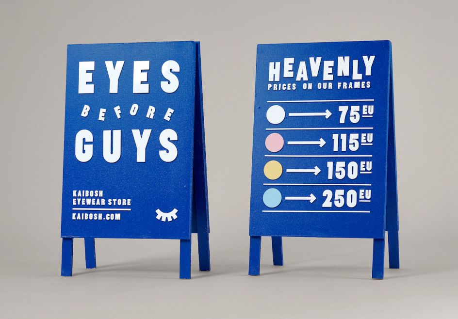
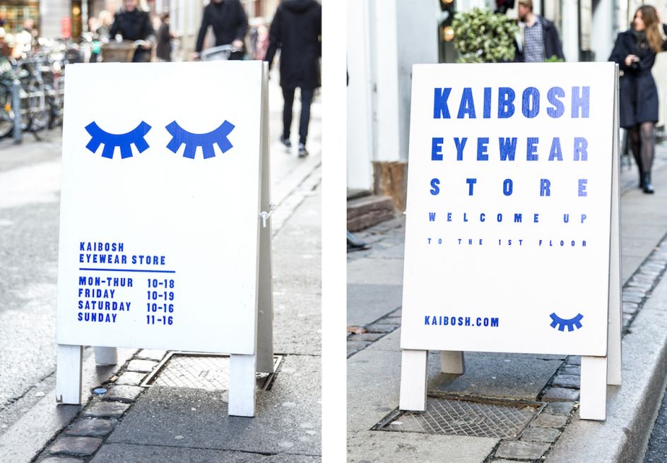
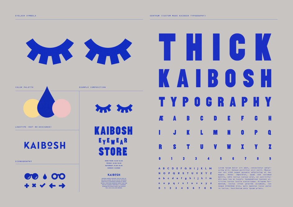
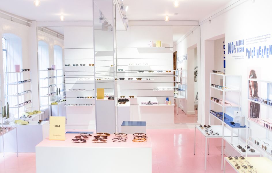
"They felt their identity was too clean and they wanted to be more expressive and outgoing. The fashionable contender would finally get a fitting dress as well as a lovely new voice. We got the assignment to start out with keeping their existing logotype and from that develop their new brand ranging from signs, ads, packaging, bags and posters, as well as to create their entire flagship store.
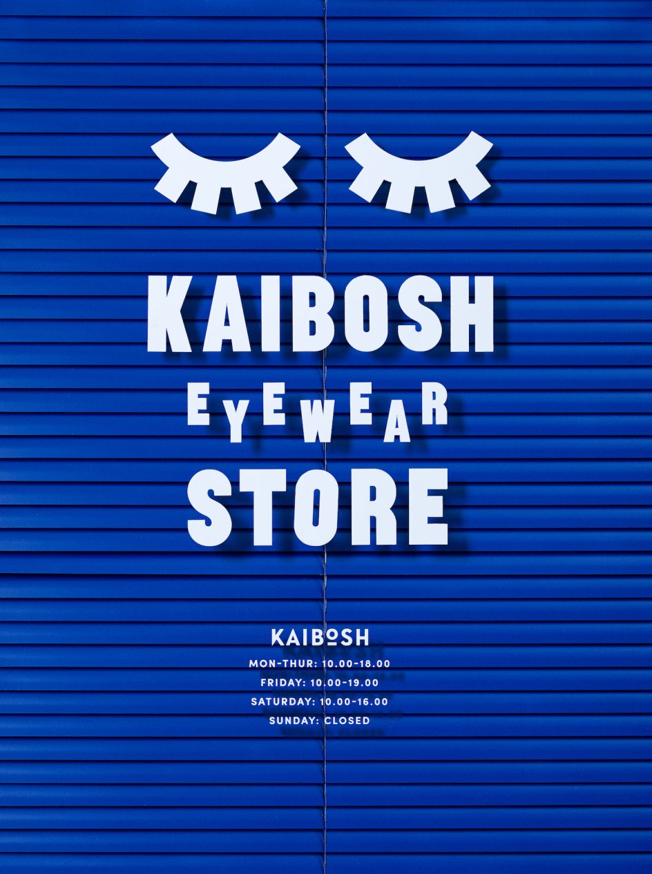
"We started out writing their brand platform and tonality where they would use much more copywriting in their communication, from promotion material to walls in their stores. The brand and tonality was translated into visual form and matched with a custom-made display typeface, named Sentrum, made to suit the in-store signage.
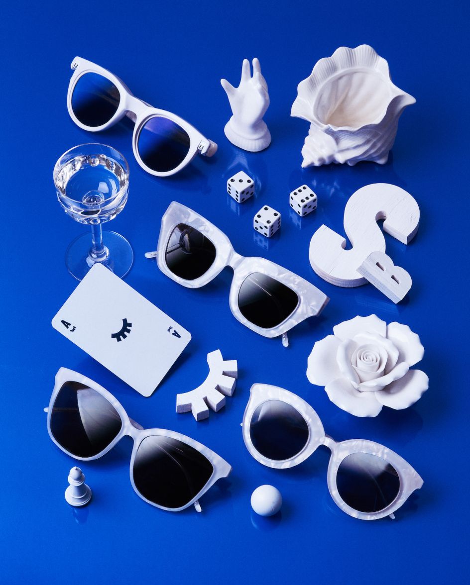
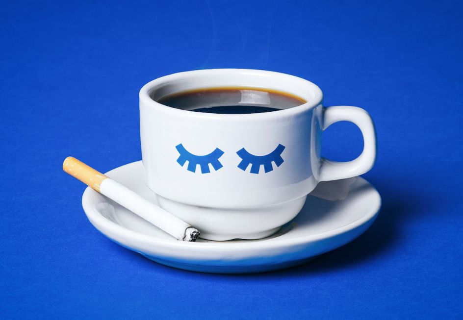
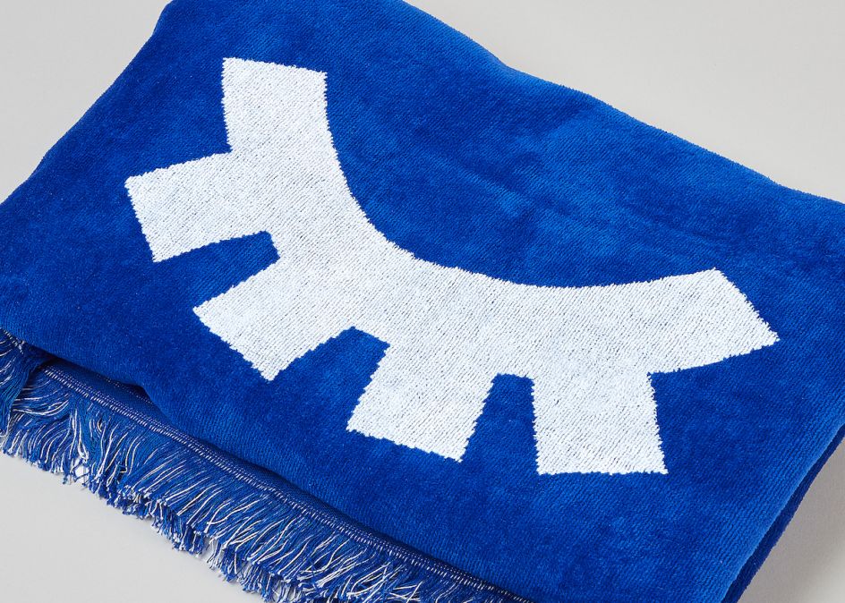
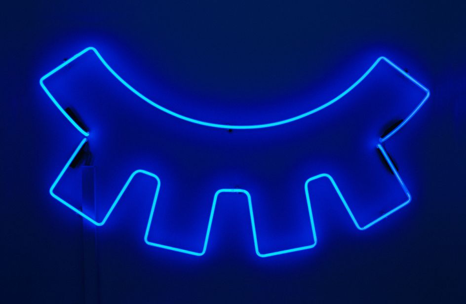
"We added two eyelashes as a symbol to distinguish the identity as well as to be used as graphic elements for many different scenarios. We created the entire flagship store with shelving systems, signage, colours and murals. The project ranged from typeface and still life photos to campaigns, fashion-photography, notebooks and towels." Looking never looked so good. Discover more at www.snask.com.
Via Creative Boom submission | All images courtesy of Snask


 by Tüpokompanii](https://www.creativeboom.com/upload/articles/58/58684538770fb5b428dc1882f7a732f153500153_732.jpg)


 using <a href="https://www.ohnotype.co/fonts/obviously" target="_blank">Obviously</a> by Oh No Type Co., Art Director, Brand & Creative—Spotify](https://www.creativeboom.com/upload/articles/6e/6ed31eddc26fa563f213fc76d6993dab9231ffe4_732.jpg)


