Bold yet playful brand identity for Japanese sushi restaurant, Samurai
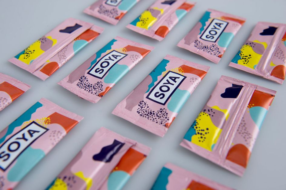
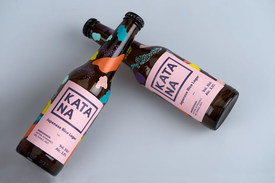
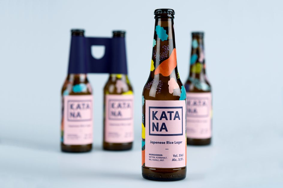
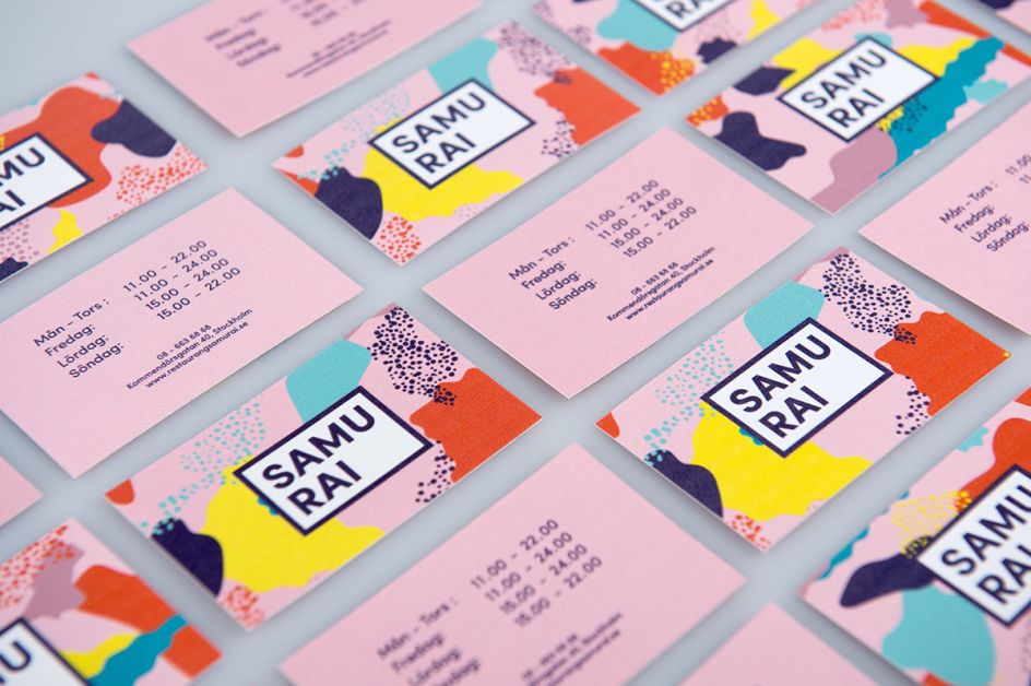
We love this playful brand identity created for Stockholm-based restaurant, Samurai, by designers Fanny Löfvall, Nanna Basekay and Oliver Sjöqvist. The concept is centred around the restaurant's approach to take away, offering a premium and unique experience for its customers. The inspiration for the design was taken from Japanese culture.
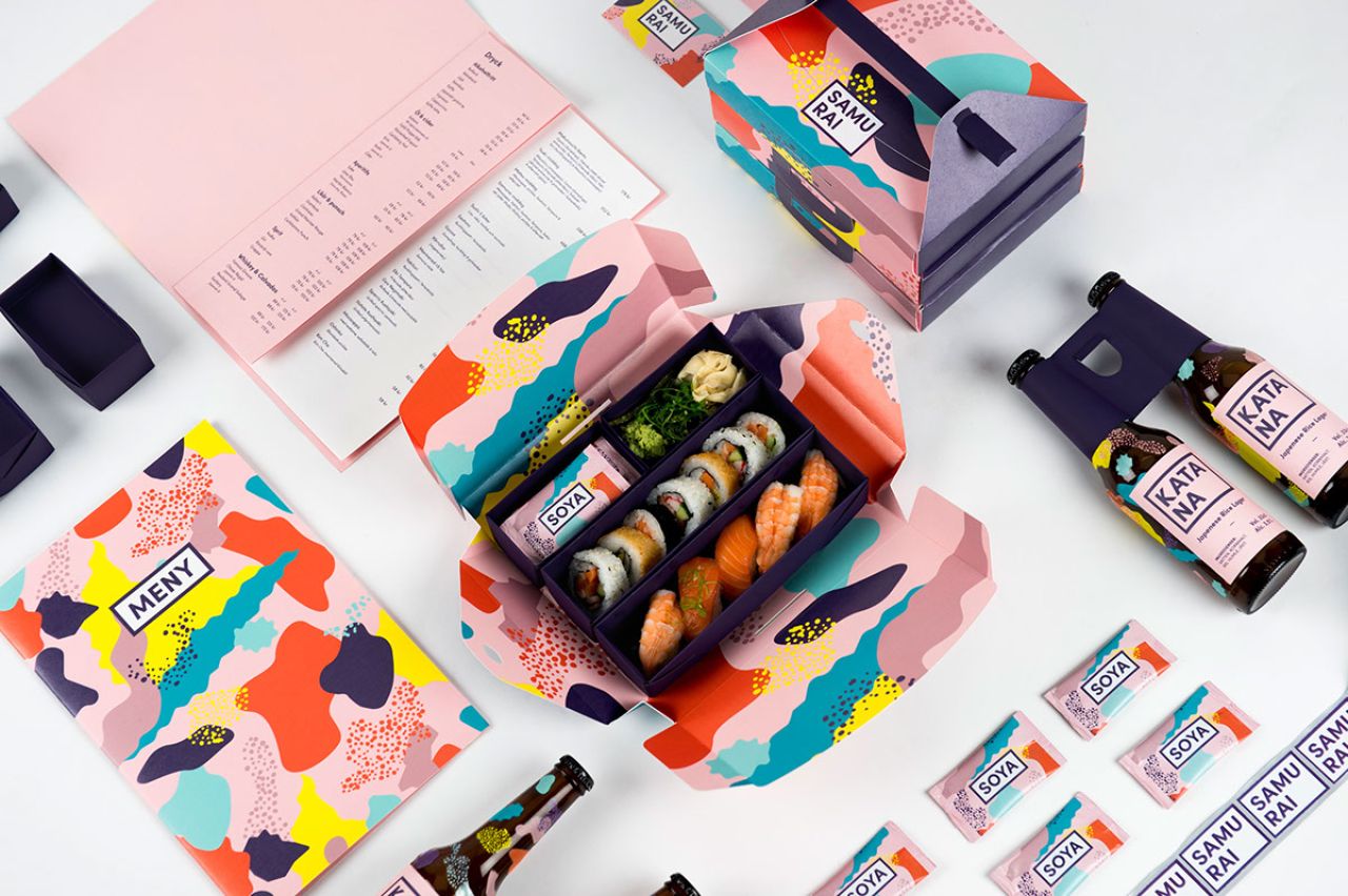
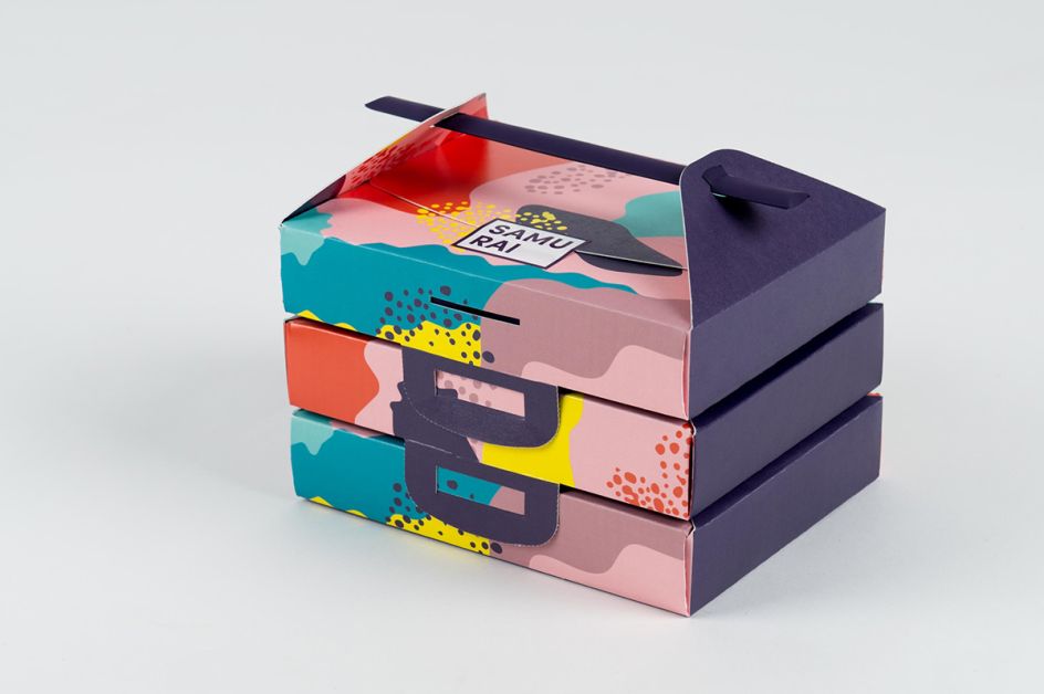
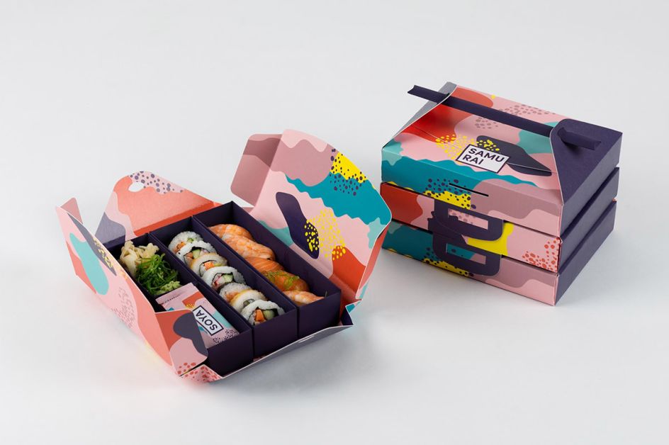
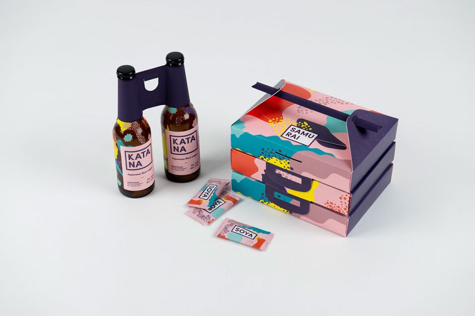
The team explain: "The take away box is packaging made entirely without glue. Inner drawers can easily mix with each other, depending on what the customer orders. The packaging is sealed with a simple sticker.
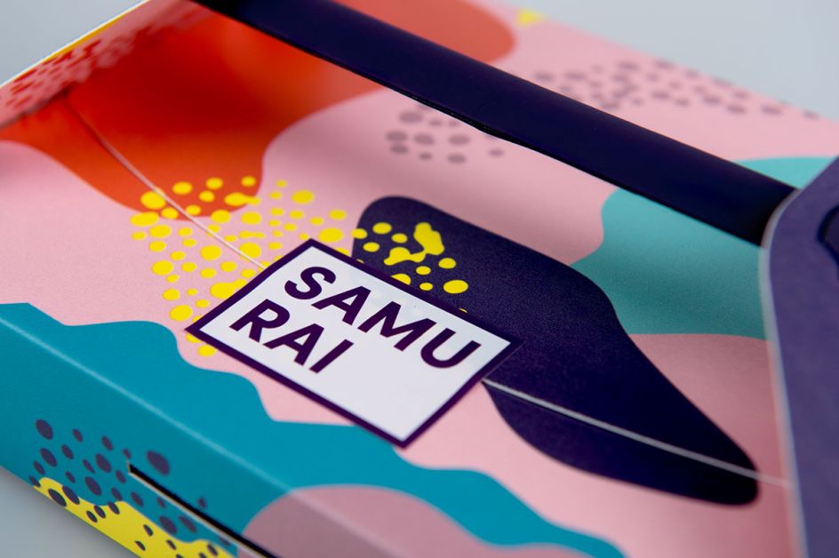
"We wanted to avoid using a bag as a solution and therefore created a design where you can stack and attach packagings on top of each other. The packaging to chopsticks are used as handles. In the middle of the pack you can see a perforation that makes it very easy to open up and take out the chopsticks.
"It is a unique take away box that gives the customer a more personal and premium experience."
Via Behance | All images courtesy of the designers


 by Tüpokompanii](https://www.creativeboom.com/upload/articles/58/58684538770fb5b428dc1882f7a732f153500153_732.jpg)


 using <a href="https://www.ohnotype.co/fonts/obviously" target="_blank">Obviously</a> by Oh No Type Co., Art Director, Brand & Creative—Spotify](https://www.creativeboom.com/upload/articles/6e/6ed31eddc26fa563f213fc76d6993dab9231ffe4_732.jpg)


