Boxpark Wembley gets a new identity and launch campaign courtesy of Filthy Media
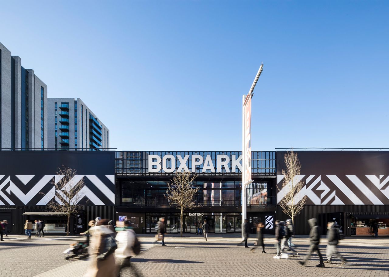
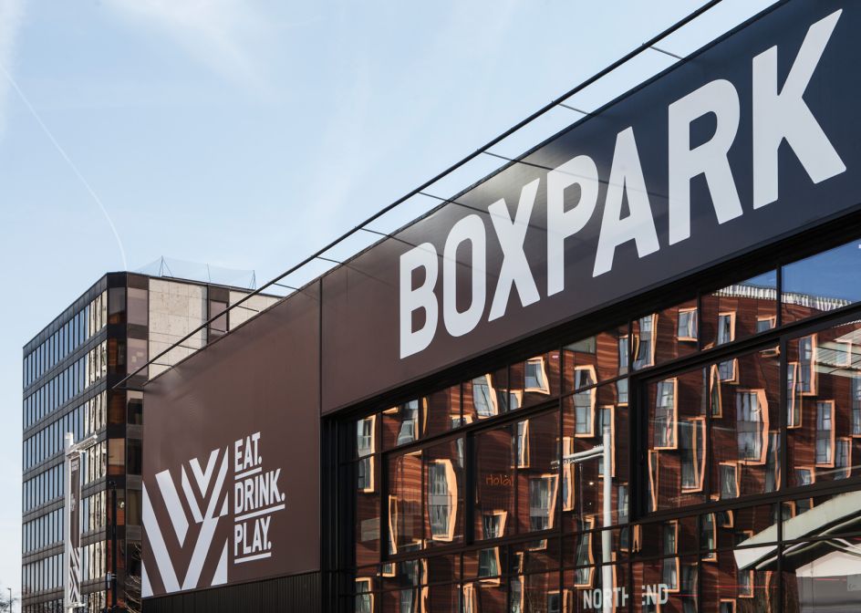
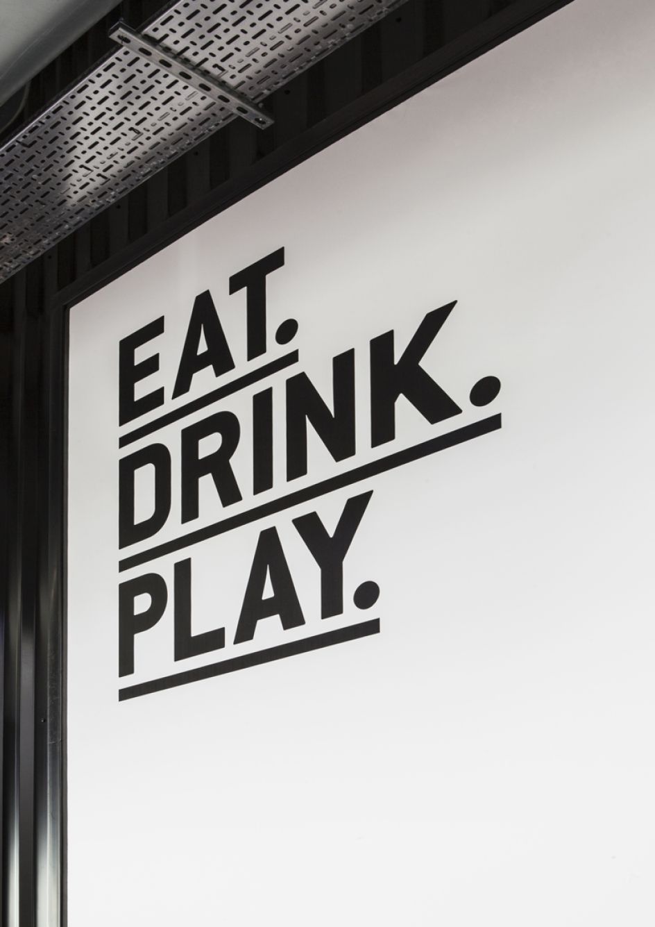
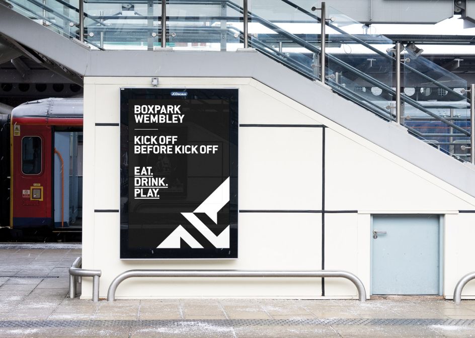
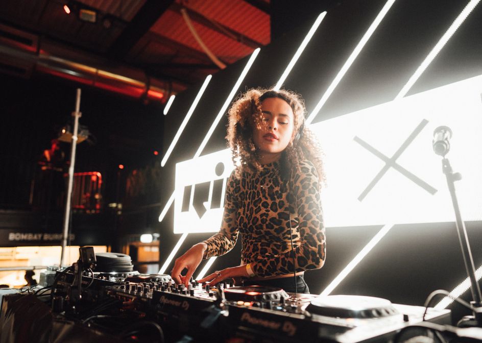
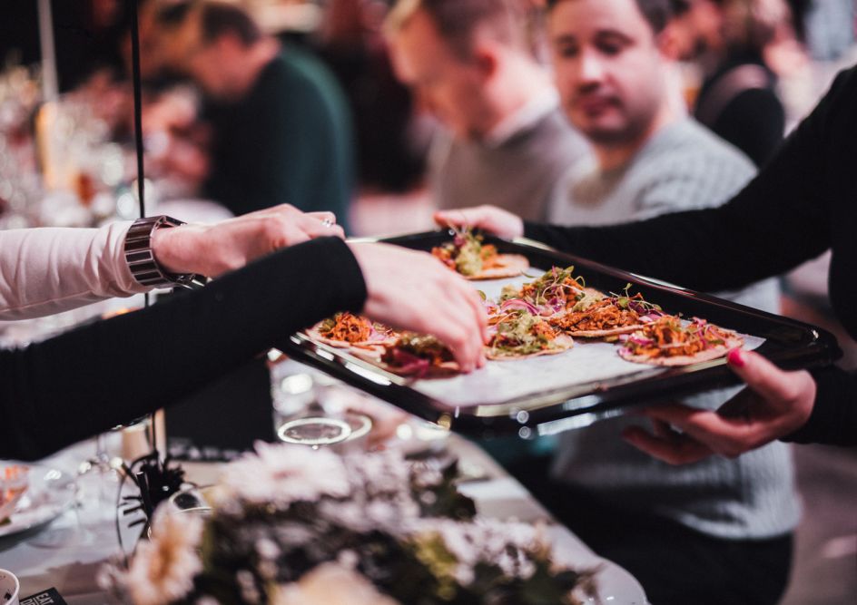
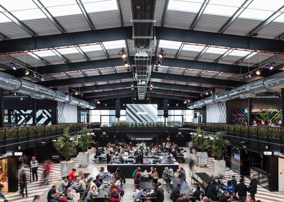
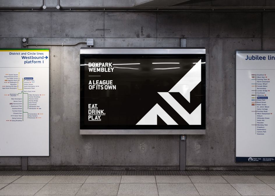
Boxpark Wembley is the third iteration of Roger Wade's modern street food, events and leisure concept: a place where you can "eat, drink and play". For its latest setting, it needed an identity that was fresh but also tied in with the brand's two other homes.
Via Creative Boom submission. All images courtesy of Filthy Media
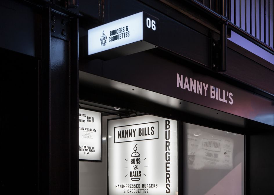
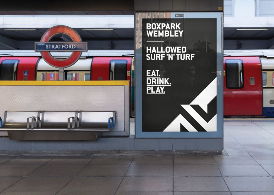
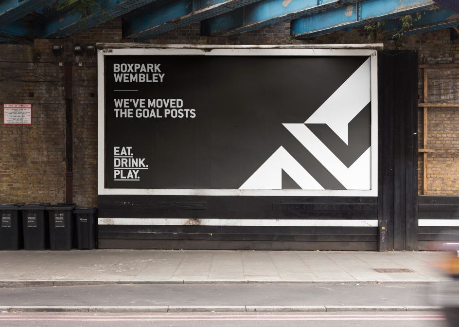
Brighton studio Filthy Media came up with the goods, working in partnership with BDP Architects to design the visual language and launch campaign for Boxpark’s latest development in Wembley Park.
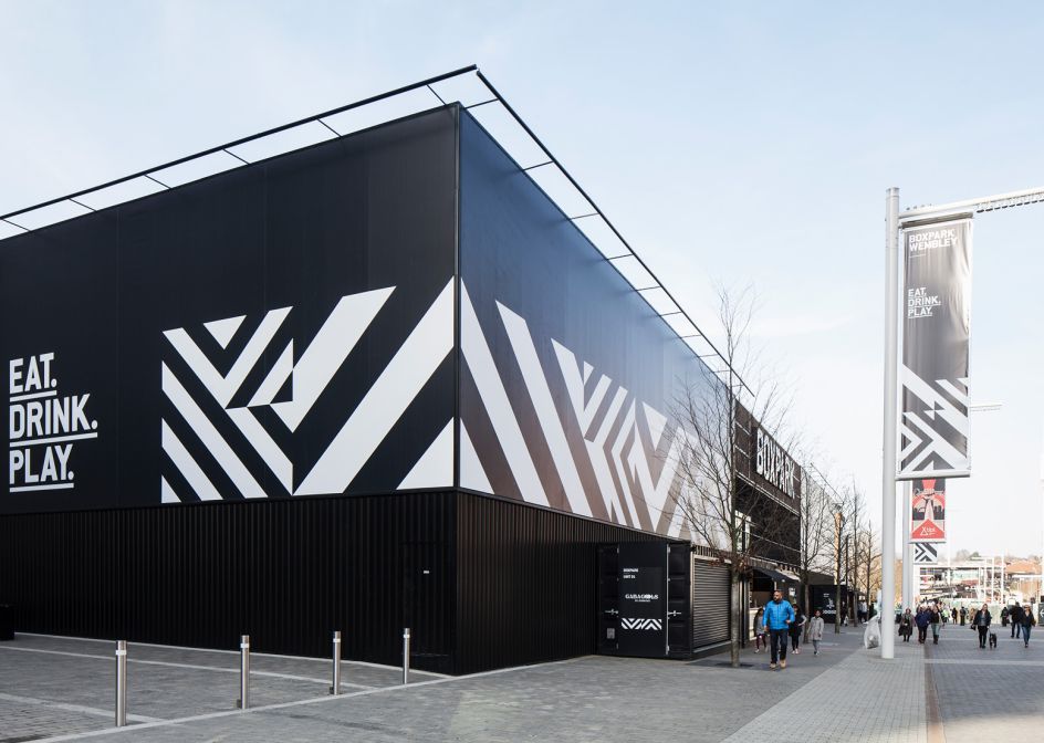
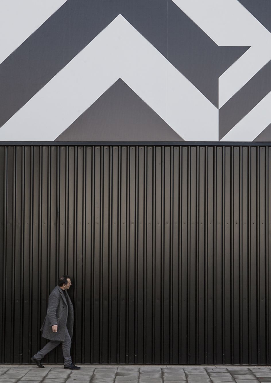
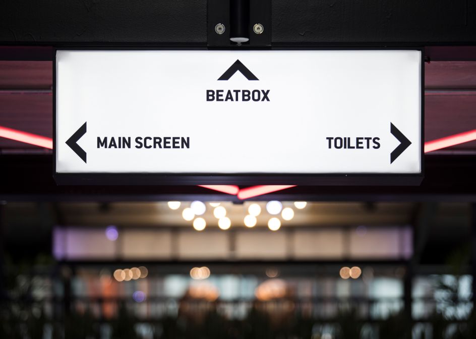
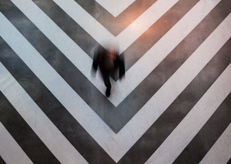
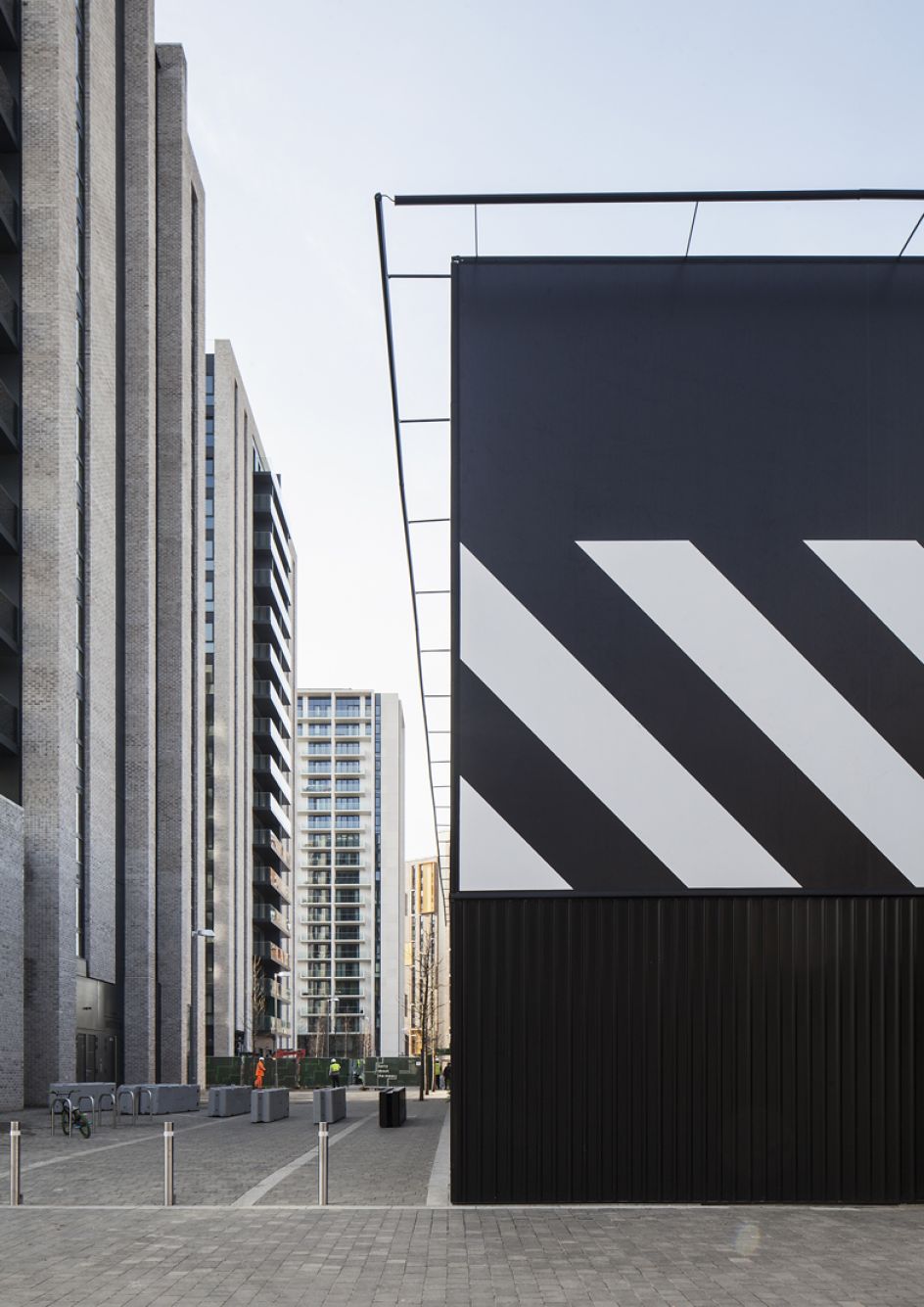
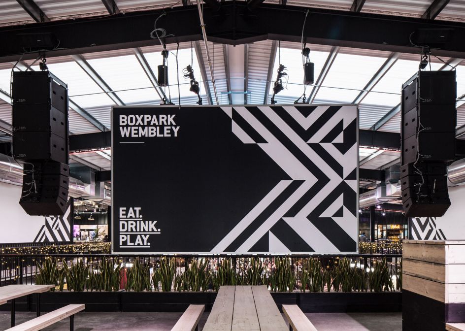
Inspired by the regeneration of the surrounding area, the studio adopted the brand's iconic chevron pattern and transformed it into a single square unit in "two proportional sizes", which were then flipped and rotated to create infinite graphic combinations.
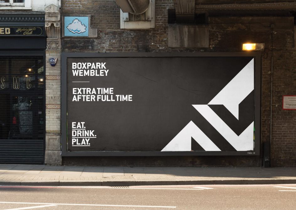
"From floor markings to eight-storey ad banners, we ran this visual language alongside a bold opening campaign that played on Wembley’s fundamental links to sporting contests and the beautiful game," says Creative Director Joe Pilbeam.



 by Tüpokompanii](https://www.creativeboom.com/upload/articles/58/58684538770fb5b428dc1882f7a732f153500153_732.jpg)


 using <a href="https://www.ohnotype.co/fonts/obviously" target="_blank">Obviously</a> by Oh No Type Co., Art Director, Brand & Creative—Spotify](https://www.creativeboom.com/upload/articles/6e/6ed31eddc26fa563f213fc76d6993dab9231ffe4_732.jpg)


. Via CB submission](https://www.creativeboom.com/upload/articles/31/310234ca948c85b7dfbf8ed3f7532110cf56e0a9_732.png)

