BrandOpus launches 'inspiring new beginnings' for Canadian craft beer, Creemore
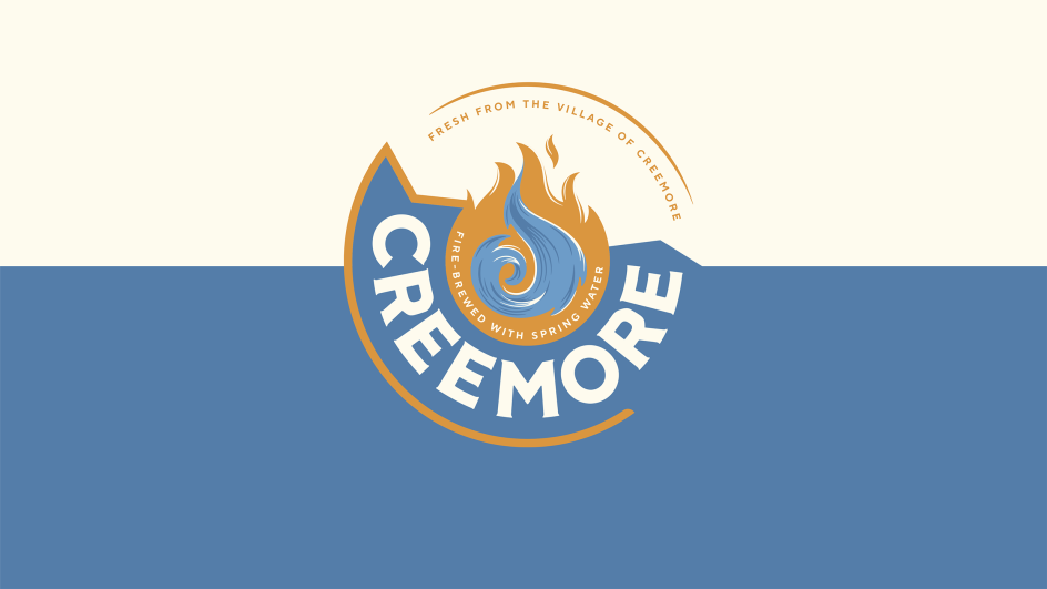
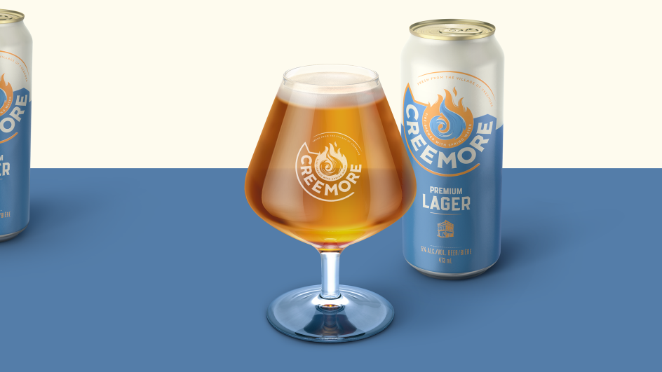
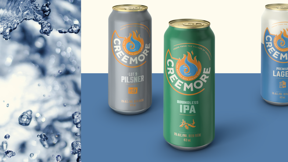
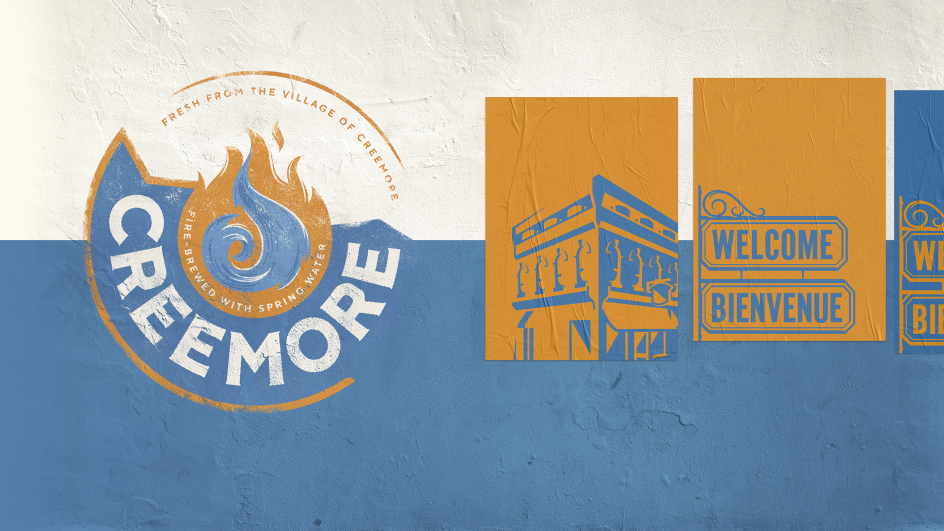
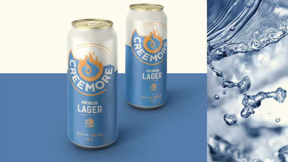
BrandOpus has created this rather tasty identity and packaging for Creemore, a Canadian craft beer brand, founded in 1987 to celebrate a small Ontarian community.

Brewed with Creemore springwater, then fire-brewed in copper for complexity and taste, the mix of fire and water offers a distinctive fresh beer loved for its depth and character – and it's much-loved all over the world.
Creemore briefed BrandOpus to reinvigorate and bolster its brand, with a new look and feel that would drive reappraisal with current and new drinkers. It was eager to move away from the niche of the craft category, whilst maintaining its rich foundations, small-town personality and the spirit in which it was founded.
Acknowledging this founding spirit, BrandOpus crafted an identity that embodies the core values of "looking to the next chapter, awakening opportunity and celebrating the future". And the new identity champions Creemore’s blend of fire and water, embracing its heritage and locality, whilst staying true to its roots.
Kim Dunphy, creative director at BrandOpus says: "Our aim was to showcase Creemore as an advocate for inspirational ventures. Not wanting to lose what’s special about Creemore the place and its strong sense of community, we visited the town of Creemore, felt their spirit and saw first-hand how important the brewery is to its community. The new visual identity and brand narrative now reflects their passion and uniqueness and stays true to years of brewery history."


 by Tüpokompanii](https://www.creativeboom.com/upload/articles/58/58684538770fb5b428dc1882f7a732f153500153_732.jpg)


 using <a href="https://www.ohnotype.co/fonts/obviously" target="_blank">Obviously</a> by Oh No Type Co., Art Director, Brand & Creative—Spotify](https://www.creativeboom.com/upload/articles/6e/6ed31eddc26fa563f213fc76d6993dab9231ffe4_732.jpg)


