Build creates modern, clean yet playful branding for botanical skincare range
Demonstrating their deft ability to turn any project, from a finely rendered printed book to an exhaustive identity system, into a considered and effective design solution, here’s some more great work from Leeds-based agency Build.
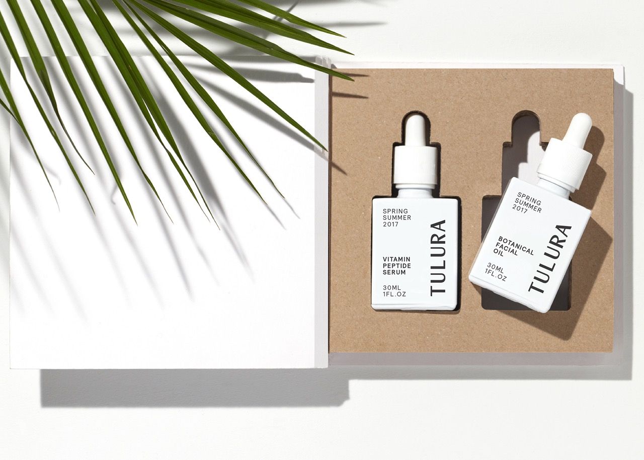
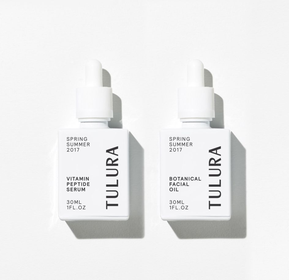
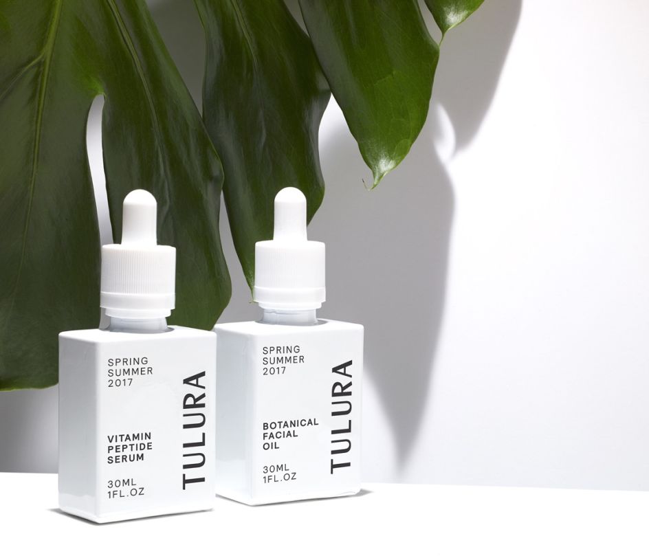
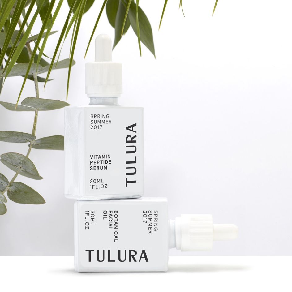
The studio was tasked with creating the branding and packaging design for Tulura, a new "botanical skincare" brand from New York launched by former model Eileen Feighny, who was raiased in Korea. Her upbringing has informed her approach to beauty, and as such Build began its design process with a lengthy stint of engagement with her beliefs around “being kind to yourself, others and the planet.”
This led to a clean, simple and modern approach when it came to the designs. “This brand is all about Eileen, it’s her ethos, her foundations – therefore it was super important that she was included and a part of all the stages of the design process,” says Build founder and creative director Michael C Place.
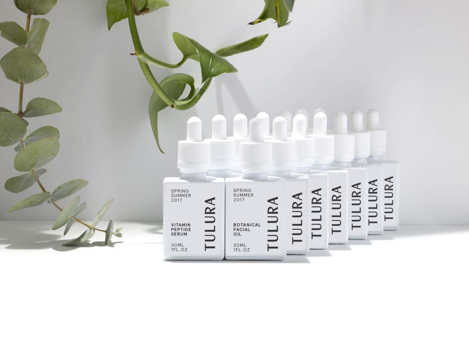
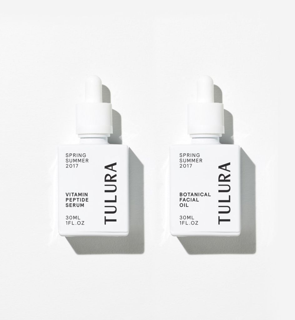
"Through lots of iterations we presented to Eileen and Fred, her business partner, we naturally came to the conclusion that less is more. We wanted to design a system that allowed the brand to come to life first, and then over time can be adapted for new season launches and limited editions. This stripped back approach matches the core approach intrinsic in the range itself, where less is definitely more."
Feighny adds that for all this paring back, it was important to hint at the less serious side of her brand. "We also wanted to demonstrate our playfulness – this brand was created for beauty enthusiasts who enjoy quality products, good health and happiness," she says.


 by Tüpokompanii](https://www.creativeboom.com/upload/articles/58/58684538770fb5b428dc1882f7a732f153500153_732.jpg)


 using <a href="https://www.ohnotype.co/fonts/obviously" target="_blank">Obviously</a> by Oh No Type Co., Art Director, Brand & Creative—Spotify](https://www.creativeboom.com/upload/articles/6e/6ed31eddc26fa563f213fc76d6993dab9231ffe4_732.jpg)


