Butcher Billy on imposter syndrome, '80s fandom, and his hit posters for Stranger Things
What's it like to design official art for Stranger Things? Taking inspiration from 1980s culture, Stephen King's book covers and "nasty video jackets", Brazilian illustrator Butcher Billy reveals all.
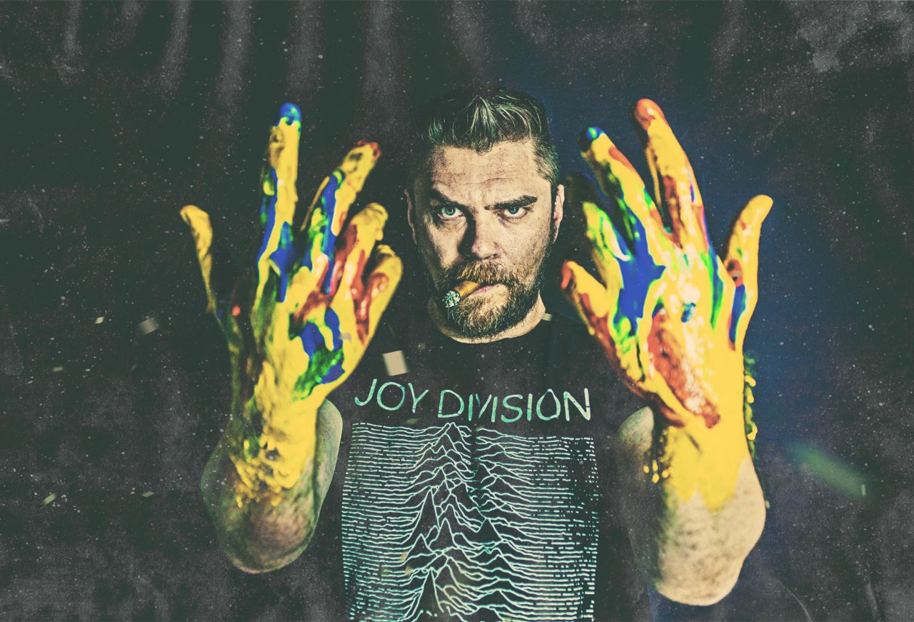
Butcher Billy
Now in its fourth season, Netflix's hit show Stranger Things isn't just a massive global hit. It's also becoming somewhat of a cultural nexus, most notably introducing '80s stars Kate Bush and Metallica to a brand new generation and propelling them back into the charts worldwide. And it's been a huge inspiration to artists and illustrators too, inspiring countless fan projects such as Xavier Portela's upside-down photographs.
But creating your own fan design for everyone's favourite nostalgia-tinged sci-fi horror is one thing. Getting commissioned to make official art for the series is very much another.
That's exactly the exciting (if somewhat scary) position that Brazilian Pop Art illustrator Butcher Billy recently found himself in. The show's producers approached him via his illustration agency, IllustrationX, and commissioned nine artworks – one for each episode – as part of the social media campaign for season four. In response, Butcher Billy created something quite special.
Rather than standard promo art featuring the main cast, his designs draw on the '80s aesthetics of horror comics, movie posters, Stephen King book covers and nasty video jackets, with a gloriously dark and sinister twist. They caused a huge stir online, garnering tens of millions of likes on Instagram alone. And Netflix quickly jumped on this fan love, releasing the image as physical posters, t-shirts, sweatshirts and hoodies via the Netflix online shop, as well as using them in outdoor advertising across Los Angeles.
So how did it all go, so right? We chatted with Butcher Billy to find out how he approached the project, how nervous he felt, and where his influences lay.
When and how did the job come about?
I was contacted in February by a New York creative agency called Ralph, which was managing the social media strategy for an upcoming, well-known sci-fi series and wanted to know my availability. They said I would be a perfect fit. When I discovered that it was Stranger Things and that the Duffer Brothers had loved my previous work and had suggested my name, I was stoked, to say the least.
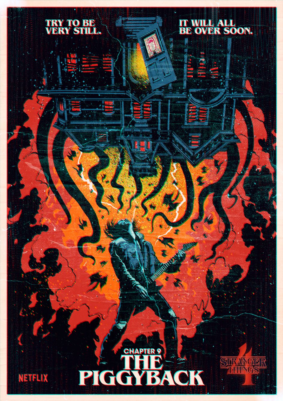
Stranger Things for Netflix © Butcher Billy
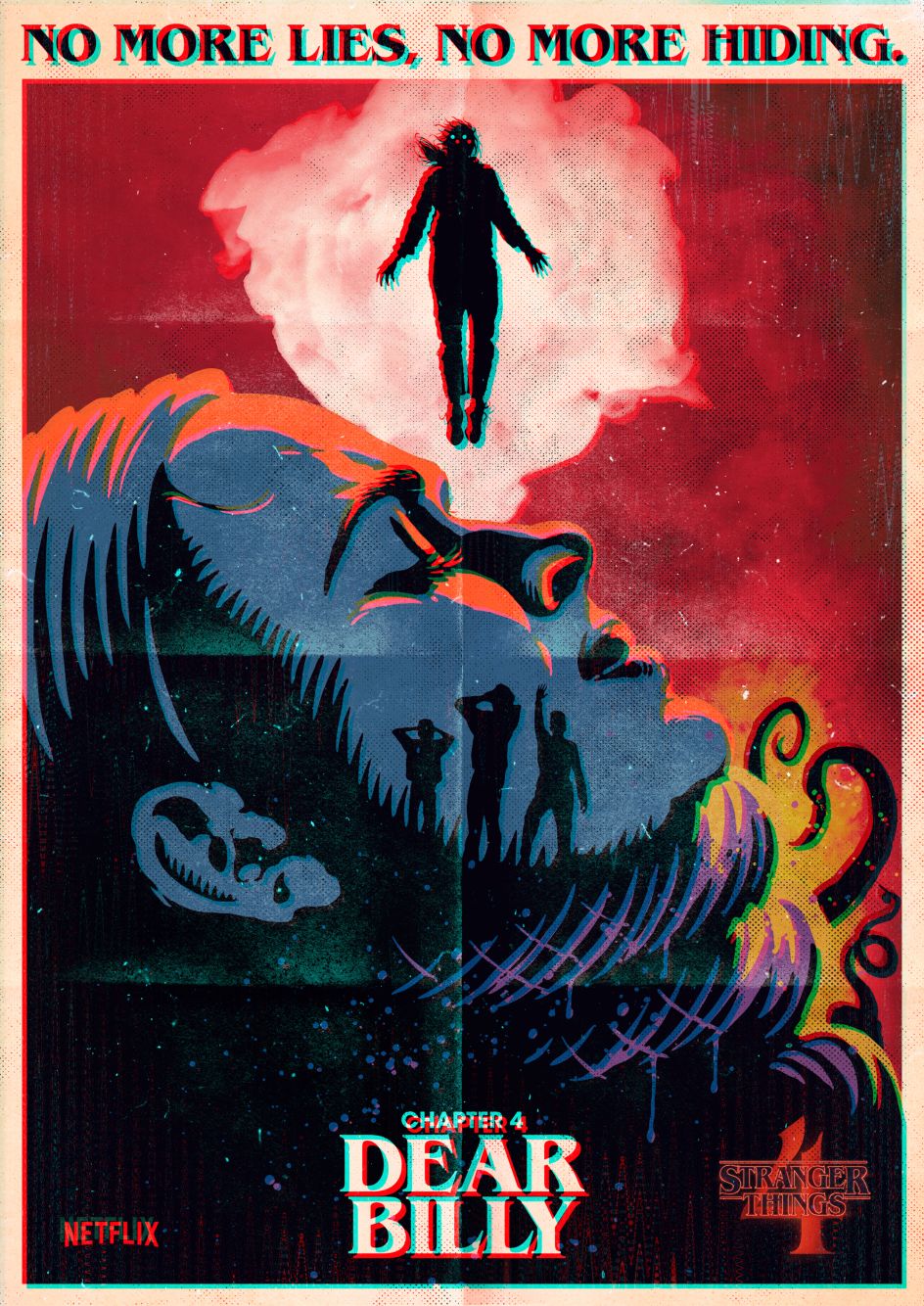
Stranger Things for Netflix © Butcher Billy
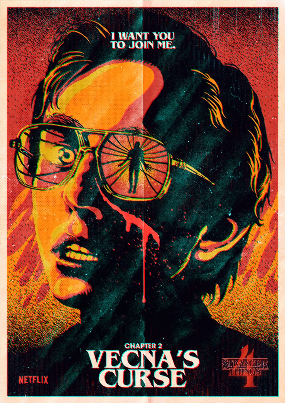
Stranger Things for Netflix © Butcher Billy
What was the brief?
They were looking for '80s-style movie posters for each episode of Stranger Things season four – not the usual art that is made for a series, where you see all the main characters grouped together, but something that plays with the iconography, symbols and specific elements of the show, focusing more on the gory and scary scenes, without giving away too much of what happens. Overall, pieces would work like teasers for each chapter.
What did this opportunity mean to you?
I've worked with Netflix on promotional material for series such as Queen's Gambit and Cobra Kai, and more notably on Black Mirror, where you can see some of my work featured in a couple of episodes. But even that wasn't as big or as personal as working on this project.
How did you develop the ideas for each poster?
I was given early screenings of each episode long before it was released. They were work-in-progress versions, with unfinished special effects as post-production was still going on when I watched it. I was absolutely free to pick ideas and whatever I thought worked best. I particularly enjoyed choosing the quotes that I thought were the most impactful and memorable in each chapter and making them part of the design.
What kind of look and feel were you going for?
VHS video nasties, '70s and '80s horror movie posters and vintage book covers, most notably Stephen King ones, of course.
What tools and media did you use?
Rough sketches by hand at first, and then digital apps like Illustrator and Photoshop.
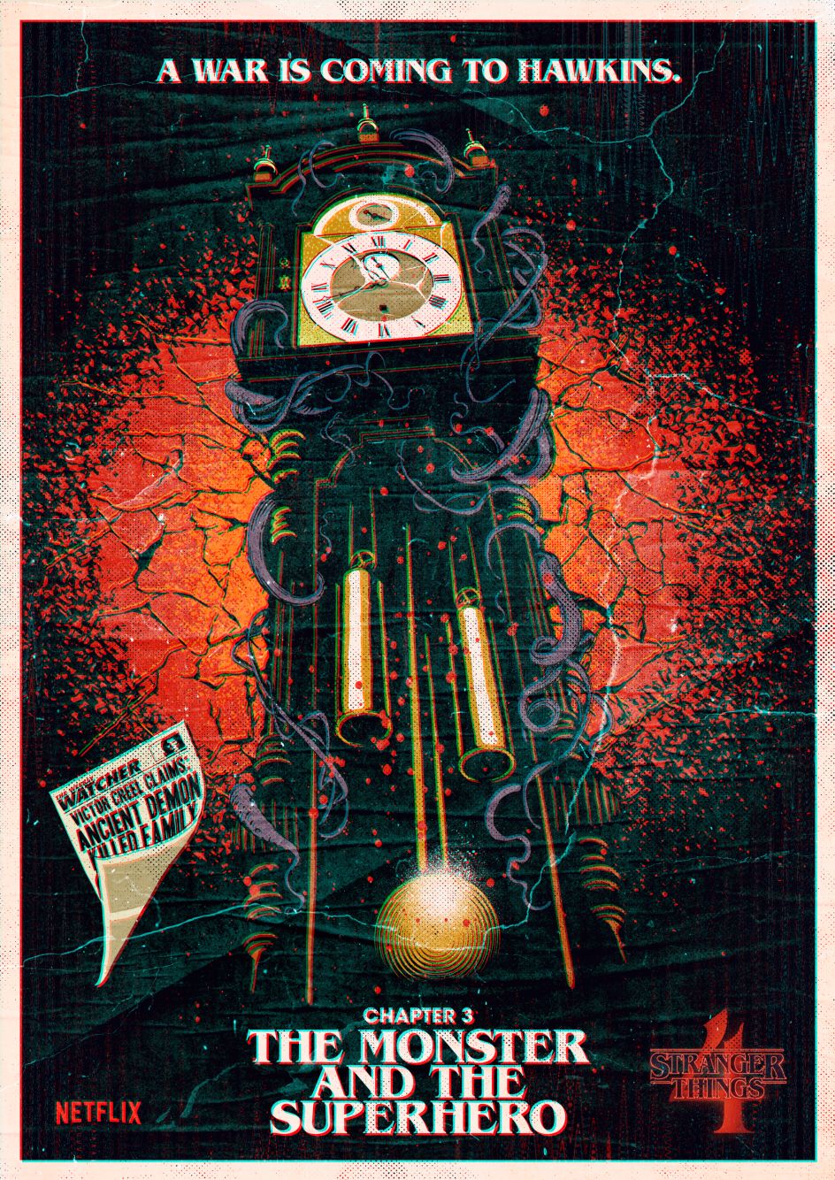
Stranger Things for Netflix © Butcher Billy
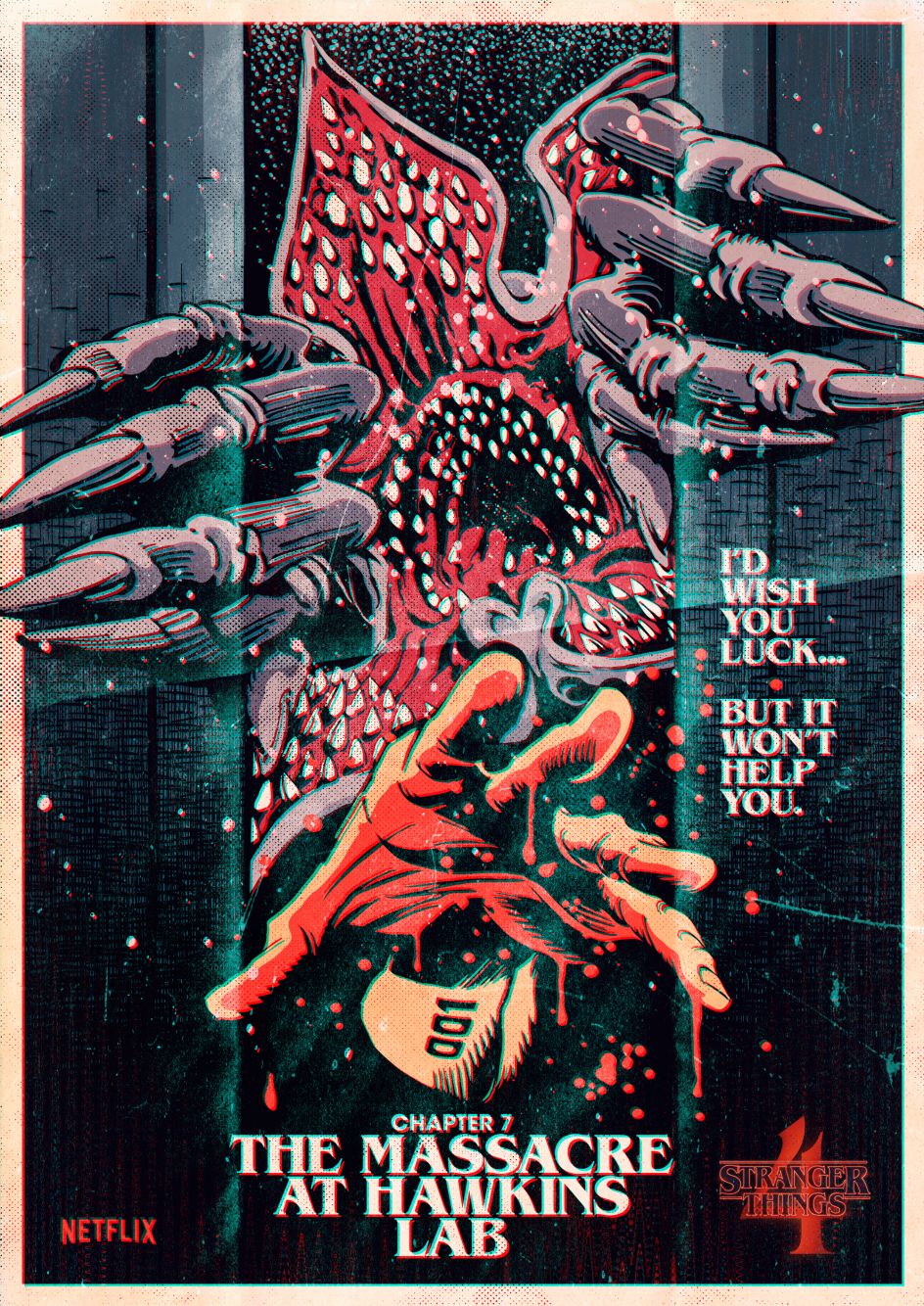
Stranger Things for Netflix © Butcher Billy
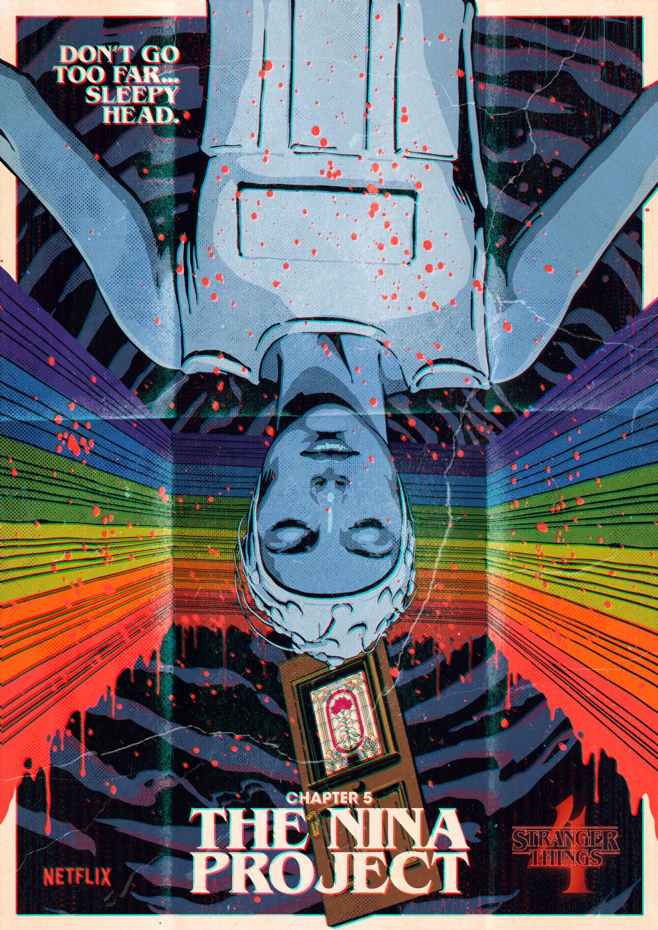
Stranger Things for Netflix © Butcher Billy
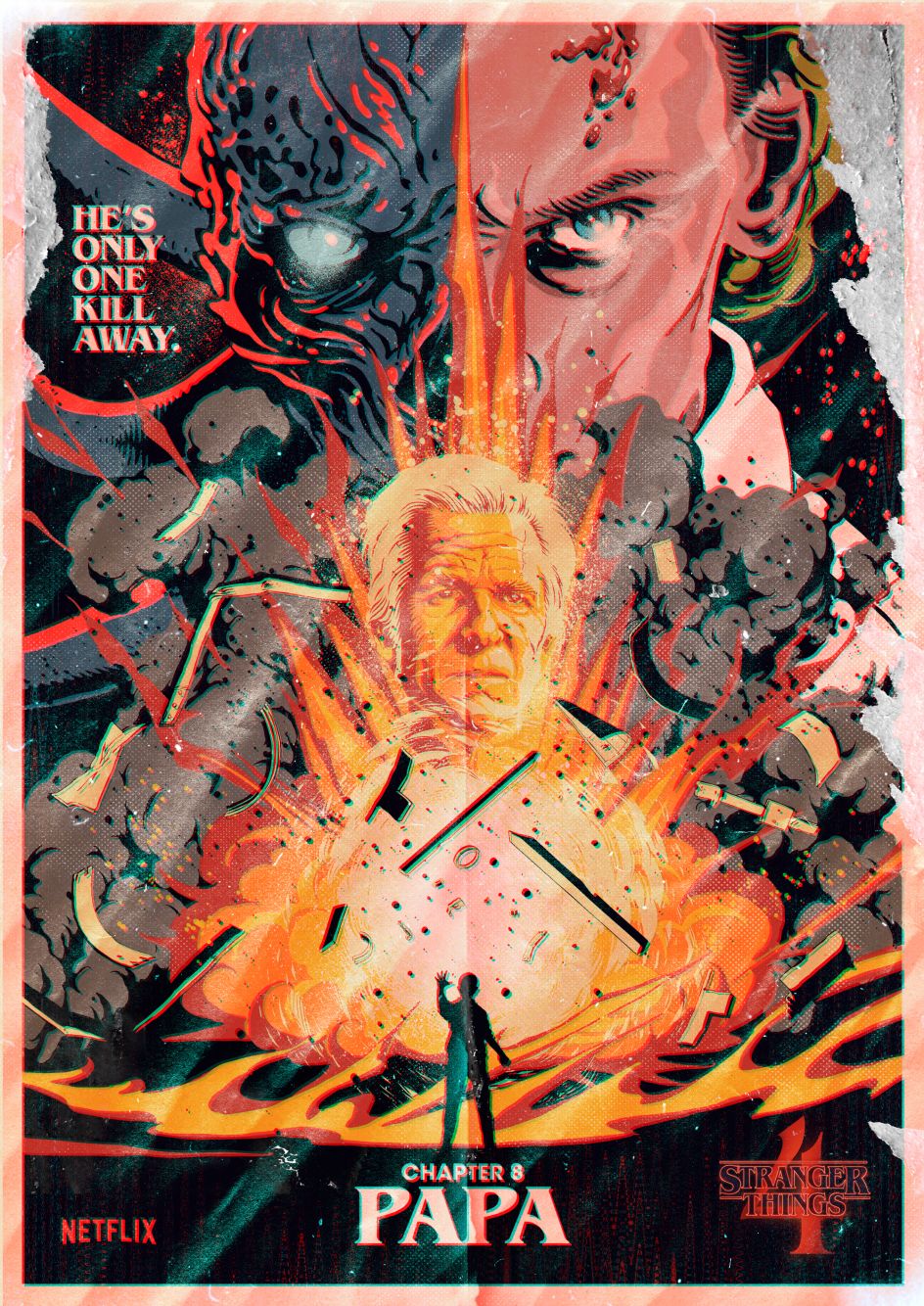
Stranger Things for Netflix © Butcher Billy
What feedback and amends did you receive during the process?
Surprisingly, there was very little feedback. They'd mentioned from the start that they all liked my previous work, so they basically wanted me to do what I usually do without much interference.
It must be flattering to be approached specifically for your style, rather than having to adapt it to suit the client. Is this always the case now?
It didn't come easy or quick, but yeah, I suppose it is a dream come true. I worked for years as an art director in agencies while I developed my own personal artwork as a side project until I felt secure enough to quit.
It's scary to let go of a steady paycheck, but I wanted to develop my style and ideas without interference. And through that decision, I indeed found that freedom, in which now I'm approached by brands and companies looking for exactly what I do, and I'm able to choose if I want to work for them or not, when I want, and only if it's the right fit for me.
Which poster was most challenging and why?
I decided to design each piece so that I didn't have to use many of the actors' likenesses unless it was strictly necessary. The two that feature a main character's face were a bit harder to create as they required more revisions to ensure everyone was happy.
Nostalgia is everywhere in a way that makes you feel like it was yesterday. I grew up as a kid during the '80s and as a teenager in the '90s. I feel privileged to have been shaped by what happened in these decades but not superior to others who haven't.
Which was your favourite and why?
Probably Dear Billy and The Piggyback because of all the excitement around the particular scenes on which they're based and the music involved.
Your style is heavily influenced by 80s comics, music and movies, and the show is heavily influenced by 80s sci-fi and fantasy. What was the combination like?
It did seem like an ideal combo. When Stranger Things first came out, I remember it ticked all the boxes for me. Finding out that the Duffers were fans and wanted me to have a go in their playground felt like things coming full circle.
Why do you think there's so much love for the '80s right now?
I recently saw a meme that said that, in eight years, the '80s will have been 50 years ago. That's quite scary. I'm 44, so that should be obvious to me, but somehow it's not.
Nostalgia is everywhere in a way that makes you feel like it was yesterday. I grew up as a kid during the '80s and as a teenager in the '90s. I feel privileged to have been shaped by what happened in these decades but not superior to others who haven't.
However, I sincerely don't know why it has endured the way it has been for people who didn't live through it. Seeing products like Stranger Things, Cobra Kai, Ghostbusters and all the legacy remakes/reboots being loved by Gen Z is fascinating to me.
When a brief lands like this, do you ever suffer from imposter syndrome or worry you won't do a good job?
Yep, every single time. I get a little bit freaked out at first, and then I go out and have a coffee. Go to a movie. Calm down a little and then realise nothing is as complicated as it looks to be inside my head. I think it's healthy to feel that way. It's a sign I'm still excited about what I do.
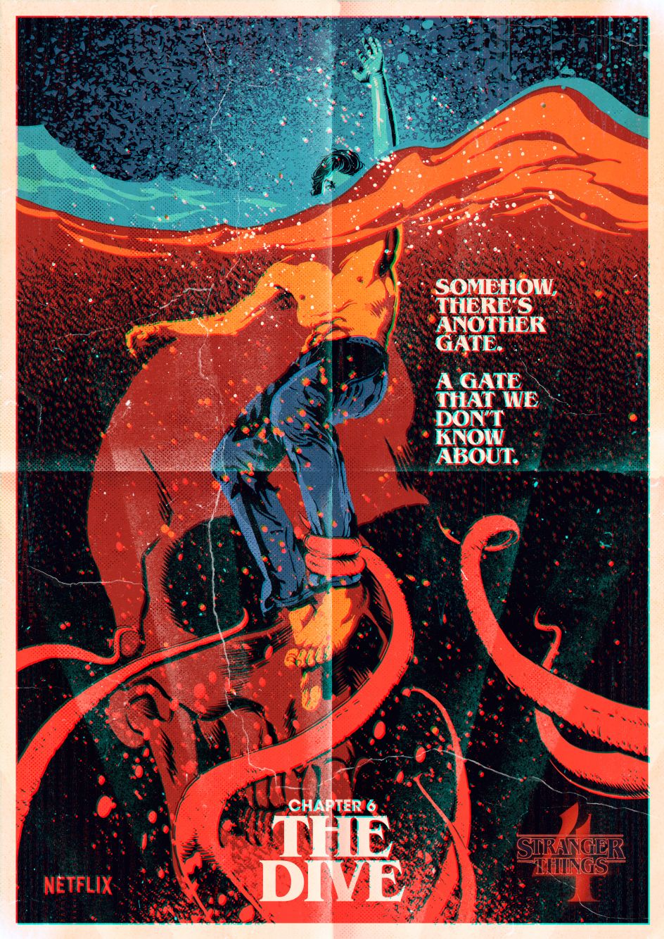
Stranger Things for Netflix © Butcher Billy
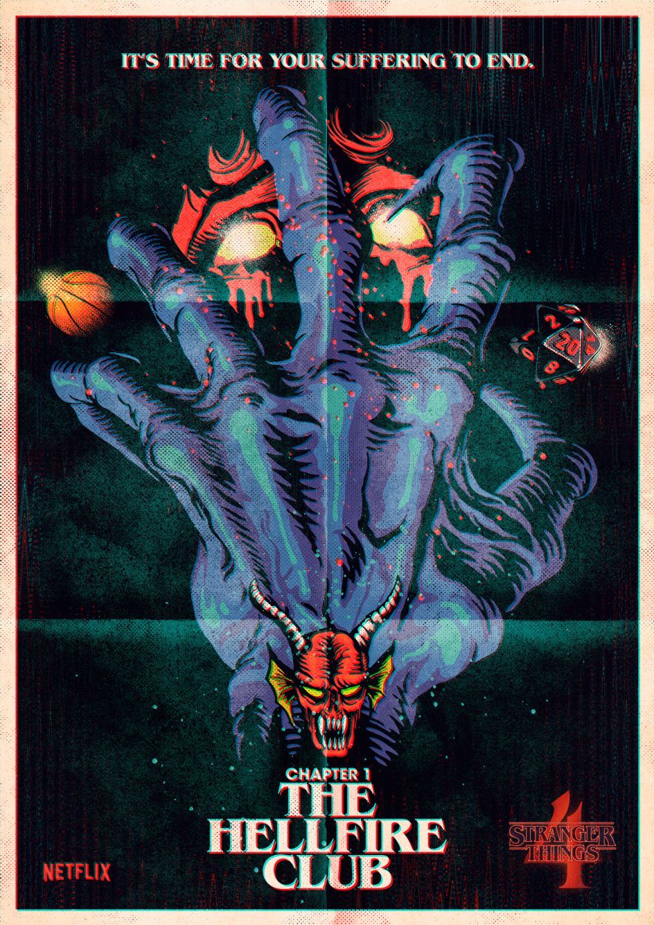
Stranger Things for Netflix © Butcher Billy
What has fan feedback on the artwork been like?
To be honest, I'm overwhelmed by the attention. People love the pieces and have been sharing them everywhere. I've been getting hundreds of comments, direct messages and even emails with compliments.
Where have the posters appeared in the physical world?
As far as I know, they decided to put billboards all over Sunset Boulevard in LA. They asked me to adapt every piece into horizontal versions. It was a last-minute thing, and I have to say I wasn't sure about it at first, as it was a very different canvas from what I worked on originally. However, in the end, I think most of them turned out as well as, if not better than, the originals. It was thrilling to see them in physical form, spread all over LA.
Who would you say your main influences are?
Saul Bass, Jack Kirby, Andy Warhol and Banksy.
What advice did you get when starting out that's helped you?
It's funny. I don't really remember any good ones. Strangely, the most effective advice I was ever given was from loved ones, who discouraged me from pursuing my dreams or criticised my work, choices, etc. I think there's something empowering in being the only one who believes in yourself. It might make you go even further.
Finally, what advice would you give to others?
Don't just work for others; find time to create for yourself.
Based in Curitiba, Brazil, Butcher Billy is an illustrator represented by IllustrationX. His retro style is heavily influenced by the music, movies, books, comics and computer games of the 1970s and '80s, which form iconic elements of his artworks. His clients include Netflix, NME, ESPN, Waxwork Records NBA TV, Loot Crate, Penguin Random House, Stylist, Foot Locker and more.
Founded in 1929, IllustrationX is the world-leading illustration agency, specialising in connecting clients with talented illustrators from diverse background around the world. Today it represents over 220 talented artists and animators, with offices across four continents. To find out more, visit www.illustrationx.com.


 by Tüpokompanii](https://www.creativeboom.com/upload/articles/58/58684538770fb5b428dc1882f7a732f153500153_732.jpg)


 using <a href="https://www.ohnotype.co/fonts/obviously" target="_blank">Obviously</a> by Oh No Type Co., Art Director, Brand & Creative—Spotify](https://www.creativeboom.com/upload/articles/6e/6ed31eddc26fa563f213fc76d6993dab9231ffe4_732.jpg)


