Sawdust, aka Rob Gonzalez and Jonathan Quainton: Thoughts from the London duo
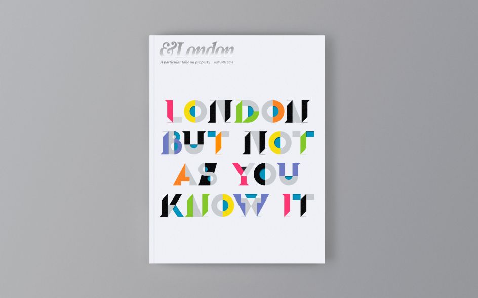
Sawdust is the award-winning creative partnership of Rob Gonzalez and Jonathan Quainton. Based in London, the talented pair focus on bespoke typography, image-making and visual identity across a range of sectors.
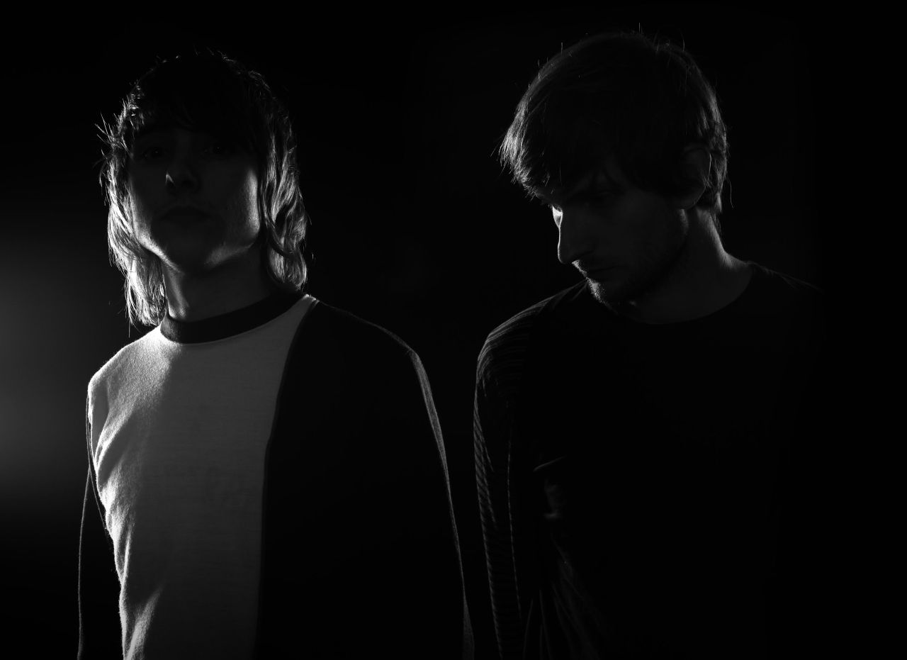
Their approach has earned them a worldwide reputation for creating visually striking work that is thoughtful, innovative and meticulously crafted. And Sawdust’s work has been recognised by many of our favourites within the industry. We spoke to founders Rob and Jonathan about their creative lives.
How did you get into your respective careers?
Jonathan: It started from studying graphic design at college straight after I finished secondary school, there was nothing else that I wanted to do other than something creative, ideally not working in a factory like I did part-time whilst in school. To be able to carve out my own direction in a career doing something that I enjoyed was ultimately the most appealing thing to me at that time, I had no idea then where it would lead.
Rob: Since I can remember I have always been interested in drawing, it is very exhilarating to produce something different that no one else has ever seen before. This eventually led me into taking an art course, shortly followed by a graphic design, to where I am today.
Tell us more about Sawdust, how did it all begin?
Jonathan: We had always talked about going into a partnership back at college as Rob and I had constantly been working together on projects. It just seemed inevitable that we would carry on working together in the future. At the beginning we had nothing to lose but ended up taking on whatever job we could get, just to get the wheels in motion.
Rob: It got to the point where the job I wanted didn’t exist, or to clarify, the type of work that I wanted to create wouldn’t be possible within most conventional design studio practices and for this reason we decided to take our destiny into our own hands and occupy a space that caters to our creative needs and output. Easier said than done, but we’re pleased with how far we’ve come.
You've made quite a name for yourself already, how have you got there?
Jonathan: We continue to work in exactly in the same way as we first started. The main thing is getting the best exposure into the right places where it can be fully appreciated. Recently, we have been fortunate enough to be quite discerning about who we work with which has given us more influence on the direction of our work.
Rob: There is no great secret I’m afraid, it’s all perseverance and hard work. “The man who removes a mountain begins by carrying away small stones.” — nothing like a Chinese proverb to articulate a point.
Strive to do something that you enjoy, it’s easier to persevere when you like what you do.
What's been your favourite project to date?
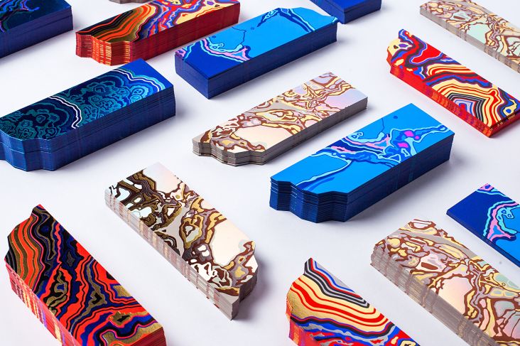
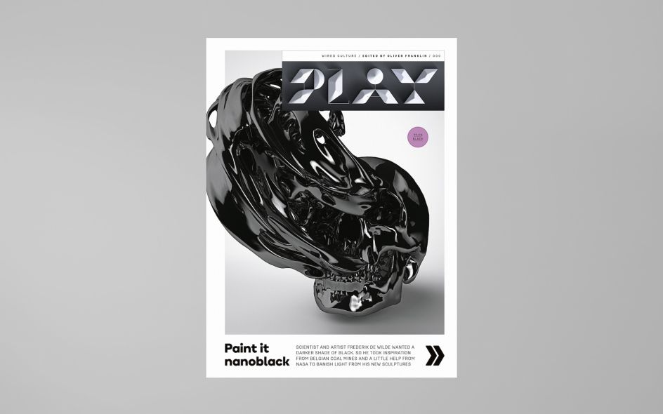
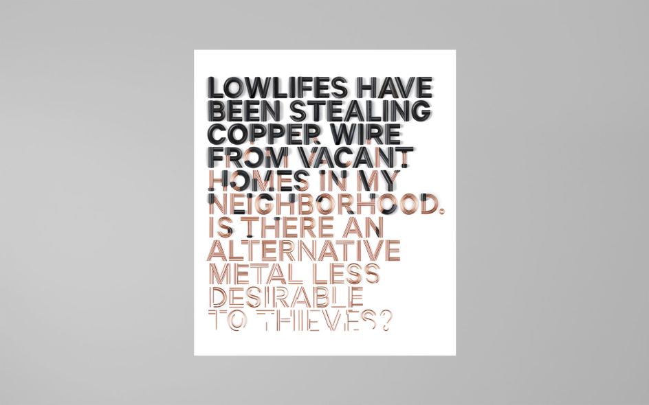
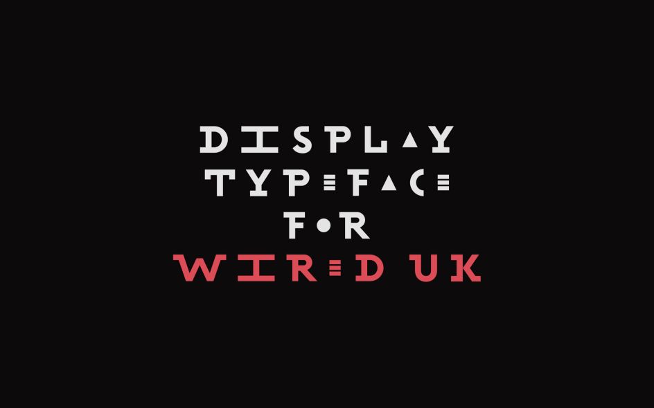
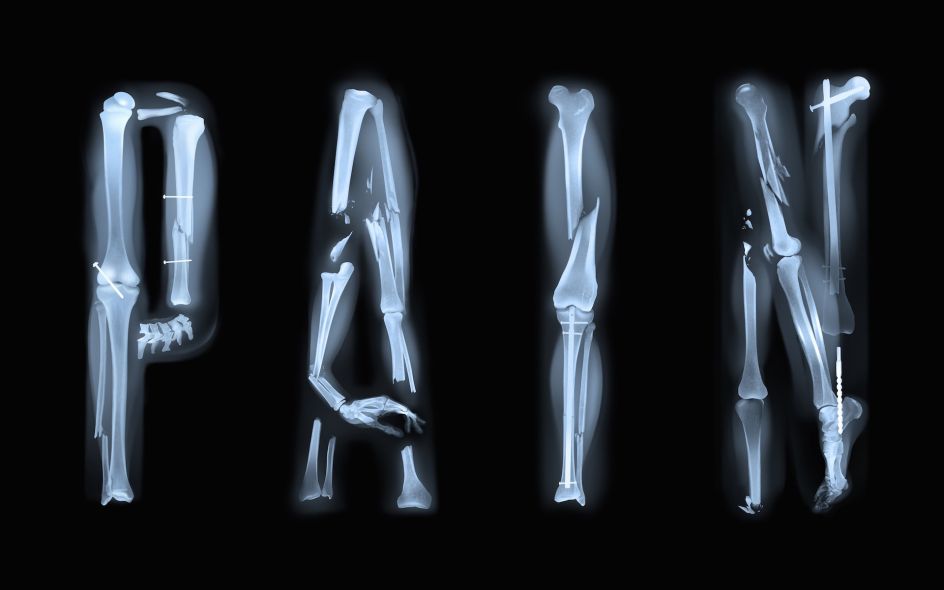
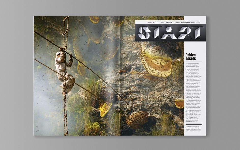
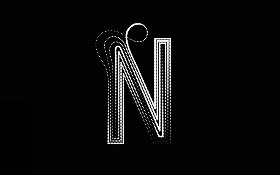
Jonathan: This is a tough question to answer as there have been so many enjoyable jobs we have worked on. The Wired bespoke typographic headers would be up there for me as one of the most enjoyable. The client's enthusiasm for our work enabled us to express our own direction on the project from start to finish and the results look epic.
Rob: Shanghai Ranking top 200 book + numerals and Wired UK headers.
And one you'd rather forget / or the most challenging?
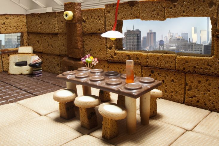
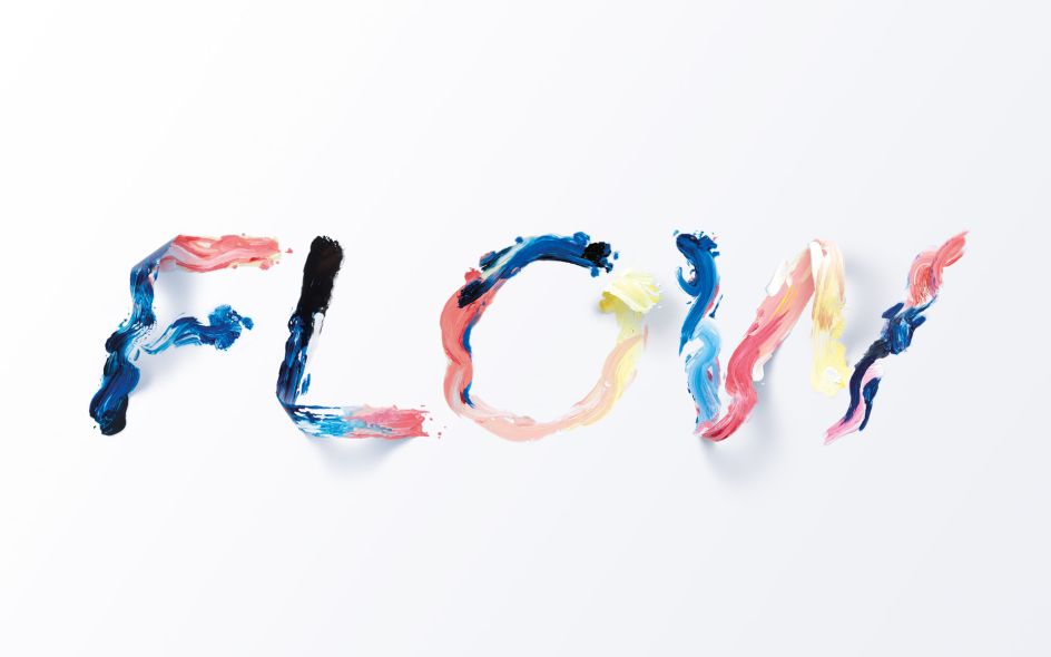
Rob: Not one that I’d rather forget because I’m very fond of the final outcome but it had its challenges. The typographic pasta/monomyth project was complicated because we were somewhat out of our comfort zone, working with another art director and photographer who were each bringing their skill sets to the table. Ultimately, this makes for a beautiful piece of work because unexpected results happen but it’s certainly a bumpier road.
Tell us about your work setup. What're your tools, tricks, and accessories? What software do you like to use? How do you get the job done basically?
Jonathan: Our methods are quite traditional we just use the standard Adobe tools, mostly Photoshop and Illustrator, and pen and paper. We leave the tricks to the magicians.
I think that we might start exploring 3D software in the future but we wouldn't want to rely too heavily on these tools to realise our ideas.
Who's work do you admire and why?
Jonathan: I’m inspired by lots of artists that I come across on my travels whether it's online, in an exhibition or on an old vinyl cover in some charity shop. I find that it is important to have an eclectic mix of inspiration otherwise you can find yourself imitating those who you admire if you obsess about their work too much.
Rob: Jorge Martins, Storm Thorgerson, Takenobu Igarashi are a few of my favourites. They inspire me because of they're unwavering when it comes to realising their vision.
What's currently playing on the Sawdust studio playlist?
Jonathan: Howling by Ry Cuming / Frank Wiedemann.
Rob: Nils Frahm is my current favourite artist.
For all those aspiring designers out there, what advice would you give to those looking to make a break?
Jonathan: You need to keep challenging and pushing yourself to constantly improve especially learning from your mistakes along the way. You need patience and should be prepared to sacrifice time and money to succeed.
There's always that one person who inspired or motivated us. Who was yours and how did they?
Jonathan: Rob will probably hate me saying it was him, but his drive and ambition to succeed is really inspiring and has helped motivate me throughout the years we’ve worked together.
Rob: I’ve always found motivation through being told I cannot do something. It sort of drives me forward with a point to prove. I wouldn’t want to name the person but when I left my first design job in London to go freelance and branch out on my own they told me they didn’t think I had what it takes to realise my ambitions. That gave me every incentive I ever needed. So I guess I should say thanks, even though I didn’t like them very much.
Where are you next going on holiday? Or where do you plan to go and why?
Jonathan: I have always loved visiting Greece but have yet to go to Santorini this is where I would like to go next year.
Rob: Hopefully a visit to New York.
So what are you currently working on?
Jonathan: We are currently finishing up a couple of editorial projects to quietly finish off the year and have a really exciting collaboration project happening beginning of next year.
Rob: Including a cover for Variety magazine in the United States.
What can we expect to see from Sawdust in the coming months?
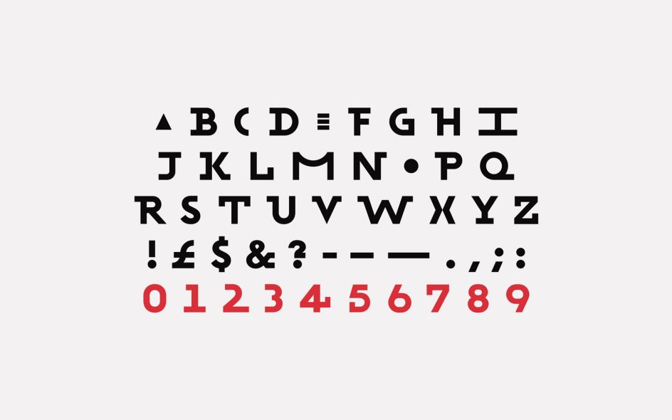
Jonathan: Hopefully many more inspiring projects — we have four typefaces that we will be showcasing in the new year which we are looking forward to publishing.
Rob: The unexpected.


 by Tüpokompanii](https://www.creativeboom.com/upload/articles/58/58684538770fb5b428dc1882f7a732f153500153_732.jpg)


 using <a href="https://www.ohnotype.co/fonts/obviously" target="_blank">Obviously</a> by Oh No Type Co., Art Director, Brand & Creative—Spotify](https://www.creativeboom.com/upload/articles/6e/6ed31eddc26fa563f213fc76d6993dab9231ffe4_732.jpg)


