Charlie Smith Design creates website to bring a Santa Monica bakery's new brand to fresh audience
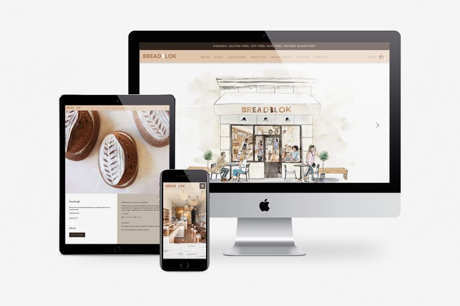
With shops and businesses around the world wondering how to serve customers during the Covid-19 crisis, Breadblok – an organic bakery in Santa Monica, California – has worked with London design studio Charlie Smith Design to rapidly launch a new website following a revamped visual identity and packaging design.
With this new site, the family-run bakery hopes to continue serving loyal and fresh customers throughout the pandemic. For generations, the Charlier family has created gluten-free, organic food on its farm in Provence. In 2018 Chloe Charlier took a stall at a farmers' market in Santa Monica and soon gained a reputation.
In 2020 it opened its bakery, its site using materials connecting the sunny beachside location in California with Charlier's Provençal heritage. "We needed a visual identity that would stand out as much as our products and our bakery," says Charlier. "We also needed packaging that is as sustainable as it is desirable. So, when we found Charlie Smith Design, the team behind Gail's and food-to-go brands like Coco di Mama, we knew they were the people to help us."
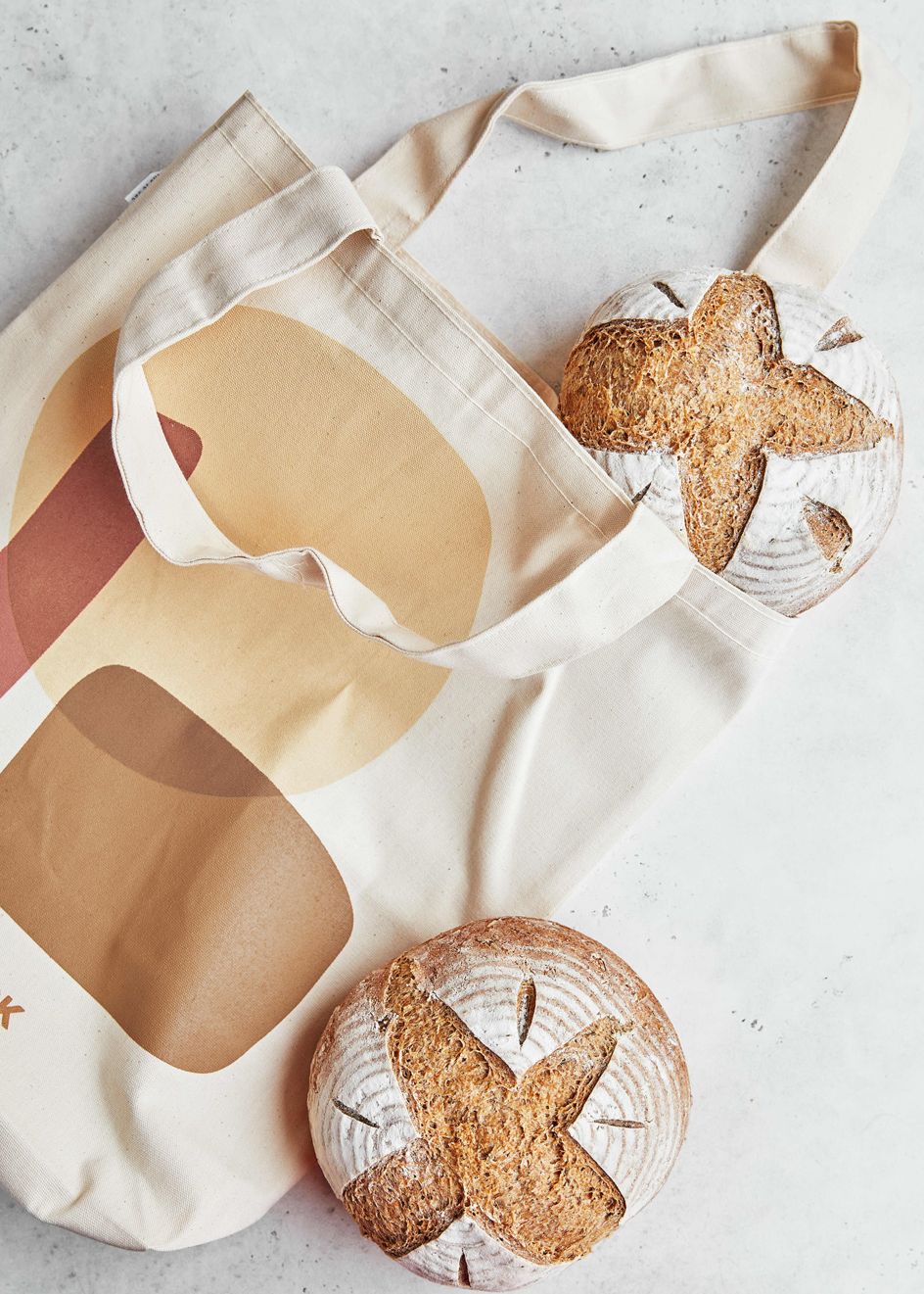
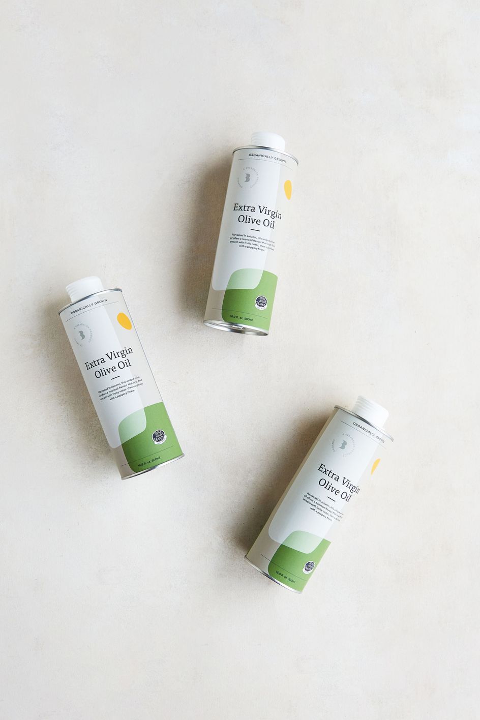
"There was a range of brand assets already in place," says Charlie Smith, founder and director at the agency. "We wanted to work with these but introduce some warmth and a range of colours, notably a pastel green, to reflect the feel of the bakery, the organic ingredients, and the brand's Provence heritage."
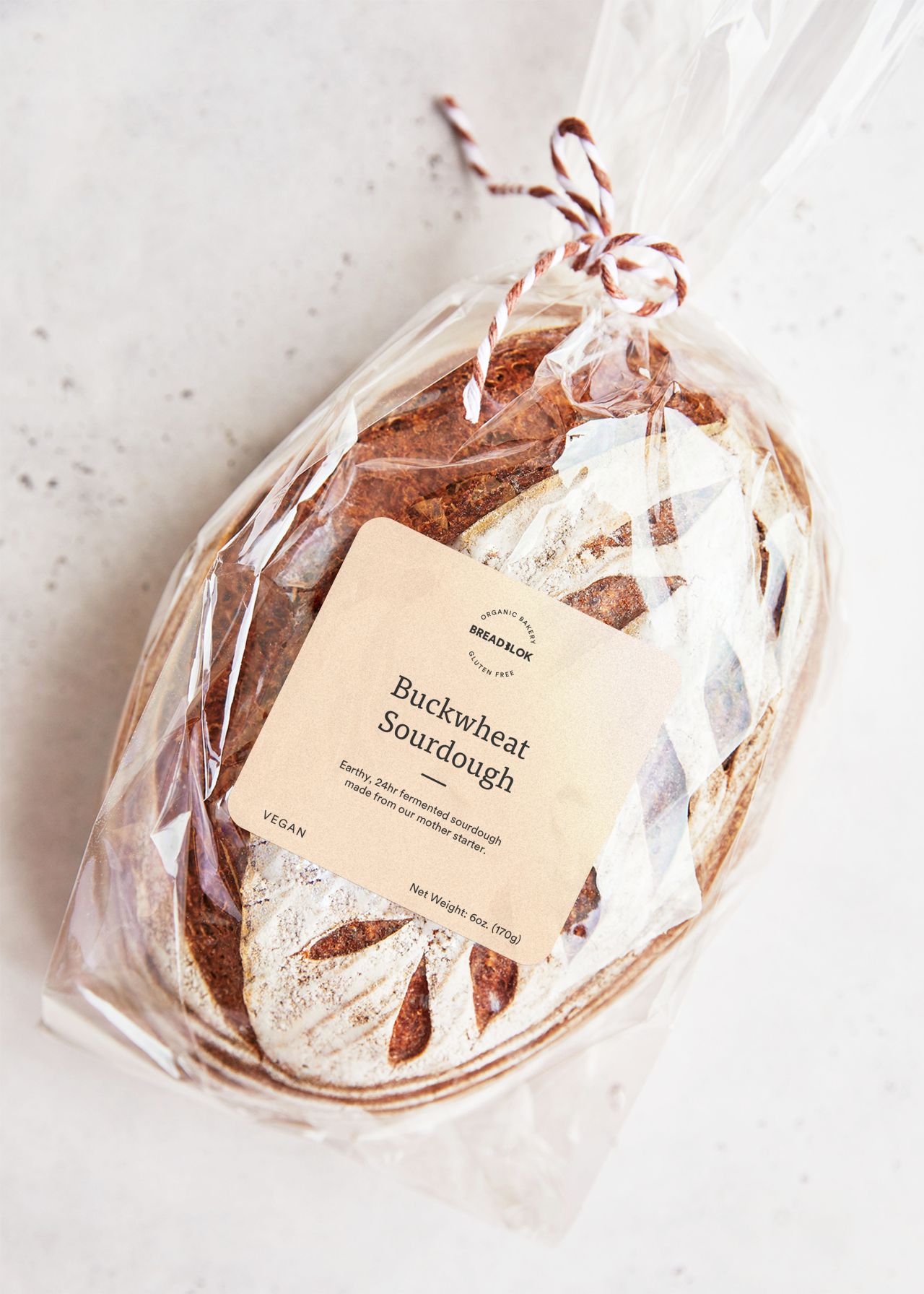
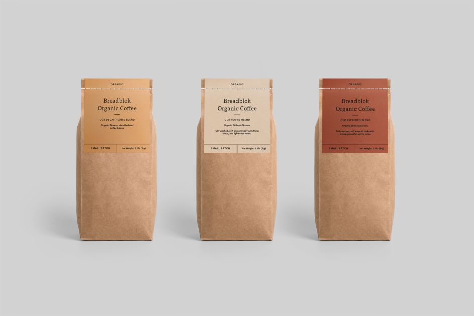
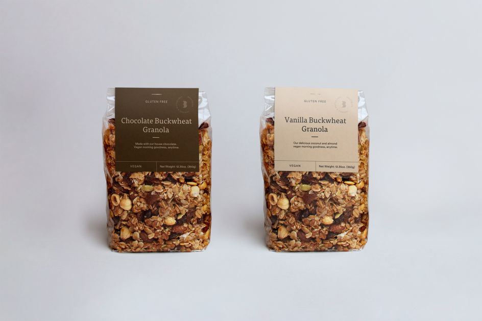
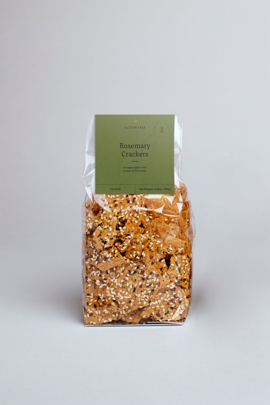
Charlie Smith Design also created a core lock-up and product lock-ups. These ensure product messages are delivered at the forefront while subtly communicating Breadblok's brand messaging across the packaging.
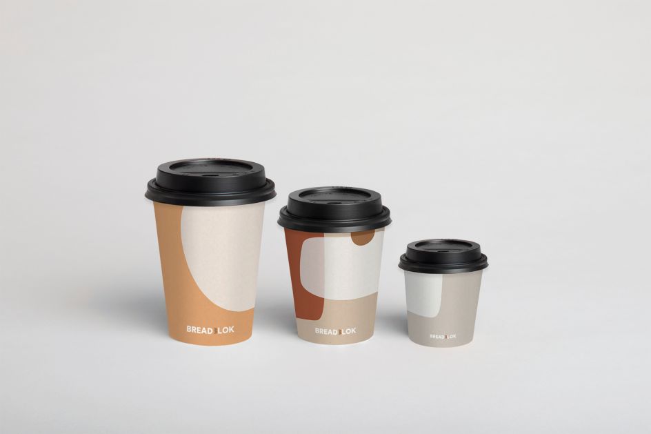
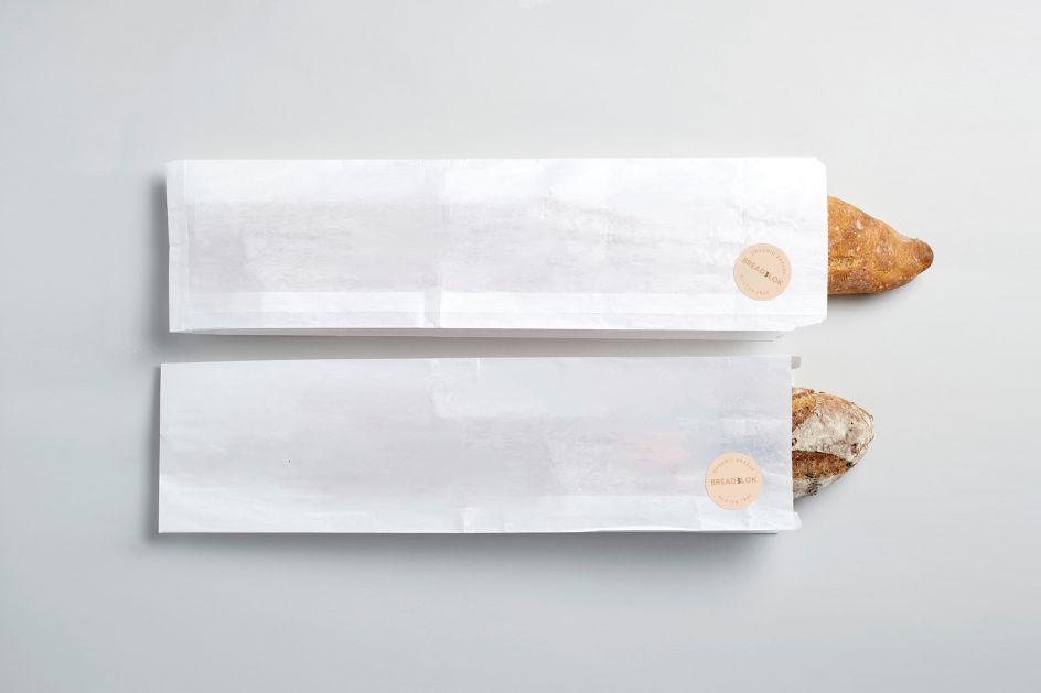
Since January 2020 California has banned the use of all plastic packaging including plant-based plastics. Packaging must be constructed from paper fibres, wood, and strictly marine-degradable materials. Charlie Smith Design worked closely with BreadBlok to identify the different packaging solutions that would be needed for the new site and how the identity should sit across these. The London team then set to work procuring suitable suppliers in the US.
At the same, with its packaging designs, it went beyond these legal requirements. To reduce materials and dyes, it created metallic gold and rose gold variations of Breadblok's logo that can be directly applied to all packaging solutions. USA-made biodegradable paper bags are recyclable and compostable.
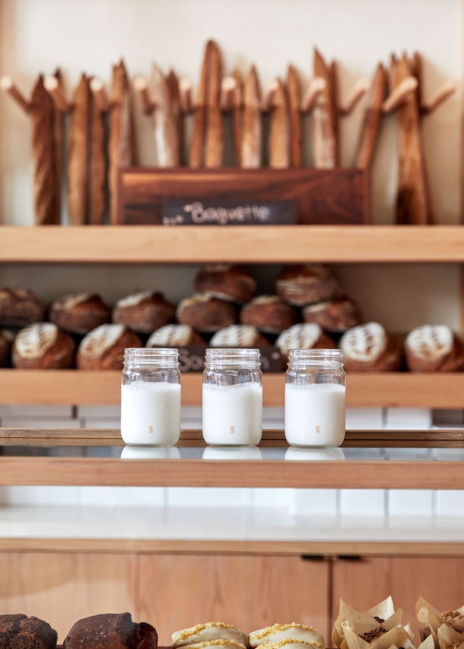
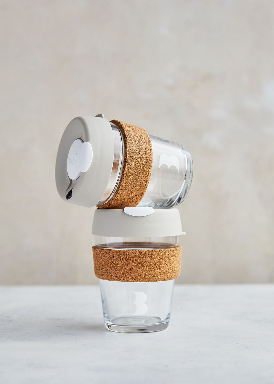
Salad boxes are made from 100% recycled, unbleached card, and cellophane bags are made from certified compostable, marine biodegradable films. Greaseproof paper is unbleached and lined with soy wax rather than petroleum. Yoghurts and chia pots are served in reusable glass jars.
This brand extension marks the beginning of a long-term relationship with Breadblok as the brand establishes its physical and virtual sites. In reaction to the Covid-19 crisis and government-mandated social distancing rules, Charlie Smith Design has helped Breadblok adapt its website to accommodate a new delivery service.
"Our new visual identity and packaging will bring visitors to our beautiful new bakery for years and years to come," says Charlier. "But in the challenging few months ahead of us, this rapidly developed, on-brand website, will ensure that even while isolated at home, our customers can continue to enjoy a croissant, a tartlet, or whatever it is that brightens their day."


 by Tüpokompanii](https://www.creativeboom.com/upload/articles/58/58684538770fb5b428dc1882f7a732f153500153_732.jpg)


 using <a href="https://www.ohnotype.co/fonts/obviously" target="_blank">Obviously</a> by Oh No Type Co., Art Director, Brand & Creative—Spotify](https://www.creativeboom.com/upload/articles/6e/6ed31eddc26fa563f213fc76d6993dab9231ffe4_732.jpg)


