Che Douglas on design at the Wall Street Journal, why readers come first and what's next for media
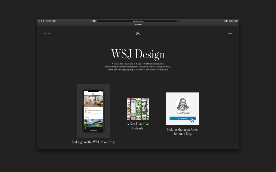
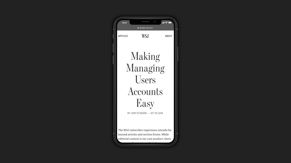
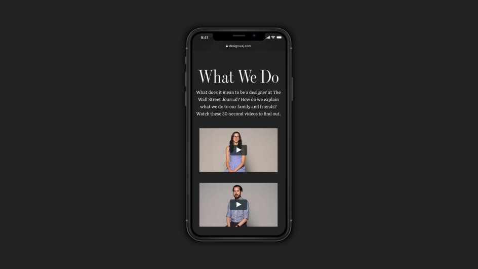
The Wall Street Journal has recently launched design.wsj.com to give readers a behind-the-scenes peek at the business-focused American newspaper.

Spearheaded by SVP, Head of Design Che Douglas, it hopes to reveal the whole design thinking behind the site, like how user research influenced its mobile app redesign. Or how a deeper understanding of readers’ behaviours and interests contribute to a more sustainable business and newsroom.
The team can now write about their processes for improving and innovating on WSJ products while also sharing their learnings with the design community. We caught up with Che to find out more.
What was the thinking behind design.wsj.com?
Firstly, to build on the success of our internal newsletter and create a space for designers across the company to feel connected by something. Secondly, there is a rich history of design at WSJ and I felt like this isn’t talked about enough in its current state.
For example, in 1889, The Wall Street Journal was four pages of carefully typeset and art directed paper – design has been in the DNA since day one. Today, WSJ designers utilise new skills, including conducting usability studies, coding prototypes and shaping voice experiences for Alexa to help expand the Journal’s storytelling, marketing, events and advertising capabilities.
Design is often thought of as “just” aesthetics: fonts, colours and styling – but the site and its behind-the-scenes look aim to shed light on the other aspects of design and the impact they are having on the future of our business and newsroom.
What can we expect?
You can expect more in-depth case studies. Exposure to more designers behind the work and as such, different types of design skill-sets and disciplines that contribute to WSJ experiences. Insights into the culture and inner workings of the teams, our tool kits, processes, day-to-day challenges and successes.
On working on the design of WSJ, what have been the biggest lessons you’ve learned so far?
Here are my top three from the last four years at WSJ. Firstly, as a design leader, you need to build meaningful relationships across the business. Design is only successful when its value and potential is fully understood and utilised by as many people, teams and departments as possible. There is so much more power in showing the value and direct impact design can have to the business through projects than there is talking about it.
Secondly, decentralise design in large enterprise: Embed designers in cross-functional teams across the business and find other ways outside of reporting lines to keep them connected. Design has the potential to keep a huge ecosystem of complex products connected and easy to understand for users.
Finally, how much of an impact great journalism has on the world. I’ll never see the news the same way again. Just like how I can’t look at the world and not get frustrated by poor kerning of type on a street sign or the menu at a restaurant – I already find it hard to simply ‘read’ the news and not also critique the user experience.
What was the most satisfying improvement you’ve made?
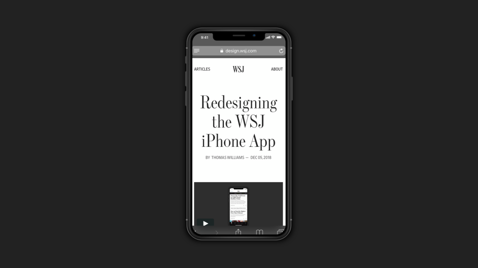
The iPhone app redesign, because it brought so many people together from different backgrounds and corners of the business, which is ultimately why it was so successful. From winning the Webby Award for ‘Best News App’ in 2018 to a 200% increase in time spent in the main news feed and a 4.5-star rating in the Apple App Store – it clearly showed the impact design and deep collaboration can have. You can read more about it here.
Is the user king in terms of how much they influence the evolution of the WSJ’s design?
Yes! We have constant contact with our users and are regularly synthesising their feedback from numerous data sources, including customer service, social media, usability studies, surveys, analytics and many more.
However, users don’t always know what’s next nor can they see the opportunity for significant advancements. Therefore the evolution of WSJ is equally about innovation, which requires years of collective experience and falls on our team of designers to test and learn what the next big leap might be that will further enhance our storytelling.
What has surprised you most from your findings of user research?
That our members actively want to give us feedback. I don’t simply mean app store reviews; they have gone so far as to drive for hours for in-person interviews or usability testing sessions. They care deeply about WSJ and what it means to society, and this has made it much easier to bring our customers closer and co-create with them.
I can’t begin to tell you how rewarding it is to see non-designers in the company attend these testing sessions and in some cases interview our members. Everyone learns so much each time, but the main lesson is always the same: that you can never spend too much time with your customers.
What improvements are you currently working on?
One of our most exciting initiatives at the moment is rethinking a lot of our publishing tools. As such, in the last year, we hired our first dedicated product designer to work on these. Previously, this had been shared responsibilities by many.
This work is particularly exciting because it is working hand-in-hand with different users (journalists and editors) on product development every day. I’ve particularly enjoyed seeing how powerful connecting the publishing experience to the user experience can be because it deeply links the people creating the content to the end user experience – this has already had a profound cultural and workflow impact.
What has changed the most for the WSJ over the last decade? Has the newsroom shrunk? Adapted? What’s different?
From a design perspective, the team has almost doubled in size. Most notably, the change that has had the biggest impact was moving the design team into the newsroom over three years ago, where they now sit amongst the editors and journalists.
Journalism is our core product, and having design at the heart to amplify it and provide the most value to our readers means understanding it, first and foremost. What better way than living and breathing it every day?
Is there a future for the media?
There will always be a place in the world for the quality journalism The Wall Street Journal provides. The business will no doubt continue to change and evolve as advances in technology arm journalists with new storytelling techniques, but I believe the future is bright.
Does design play a part in its survival?
Yes, because the digital news landscape is infinitely more complex than I’m sure anyone could have ever imagined. Designers play a critical role in helping translate and present all the nuances of news in clear and easily understandable formats.
Regardless of the platform or environment, designers will always be the ones to speak on behalf of the user. That role, along with having the capability to build prototypes and talk to users directly, will ensure it not only survives but thrives.


 by Tüpokompanii](https://www.creativeboom.com/upload/articles/58/58684538770fb5b428dc1882f7a732f153500153_732.jpg)


 using <a href="https://www.ohnotype.co/fonts/obviously" target="_blank">Obviously</a> by Oh No Type Co., Art Director, Brand & Creative—Spotify](https://www.creativeboom.com/upload/articles/6e/6ed31eddc26fa563f213fc76d6993dab9231ffe4_732.jpg)


