Fintech brand launches new identity with bespoke Pantone 'it' colour, Bondi Mint
New York-based brand agency YummyColours has worked with Pantone Color Institute to create a custom new signature colour for fintech brand Afterpay.
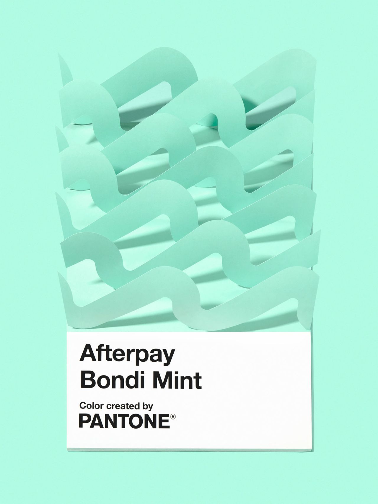
image by Aaron Bernstein
Named Afterpay Bondi Mint, the colour is part of a broader new identity project to evolve the brand. The design direction aims to highlight the brand's qualities of being "built on trust", "championing connection", and "rewarding everyone," according to YummyColours.
The agency also created a new logo and design system across all Afterpay's physical and digital platforms. The identity looks to pay homage to the brand's Australian roots with its surf-like hue, while also highlighting its global reach and evolving the branding to create unified messaging across all touchpoints.
"Offering a steady departure from the once-ruled palettes of millennial pink, Afterpay Bondi Mint exists as a place for authenticity and transparency; a place where nothing is an afterthought," says YummyColours.
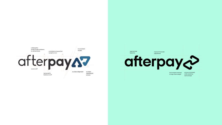
The agency retained the former branding's two arrows that were used in the logo, reimagining them as a "linked, continuous form that evokes balance and interconnectedness. This new logo looks to represent "how the relationships between Afterpay, their partner merchants and customers are continually strengthened each time they interact with one another," says YummyColours.
The brand is known as Clearpay outside of the US, Australia and New Zealand.
"Colour is one of the easiest and most effective ways to highlight to a consumer the unique qualities and promise behind the brand. Because the colour a brand chooses to present themselves is the most tangible representation of who they are," says Pantone Colour Institute vice president Laurie Pressman.

image by Aaron Bernstein
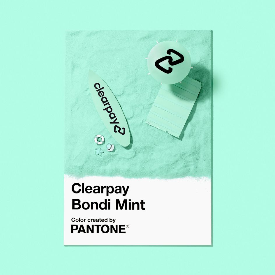
image by Aaron Bernstein
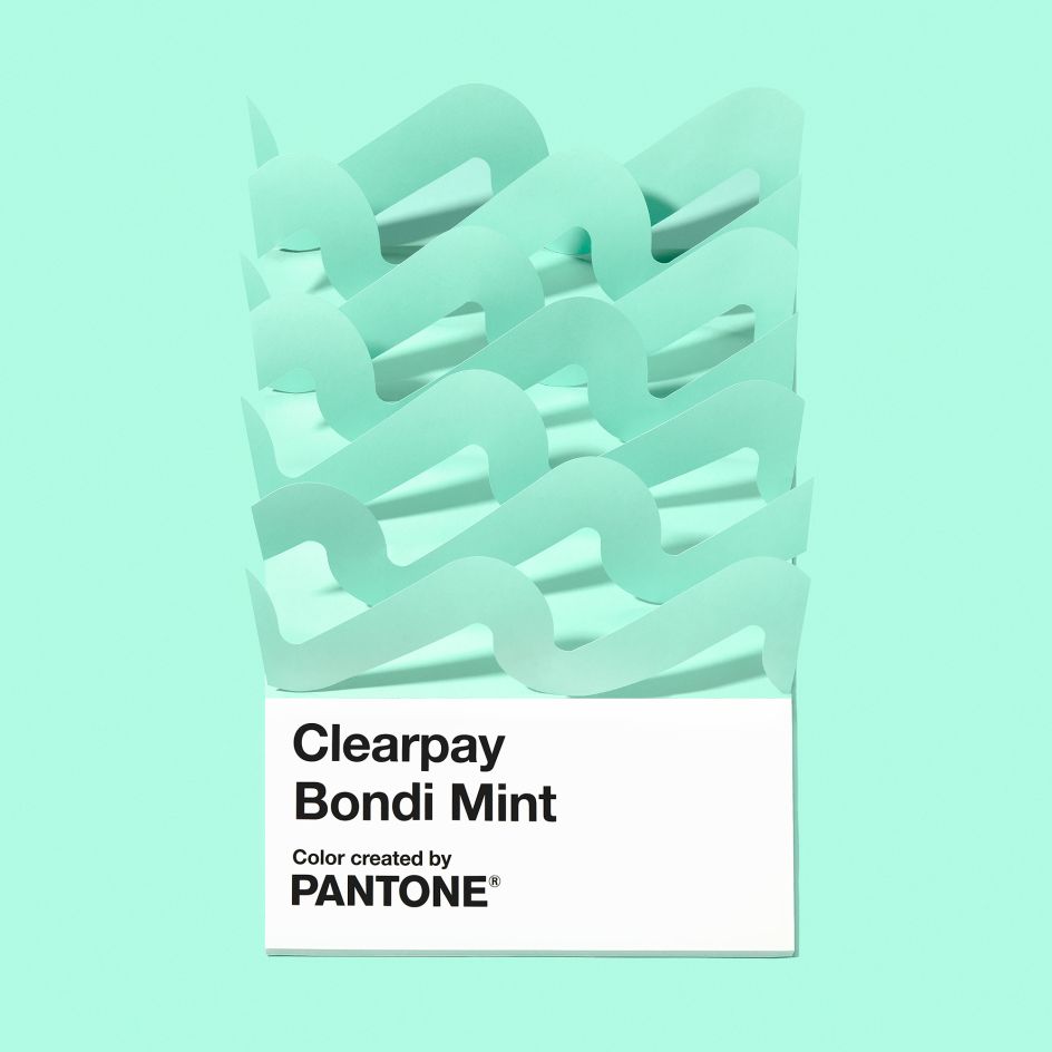
image by Aaron Bernstein

image by Aaron Bernstein


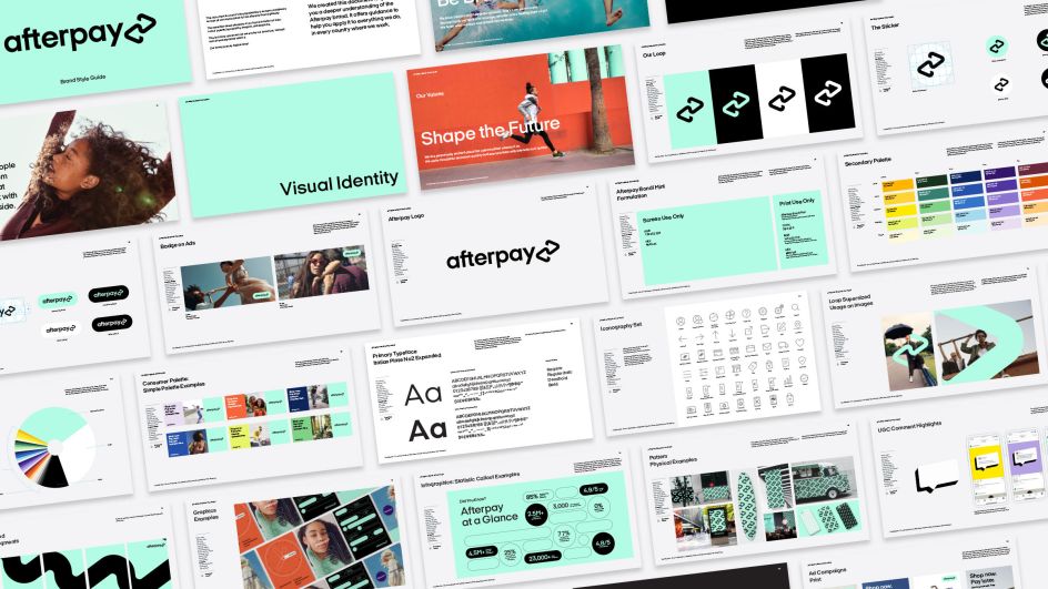
image by Aaron Bernstein


 by Tüpokompanii](https://www.creativeboom.com/upload/articles/58/58684538770fb5b428dc1882f7a732f153500153_732.jpg)

 using <a href="https://www.ohnotype.co/fonts/obviously" target="_blank">Obviously</a> by Oh No Type Co., Art Director, Brand & Creative—Spotify](https://www.creativeboom.com/upload/articles/6e/6ed31eddc26fa563f213fc76d6993dab9231ffe4_732.jpg)


