Behind the scenes: the design thinking behind Coca-Cola's global holiday toolkit
We chat with Rapha Abreu, VP of design at The Coca-Cola Company and Kristie Malivindi, creative director at John Knowles Ritchie, to learn how they collaborated on a new holiday campaign identity for the world's most popular beverage.
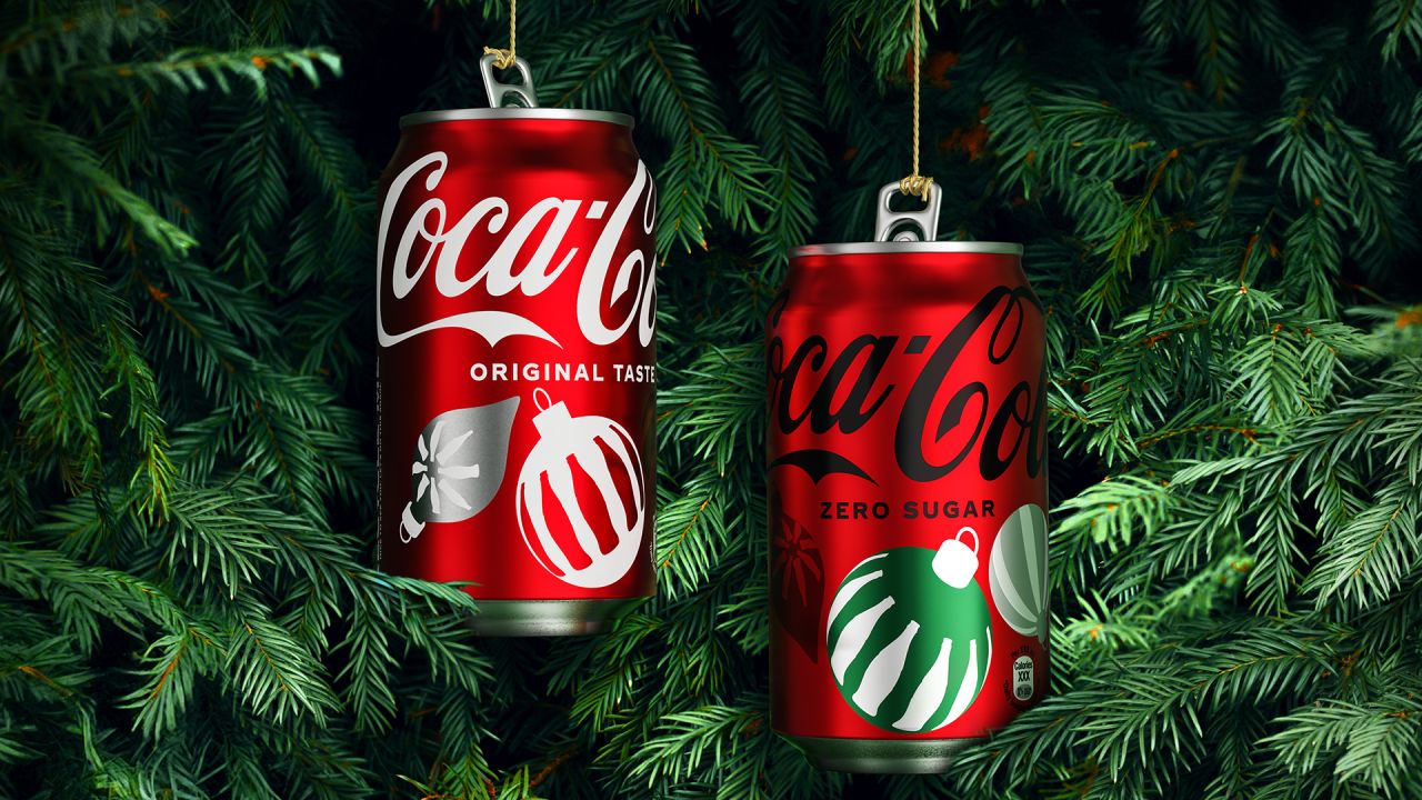
Coca-Cola has released a holiday campaign identity for 2023, built in collaboration with John Knowles Ritchie and the brand's own in-house design team. And this new global toolkit is a stylish combination of nostalgia and modern design.
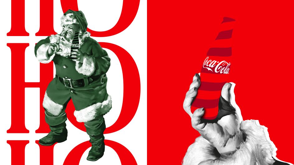
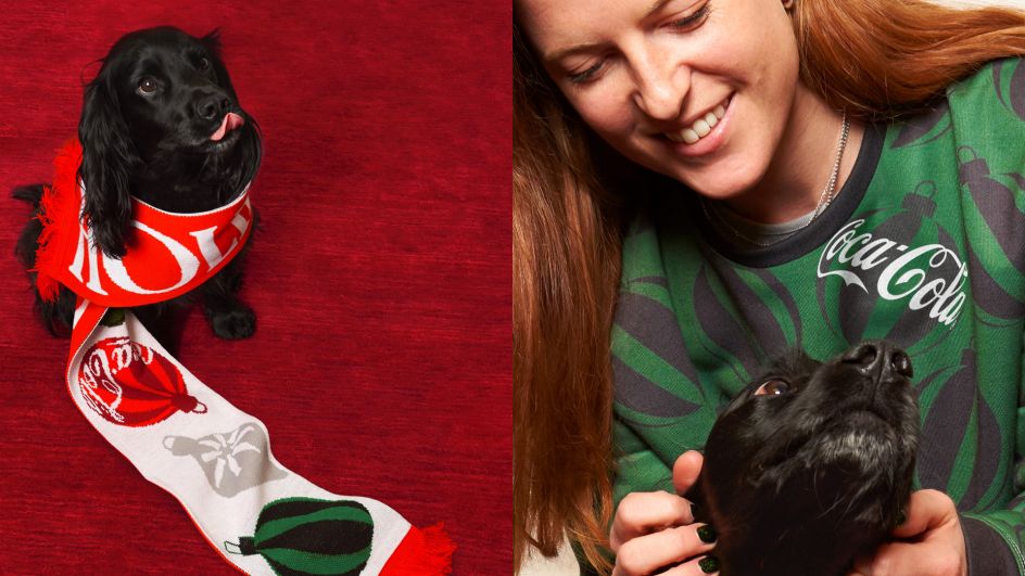
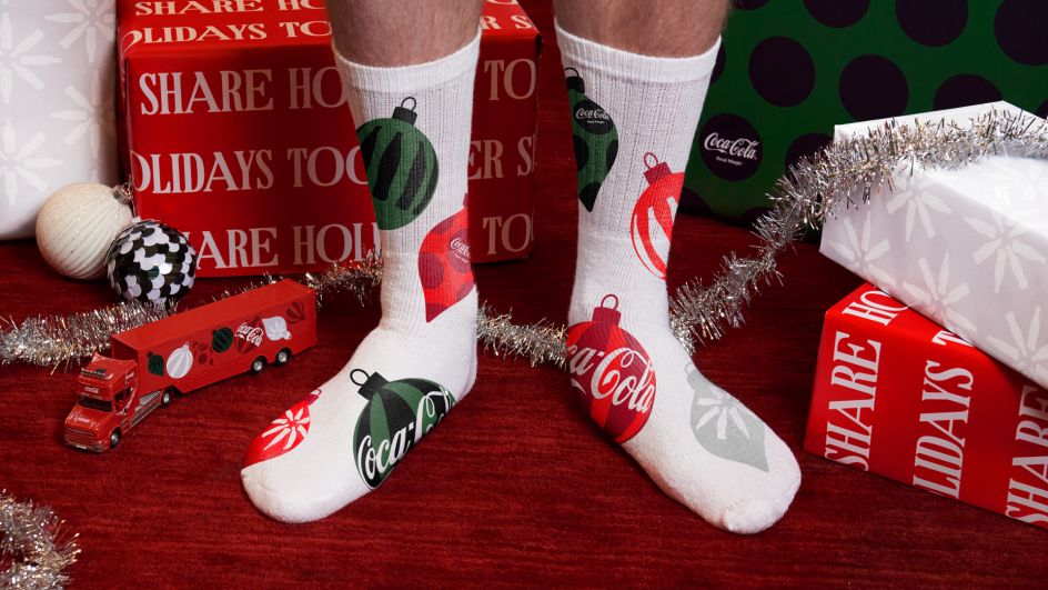
Marketing assets and new can designs feature festive ornament graphics, a classic Santa with a modern, mono-colour twist, vibrant contour bottle silhouettes, fresh bespoke typography and motion principles to bring the holiday magic to life.
We chatted to Rapha Abreu, VP of design at The Coca-Cola Company and Kristie Malivindi, creative director at John Knowles Ritchie (JKR), to learn more about the thinking behind the new designs.
Collaboration and brief
"JKR and Coca-Cola Design team have been partnering for almost three years," says Rapha, "and we collaborate as one team. That's what makes it successful and generates outstanding design work. Open dialogue, exchange of ideas, bravery, ego-less creative process, and a love for the craft: that's the recipe.
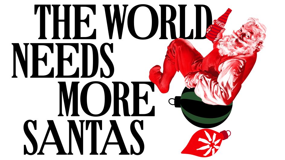
"The brief here was to bring Real Magic to life during the holidays by creating an iconic and distinctive identity system that celebrates our Christmas heritage assets and creates new ones," Rapha explains. "We wanted the result to achieve an authentic and contemporary look for the brand worldwide during the season.
"To that end, JKR, in collaboration with Coca-Cola's in-house design team, created a new set of holiday illustrations, logo signatures, Santa treatments, a bespoke typeface, motion assets and more. These assets will appear across all platforms, including packaging, point of sale, OOH and digital communications, plus experiential activations such as the Coca-Cola caravan." That's the iconic festive truck that traditionally announces 'Holidays are coming' for Coke; it was first featured in a 1995 advert created by WB Doner and titled 'Christmas Caravan'.
Illustrations, typography and colours
What's really grabbed people's attention so far has been the dramatic and forward-thinking illustration style, which we love. "This was inspired by a pair of iconic Coke assets: the contour bottle silhouette and the Coke Hug Logo," explains Kristie. There, she's referring to a special wraparound version of the brand's classic logo, which debuted in 2021.
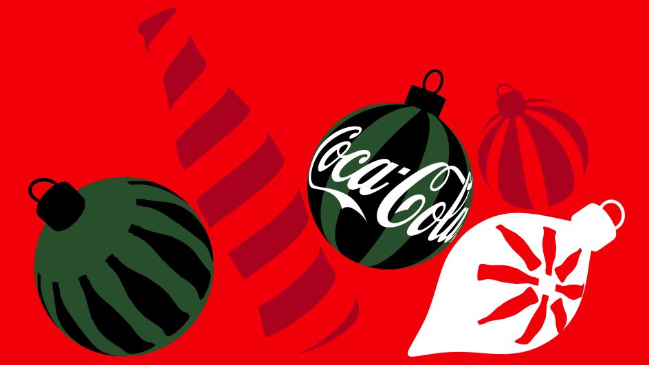
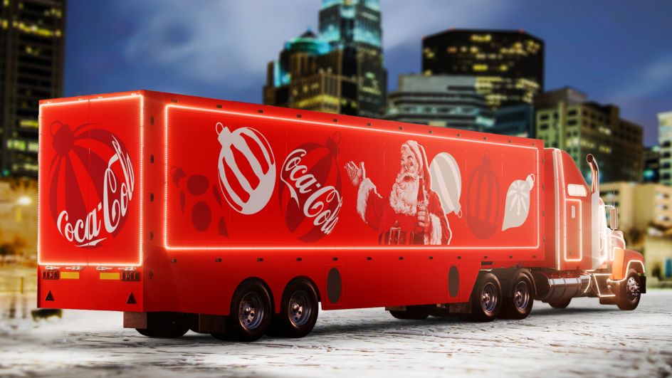
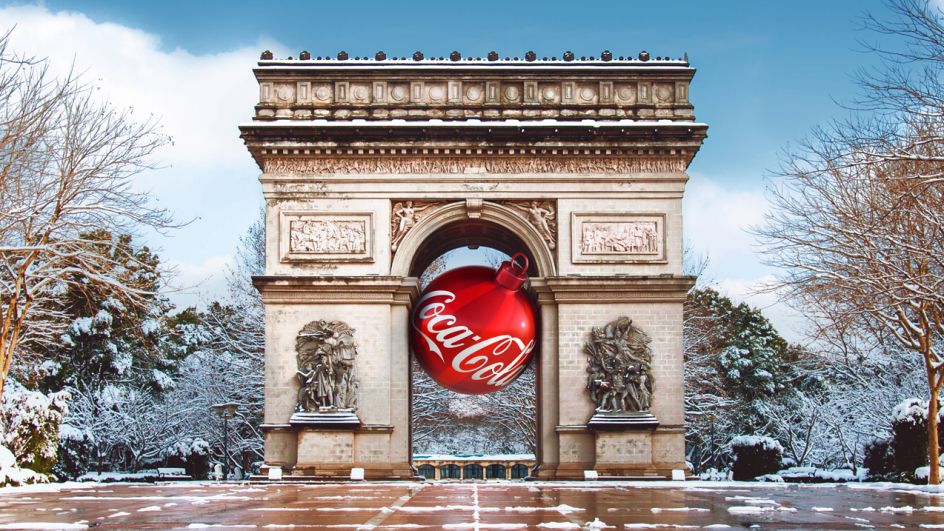
"We created all the ornaments in CGI, which allowed us to animate them, apply patterns and create the 2D shapes," she continues. "We made sure to stay true to the original Sunblom Santas, giving them a subtle reinterpretation in a single colour to seamlessly bring them into our graphic world."
Here, she's referring to Haddon Sundblom (1899-1976), the American artist of Swedish and Finnish descent best known for the images of Santa Claus he created for The Coca-Cola Company in 1931. These images firmly established the larger-than-life, grandfatherly Claus as a key figure in American Christmas imagery and still resonate deeply with audiences today.
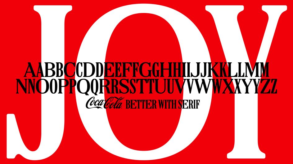
A custom font was also created for the campaign, titled 'Better with', which originated from the tagline lockup 'Things go better with Coke' that Coca-Cola used in the 1960s. "Coke has a legacy of using beautiful, sparkling serifs but has been relying on their bespoke sans typeface, TCCC Unity, since 2017," explains Kristie.
"To craft the 'Better with' typeface, we collaborated with Brody Associates, the creators of TCCC Unity, who had extensive knowledge of the Coca-Cola archives. They honed in on details from various vintage specimens and developed the pair of widths we ultimately mixed to create a single, curated font – making it simple to typeset headlines with real character."
Finally, the colour palette is both distinctive and familiar, and that's no accident. "Coke is iconically red and white," Kristie notes. "More broadly, once you add in Zero Sugar (black) and Diet Coke (silver) and Cherry Coke (dark red), you've basically got a Christmas palette. The addition of dark green helped to bring a modern and unexpected, yet seasonally appropriate, pop to the identity."


 by Tüpokompanii](https://www.creativeboom.com/upload/articles/58/58684538770fb5b428dc1882f7a732f153500153_732.jpg)

 using <a href="https://www.ohnotype.co/fonts/obviously" target="_blank">Obviously</a> by Oh No Type Co., Art Director, Brand & Creative—Spotify](https://www.creativeboom.com/upload/articles/6e/6ed31eddc26fa563f213fc76d6993dab9231ffe4_732.jpg)


