Creative Spark gives Manchester's Seven Brothers a 'Lucky 7' brand refresh
It's been seven years (funny enough) since Manchester studio Creative Spark created the identity for Seven Brothers, the local brewery founded by the McAvoy brothers.
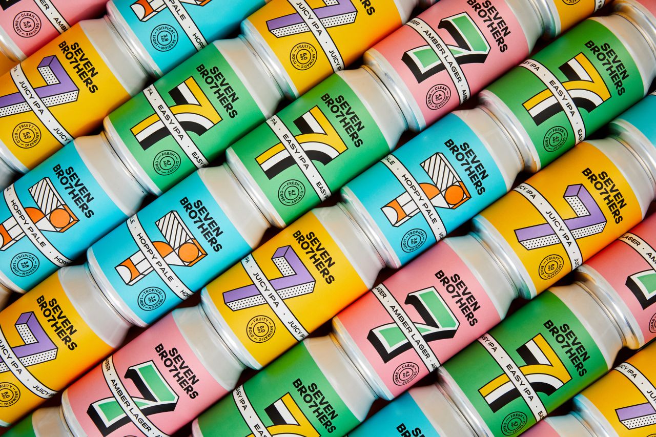
Guy, Keith, Luke, Daniel, Nathan, Kit and Greg were inspired by their dad's home-brewing in their cellar at home and decided to club together in 2014 to start their own business. Since then, they've become a huge success story, not just for the North of England, but for all of the UK.
Today, you can find the Manchester brewery's products in Selfridges, Booths and Ocado, and visit two of its beerhouses in Manchester and Salford (another six sites are planned over the next couple of years, too). With so much growth and plenty to celebrate, Seven Brothers naturally felt ready for a brand refresh.
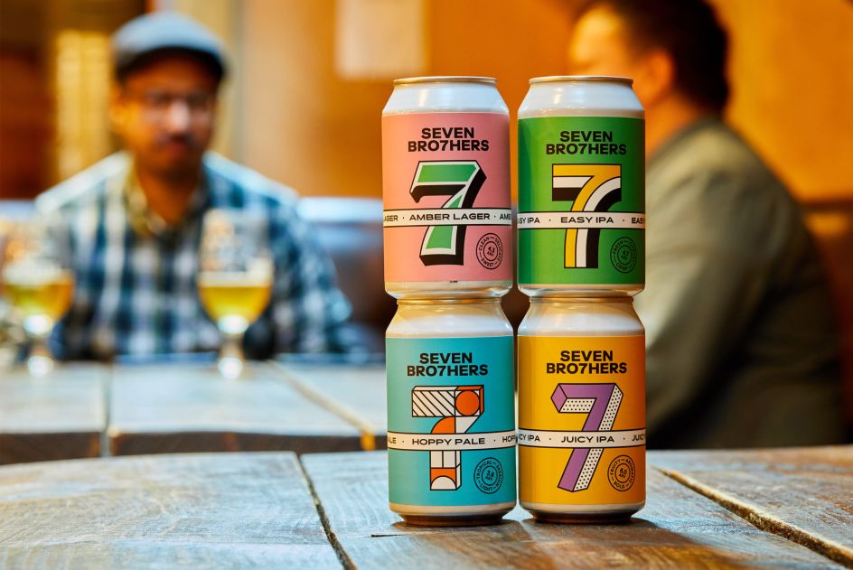
Working closely with the seven brothers, Creative Spark used vibrant yellow and black along with a bold capitalised logo to create a strong typographical identity, consistent across the family of beers that has also expanded. The new logo also incorporates the number '7' in place of the letter 'T'.
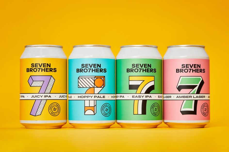
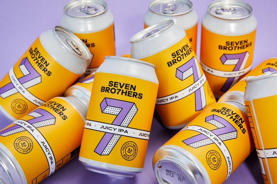
Each of its beer flavours is reflected in various pastel colours and expressive typefaces, helping them to "pop off the shelves", as Creative Spark puts it. This time around, there's more of an emphasis on the '7' which dominates each can with a cleaner, more vibrant background. Each '7' is uniquely designed for each beer flavour.


 by Tüpokompanii](https://www.creativeboom.com/upload/articles/58/58684538770fb5b428dc1882f7a732f153500153_732.jpg)


 using <a href="https://www.ohnotype.co/fonts/obviously" target="_blank">Obviously</a> by Oh No Type Co., Art Director, Brand & Creative—Spotify](https://www.creativeboom.com/upload/articles/6e/6ed31eddc26fa563f213fc76d6993dab9231ffe4_732.jpg)


