Darren Firth of Six on the new Kinfolk site, working outside London & juggling side projects
You'd think with today's technology and changing lifestyles, the success of a design firm wouldn't depend on being based in London – but that still seems to be the norm in many cases. Except, of course, if you're Leicester-based studio Six, the people who boast Kinfolk magazine, Daniel Hopwood and Harley-Davidson amongst their many international clients.
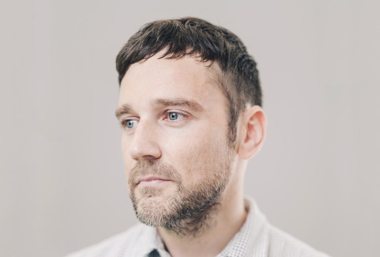
How do they get noticed outside of London's bubble? Co-founder and Design Director Darren Firth believes it's down to several key things (more on this later). But with over 14 years in the industry, and a sterling reputation for producing great design, it's easy to see why Darren and Six are doing so well.
Aside from the studio, Darren also runs his own side project, We Occupy, which he launched in 2003 to curate full-scale exhibitions, printed publications and limited edition products. With so much at play, how does he find the time to run both, while designing quality websites for some of the world's biggest brands? We spoke to Darren about this and much more...
How did you come to co-found Six, and where does it get its name?
We all worked together at a previous agency and had a shared philosophy on how a studio design should be run. The name is based on the six co-founders.
You were recently voted in the top 30 of UK design studios by Computer Arts – one of only three outside London. How does it feel to be breaking the London-centric mould?
Ultimately it's a great accolade, especially since that recognition stems from our peers, but it is slightly concerning that there were only three agencies recognised outside of London. As much as this magnifies our own personal achievement, it equally highlights the point that location is still a defining factor in our industry, regardless of technological advances making the world smaller.
I'm unsure whether this is purely down to the sheer volume of studios in the capital, a lack of recognition from industry press, client bias when commissioning work or there is a genuine difference/advantage (beyond convenience) for those designers and agencies based in London.
Our location used to be something that weighed heavy, but we now embrace it as an advantage to the business.
Are you often in London? Or do you find you don't need to be these days?
More often than not I find myself in London because I want to be, not because I have to be, and usually for pleasure rather than business. I love the city, but I love coming home too.
You have clients worldwide. How do you win new business?
The saying 'Do good work and the work will come to you' springs to mind. We've always put our focus into the projects we have in the studio, rather than strategising how to win new ones. Most of our enquiries come through word of mouth and site credits, with the portfolio legitimising our offer.
Our overseas client list is something we've nurtured since inception, with smaller, pro-bono projects in the US eventually attracting the attention of various startups in Silicon Valley. Over the subsequent years, client loyalty has seen our services transfer across multiple businesses and sectors in San Francisco and LA.
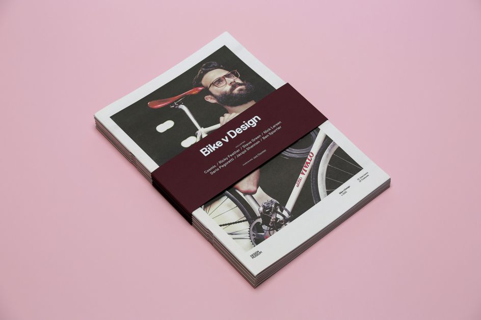
Bike V Design (Design Museum) © Six. Design + AD, Darren Firth
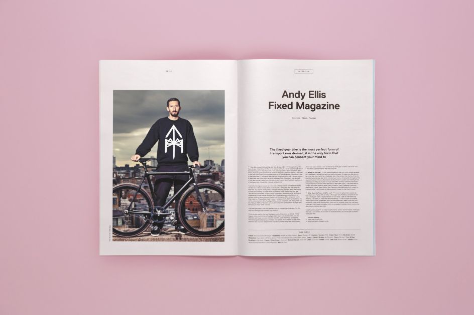
Bike V Design (Design Museum) © Six. Design + AD, Darren Firth
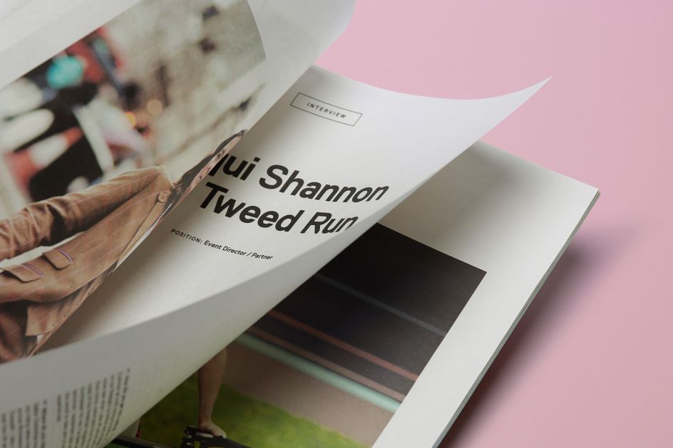
Bike V Design (Design Museum) © Six. Design + AD, Darren Firth
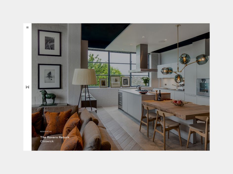
Daniel Hopwood © Six. Design + AD, Darren Firth
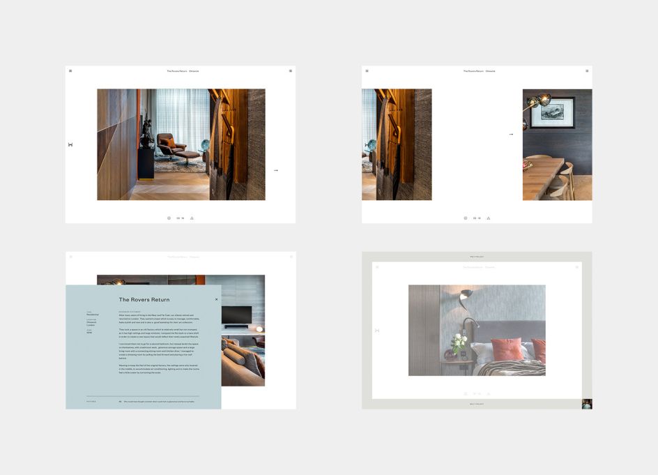
Daniel Hopwood © Six. Design + AD, Darren Firth
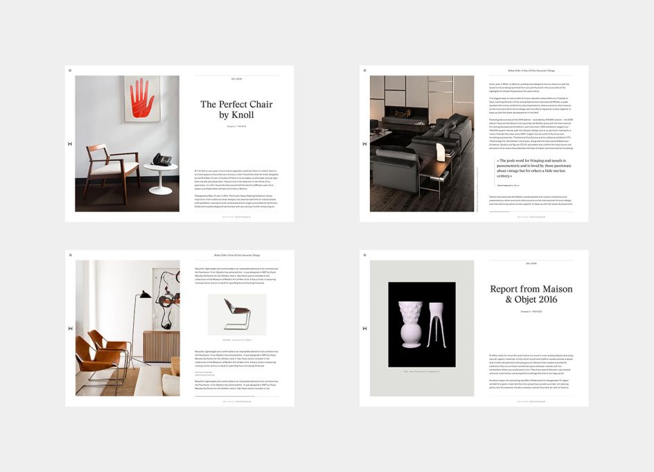
Daniel Hopwood © Six. Design + AD, Darren Firth
Six has just designed and developed Kinfolk's new website. Did you work with the editorial designer Alex Hunting on this? Or were you tasked to come up with the digital version yourself?
The brief was to take the essence of Alex’s redesign and translate it into a digital format; this involved the typography, graphic detailing and use of white space.
Were there any challenges you had to overcome?
The main challenge was producing an online version that not only retained a synergy with the printed magazine but also delivered an experience which centred around readability and ease of use.
Furthermore, the experience needed to translate equally across all devices, so the responsive design was crucial to the success of the project.
Kinfolk has had quite a lot of stick in recent times – many citing the publication as a victim of its own success. Did you feel the pressure to impress?
Yes we did, not only as a result of this negative commentary (although the change in editorial content helped in that respect) but also because it was an important project for the studio since the previous version was so well received.
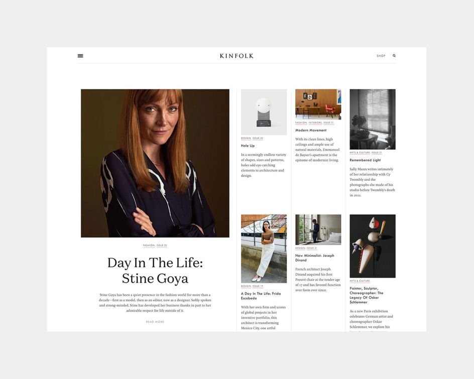
Kinfolk © Six. Design, Six
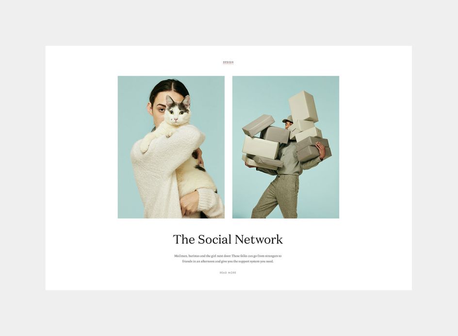
Kinfolk © Six. Design, Six
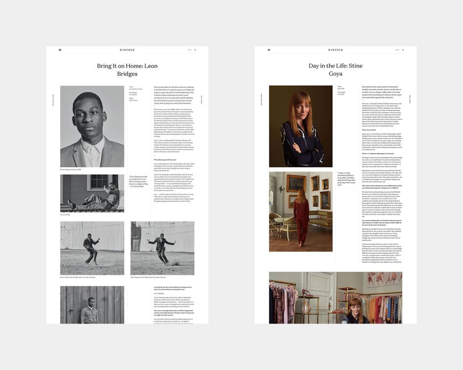
Kinfolk © Six. Design, Six
You also run We Occupy. It's been nearly 14 years since its launch and it's changed somewhat since 2003. Any highlights you'd like to share?
It has changed significantly over the years, but I feel that I've reached the point where I know what the platform is and where I want to take it. Ironically my highlights stem back to the first 5 years when I organised exhibitions and collaborative projects on a regular basis and travelled as far as Hong Kong to launch a book I edited and co-designed...it would be great to return to this level of curation.
You've recently redesigned its website – can you describe the process you went through?
Long and torturous; like most creatives, I find the most difficult brief is the one you set for yourself. Fundamentally it was unavoidable, the previous incarnation was over 10 years old and wasn't viable as a platform anymore; both from an admin and user perspective. Secondary, it was a chance for me to experiment beyond the constraints of client projects.
The new version isn't particularly pushed, but I'm happy with the end product in relation to the limited development budget I had available.
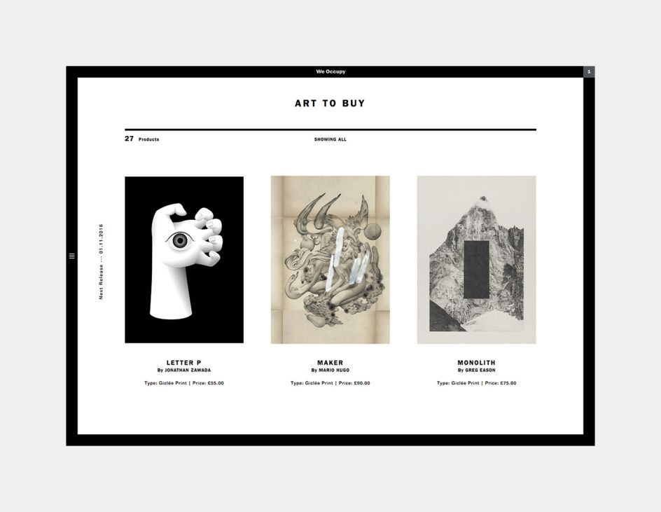
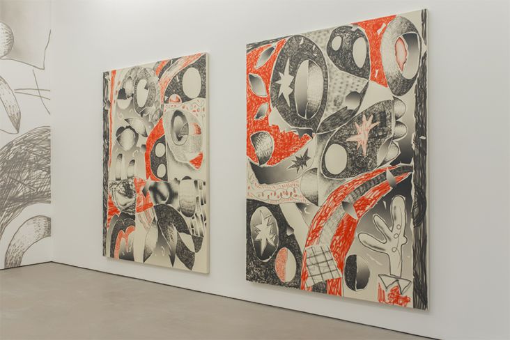
We Occupy © Sane. Design + AD, Darren Firth
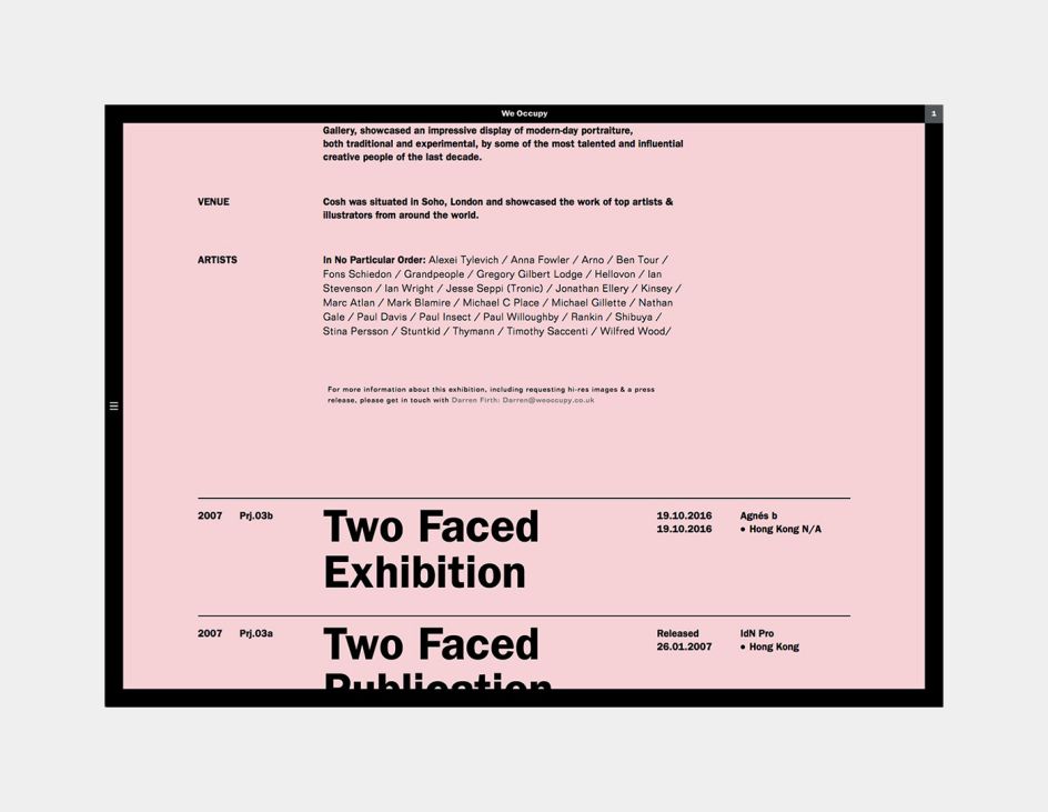
We Occupy © Sane. Design + AD, Darren Firth
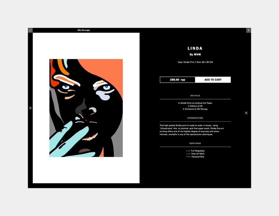
We Occupy © Sane. Design + AD, Darren Firth
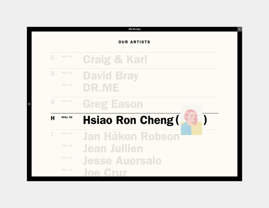
We Occupy © Sane. Design + AD, Darren Firth
How do you select the featured artists? Do they approach you, or is it the other way around?
I've always selected the artists myself; the project has always been very personal. It's a passion, not a revenue stream, and curation has always centred around the question "would I have it on my wall?", not "would this make me money?". Running We Occupy as a sideline has meant I can stay true to this ethos and not feel pressured into selling 'popular' work to pay the rent.
How do you find the time to run such a big side project as well as an established studio?
I'm not actually sure. The discipline I guess, maybe routine; perhaps it's sheer stubbornness to see something through that I've invested so much time in.
Ultimately it's driven by a combination of a passion and distraction, both of which I believe is integral to a healthy work/life balance. Technically, it's still 'work' (that fact hasn't escaped me), but I enjoy it and that's the main thing; whether it cuts too much into the 'life' part of that equation is another matter.
Are you fussy about the clients you take on?
I think the majority of creatives care about the kind of work they take on, it's a natural characteristic, and as an agency, our name is attached to everything we produce, so there is a level of collective pride that needs to be upheld.
In terms of screening clients, I'd say we are careful, not fussy. Ethics aside, what makes a project interesting is purely subjective; we're designers, not artists, and as a general rule we feel there is creative opportunity in most briefs, regardless of the sector or subject matter.
The definition of 'fussy' is more applicable to the duration of our portfolio since it's this that sets the standard for our creative output and clearly communicates our processes and values to potential clients. In this instance I'd actually say the term 'militant' is more appropriate than 'fussy'; we are definitely our harshest critics.
Like most agencies, we've had to take on our fair share of 'difficult' projects, but that's often been influenced by the financial situation at the time. Ultimately, we approach every project, in the same manner, striving for the best possible outcome and what we would coin internally as the 'Six standards'.
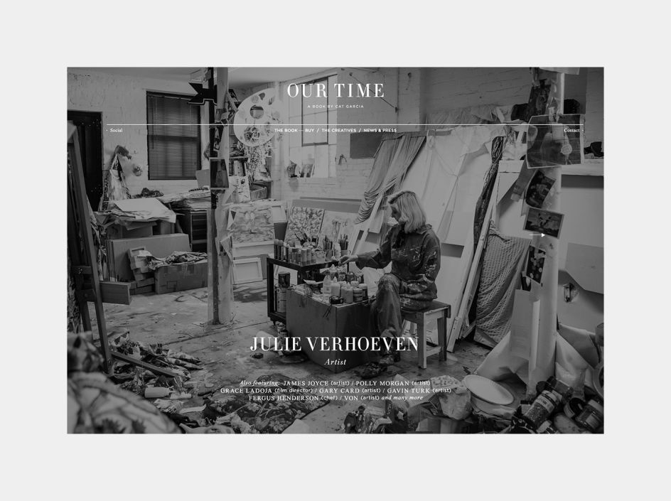
This Is Our Time © Sane. Design + AD, Darren Firth
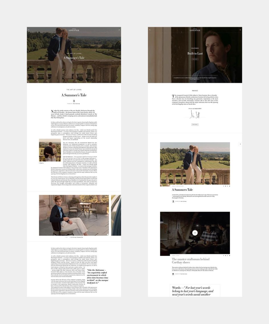
Essence © Six. Design + AD, Darren Firth
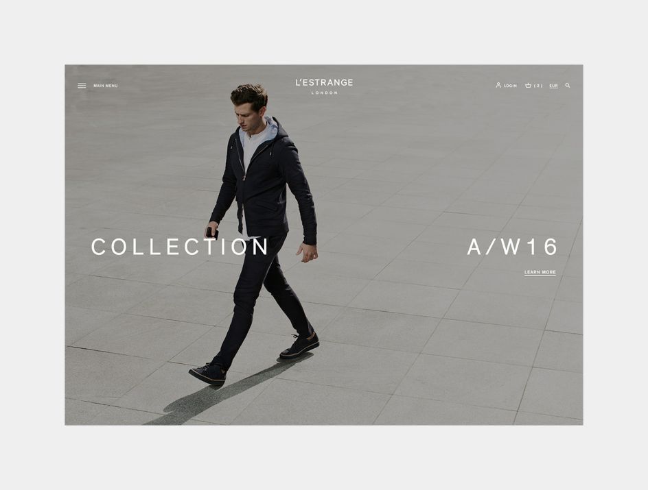
L'Estrange © Six. Design + AD, Darren Firth
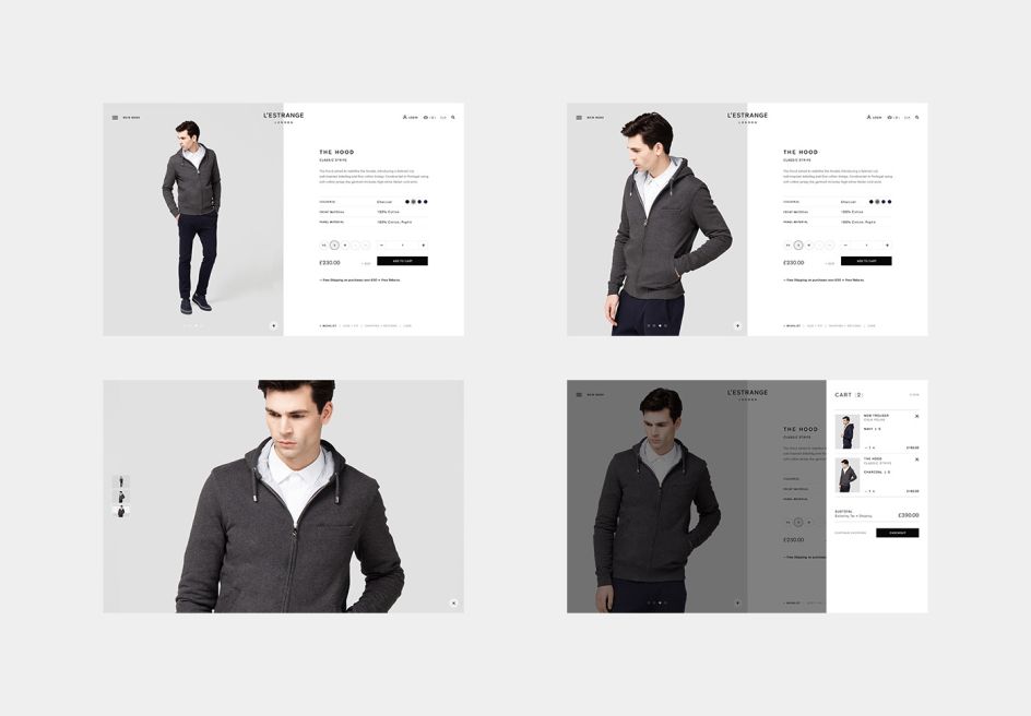
L'Estrange © Six. Design + AD, Darren Firth
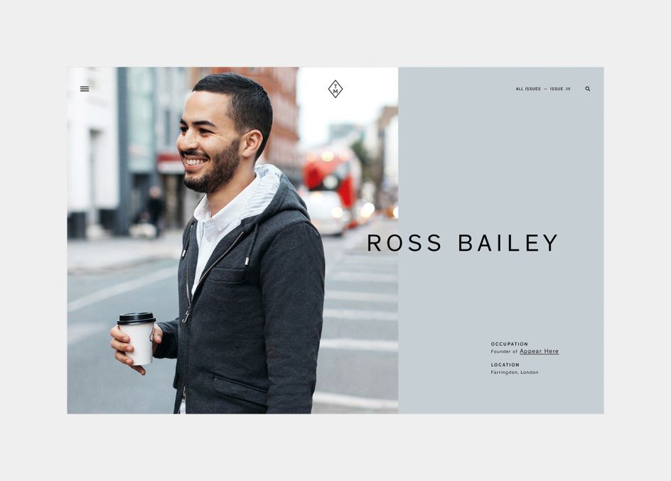
L'Estrange © Six. Design + AD, Darren Firth
What keeps bugging you at the moment – and is something you'd like to tackle in 2017?
As an agency, we still have plenty to learn and are looking to hone our studio practices as the year unfolds; my role as Head of Digital will be to focus on the digital side of this.
What's changed in the design industry the most since you got started? For better, and for worse?
I feel the rise in popularity of Pinterest has had a monumental impact on our industry (positive and negative); more specifically, the way that clients and designers approach new projects.
On the plus side, Pinterest provides creatives with an instant, and endless stream of potential reference material, which can be honed and saved according to different briefs (This borders on being negative too).
The downside is that clients can do the exact same thing, and as a consequence become attached to specific examples of design, rather than focussing on their commercial goals and requirements. Fixating on existing work can often push the designer/agency into a corner and ultimately, narrows down the creative thinking from the start.
More and more, clients are asking "Can we just have the same as X", rather than pushing the notion of originality and experimentation. I feel this attitude stems from the fact that clients are being swamped with an abundance of creative material, way beyond that of general internet browsing, and as a consequence, this process is breeding a culture of homogeny in our industry.
To sum up, I like Pinterest, it's a brilliant tool and I use it on a weekly, if not daily basis. In relation to the question, it is one of the biggest influences I've felt in my own career, positively and negatively.
Any typefaces you just can't get enough of?
Personally, anything Grotesque at the moment.
What's next for Six and your other projects? What can we expect this year?
Continue to grow our in-house development team and to set up a sales office in LA, with the intension of expanding this into a working studio by 2018.
Finally, what wisdom can you share to designers just starting out in the industry?
I still can't believe this is still an issue in 2017, but if you are contacting an agency for a job or internship, do your research and make it personal; 'copy and paste' emails are destined to be ignored.
A common misconception regarding Six is that we are based in London, despite the fact our address sits directly above the contact email on our website; you may have a killer portfolio, but attention to detail is just one of the necessary traits that should extend beyond pixels and point sizes.


 by Tüpokompanii](https://www.creativeboom.com/upload/articles/58/58684538770fb5b428dc1882f7a732f153500153_732.jpg)


 using <a href="https://www.ohnotype.co/fonts/obviously" target="_blank">Obviously</a> by Oh No Type Co., Art Director, Brand & Creative—Spotify](https://www.creativeboom.com/upload/articles/6e/6ed31eddc26fa563f213fc76d6993dab9231ffe4_732.jpg)


