Design Army's pop-up experience helps Saucony launch its new ‘shoe of speed’
Design Army's Pum Lefebure explains how they created hype and buzz around the Endorphin Pro 3, Saucony's latest "fast shoe".
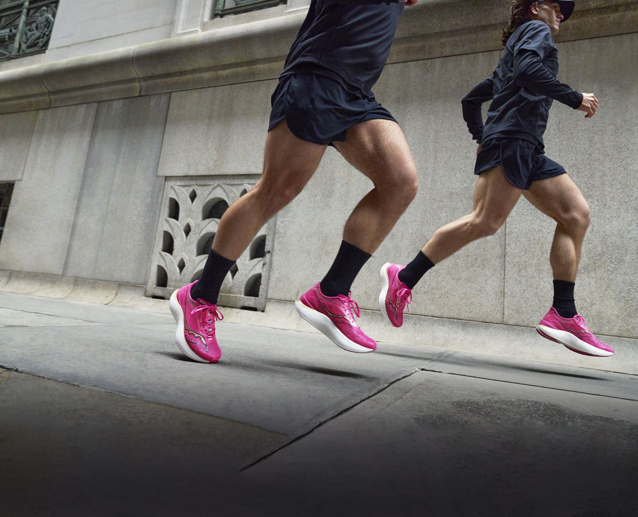
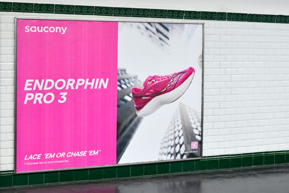
Running footwear brand Saucony was launching its new shoe, the Endorphin Pro 3. So it turned to Design Army, an award-winning graphic design firm based in Washington DC, to help its team promote it. But there was one small problem, says the agency's chief creative officer and co-founder, Pum Lefebure.
"The overriding goal was to create buzz and hype," she explains. "But the campaign would be taking place during Paris Fashion Week Men's Collections. So we knew there would be a lot of clutter we'd need to break through and disrupt. The campaign needed to be bold and provocative."
To fulfil the brief, Design Army devised a 360-degree experience that spans digital, retail, and experiential. For the latter, they created a pop-up experience titled House of Speed.
Wow factor
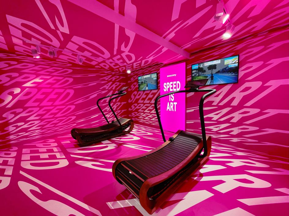
A multi-level gallery was transformed into an Endorphin-themed townhouse, complete with a treadmill room for in-person demonstrations, a bar with refreshments, and upstairs living quarters that doubled as spaces for socialising.
House of Speed
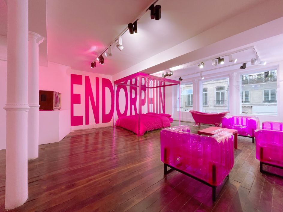
House of Speed
"On the first level, the treadmill room had a real wow factor when you walked in," says Pum. "You entered an alcove space plastered with phrases like 'Speed Is Art', and there were two treadmills with screens in front of them, inviting you to run, go fast, and have an emotional experience."
The team is especially proud of the upstairs 'living quarters', designed for interactive content opportunities. "A four-poster bed with a mirror on top and a decal that read 'Go Faster' was a total selfie moment, which we saw gain traction on social media," says Pum.
"A hot pink bathtub with 'feet' wearing the Endorphin Pro 3 was another photo opportunity we saw go viral. Guests were hopping in solo, or groups, taking pictures with their branded hot pink coffee cups reading the 'Runner Times' newspaper."
That specially-created newspaper was handed out at the House of Speed and on the streets of Paris. "It started as a prop for the campaign film," recalls Pum. "The paper blows into the face of one of the runners, slowing him down for a moment. It was the perfect opportunity to bring it to life."
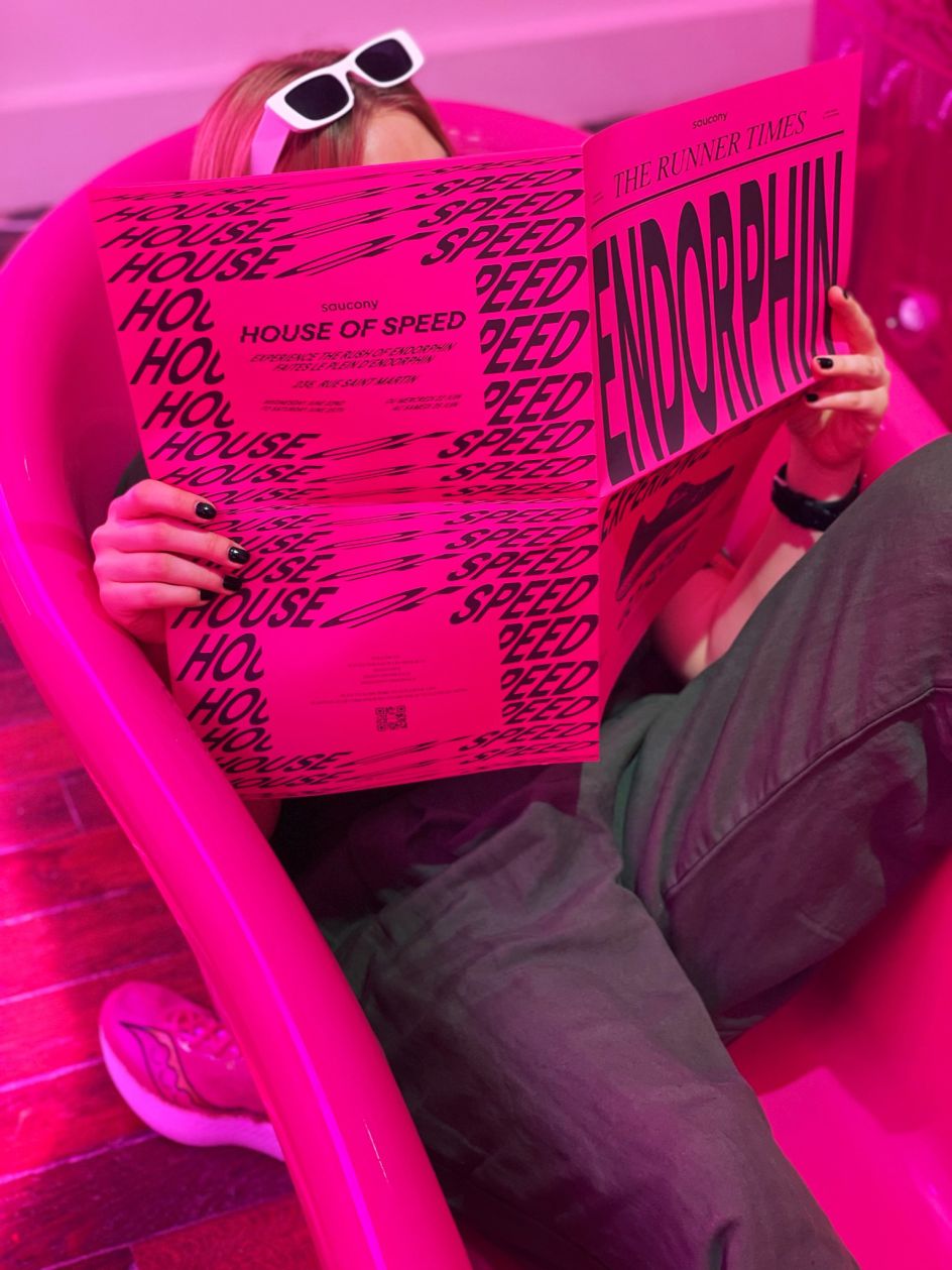
House of Speed
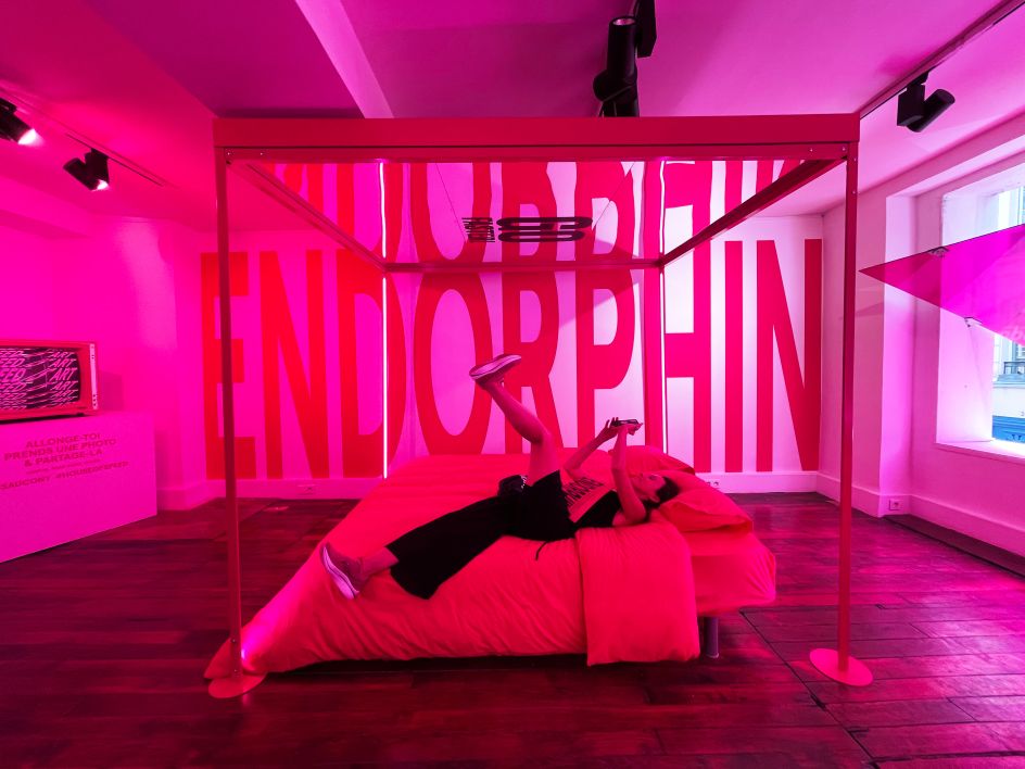
House of Speed
Design inspirations
In designing the space, Design Army was inspired by Prospect Pink, the shoe's colourway, and a modern gallery approach to displaying the shoes. "We leaned on pink as a colour representing self-expression rooted in disruption," explains Pum. "It blankets the entire house, activation and artistic displays of the shoe using LED lights and glow effects."
The House of Speed invited guests to experience the fun of going fast using the new shoes. But the central idea was that speed, and fast shoes aren't just for a certain calibre of runner. Instead, says Pum, "Whatever level you're at in your running journey, know that speed is subjective: just have fun with it."
Collaboration challenges
Design Army was responsible for the design, look, and feel of the space and worked with the brand's production agency, which physically brought it to life. This was not without its challenges, adds Pum.
"Working with multiple partners can always be challenging, especially when you're working from a different country than where the activation is being hosted," she explains. "It meant we couldn't physically pop into the space if we needed to, or we weren't seeing final fixtures until just before the event, and you're juggling a host of different timelines.
"The most difficult part was being limited with what we could do in the actual space due to what was permitted and the time allotted to load in and load out," she adds. "How could we create this bold pink exterior and interior when we weren't permitted to physically change, paint, or hang anything on the walls?"
Thankfully, though, the production agency had solutions for all of this. "And in the end, the result was executed exactly as had been planned thanks to the amazing spirit of teamwork. Overall, the House of Speed created a synergy between Saucony and the fun feeling of going fast, reinforcing its heritage as a premium, trusted, running brand."
Campaign spot
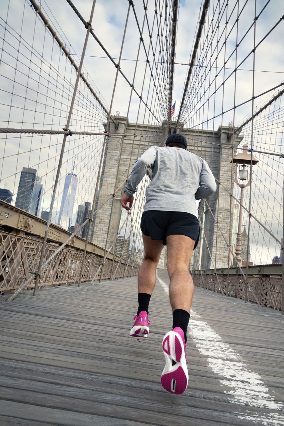
House of Speed was, however, just one element of the campaign. Another was a fast-paced, creative film that follows a runner racing his own reflection from the Brooklyn Bridge to downtown NYC. It's fun, frenetic, colourful and to the point.
In this fast-paced spot, directed by Anthony Blasko, entitled Lace 'Em or Chase 'Em, a runner races his own reflection from the Brooklyn Bridge to downtown New York City.
The reflection, wearing the Endorphin Pro 3, wins the race. But when the runner wakes the following day, it's his turn to lace 'em: leaving his reflection in the dust. The message is beautifully succinct: you can wear the Saucony Endorphin Pro 3 – or chase whoever does.


 by Tüpokompanii](https://www.creativeboom.com/upload/articles/58/58684538770fb5b428dc1882f7a732f153500153_732.jpg)


 using <a href="https://www.ohnotype.co/fonts/obviously" target="_blank">Obviously</a> by Oh No Type Co., Art Director, Brand & Creative—Spotify](https://www.creativeboom.com/upload/articles/6e/6ed31eddc26fa563f213fc76d6993dab9231ffe4_732.jpg)



](https://www.creativeboom.com/upload/articles/d3/d3d5436e37126a9065227e6e0d3f2d50c79604cc_732.jpg)
