Design Bridge's provocative campaign to launch its Dog's Bollocks Student Awards
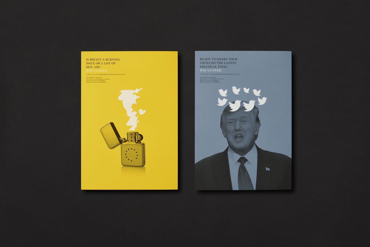
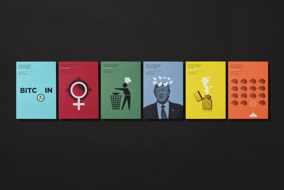
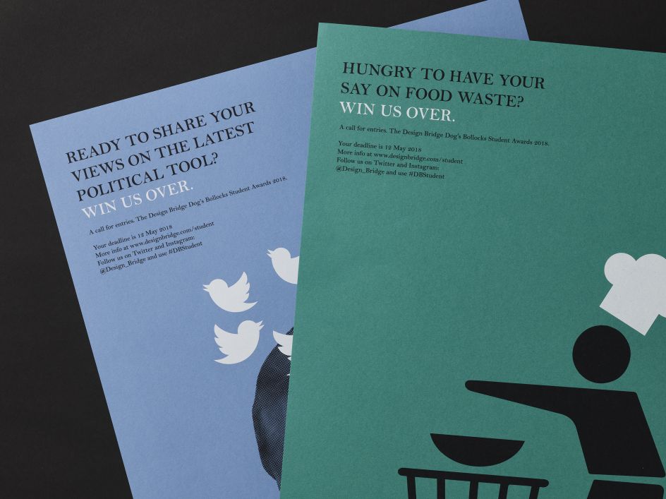
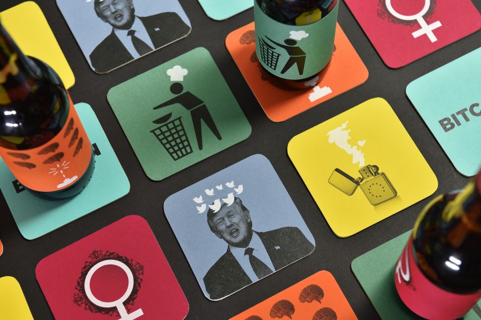
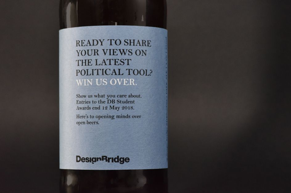
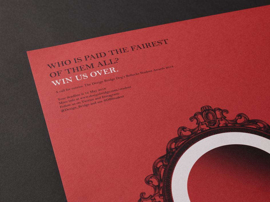
Design Bridge has created a set of six provocative posters, beer bottle labels and beer mats to promote its 2018 Dog’s Bollocks Student Awards.
All images courtesy of Design Bridge
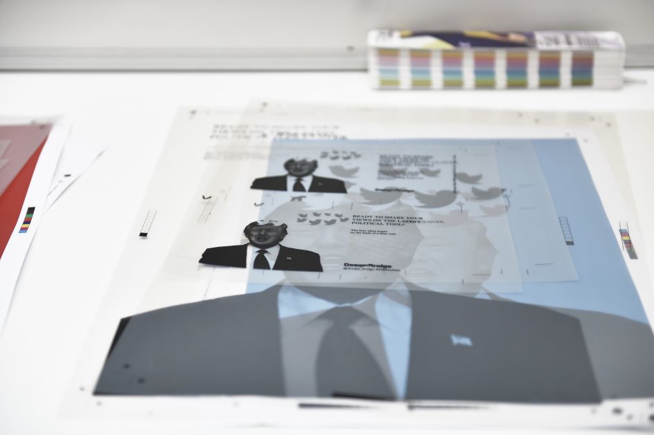
The 'Win us Over' brief challenges students to select a topic they're passionate about and convince the Design Bridge team of their point of view using bold and brilliant design. This year, the London studio's promotional campaign brings to life six topical issues that students might choose to base their entries on including Brexit, the gender pay gap, cryptocurrency, gaming, food waste, and social media as a political tool.
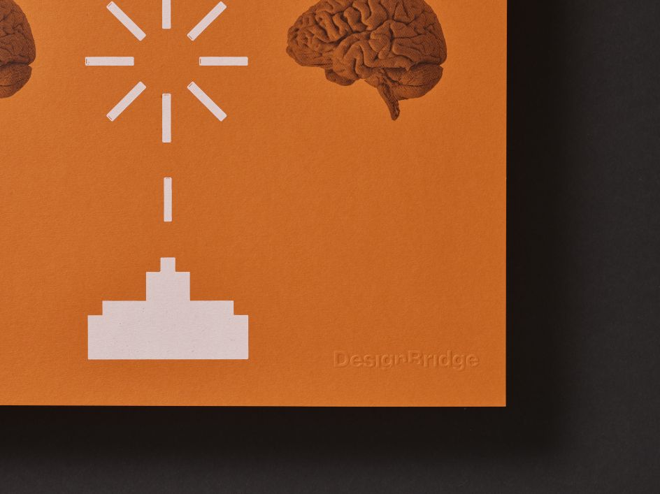
"Our idea was to spark conversations and inspire students by visualising some potential starting points with provocative illustrations and copy," says Design Bridge's creative director, Asa Cook. "The illustrations are inspired by the punk aesthetic that puts bold twists on familiar, found imagery to create challenging new meanings, such as an EU lighter bearing a Britain-shaped flame and a re-imagining of the Space Invaders arcade game with human brains as targets."
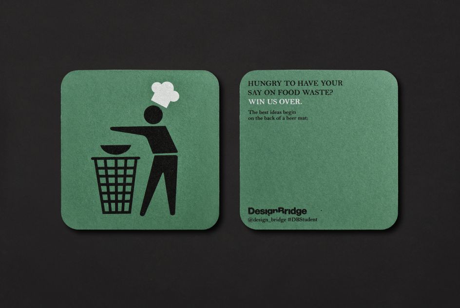
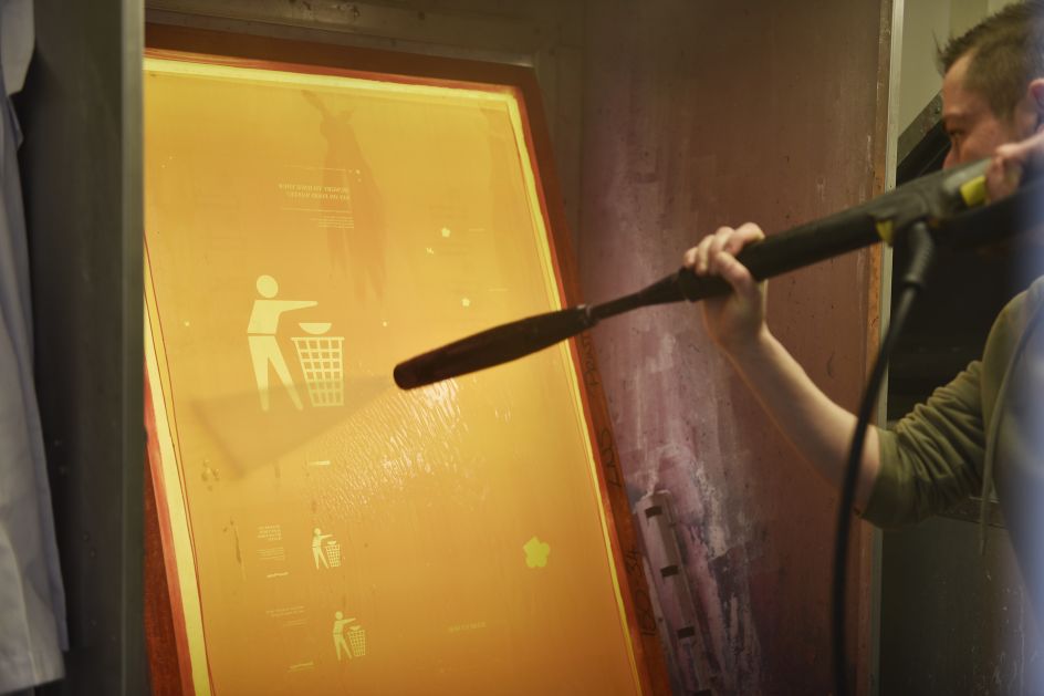
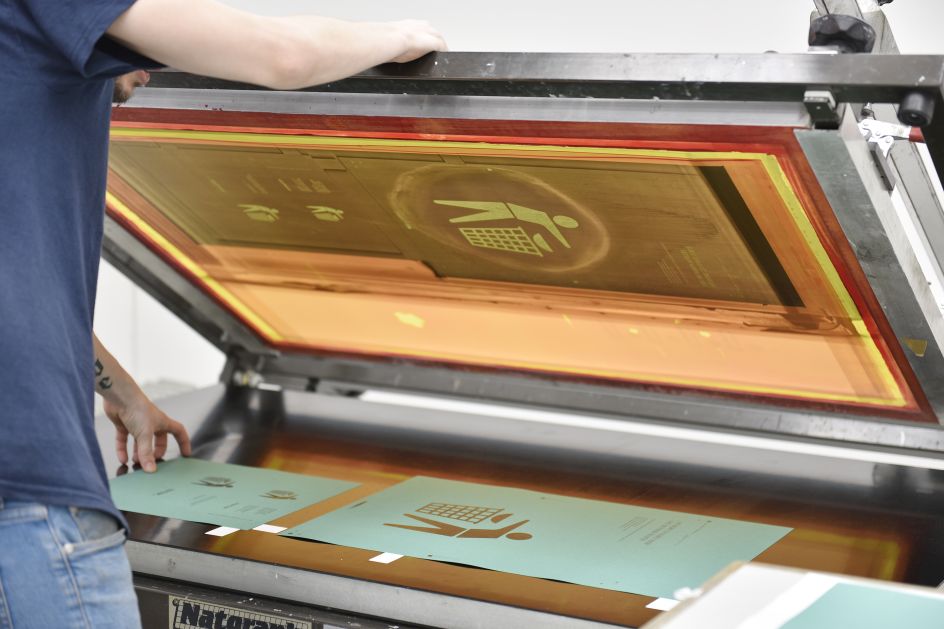
The posters have been expertly screen-printed at LNS Print onto G . F Smith Colorplan stock using only two colours to create a bold, bright and clean aesthetic. Their aim is to capture students’ attention and interest on cluttered university noticeboards and in student union bars. Meanwhile, the matching sets of beer bottle labels and beer mats are inspired by the idea that the best debates often happen in the pub. These additional touchpoints will be distributed in student unions across the UK to ignite conversations with messages such as "Here's to opening minds over opening beers” and "The best ideas begin on the back of a beer mat".
Crafting engaging copy was a crucial part of the poster designs, as Holly Kielty, creative director of Brand Language at Design Bridge, explains: "With the poster headlines, we simply wanted to provoke and inspire, so it was less about providing answers and much more about raising questions. Each headline includes a subtle wordplay on the topic shown, but we kept it relatively abstract and playful so that whether you’re seeing it on a poster or on a beer mat, you’re intrigued and prompted to discover more. We were conscious that this isn’t Newsnight, it’s a student competition, so the tone had to be light, but with a bit of an intriguing edge."
Design Bridge is hoping that the posters, beer labels and mats will encourage students to take up the brief and show off their design skills by communicating their own views on the subjects they feel most passionately about. Many of Design Bridge’s current team were offered positions as a result of applying to the awards in the past and the firm has since employed eight people.
Sound good? Check out the full brief at designbridge.com.




 by Tüpokompanii](https://www.creativeboom.com/upload/articles/58/58684538770fb5b428dc1882f7a732f153500153_732.jpg)


 using <a href="https://www.ohnotype.co/fonts/obviously" target="_blank">Obviously</a> by Oh No Type Co., Art Director, Brand & Creative—Spotify](https://www.creativeboom.com/upload/articles/6e/6ed31eddc26fa563f213fc76d6993dab9231ffe4_732.jpg)


