Designing 'the people's money' for Scotland, with a very cute squirrel
A collective of Scottish design agencies has worked together on the designs for the Royal Bank of Scotland's 'The People's Money' £20 banknote.
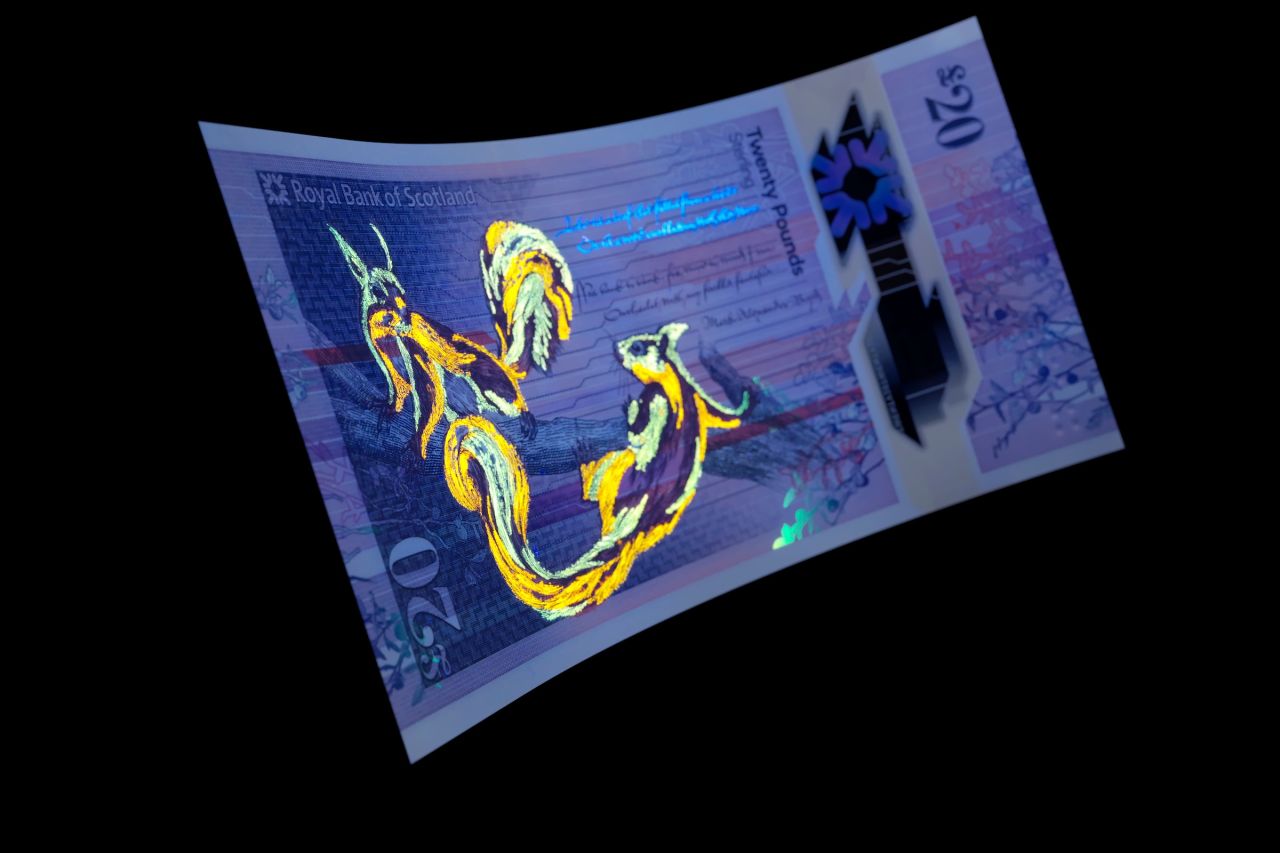
Royal Bank of Scotland’s £20 bank note © De La Rue 2020
The new £20 polymer note, which was released in early March, is the third instalment of the "Fabric of Nature" series that was introduced with the £5 note in 2016. The design concept for the set of notes draws on opinions gathered from the public and used a range of specially designed colour palettes, bespoke tweed patterns and typefaces.
While the series has a narrative of sorts when together, each note also has its own story— four different tweed patterns are used to reflect their denomination, and poetry is featured to connect the visual elements that reference the Scottish landscape and its wildlife.
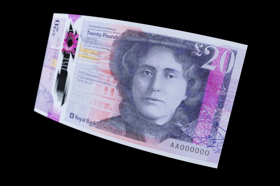
Royal Bank of Scotland’s £20 bank note © De La Rue 2020
Nearly 30 different designers have been involved in the project to date, with this latest launch worked on for the most part by Glasgow studio Timorous Beasties along with Edinburgh-based service design consultancy Nile, branding agency O Street and Glasgow interior design practice Stuco Design.
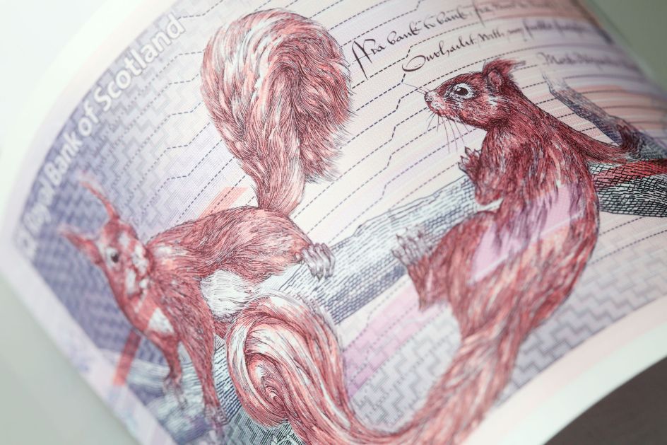
Royal Bank of Scotland’s £20 bank note © De La Rue 2020
The notes show the adorable and handsome red squirrel that's native to Scotland; as well as a portrait of Kate Cranston, a tea room pioneer in the early 20th century who was said to help bring about social change in Scotland, seemingly through the medium of scones.
"Considered to be pocket-size works of art, the notes are full of meaning and part of a family narrative to celebrate the people, achievements and nature of Scotland," says Timorous Beasties, which worked on the illustration side of the project. Studio director Alistair McAuley adds: "This unique campaign has allowed us to work with a varied group of designers, makers, poets, writers, historians and zoologists on an idea developed by the people of Scotland. It has created not only a monetary token but promotes a valuable cultural exchange both nationally and internationally."
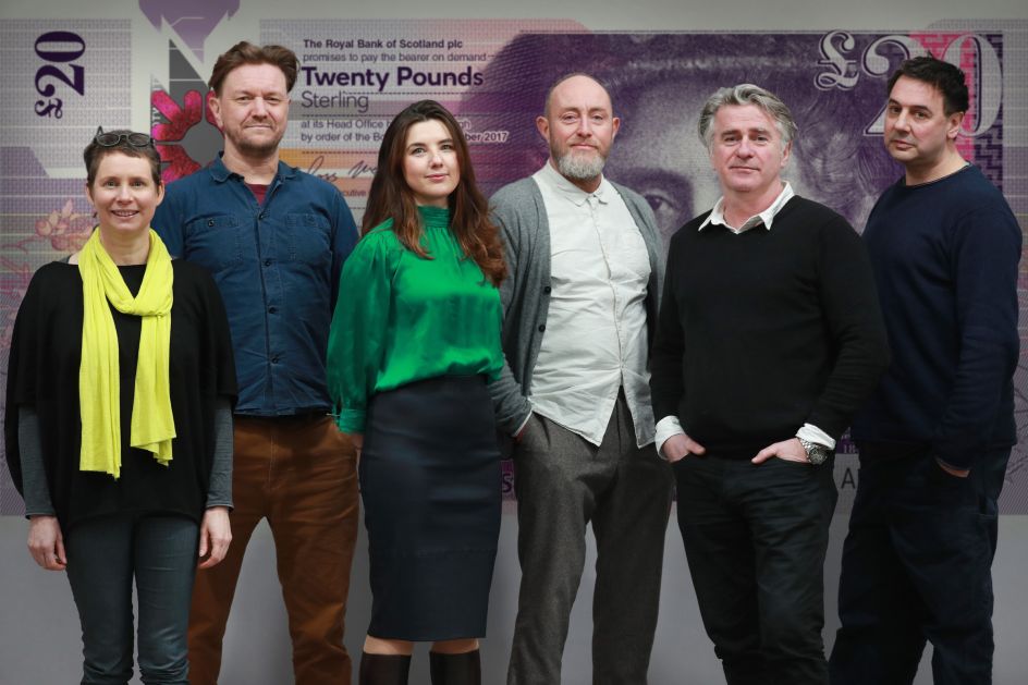
Scottish design professionals from Nile, O Street, Stuco Design and (far right) Alistair McAuley and Paul Simmons from Timorous Beasties © Stewart Attwood


 by Tüpokompanii](https://www.creativeboom.com/upload/articles/58/58684538770fb5b428dc1882f7a732f153500153_732.jpg)


 using <a href="https://www.ohnotype.co/fonts/obviously" target="_blank">Obviously</a> by Oh No Type Co., Art Director, Brand & Creative—Spotify](https://www.creativeboom.com/upload/articles/6e/6ed31eddc26fa563f213fc76d6993dab9231ffe4_732.jpg)


