DesignStudio rebrands Section to 'revolutionise' elite business education
DesignStudio has created a new visual identity and brand positioning for Section, an organisation that was founded "as the antidote to formal, impractical business education".
Formerly named Section4, the company was founded by NYU Professor and entrepreneur Scott Galloway in 2019 and aims to democratise elite business education through a future-facing "invigorating" curriculum. Currently working with 20,000 students in 97 countries, Section seeks to give students the business knowledge they need to excel through an "authentic look into the boardrooms of the world's biggest companies".
DesignStudio's New York office was brought in to help the brand articulate its story through new positioning and identity that matched and augmented its bold ambitions for the future.

"A revolutionary approach to education needed a brand with the right attitude," says Andie Wexler, strategist at DesignStudio. "We started by building a strategic foundation it could use to effectively communicate Section's story. Honing in on the fundamental qualities of its students, we solidified its mission—to make ambition burn brighter. Ultimately, positioning Section as the proving ground for the ambitious, provoking learners to explore, build upon and apply the most compelling ideas in business."
The positioning was based on the four "key principles" that Section runs by hands-on learning, healthy debate, freedom to fail and diverse perspectives. The visual identity looks to reflect these with a look that's "cheeky" and "no-nonsense" to demonstrate that the brand takes a very different approach to the typical university route.
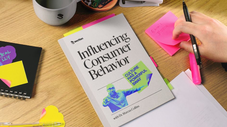
The design system emphasises Section's points of difference to traditional business education by using duality and contrast, such as black and white colour palettes that sit against neon tones inspired by highlighter pens. Likewise, two primary typefaces were chosen: a rigorous but playful serif and a thoroughly modern, dynamic sans serif. These are used together across communications such as social posts, billboards, subway ads and workbooks from the Section courses.



According to DesignStudio, the overall identity looks to be loud, pragmatic and lively in order to help Section stand out from universities and ed-tech companies in the business education landscape.
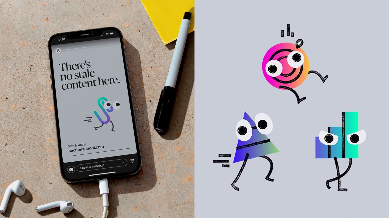
"With an emphasis on real-world learning, the identity brings in authentic reference points for students–Post-its, highlighters, crossed out notes, Tweets, diverse imagery – that reflects how people think and learn," says Alexis Sellal, DesignStudio creative director. "The logomark itself incorporates one of the most tangible icons in the business world, the paperclip."
The new branding began to roll out earlier this month.


 by Tüpokompanii](https://www.creativeboom.com/upload/articles/58/58684538770fb5b428dc1882f7a732f153500153_732.jpg)

 using <a href="https://www.ohnotype.co/fonts/obviously" target="_blank">Obviously</a> by Oh No Type Co., Art Director, Brand & Creative—Spotify](https://www.creativeboom.com/upload/articles/6e/6ed31eddc26fa563f213fc76d6993dab9231ffe4_732.jpg)


