DNCO captures the agile spirit of science startups with new brand for Motherlabs
DNCO, the creative studio for place and culture, has collaborated with Motherlabs to design a brand that captures the spirit of the science startup industry. Bright, bold, and full of momentum, it's the perfect encapsulation of an industry that thrives on innovation.
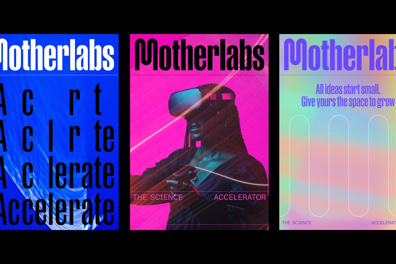
DNCO's mission statement is that it wants to shape brands for the world we need next. And with its new identity for Motherlabs, it's doing exactly that. For those not in the know, Motherlabs are fully supported, ready-to-move-into incubator labs for members of Advanced Research Clusters (a real estate partner for science and innovation).
And if there's anything the science startup sector needs, it's support. Despite the sector growing by 24% between 2016 and 2020, many of those businesses struggled to find suitable lab spaces. Lack of supply is one of the biggest ways innovation is stifled, so hopefully, Motherlabs can turn the situation around.
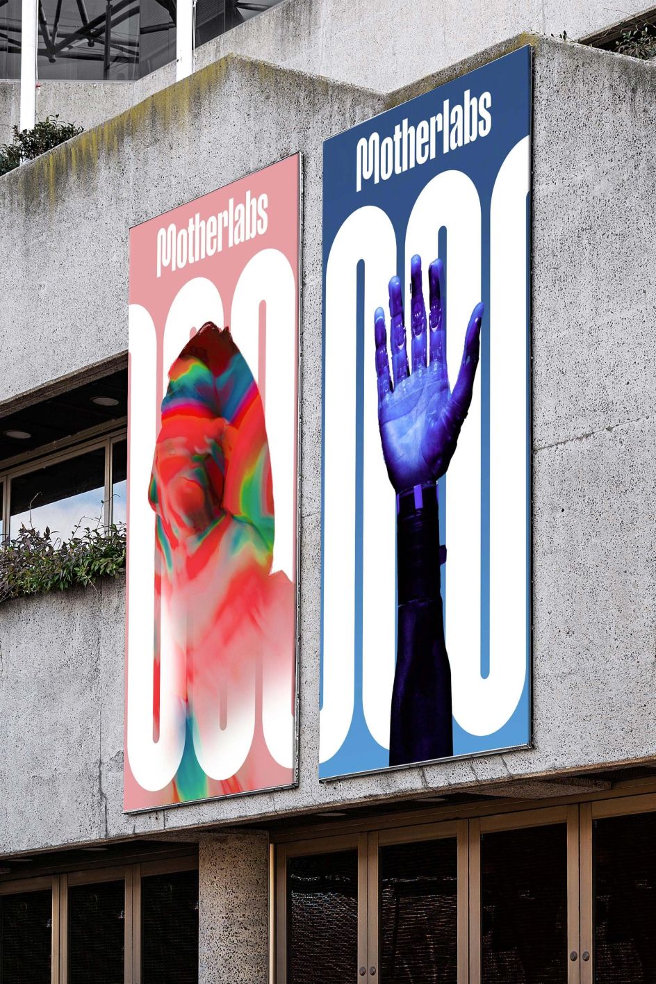
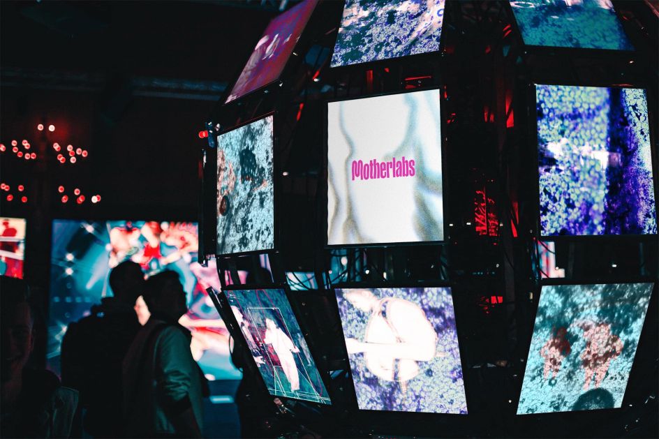
What science startups need is something that reflects their dynamism and agility. Luckily that's just what they've got with DNCO's new identity, which celebrates their place within the broader ARC network.
Even its name, Motherlabs, evokes the vision to provide science's most fragile, early-stage enterprises with the best possible start in life. As for the design, the hot pink 'M' of the wordmark symbolises forward momentum with a looping letterform that rolls on and creates an adaptable, scaling graphic language.
Sam Jones, design director at DNCO, says: "We wanted to express the power of places to accelerate new ideas that will one day change the world. The Motherlabs brand is a brand that does not stop. With a restless, agile spirit, it reminds us of the tireless way science startups have to adapt in order to flourish. Motherlabs is a cousin to the ARC brand — we sought affinity through common typography, colour and spirit. It was a delicate balance of family resemblance and unmistakable independence."
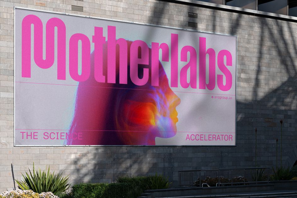
The new brand has launched today at ARC's first Motherlabs in west London. ARC has plans to roll the business out across its 1.6m square feet cluster network, including at Harwell and Oxford campuses.
DNCO, who also developed the brand for ARC, developed the brand strategy, identity, and flexible visual expressions ranging from social media and animations to large-scale super graphics.


 by Tüpokompanii](https://www.creativeboom.com/upload/articles/58/58684538770fb5b428dc1882f7a732f153500153_732.jpg)


 using <a href="https://www.ohnotype.co/fonts/obviously" target="_blank">Obviously</a> by Oh No Type Co., Art Director, Brand & Creative—Spotify](https://www.creativeboom.com/upload/articles/6e/6ed31eddc26fa563f213fc76d6993dab9231ffe4_732.jpg)


