Niceshit's amazing animations want to change how people browse and buy books
Barcelona-based studio Niceshit encourages readers to look beyond book covers and discover stories in new ways with a fun series of beautifully animated reels.
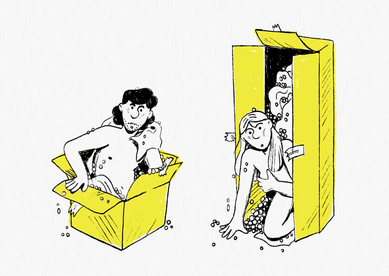
What was the last book you picked up in person? And how many times are currently piled up on your to-read list? (No judgment here; ours is just as bad.) It's sad that how people browse and buy books has changed in recent years, with many stories going overlooked. To combat this trend, animation studio Niceshit has whipped up some glorious reels to encourage people to look past covers and focus instead on the stories themselves.
The project is inspired by the fact that approximately one million new books are published every year in the US, but only one per cent of this number actually sells more than five thousand copies. Perhaps most shockingly of all, half of these book sales happen online. The in-store browsing experience as we know it is at risk of disappearing, something that the Niceshit team didn't want to happen.
"This campaign aims to bring back in-store browsing, help more people discover new books, and hopefully change the way authors release books moving forward. No need to judge a book by its cover anymore!"
Appearing on Instagram and Facebook reels, the campaign, appropriately titled Reel Page Turne, was created in partnership with New York creative agency BBDO for Penguin Random House and Meta. As self-confessed book geeks, Niceshit considered the series of animations a dream project because it allowed their imagination to run riot.
"These animated reels take you beyond the front cover and hopefully help more people discover new books, and hopefully change how authors release books moving forward," it adds.
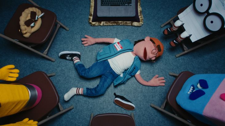
The campaign brought three books to life: Ghosts by Dolly Alderton, Everyone You Hate Is Going to Die by Daniel Sloss, and When Women Were Dragons by Kelly Barnhill. The trio was settled not just because they were amazing and exciting stories but also because they were very different from one another.
"It was a great experience to collaborate directly with the authors, sharing our storyboards and sketches and to get their input," Niceshit adds. "They were all really excited to see parts of their story come to life and were super open and supportive."
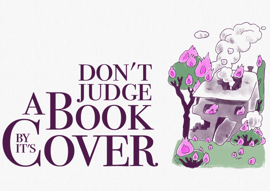


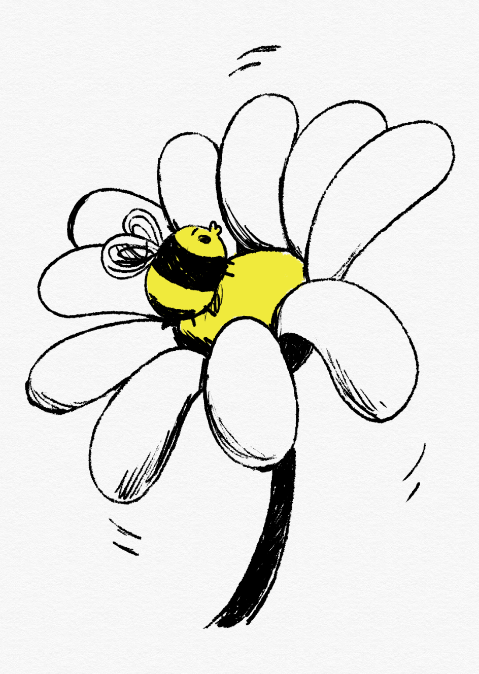
Despite being different from one another, each animation still manages to feel like part of a consistent series. That's because they're deliberately made to look like they take place inside a book, with a style that feels native to paper.
"Each of the three films was approached differently, inspired both by the author and the story," Niceshit explains. "We were looking for an ink, printed feeling that would help them feel part of the same set even if the illustration styles differed."
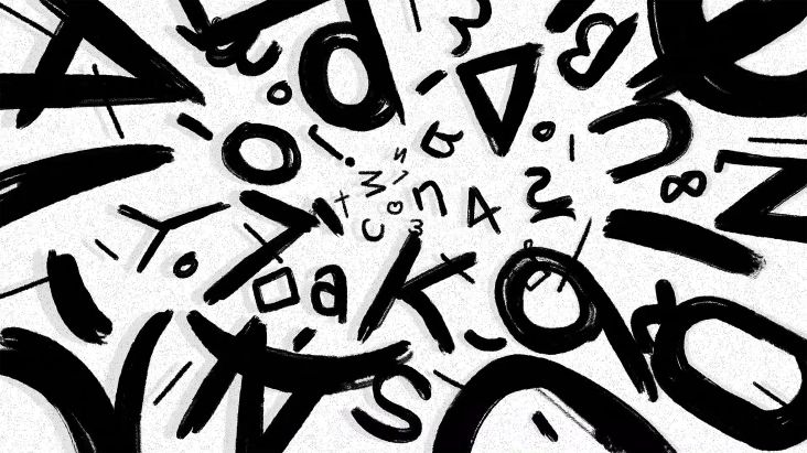
Speaking of the illustration styles, these reflect the concepts of the story. Take Everyone You Hate Is Going to Die, a hilarious book about losing virginity, being young, and the hilarious, hormone-driven mistakes everyone makes in their teenage years.
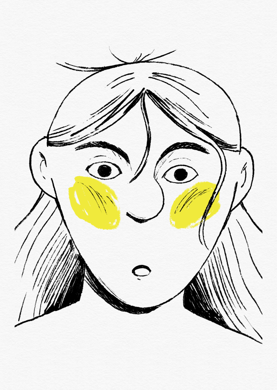
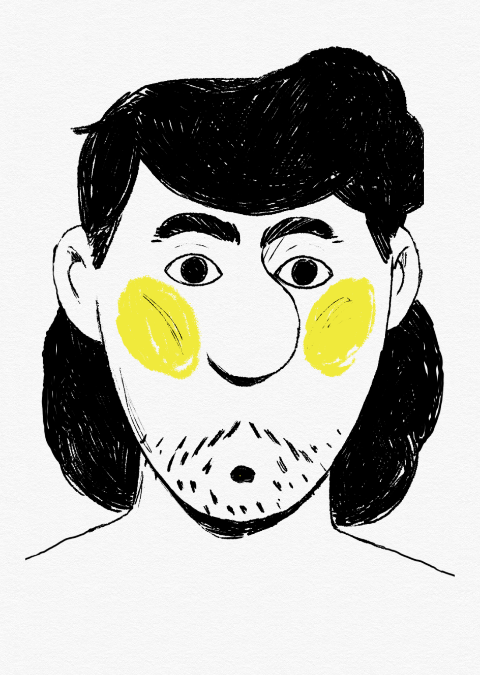
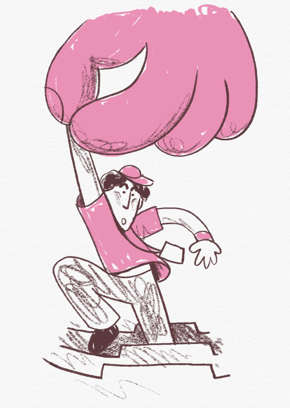
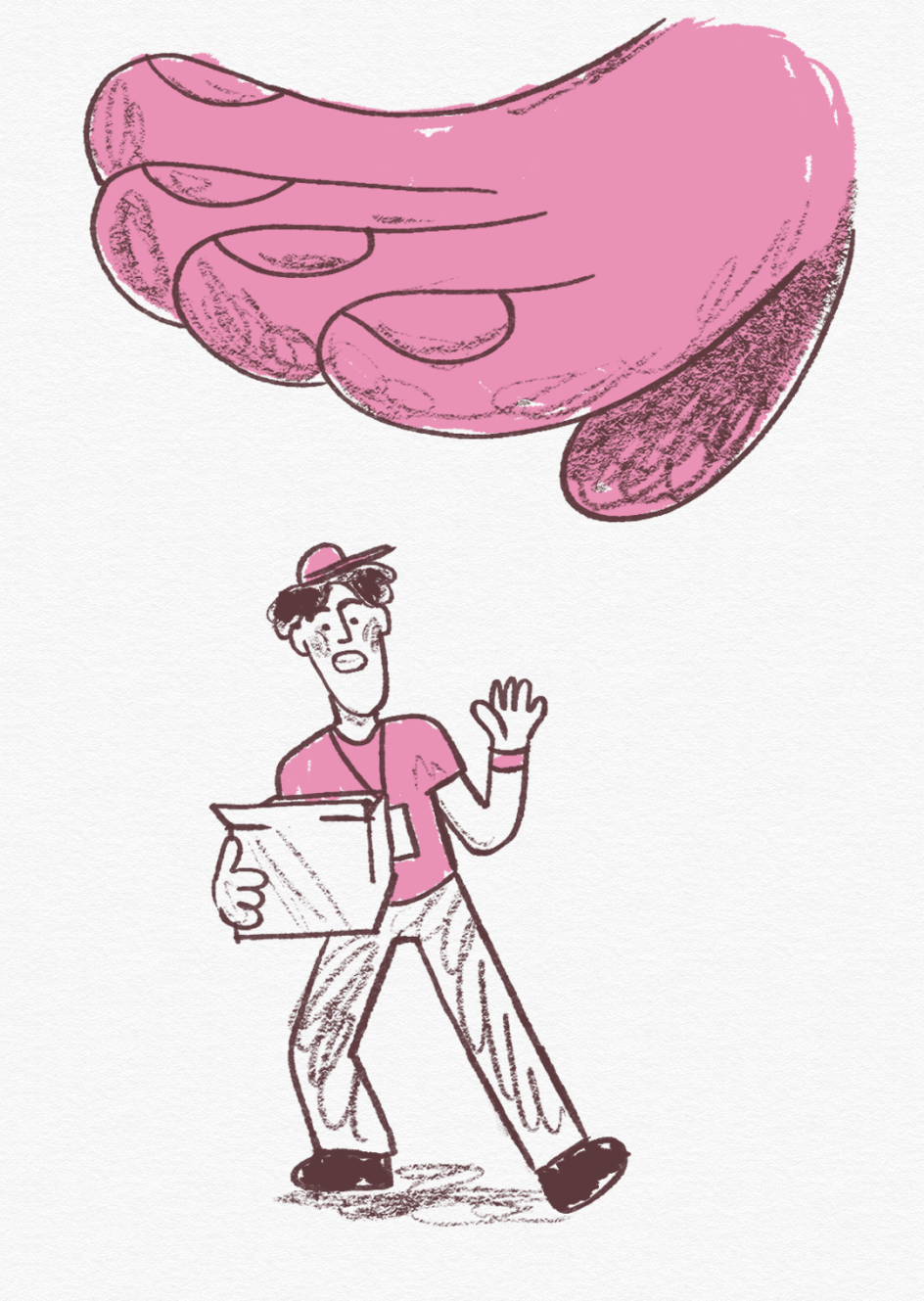
This was brought to life with an appropriately raw illustration style, using hard ink and messy lines. The accompanying sound design was infused with punky electric guitars because nothing captures the carefree nature of youth better than some slightly out-of-tune power chords.
"Meanwhile, When Women Were Dragons is a story full of brave women and lots of dragons, so it takes us back in time to a world made out of watercolours, the sound of horns and screams – a place where you can find great calm and great chaos," Niceshit adds.
Due to the campaign's modular and scalable nature, Niceshit hopes to add to it "endlessly" if Reel Page Turner proves to be a success. "I guess we'll have to wait and see how the campaign does," it concludes. "This is one of the coolest projects we've made, and we would love to visualise more books and stories."


 by Tüpokompanii](https://www.creativeboom.com/upload/articles/58/58684538770fb5b428dc1882f7a732f153500153_732.jpg)

 using <a href="https://www.ohnotype.co/fonts/obviously" target="_blank">Obviously</a> by Oh No Type Co., Art Director, Brand & Creative—Spotify](https://www.creativeboom.com/upload/articles/6e/6ed31eddc26fa563f213fc76d6993dab9231ffe4_732.jpg)


