Quarantine is looking good thanks to a brand refresh (the art collective, not self-isolation)
Quarantine is very much a hot topic at the moment, which may or may not work in the favour of the Manchester-based ensemble of artists and producers of the same name, which recently unveiled its new visual identity to mark its 21st birthday.
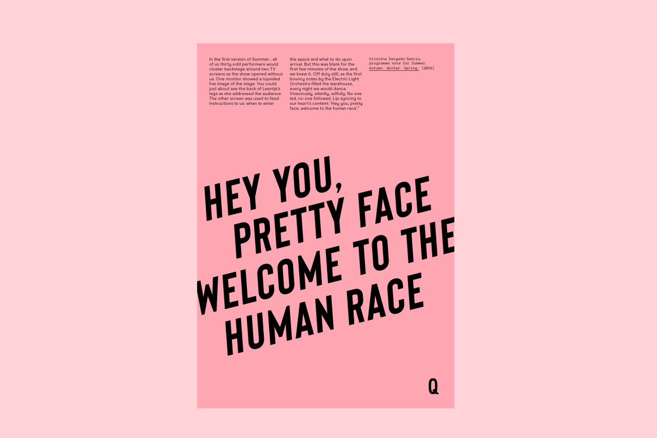
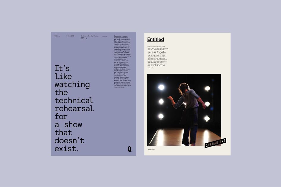
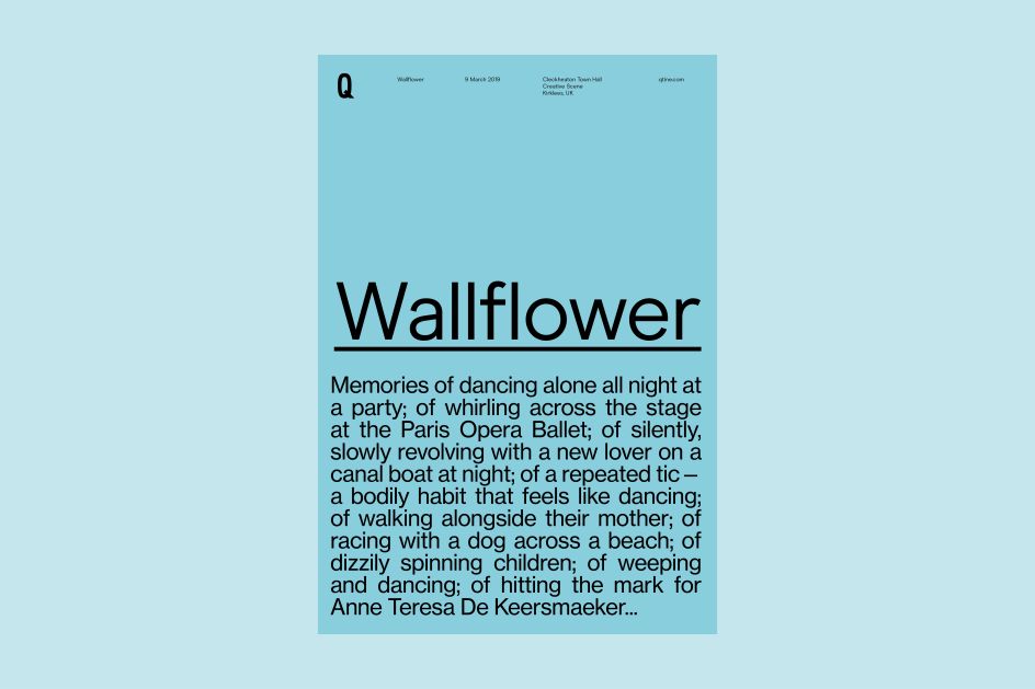
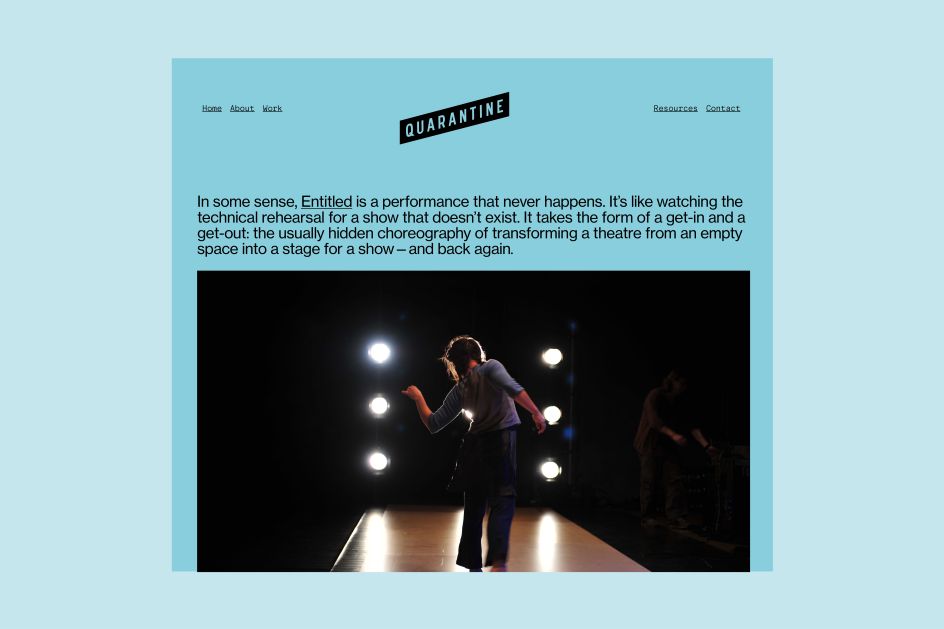
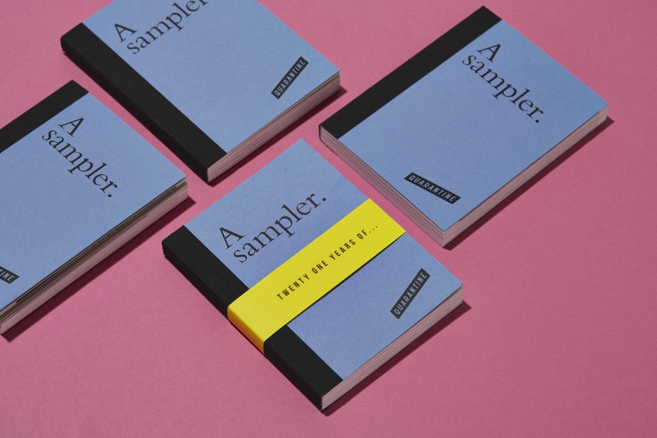
The collective commissioned creative agency Dotto to create a new look that retained the feel of their established brand, while also reflecting their current values and ways of working and being "recognisably Quarantine".
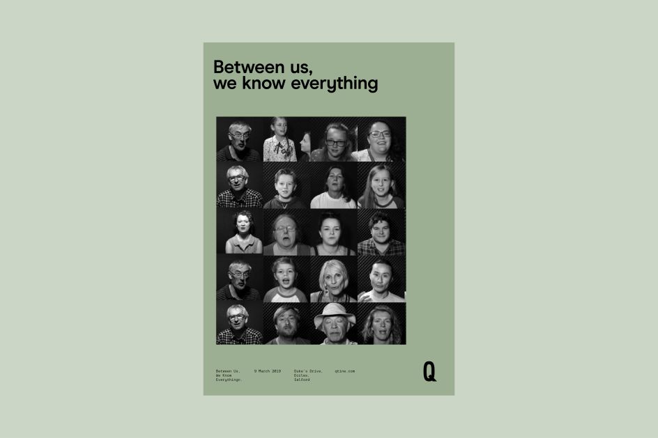
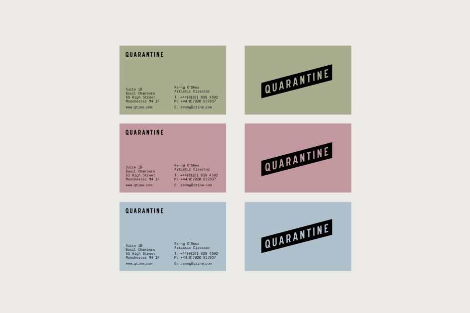
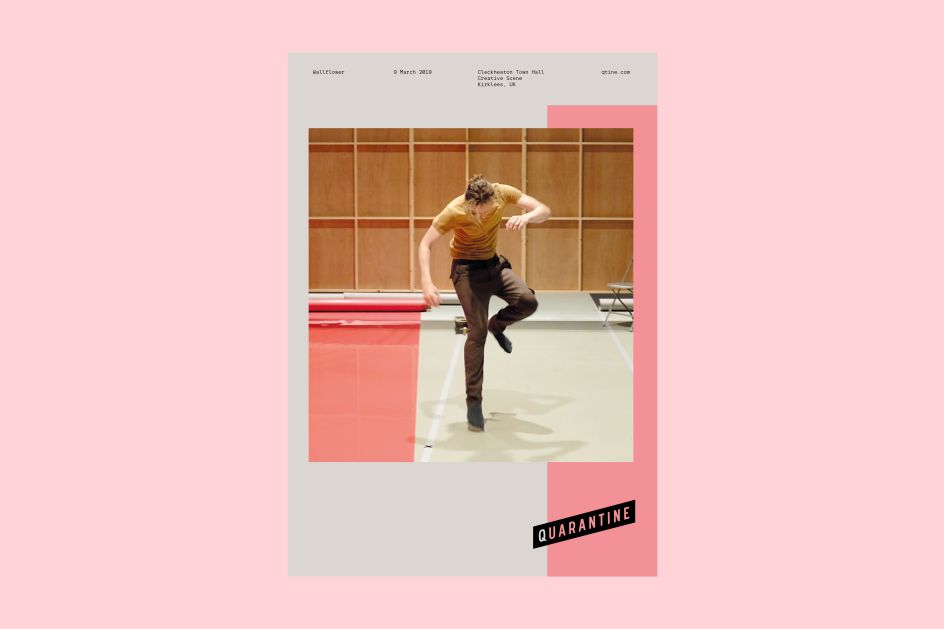
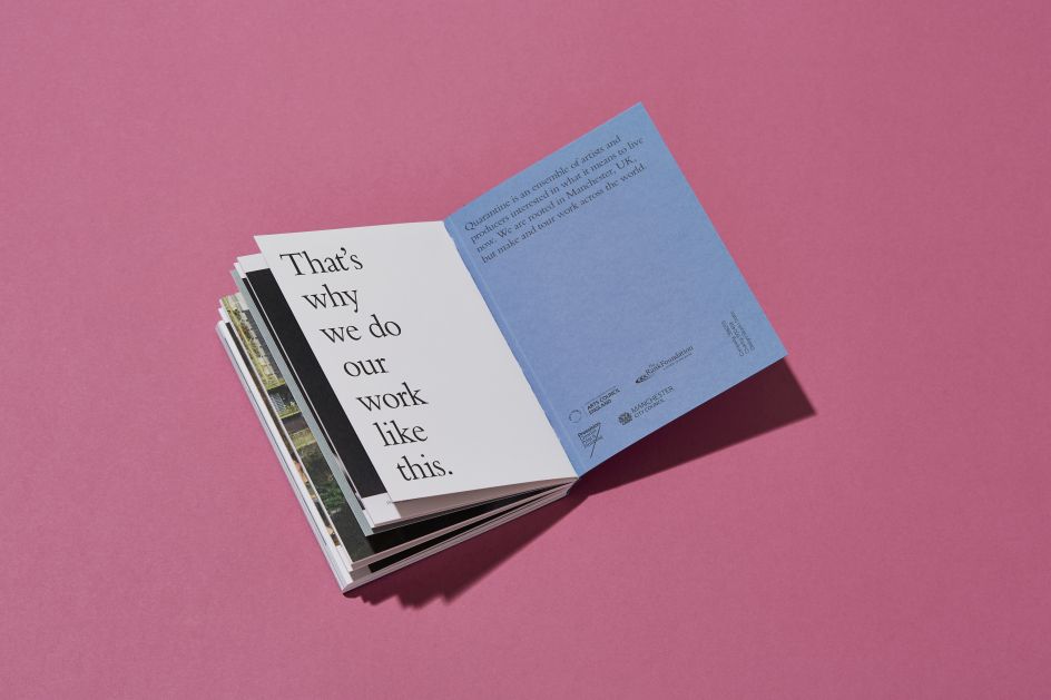
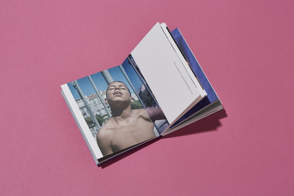
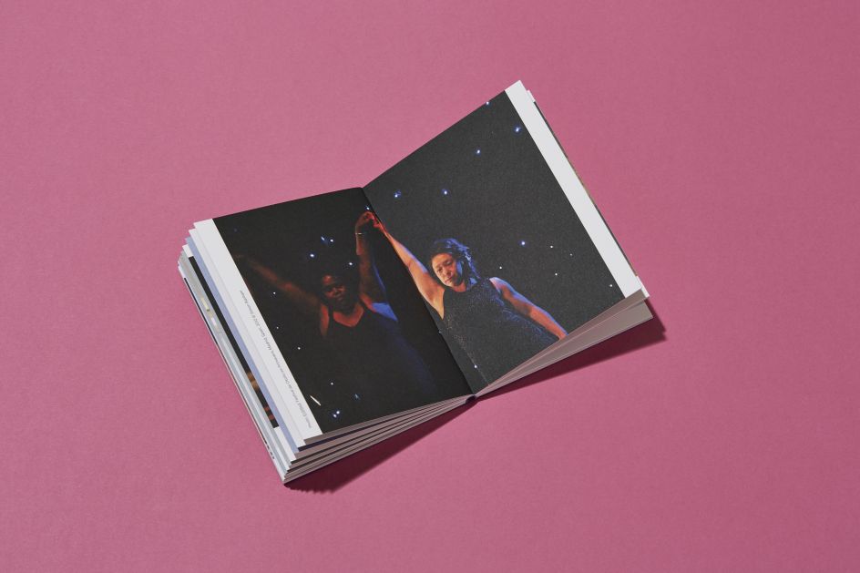
The Dotto team worked across the creative direction and created a new identity and brand toolkit, which it applied across deliverables including stationery. Dotto also created a bespoke Advocacy print in collaboration with printers Pressision and photographer Laura Hutchinson.
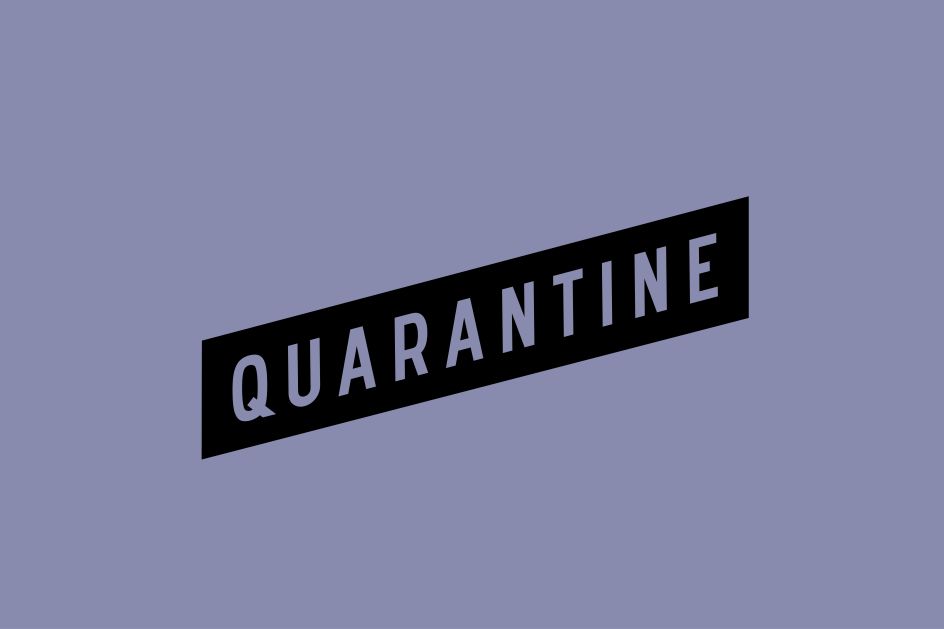
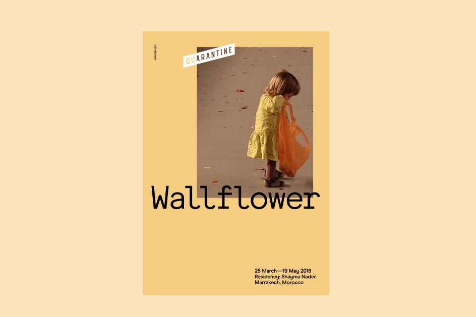
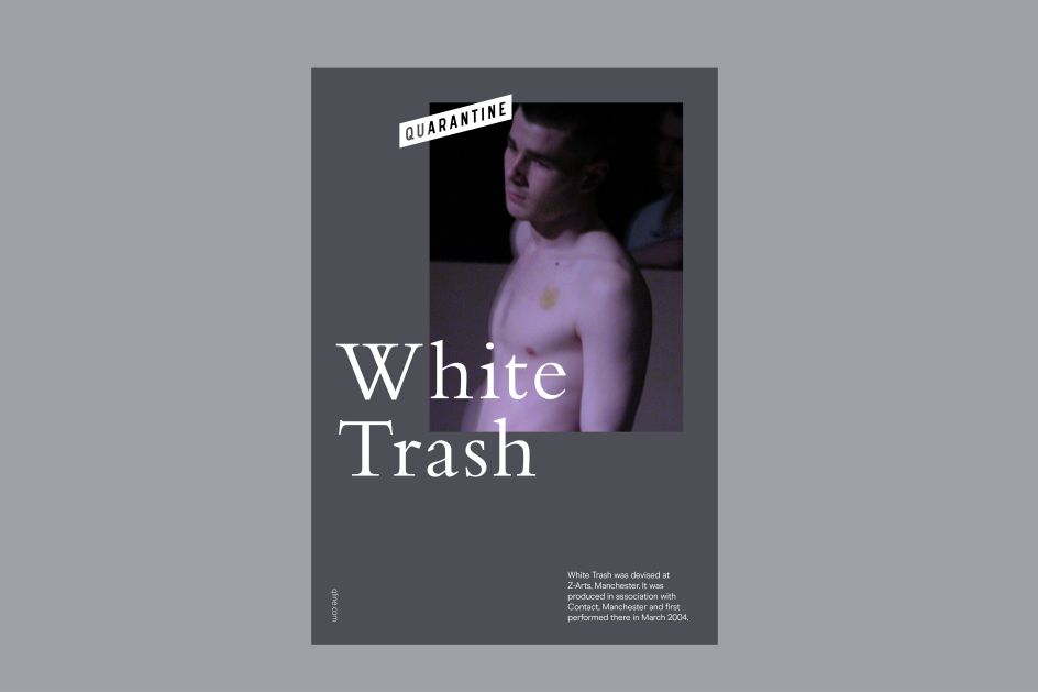
The new wordmark was born out of the original Quarantine flag and is "simplified, elegant and more flexible," according to Dotto. It works as a tape-like design that means it can be laid over imagery and various colours, and an animated version was created by James Huson.
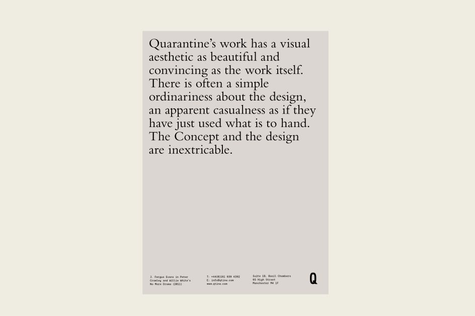
The team used typography as a key illustrative element for "mood and tone"; with the letterforms inspired by Quarantine's values. "It reflects the questioning and conversational themes they explore in their work," says Dotto. The overall look and feel are described as "minimal, refined, functional and understated"; using a subtle but vibrant chalky colour palette alongside "intriguing words and imagery."
Dotto adds, "With Quarantine, their work, words and visuals are hero. The new brand framework makes them the focus."



 by Tüpokompanii](https://www.creativeboom.com/upload/articles/58/58684538770fb5b428dc1882f7a732f153500153_732.jpg)


 using <a href="https://www.ohnotype.co/fonts/obviously" target="_blank">Obviously</a> by Oh No Type Co., Art Director, Brand & Creative—Spotify](https://www.creativeboom.com/upload/articles/6e/6ed31eddc26fa563f213fc76d6993dab9231ffe4_732.jpg)


