Ragged Edge shakes up the juice industry with a 'refreshingly ordinary' rebrand for Eager Drinks
London-based branding agency Ragged Edge has collaborated with juice company Eager Drinks to create a free-from nonsense brand identity that concentrates on refreshing honesty.
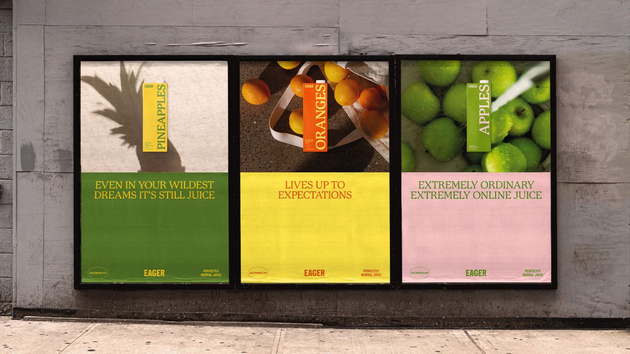
The rebrand appears on packaging and advertising
Juice is healthy, right? After all, it usually contains one of your five-a-day, meaning it must be good for you. Sadly, that's not always the case. In fact, juice is often surrounded by many misleading claims, which has resulted in a marketplace that's become loud, crowded, and sometimes misleading.
To take things back to basics, juice company Eager Drinks has teamed up with Ragged Edge to create a crisp, simple brand identity that still has room to be fun and celebrates the good qualities that the drink actually possesses.
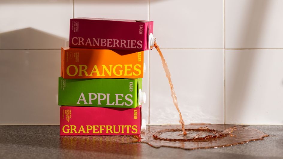
Ragged Edge shakes up the juice industry with this new rebrand
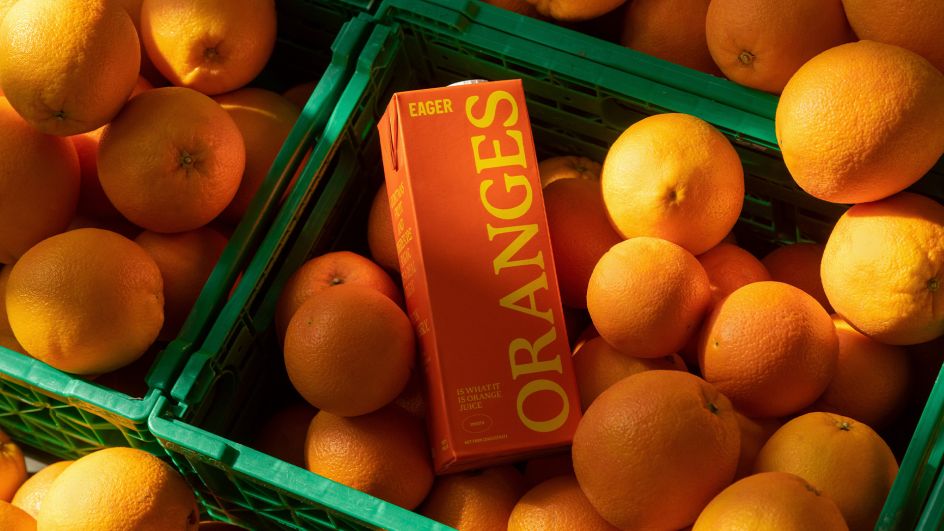
No ingredients appear on the packaging

The rebrand bucks a lot of conventional design wisdom
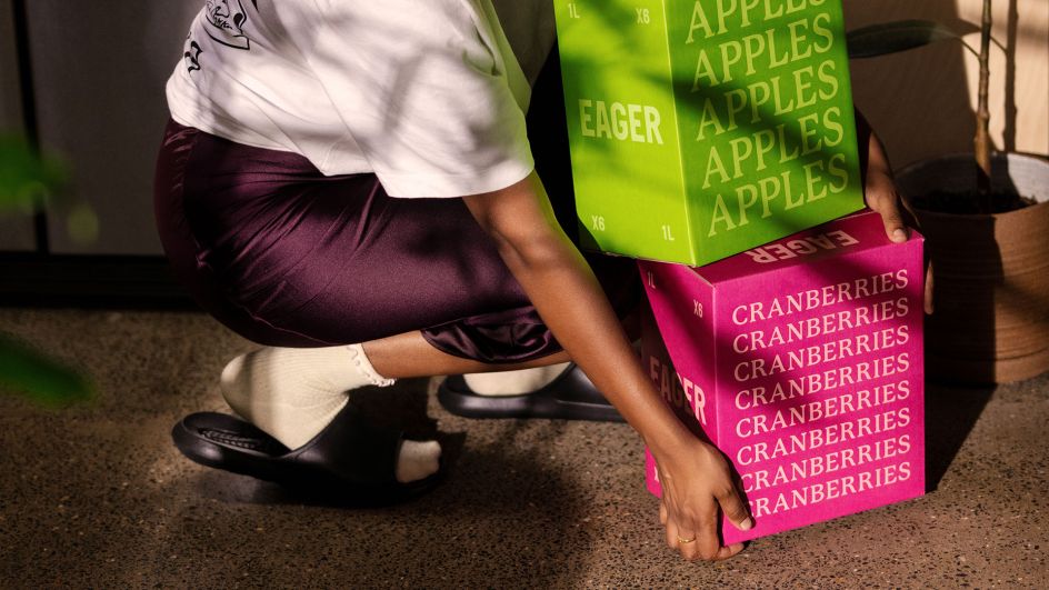
Did you know juice doesn't have to be chilled?
Rather than relying on sumptuous photographs of fruit and splashing bold claims all over their packaging like their competitors, Edge Drinks now has an identity which leans into simplicity. From cartons to the sides of trucks, they've settled on bold colours, stripped pack typography and a tone of voice that's crisp and straightforward. It also dispels one of the biggest preconceptions surrounding juice, that it needs to be kept refrigerated.
"Juice isn't as innocent as it seems," says Max Ottignon, co-founder of Ragged Edge. "The category is littered with false claims and unearned hype. But Eager knows that cold isn't fresh, and juice isn't a health drink. So to get noticed in a noisy, saturated market, we did what no one else dared. We told the truth, and we embraced the ordinary."
The shift is part of a wider leap for Eager Drinks. The company is already a favourite across the drinks trade, with bartenders and bar owners appreciating the eight simple and delicious flavours it offers. This is partly due to its juices not needing to be stored or shipped in refrigerated containers. Now though, Eager Drinks wants to expand into the consumer market.
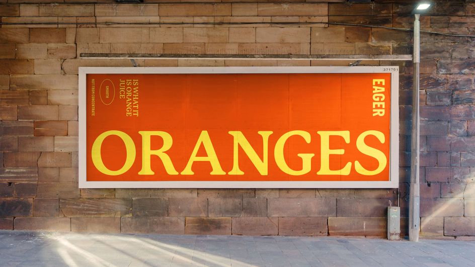
Eager Drinks is already popular in the business sector
Eager Drinks wanted to make it easier for people to buy juice online
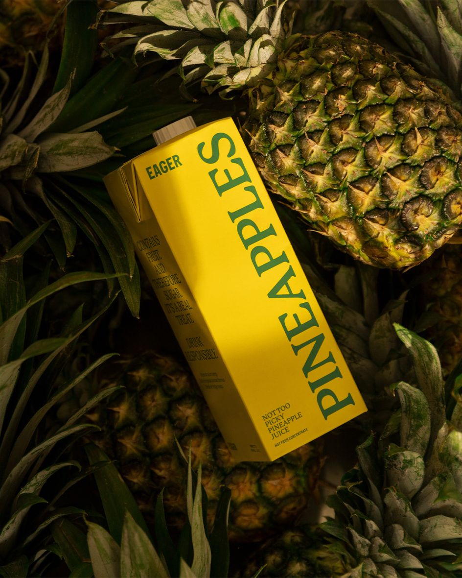
Crisp type and bold colours are the order of the day
"The rebrand provides Eager Drinks with the tools to change people's purchasing behaviours as we enter the busy direct-to-consumer market," says Eager Drinks founder Ed Rigg. "These aren't trivial issues to tackle: we shouldn't be wasting electricity on refrigerating products that don't need it.
"The brand Ragged Edge has created takes these issues seriously but with an aesthetic appeal and a disarmingly upfront attitude. People want to do the right thing and enjoy their drinks – and with our brand, they can."
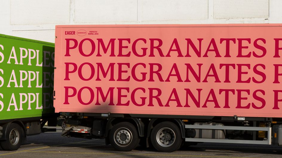
Ragged Edge dispelled a lot of myths with the rebrand
The Eager Drinks website follows the same creative approach
Part of the daring appeal of the rebrand is that it breaks every category code. It contains no misleading health claims, pictures of the ingredients are nowhere to be seen, and the voice is honest and defiant.
Even the company's website follows this pleasingly crisp design approach by prioritising what's important: making it easy for people to buy juice. It's a pleasing change of pace to the competition's poor taste.
"Big juice talks a lot of nonsense," adds Ed. "But they've also got a lot of money, so getting our message heard would be tough. I knew Ragged Edge would find a way, but the result is something else. They're geniuses."


 by Tüpokompanii](https://www.creativeboom.com/upload/articles/58/58684538770fb5b428dc1882f7a732f153500153_732.jpg)


 using <a href="https://www.ohnotype.co/fonts/obviously" target="_blank">Obviously</a> by Oh No Type Co., Art Director, Brand & Creative—Spotify](https://www.creativeboom.com/upload/articles/6e/6ed31eddc26fa563f213fc76d6993dab9231ffe4_732.jpg)


