Sebastian König's latest zine uses quirky pictograms to tell unusual stories
Facts & Figures is the latest zine from Hamburg-based designer and illustrator Sebastian König. In it, he transforms familiar symbols and pictograms in order to tell surreal stories.
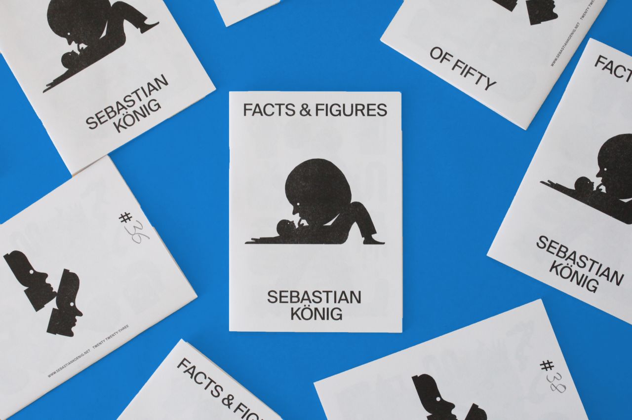
Pictograms are such a familiar part of everyday life that it's easy to take them for granted. This is especially the case for Sebastian König, who lives in Germany, where icons can be seen everywhere and are a standard way of telling stories via images. For him, these symbols were a good starting point for his drawings and illustrations, and they can still be seen in his work today.
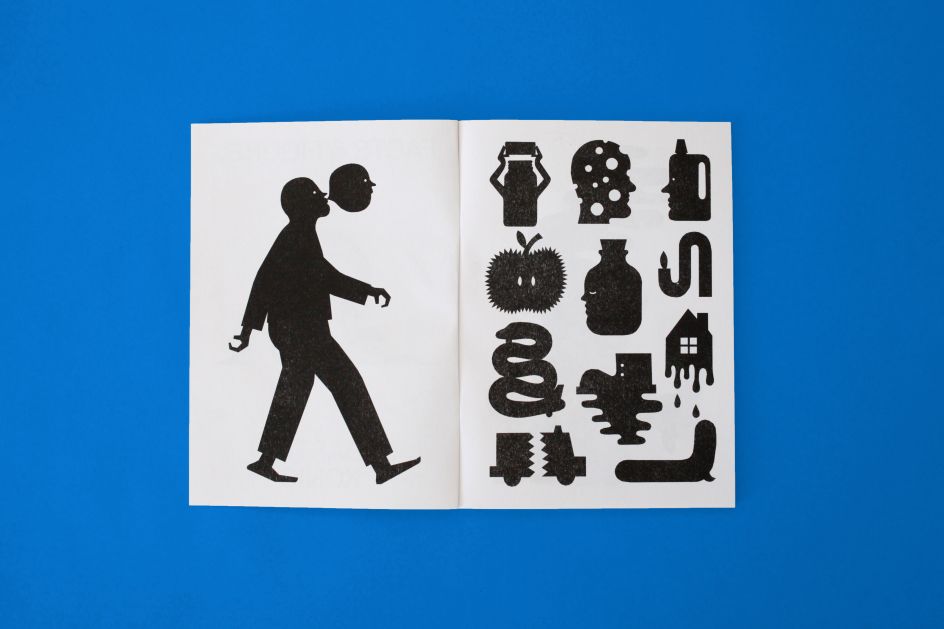
Nowhere is this influence more evident than in Facts & Figures, Sebastian's newest zine, which sees pictograms reinterpreted in a strange and amusing fashion. In its pages, you'll see a man blowing a bubble that looks like his head, a dripping Nike swoosh, and a melting guitar. What do they all mean? It's up to you to decide.
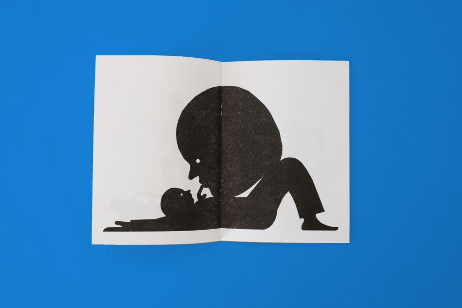
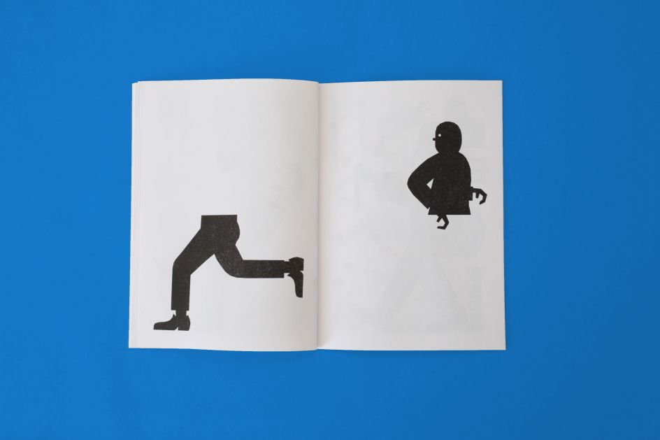
Sebastian's motivation for making this zine came from his desire to explore new shapes and style elements. "I usually use simple shapes and a limited colour palette for my drawings," he tells Creative Boom. "Here, I wanted to focus on the details and the shapes of an element by just using one solid colour and the surrounding white space. This simplicity led to drawings with more defined outlines and clearer details."
Starting as designs drawn in a sketchbook, the pictograms in this zine were then transferred to his iPad so they could be neatened up. This was all part of Sebastian's desire to return to a more hand-drawn approach. Finally, the designs were then redrawn in Adobe Illustrator as vector shapes.
"The whole zine and the prints were then riso-printed based on a simple black and white PDF," he adds. "I love how the nice texture in the black of the zine came out. Riso-printing at its best!"
The symbols in Facts & Figures are an uncanny collection that almost look as if they could appear in real life. However, they're too absurd to have any useful meaning. This doesn't mean they don't communicate a message, though.
"What I like about illustration is that you can tell a whole story with a simple, single image," Sebastian explains. "The perception of the image continues in the mind of the viewer, so these images open up a new world by just looking at them. In the zine, I show regular objects that take on a completely new meaning by changing a simple detail. It's up to you how the story continues or explains what happened there."
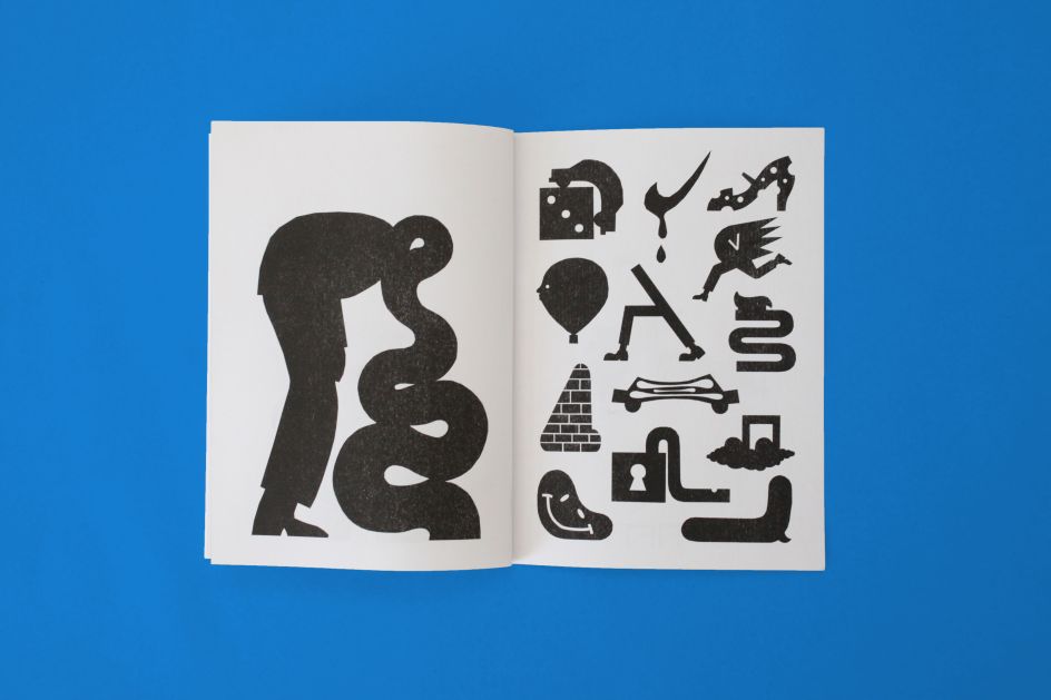
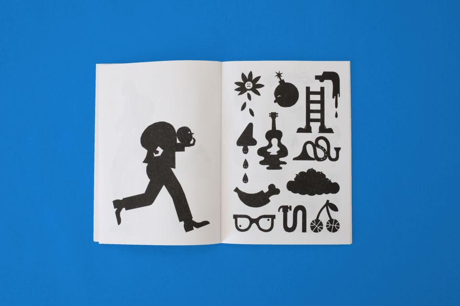
According to Sebastian, the drawings trigger a joyful reaction in the viewer as they try to puzzle out the meaning behind such odd symbols as a sad flower dropping its petals. "I like the transformation from 'regular' objects to 'storytelling' objects," he says. "And this can be done by just changing a little detail.
"Another big influence on my approach to these illustrations was psychedelic art. I like the loose vibe and its anything-goes feeling. I had a lot of fun applying this approach to the zine."
Sebastian's background in graphic design definitely informed his pictograms, as did his previous work in typography and branding. Here, he came across the work of Swiss typographers and designers such as Otl Aicher, Wim Crouwel, Max Bill and Gerd Arntz, whose approach to geometry and construction had a huge influence on his work. "I grew up with Otl Aicher's 1972 Olympics pictograms. In Germany, they can be seen everywhere and are iconic."
To help him distil his subjects into pictograms, Sebastian also turned to drawing real-life objects, an approach he always takes to understand the shape of something unfamiliar. "There is always a kind of truth in the shapes of an object that have been simplified to a minimum," he reveals. "But they have to rely on real roots."
"A hand, for example, even if it is simplified, has to have its thumb on the correct side to work naturally. But here I am mixing my imagination with my natural approach in order to draw things, as well as taking inspiration from photos of objects."
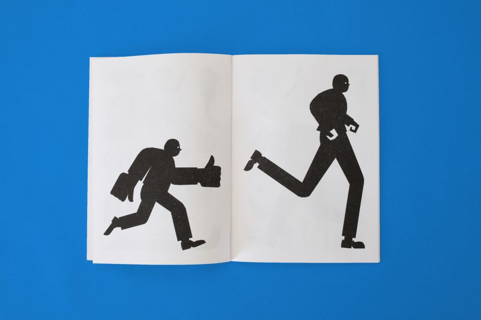
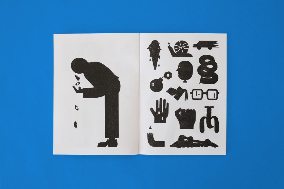
Facts & Figures is just one of the many zines that Sebastian regularly releases, with most being similarly Riso-printed and self-published. Previous zines include Cars, a collection of four-panel comics about automobiles, and Rotklinker, a zine featuring drawings of the red bricks commonly seen in Hamburg.
"What I learned from Facts & Figures, though, was to be a bit more relaxed regarding the layout and the narration," says Sebastian. "The symbols are placed randomly, and I just wanted to achieve an even balance in terms of the layout of the symbols on each page. You can dive into each symbol or just flip through the pages. The zine invites you to read at your own pace."
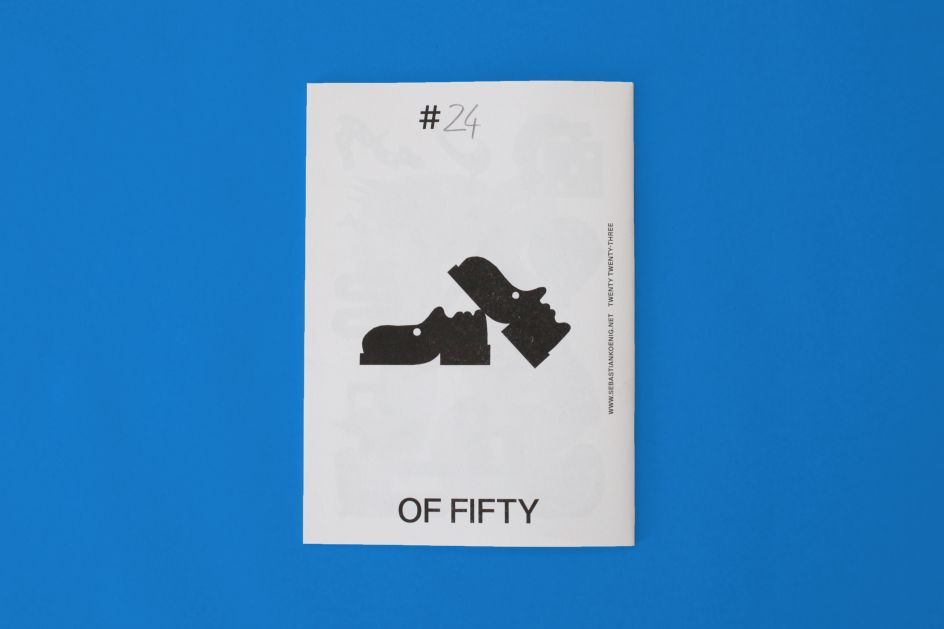
Of the dozens of symbols in the zine, though, Sebastian has a couple of favourites he's particularly proud of. "I love the shoes on the back of the zine," he says. "They perfectly combine two individual items into one drawing and have a nice charisma. The shoes become a character and come to life. That's how I imagine my shoes would look while they wait for me to step in them again.
"Also, I like the lock with the limp bolt," he concludes. "To me, it looks like it has given up its strict purpose and has finally relaxed. That's a good example of a tiny story that is told within a minimal number of elements."


 by Tüpokompanii](https://www.creativeboom.com/upload/articles/58/58684538770fb5b428dc1882f7a732f153500153_732.jpg)


 using <a href="https://www.ohnotype.co/fonts/obviously" target="_blank">Obviously</a> by Oh No Type Co., Art Director, Brand & Creative—Spotify](https://www.creativeboom.com/upload/articles/6e/6ed31eddc26fa563f213fc76d6993dab9231ffe4_732.jpg)


