Fiasco gives new meaning to volunteering, with its branding for OnHand app
Dragon's Den-backed app OnHand makes it easier for people to volunteer for good causes. We assess the new branding crafted for them by Fiasco Design.
It may sound surprising to those who haven't tried. But many people who devote themselves to good work discover that it's not as easy as expected. Finding a volunteer project to take part in that will fit your skills and interests can be quite a challenge. Apps can help, though, and one of the best is OnHand, a social and environmental impact app that received backing from the BBC's Dragon's Den.
OnHand encourages employees to participate in mini-volunteering missions. Started and supported by a growing network of big-name charity partners, it connects those in need with those who want to give.
In other words, OnHand makes it easy to do good. Employees can open the on-demand, location-based app and participate as easily as by booking a taxi. Whenever it suits them, wherever they are, they can find easy-to-do, meaningful missions that align with the causes they care about.
After a successful appearance on BBC's Dragon's Den, the app's creators turned to Fiasco Design, a 15-strong creative studio based in Bristol. And they asked them to craft a new identity for the next stage in their global, enterprise-level B2B growth.
Brand idea and logo
The brand centres around the idea: 'Mini missions that matter to you'. Designed to empower the employee, this statement talks directly to them and highlights the opportunity to make a difference in what they care about.
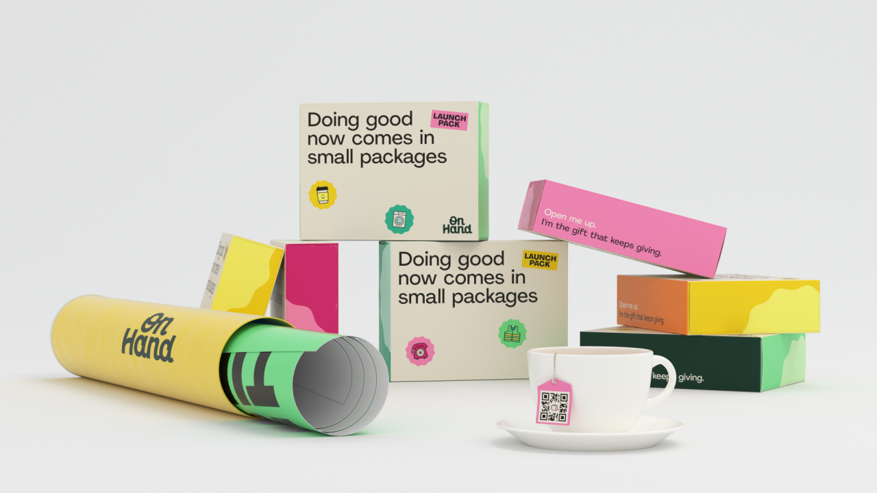
At the heart of the rebrand is the new logo. Fiasco Design enlisted the help of lettering artist Alec Tear to assist in crafting a logo that touches on the human-to-human nature of the brand.
Retaining the hand-drawn qualities of the previous logo, the new version features connected letters and offset cursive strokes. The capitalised 'O' adds extra impact. The uplifting arched crossbar of the 'H' adds a sense of vitality while allowing the logo to be easily stacked.
Colours, brand voice & typography
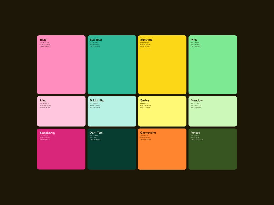
The logo is complemented with a cheery sunshine yellow to boost the good vibes. Meanwhile, the supporting colour palette features earthy shades and deep teal hues. These are contrasted with pops of colour for punchy captions and call-to-actions.
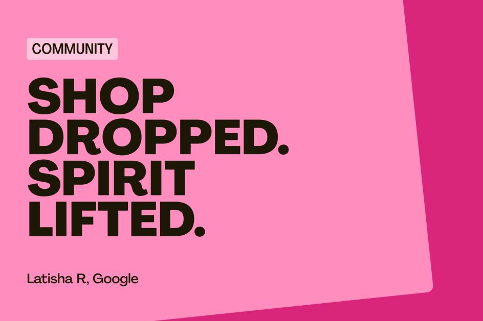
Fiasco also crafted a perma-positive brand voice for OnHand, characterised by succinct, encouraging, celebratory headlines. This is reinforced with the hero font Agrandir, which oozes positivity. Paired with Plus Jakarta, the font choices are warm, welcoming and accessible.
Emojis and UGC
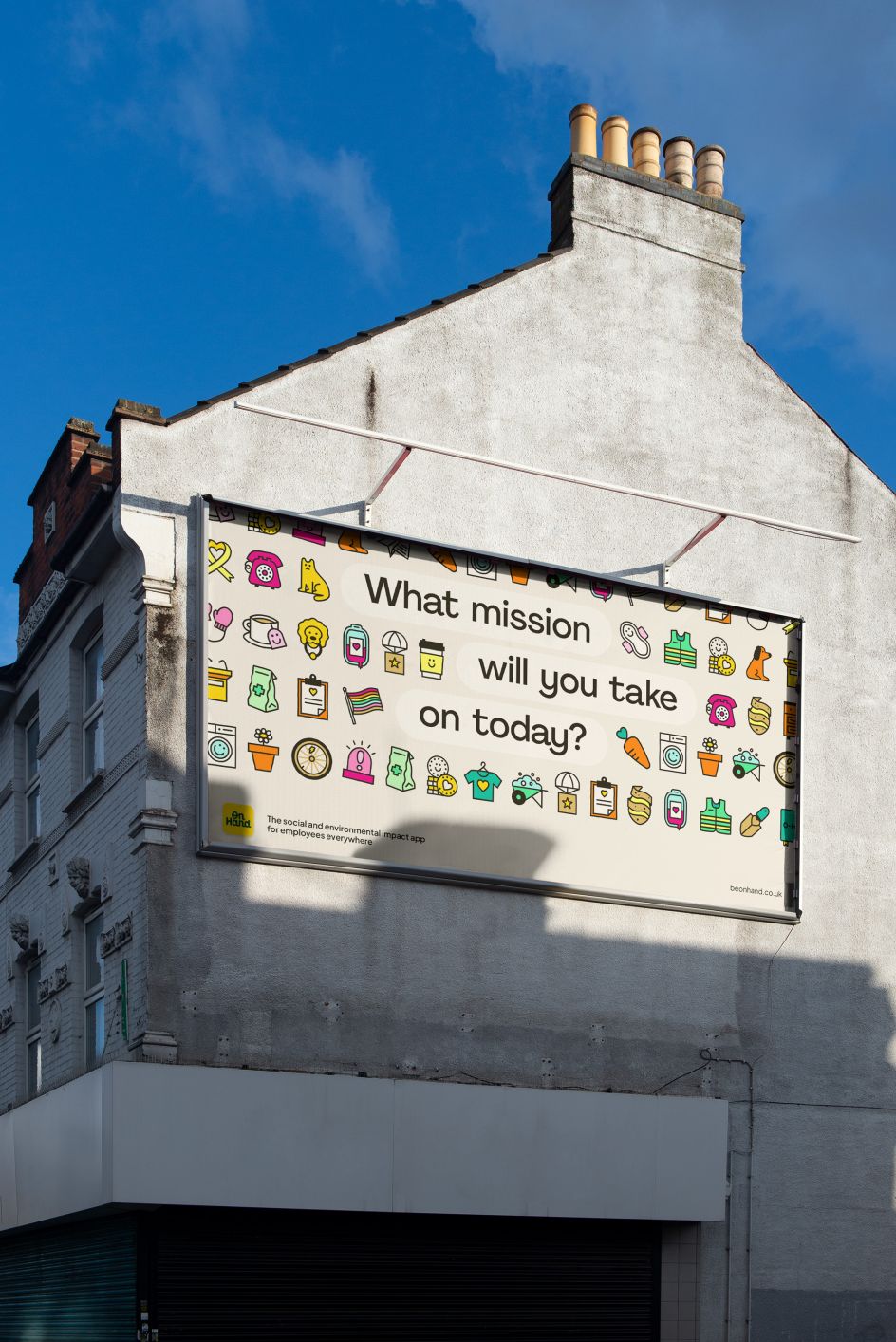
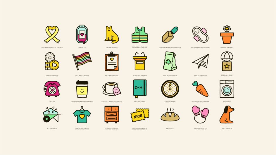
Within the app, missions are arranged vertically to give a sense of scroll-through, whilst lozenges and rounded modules connote an app experience. A suite of charming, custom emojis created in-house help to lift missions off-screen and bring them to life in a way that feels authentic and palpable.
Meanwhile, user-generated photography, combined with cause-and-effect storytelling, celebrates successful missions and propels them into the real world. Mission and name badges add a sense of achievement and reflect the gamified nature of a mobile app.
A candid photography style aims to capture meaningful moments as they happen; from individuals completing missions, team-building tasks, and the friendships that are formed. OnHand puts people right at the forefront of their brand and champions their hard work.
Overall, Fiasco has created a feel-good, engaging and fun brand for employees and employers alike. And by all accounts, it's been a rewarding project for all concerned.
"OnHand is a prime example of the kind of client we love working with," says Chris Tozer, associate creative director. "A down-to-earth, ambitious and lovely team with a purpose-led business that values creativity. It's been a joy."
Sanjay Lobo, MBE, CEO at OnHand, returns the compliment. "The Fiasco team just got it from the outset," he says. "We've now got a super positive brand that reflects our vision – and is really compelling for both employees and employers. Not an easy feat."


 by Tüpokompanii](https://www.creativeboom.com/upload/articles/58/58684538770fb5b428dc1882f7a732f153500153_732.jpg)

 using <a href="https://www.ohnotype.co/fonts/obviously" target="_blank">Obviously</a> by Oh No Type Co., Art Director, Brand & Creative—Spotify](https://www.creativeboom.com/upload/articles/6e/6ed31eddc26fa563f213fc76d6993dab9231ffe4_732.jpg)


