Slick new identity for Film and Furniture, the site that lets you buy on-screen furniture icons
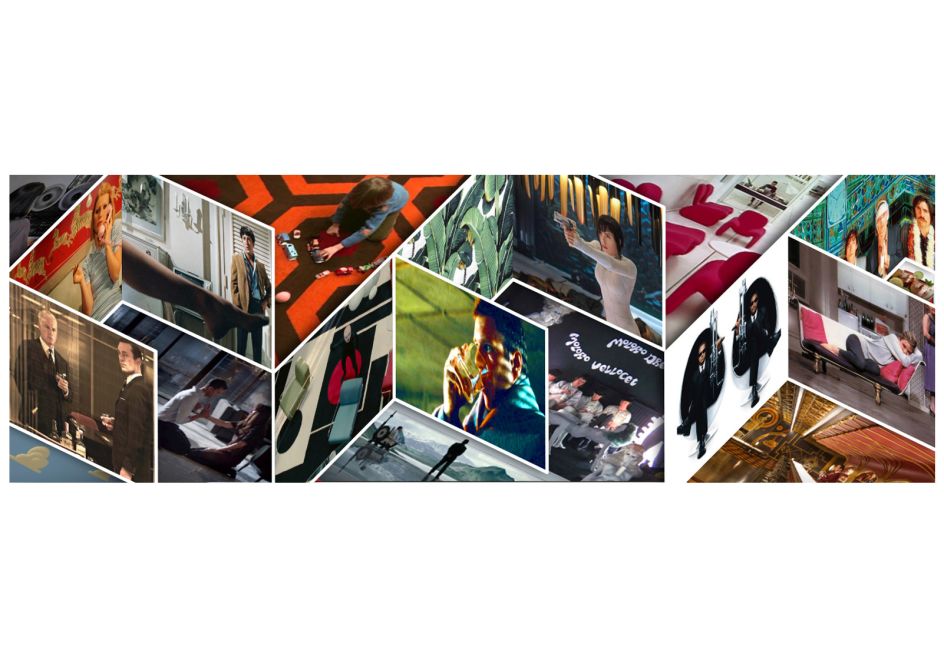
Ever spotted a classy bit of glassware on Mad Men and thought, "I gotta get me one of those"? Or longed to recline on the white modernist couch of Ex Machina? Then best get over to Film and Furniture sharpish: the site bills itself as being "for design geeks, film nerds and furniture fans", and ticks all three boxes by pinpointing (and selling) iconic pieces of homeware from the silver and small screens.

The site was founded by Paula Benson of design agency Form, so naturally, she turned to herself and partner Paul West when it came time to give Film and Furniture's branding and identity a spruce up. According to the agency, "a key part of the brief was to help the site become more commercial without losing any of the passion and ‘fan feel’ it has become known for and to help it stand apart from competitors influenced by the site’s content and success."
The new designs are based around a dynamic three-dimensional ‘F’ logo mark, which Forms says "subtly communicates the 3D space of a film set and the scenery flats used to create rooms in the movies... Two versions have been created for flexibility across different media – one with a white background with the ‘F’ mark fading from red to black, together with a reversed version – white on red."
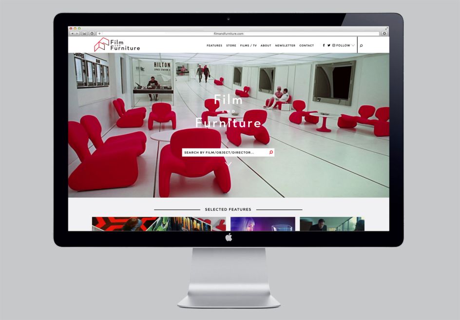
Devoted cinephiles (and design nerds) will also clock that the identity's colour palette of red and white is also a nod to the red Djinn chairs in Kubrick’s 2001: A Space Odyssey.
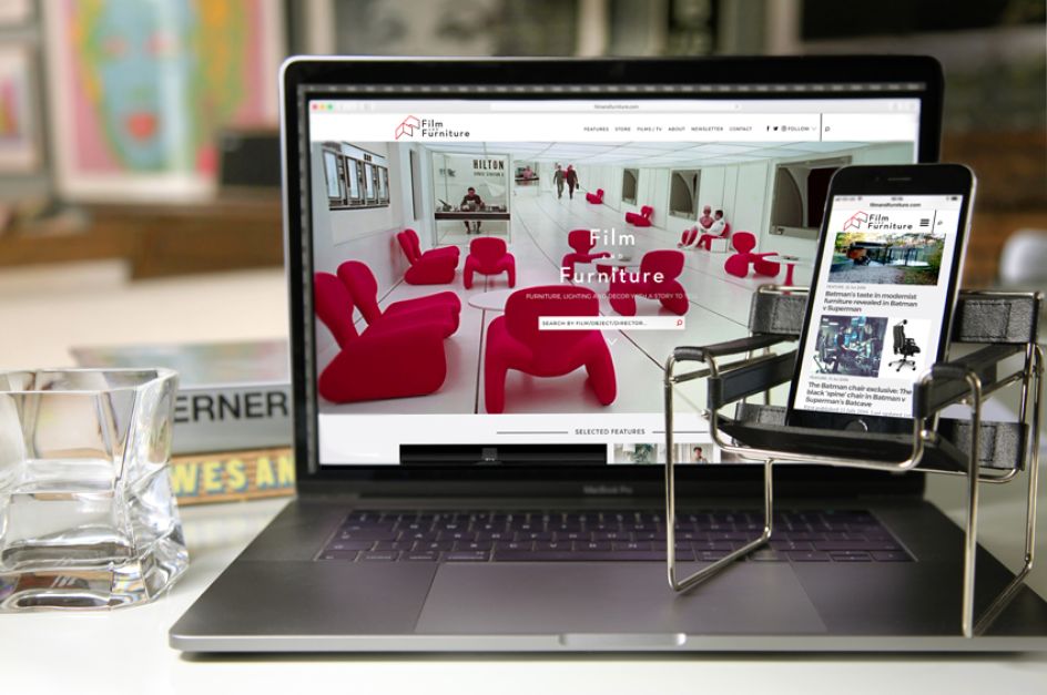
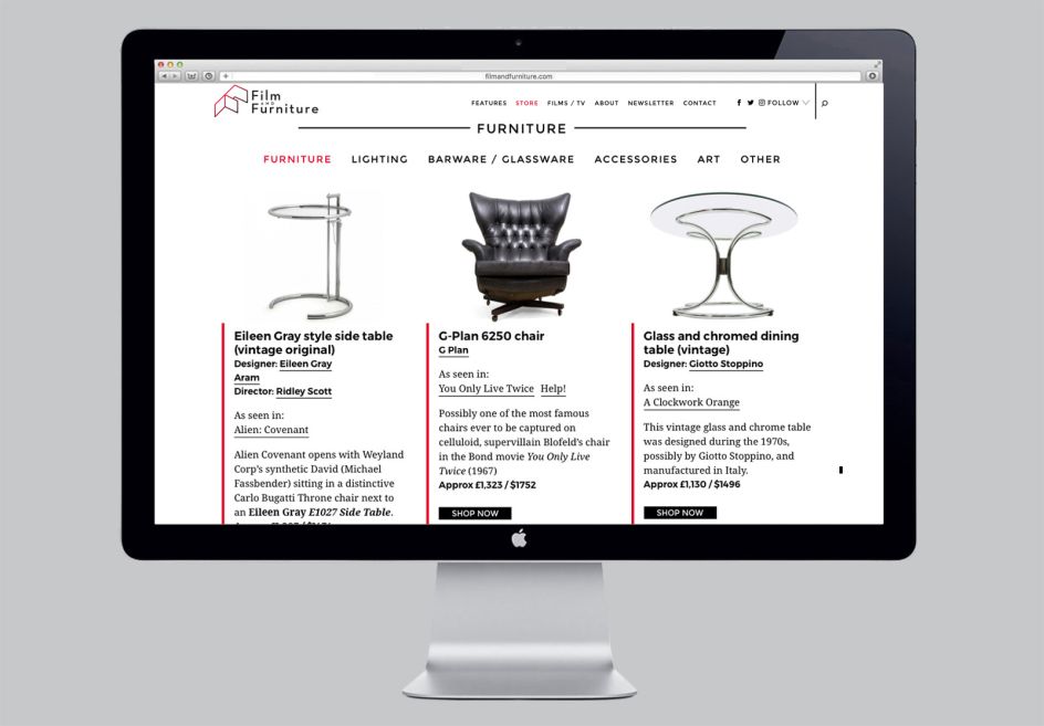
Alongside the new logo, Form also worked with Paris-based web developers Bleeps and Blops to overhaul the website, aiming for a slicker look and improved functionality. As well as offering easier searching by film, the site also offers up film and furniture-related features for those looking to dig deeper into the scenery.






 by Tüpokompanii](https://www.creativeboom.com/upload/articles/58/58684538770fb5b428dc1882f7a732f153500153_732.jpg)


 using <a href="https://www.ohnotype.co/fonts/obviously" target="_blank">Obviously</a> by Oh No Type Co., Art Director, Brand & Creative—Spotify](https://www.creativeboom.com/upload/articles/6e/6ed31eddc26fa563f213fc76d6993dab9231ffe4_732.jpg)


