First Choice: Ragged Edge rebrand celebrates the pickiness of modern travellers
This week sees the launch of a new brand identity for online travel agency First Choice created by Ragged Edge. Setting itself apart from the competition with a pink palette and unconventional logo, it perfectly reflects how modern travellers pick their preferences.
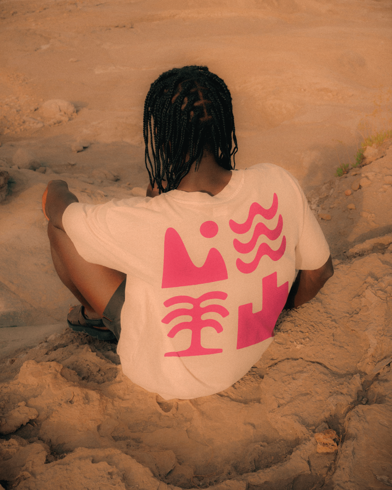
Travellers' needs are constantly evolving, and so is First Choice. Whereas jet setters used to be tied to a set of options offered by a travel agency, the digital age means that people have more freedom to select what they want from a holiday. And the company's new identity from Ragged Edge is here to reflect that.
Resplendent in a soft pink and paired with innovative photography that leans into its customisable ethos, First Choice is now equipped to reflect the era of personalised travel. Tackling the concern of many a traveller — the Fear of Better Options — the new identity expresses how First Choice offer the freedom to craft a unique holiday experience without the hassle of multiple booking platforms.
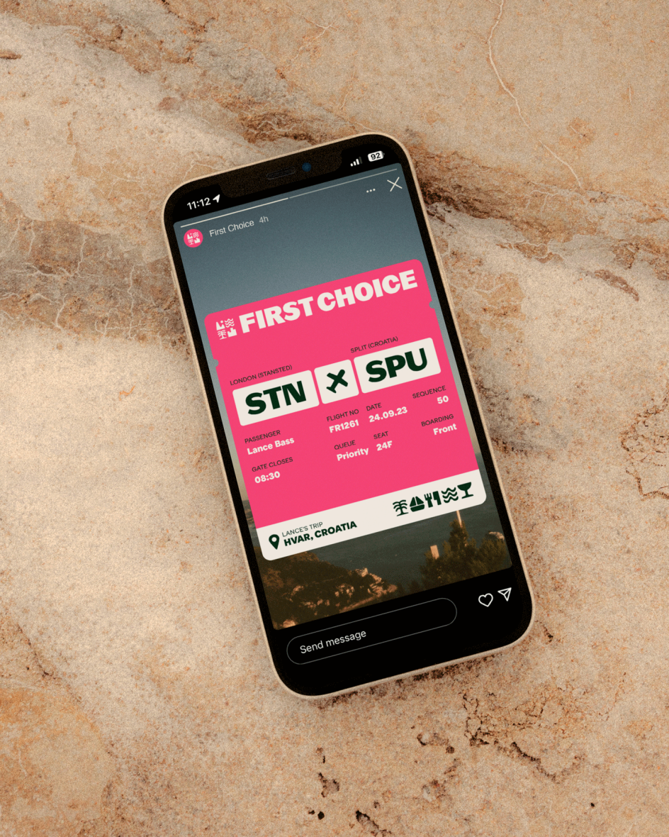
The new identity is the latest in a long series of changes for First Choice. For 30 years, the company has been helping customers choose their perfect holiday, and in that time, it has transitioned from the high street to the internet, as well as become part of the TUI Group. And it sounds like its latest change is the timely start of a new chapter.
"Booking travel has become an increasingly overwhelming experience," says Max Ottignon, co-founder of Ragged Edge. "Having unlimited and unfiltered choice makes picking the right holiday harder, not easier.
"First Choice replaces endless options and the choice paralysis that comes with them with a single platform built to help you pick the trip you really want. So, that became the focus of the brand. A brand that makes it easy to get picky."
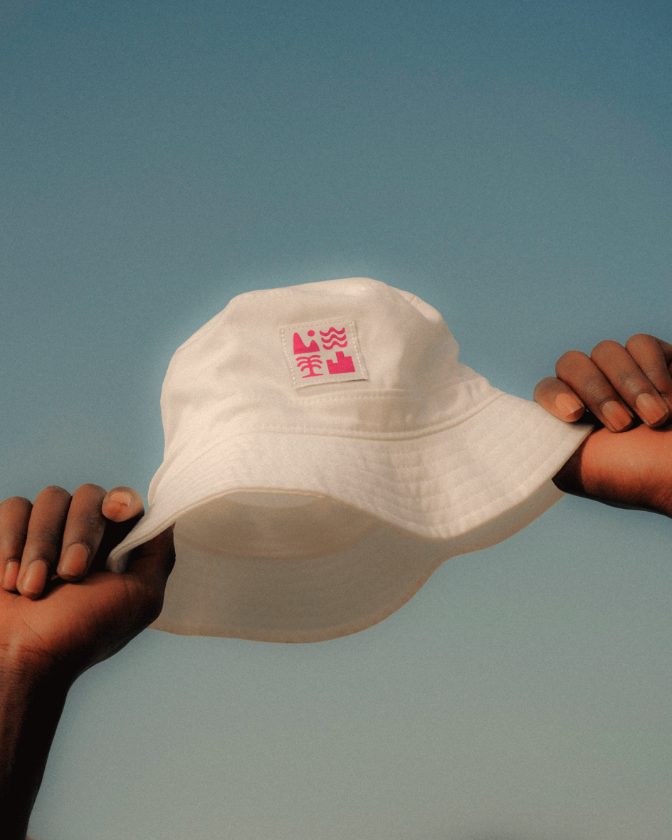
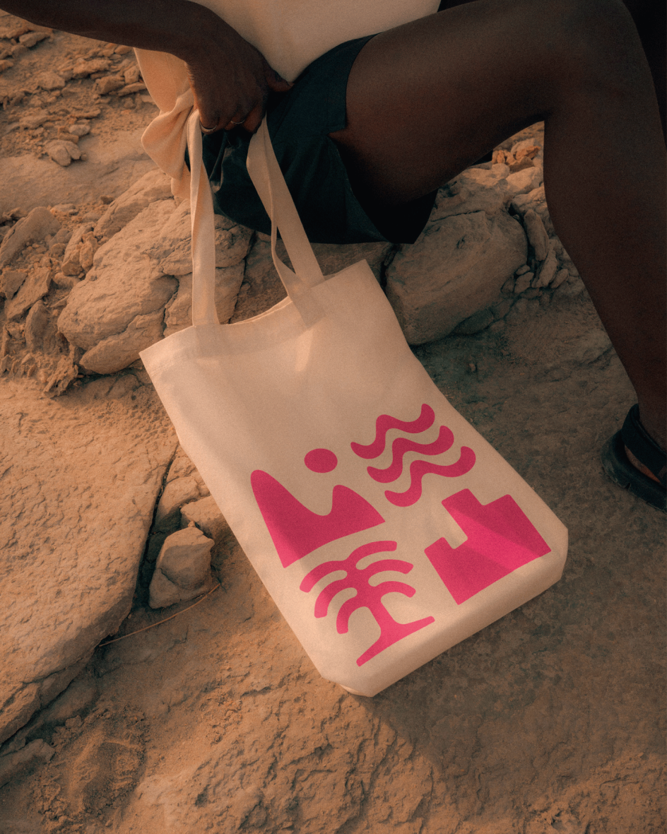
To bring this brand vision to life, Ragged Edge settled on the idea of using a suite of icons such as a wave, tree and mountain. These work by representing the various options and activities that travellers can pick and choose from, yet they also succeed by retaining a sense of uniformity that allows the brand to remain consistent as well as personal.
The logo further represents this, which pairs four distinctive icons into one bold and unashamedly unconventional graphic. The logo not only fulfils its need to visually communicate a focus on tailoring the perfect trip but also signposts to First Choice customers what their user experience will be like as the design elements run right through the website.
Bolstering the rebrand is a suitably playful tone of voice in the copy that reflects how people take their holidays at their own pace. Messaging such as "5am start or 5am finish" and "29 degrees or 2 degrees" succinctly capture how everyone has different expectations regarding their holiday and that First Choice is the perfect travel agency to cater to this.
To further get this message across, Ragged Edge worked closely with Order Type Foundry to create a customised typeface based on Pastiche Grotesque. Bold and confident, yet idiosyncratic and fun, the typeface strikes the perfect balance and effortlessly sums up the spirit of the rebrand.
Capping off the identity is a purposefully imperfect art direction that includes natural, authentic photos that do away with the empty, pristine beaches that have become something of a creative cliche in the world of travel agencies. All set off with an eye-catching hot pink, First Choice is now armed with everything it needs to cater to picky travellers.
"[First Choice needed] a brand that stands out and resonates with a new generation of travellers while retaining the trust and warmth that First Choice has historically represented," concludes Bart Quinton Smith, Managing Director of First Choice.
"Ragged Edge has done an outstanding job in encapsulating that distinctive identity. The rebrand is exciting and bold and demonstrates our understanding of every holidaymaker's unique preferences while cutting through the noise of the internet's infinite possibilities."


 by Tüpokompanii](https://www.creativeboom.com/upload/articles/58/58684538770fb5b428dc1882f7a732f153500153_732.jpg)


 using <a href="https://www.ohnotype.co/fonts/obviously" target="_blank">Obviously</a> by Oh No Type Co., Art Director, Brand & Creative—Spotify](https://www.creativeboom.com/upload/articles/6e/6ed31eddc26fa563f213fc76d6993dab9231ffe4_732.jpg)


